cyrenians re-branding by kimpton creative
london charity organization cyrenians has recently undergone a redesign conducted by UK agency kimpton creative. striving for a fresh interpretation of cyrenians’ aesthetic, the london agency has developed a ‘people focused’ campaign, to sync the charity’s graphics with their community work. a major motif employed for the branding is an eye, created in several variations. they are enlarged and altered by means of an addition of darkened figures extending from their black pupils into the brightly colored irises. the agency has also developed a more dynamic typographic style, including a gradual enlargement of a standard font for promotional material – the more positive phrases said by their clients taking precedent over less powerful ideas – expressing the gradual progress of their clients over time.
 the eye series on cyrenians merchandise
 typography redesign
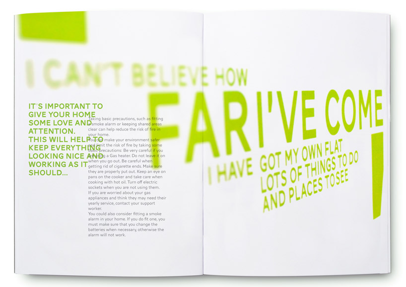 gradual enlargement of a standard font is used to express the progress of their clients
PRODUCT LIBRARY
 Sep 07, 2024
 Sep 02, 2024
 Aug 29, 2024
 Aug 21, 2024