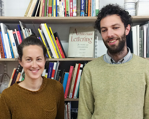
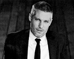
top image: mia frostner and robert sollis
europa is a graphic design studio formed in 2007 and based in london. it is run by mia frostner, robert sollis and paul tisdell, (paul currently lives in australia and is a sleeping partner for time being). for the past six years europa have been designing books, publications, signage and graphic identities for clients who are operating predominately in the public or cultural sector. a significant part of europa’s practice is directed towards education. europa run the second year of the BA graphic design course at camberwell college of art, and have run workshops at the architectural association, danish design school, écal, glasgow school of art, konstfack, london college of communication and typography summer school.
DB: please could you tell us briefly about the evolution of europa?
E: there were four of us that started the studio and we all studied together at the royal college of art. whilst we were there we collaborated with each other in different combinations but the first project we worked on all together was a self initiated one which called work for work. the idea of work for work was that we invite someone to do a day’s work for us, and in return agree to do a day’s work for them. in retrospect the project was in part a way for us to find a structure and purpose within the loose, cross-disciplinary nature of the course that we were on. we were students actively contacting people we admired, and throughout the project we were surprised at how far a well considered, polite invitation can get you – we had david hockney, bill drummond and ryan gander coming in to work with us amongst others. so the network was an important part of the project but we were also thinking about the hierarchy that is present in any working relationship. the project was a framework that encouraged a flattening of that hierarchy. one day we would be the client and the next that relationship would be reversed.
DB: how do each of your skills compliment or contrast with each other?
E: we’ve always taken the position in the studio that we want to learn and develop a broad set of skills, so we support each other to do this. we usually have one person in charge of a project and they act as the point of contact for the client. generally the early ideas stage is worked through collectively so that we get the biggest variety of ideas into the project. then when it comes to implementing and delivering a project it tends to done by one or two people. it’s just about finding an efficient way to come up with the best results.
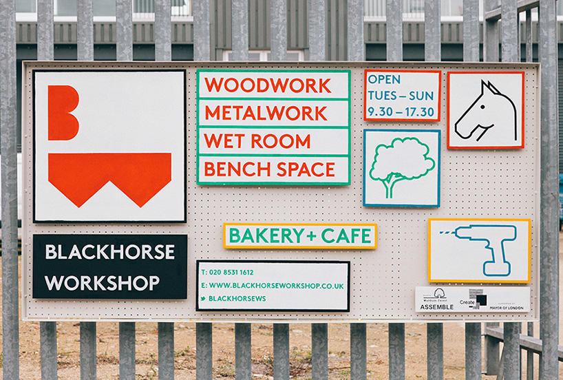
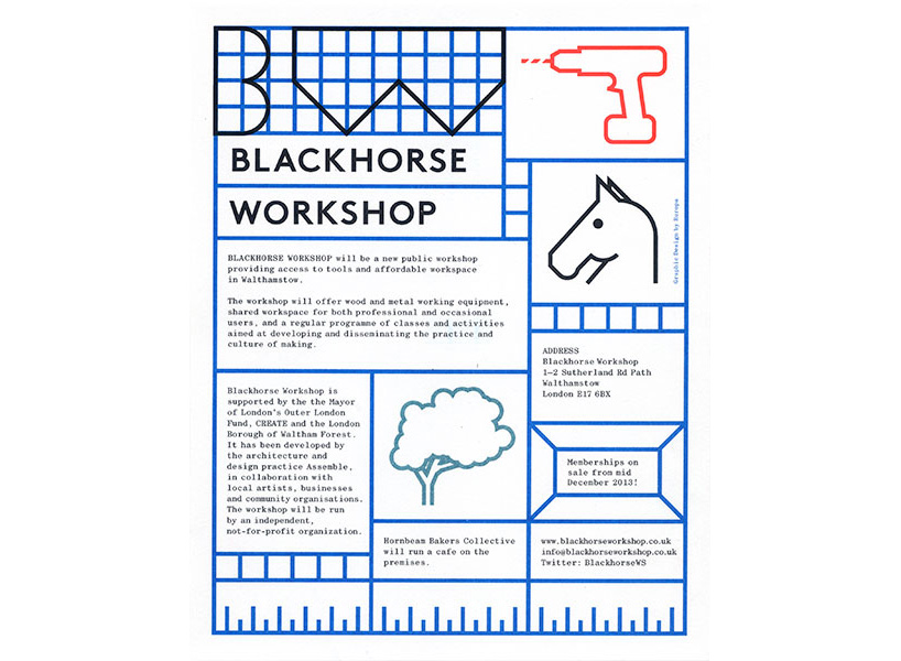
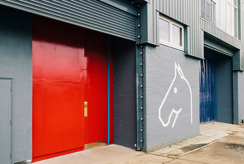
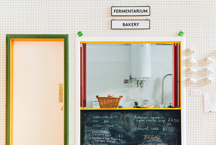
identity for blackhorse workshop – a wood and metal workshop for making and mending in walthamstow, london.

DB: what drew you to identity design and what do you enjoy most about it?
E: identities are one of the hardest tasks for a graphic designer. to sum up something about the personality of a company or organization in a reduced graphic form can be very tricky. when designing a book for example you have a lot more content to work with and the personality of the book can be communicated through the arrangement and presentation of all of this content. with a graphic identity it has to some extent work independently of content. you can anticipate some of the implementations that it might be used for – business card, letterhead, website etc. – and propose design ideas for these but often we need to give an identity away for other people to use and it needs to be robust enough to withstand that.
DB: what should a young designer remember when designing an identity?
E: work with your client not against them. it can often be the case that we propose ideas that we are happy with but our client thinks otherwise. from what we have understood of a client through the research and discussions we might think we have captured some of that spirit in a design but we will never have the expertise they have at what they do. often by embracing the direction that a client gives send us to a new and better place with the design, down a path we might not have discovered by ourselves. this is something we are always searching for, journeys to new places for our work.
this brings us to a more general discussion about a designers willingness to embrace constraints. here we would like to turn to the words of artist, designer and educator sister corita: ‘assignments are limitations and helpful in that they are limitations. they allow you to do something instead of everything … assignments make a choice and say work within this area, and that in a sense frees you. you are free not to do everything.’
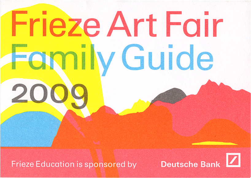
frieze art fair family guide 2009
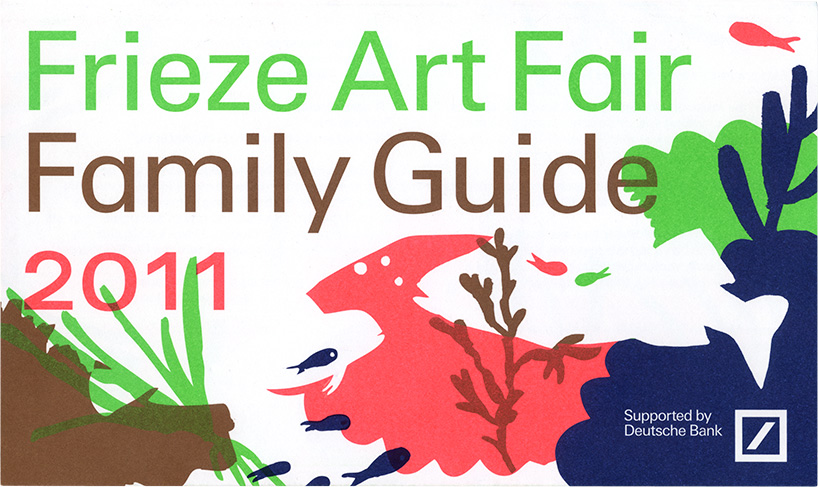
frieze art fair family guide 2011
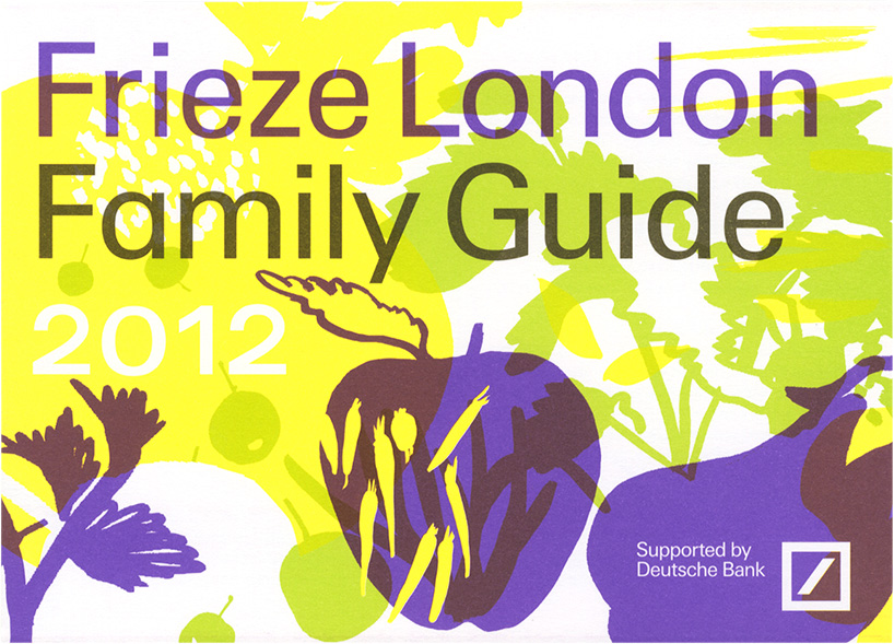
frieze art fair family guide 2012
DB: what are your thoughts on specialization vs generalization?
E: ‘jack of all trades, master of none, often times better than a master of one.’ we find the contradiction in how this saying gets used really interesting. often the first half gets used to suggest that attempts at becoming a renaissance woman are a negative thing but then the same phrase but with a second part gets used as contradiction to that. our view is that both are important. we need specialists to do things really well. too many things are realized poorly by non specialists. we also need generalists to link up the specialists. people with enough knowledge to judge what and when specialist skills are needed. what most people are is a bit of both. an ability to observe and consider things goes a long way but it takes a lot of testing to really tune in to the find details of a specialism. at the same time, and this might sound like a bit of a contradiction, we are excited by the idea of taking the skill set you have in one field and try to apply this to another. occasionally what you might lack in skill gets superseded by a fresh approach.
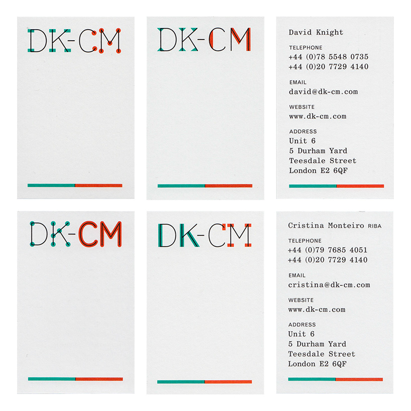
DK-CM architects identity – business cards
DB: what is something that currently fascinates you and how is it feeding into your work?
E: we often become fascinated by the content that we are given to work with by clients, and it’s this diversity that makes working as a graphic designer so rewarding. recently we have been really engaged with planning law and how it affects our environment. it is really at the heart of a tension between interests of capital and the interests of the public.
we’re currently putting the finishing touches to a website called building rights. we are working on it with the architect david knight whose leading the project and the programmer afonso martins. building rights is a user-generated resource for knowledge and information about planning issues in england and wales. it seeks to amplify and extend existing sources of knowledge available from the government and local authorities, and to increase popular engagement with the practice of planning. it seeks to increase every citizen’s knowledge of their building rights, and their ability to use them, whether they are seeking to build, to prevent building, or otherwise to play an active role in their towns and places.
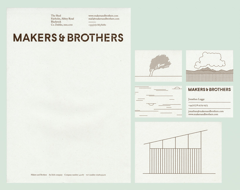
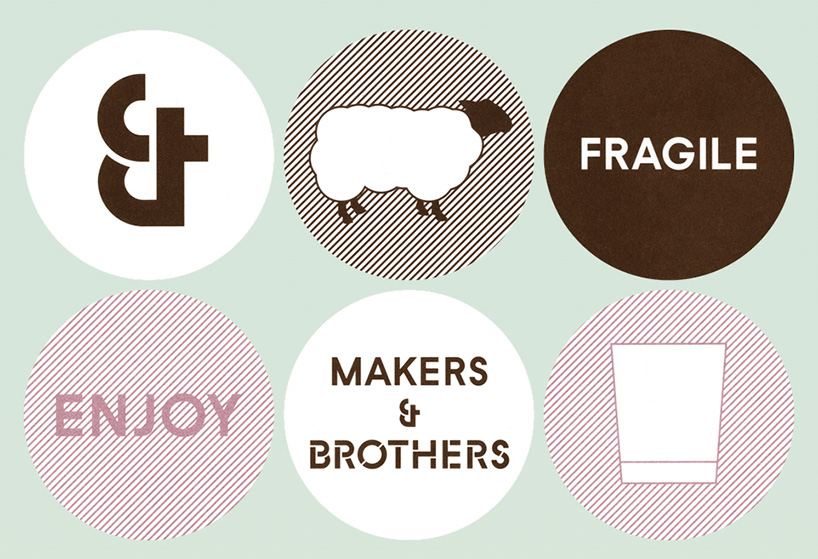
makers and brothers identity – an irish shop for design and craft objects run by brothers jonathan and mark legge.
DB: what lessons have you learned from a project that have changed your outlook?
E: we have a strong interest in graphic design history and often approach projects as if we are graphic archaeologists, excavating remnants from the past to inform our work in the present. each new project leads us to new areas of research with new stories to tell. the key thing is what we then do with this research, it is really important to create something new and contemporary without simply repeating the past.
we have learned that it is really important to reserve time for general research as well. there are certain themes and ideas which wouldn’t necessarily come up within the research for a specific project but still can prove useful sources of inspiration when the right projects come along.
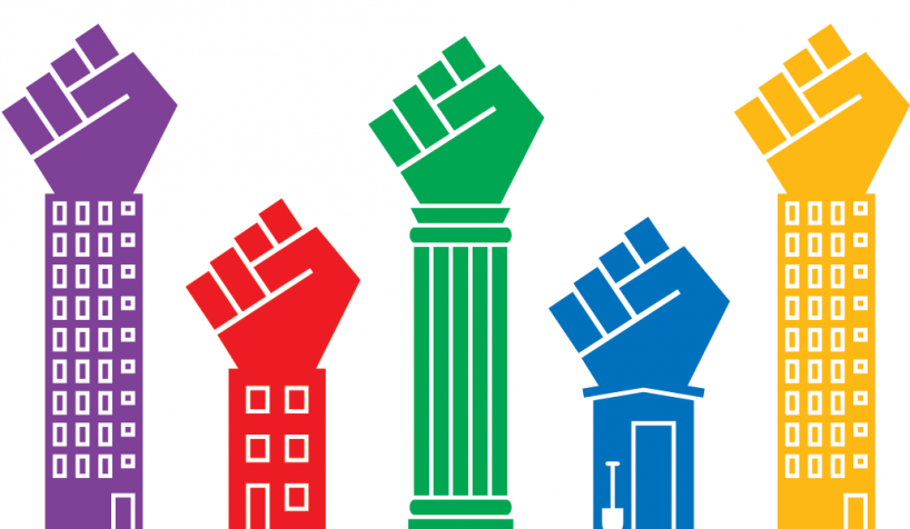
building rights identity – a user-generated resource for knowledge and information about planning issues in england and wales.
DB: besides design, what are you passionate about and how does it feed into your work?
E: teaching is very important to us as it can give us an output for avenues of research which we wouldn’t have within commissioned projects. there is often a dialogue between ideas that we are having for projects in the studio and ideas that we are having for briefs for students. one example of this starts with a type design workshop we developed with nazareno crea and our students at camberwell. in order to get a sense of basic letterforms we ask our students to study edward johnston’s set of ‘essential letterforms’. we get the students to hand draw their own set of essential letterforms. this is the first in a series of type workshops that we do with them in the lead up to designing their own typeface.
the research we were doing with the students was present in our minds when we designed an identity for the architects DK-CM. we drew a set of skeleton letterforms for them which we then added some ‘less essential forms’ to. this included slab serifs, a stress, a rounded letterform and a series of dots. david and cristina were keen to express the variety of outputs that their studio has so the overprinting of these more fun elements to the essential skeleton felt like an appropriate solution to the identity.
a little later we were invited up to glasgow school of art by neil mcguire to teach for two days on a feral studio. we again got the students to look at edward johnston’s essential forms which I remember provoked some heated debate as to who had created the most essential letterforms. there was a distinct disagreement as to how high the crossbar should be on the capital ‘a’.
in the spirit of our DK-CM identity we then asked the students to experiment with non-essential forms through a series of mark-making exercises with different tools some traditional and some handmade. this made for an eclectic set of letterforms held together with the same underlying skeleton.
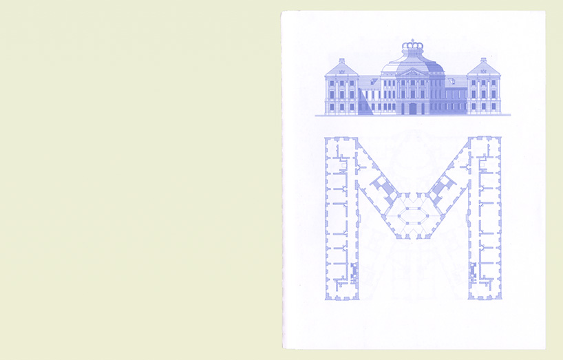
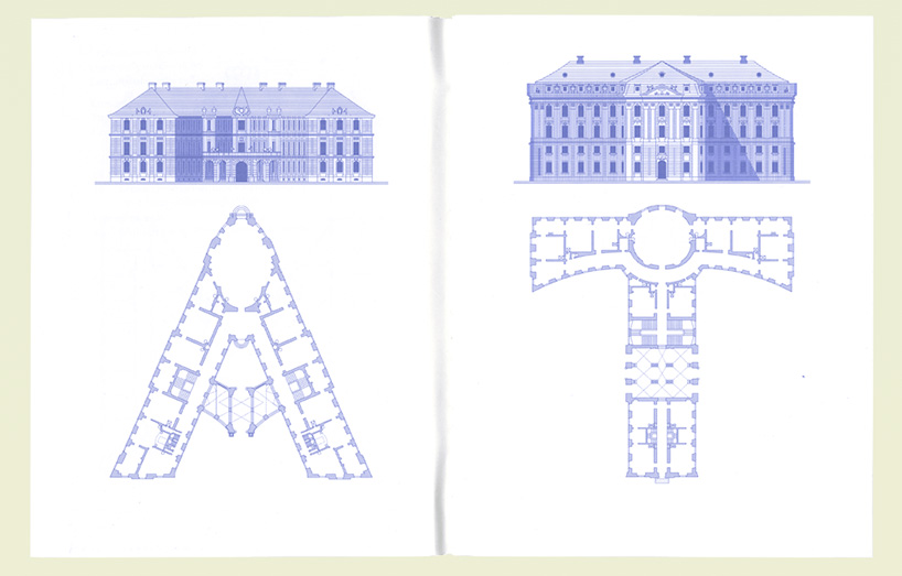
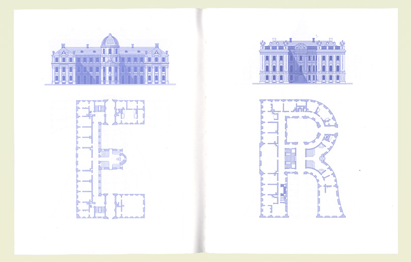
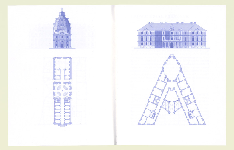
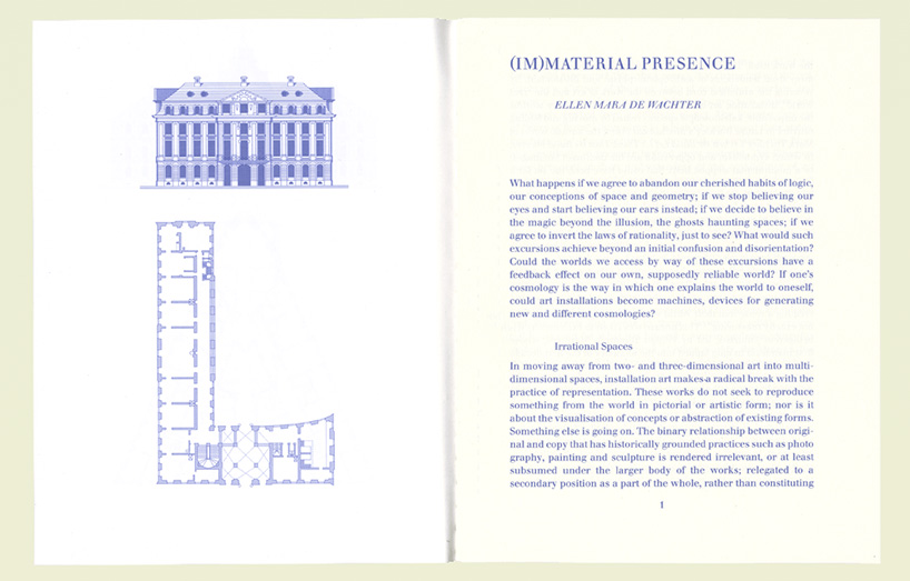
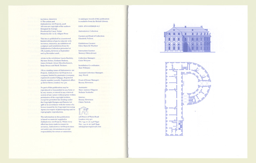
material presence was a group exhibition at 176 gallery – the headline lettering that we used throughout the graphic identity was our redrawing of the architectural alphabet – designed by johann steingruber in 1773.
DB: what is the best piece of advice you have ever been given?
E: sister corita wrote the ‘immaculate heart college art department rules’ for her students to work by. we share these with our students but also consider them rules for us to work and learn by.
immaculate heart college art department rules:
1. find a place you trust, and then try trusting it for a while.
2. general duties of a student: pull everything out of your teacher; pull everything out of your fellow students.
3. general duties of a teacher: pull everything out of your students.
4. consider everything an experiment.
5. be self-disciplined. this means finding someone wise or smart and choosing to follow them. to be disciplined is to follow in a good way. to be self-disciplined is to follow in a better way.
6. nothing is a mistake. there’s no win and no fail, there’s only make.
7. the only rule is work. if you work it will lead to something. it’s the people who do all of the work all of the time who eventually catch on to things.
8. don’t try to create and analyze at the same time. they’re different processes.
9. be happy whenever you can manage it. enjoy yourself. it’s lighter than you think.
10. ‘we’re breaking all the rules. even our own rules. and how do we do that? by leaving plenty of room for x quantities.’ (john cage)
helpful hints: always be around. come or go to everything. always go to classes. read anything you can get your hands on. look at movies carefully, often. save everything — it might come in handy later. there should be new rules next week.
DB: if europa had a motto what would it be?
E: we like chain and the gangs: ‘down with liberty! … up with chains!’
happening this week! florim ceramiche spa creates porcelain stoneware ceramic surfaces for all architecture, building industry and interior design needs, overseeing many brands in europe, america and asia including floor gres, rex, cerim, casa dolce casa – casamood, FLORIM stone, and CEDIT – ceramiche d’italia.
graphic studio interviews (193)
PRODUCT LIBRARY
a diverse digital database that acts as a valuable guide in gaining insight and information about a product directly from the manufacturer, and serves as a rich reference point in developing a project or scheme.
