ariane spanier‘s eponymous studio is based in berlin and produces graphic design and art direction for clients in the fields of culture such as galleries, artists, publishers, architects among others. ariane told designboom more about her work and process.
DB: please could you tell us briefly about how you came to do what you do for a living?
AS: I grew up in weimar, studied graphic design at the weissensee school of art and design in berlin. I undertook an internship at sagmeister inc. in new york right after graduating and learned how design can be fun. then I came back to berlin, opened my studio being, which depended highly on one client for one year and just kept doing what I still do.
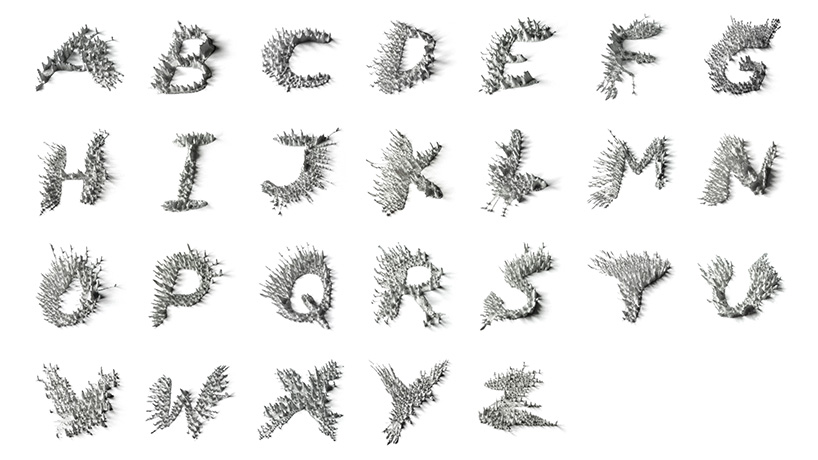
peak alphabet for the web and mobile writing application ‘notegraphy’, 2013
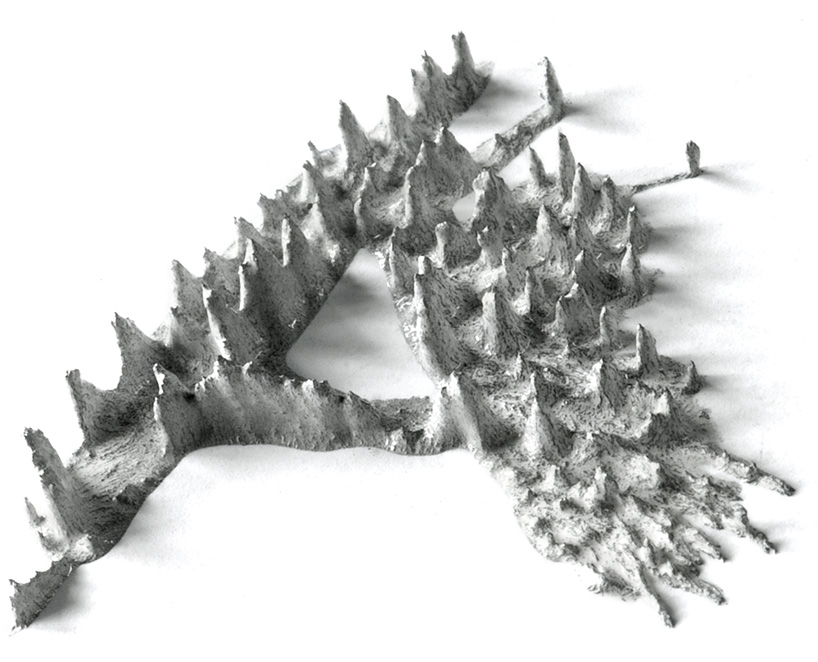
the letters were made using magnetic ink and magnets
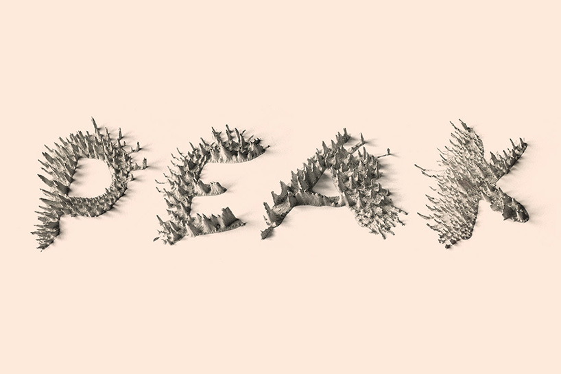
peak alphabet
DB: how would you describe your work to someone who hasn’t seen it before?
AS: I design all kinds of printed matters, such as books, posters, cards or logos and work a lot with typography, sometimes in an illustrative way. I take playfulness quite seriously in my work, even if this of course depends on the kind of design assignment that I’m working on.
DB: what has been the biggest singular influence on your work?
AS: it’s really impossible to point out one singular influence, it is (like life itself) a combination of so many things, starting from my upbringing in east germany (with a father as designer), art school, fellow students, internship at sagmeister inc. and also forming my own practice.
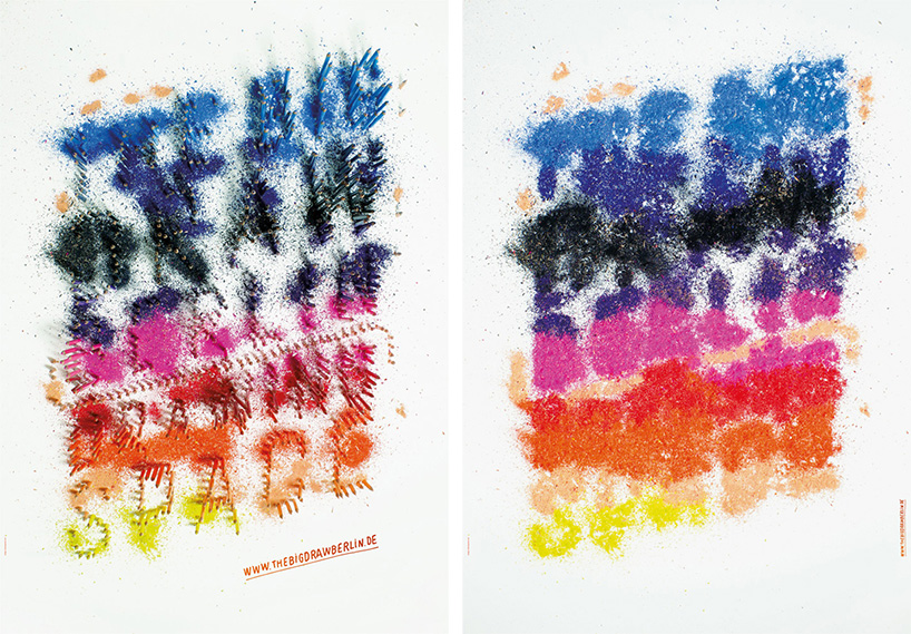
the big draw berlin poster, 2012
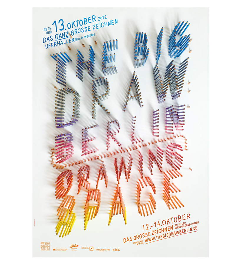
a series of 3 posters in which color pencils are making their way into forming the title of the festival.
DB: what’s the thing you enjoy most about print?
AS: I enjoy the dimensionality of it, the material, to produce printed objects that you can hold in your hand – its like something comes to life in a printed product. I also enjoy working on digital design, such as websites, magazines… on screen you can have animations and things moving, which is great fun and it’s much harder to achieve that sense of time in print and certain types of images can also look a lot better on screen. something that fascinates me is exploring how our senses work when we look at a printed product or something compared to how they function when we see something on the screen. I wonder why I always find more mistakes (in proofreading for instance) when I print something out? it seems that the screen narrows down our senses, we overlook things. I think our sense of hearing, smelling, touching, and the sense of space also play a role when we look at a book for instance. maybe thats why still and even more than ever, printed matters are produced? digital design stays (until now) in that frame of the screen, the tablet, the phone, to me there is still an invisible wall between myself and what I see on screen. there is still a feel of ‘un-real-ness’ to it. certainly each one of the areas have their advantages though and we’ll see what the near future is bringing on.
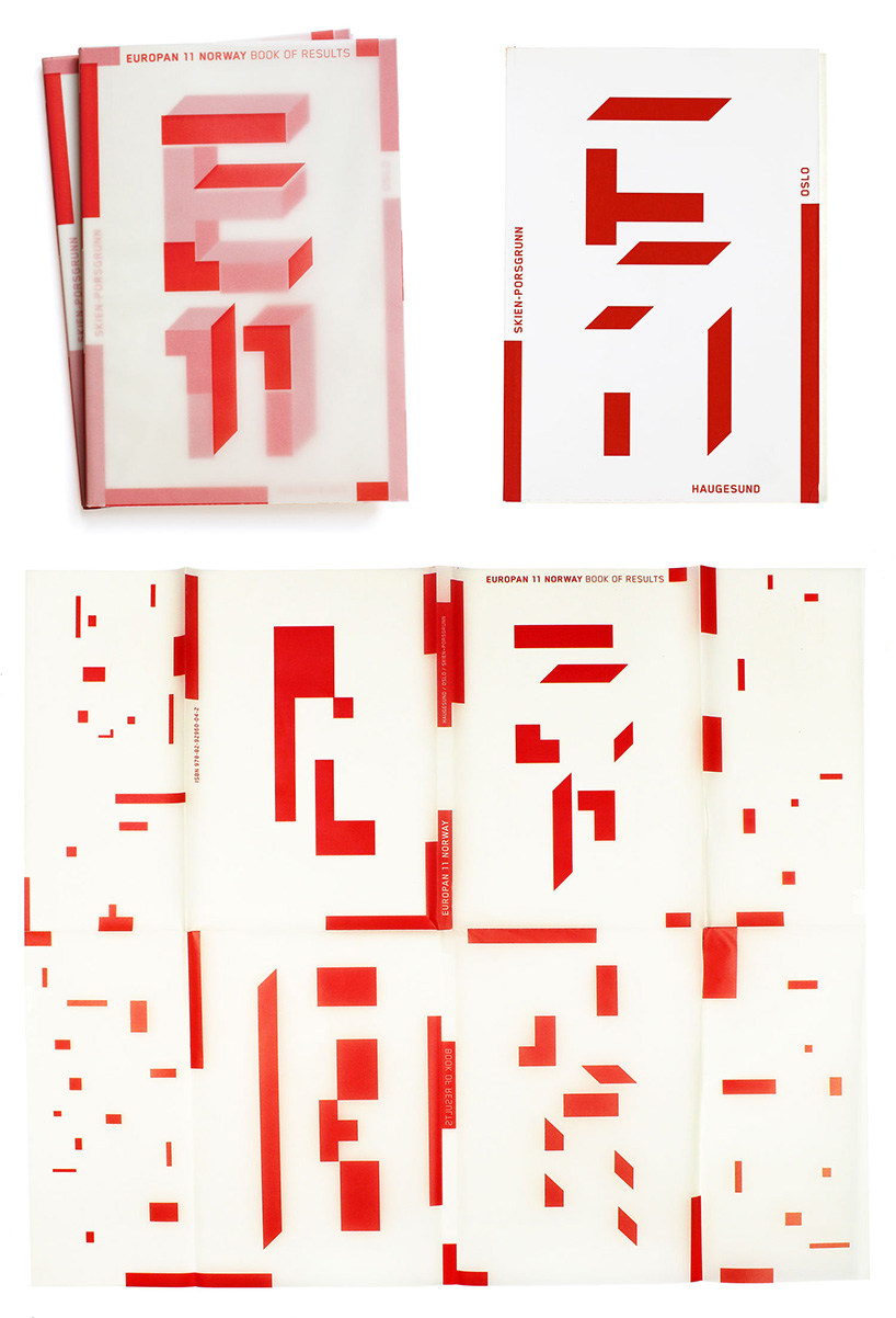
europan 11 norway, 2011
the folded cover of the catalog for the norwegian representatives at the architecture competition ‘europan’ is printed on transparent paper. the title logo is only readable when wrapped around the book, as one opens it, the letters and numbers dissolve into abstract shapes.
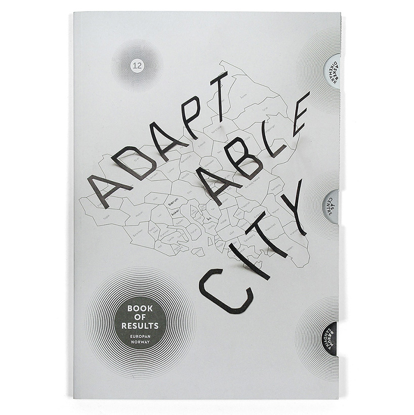
europan 12 – adaptable city, 2012
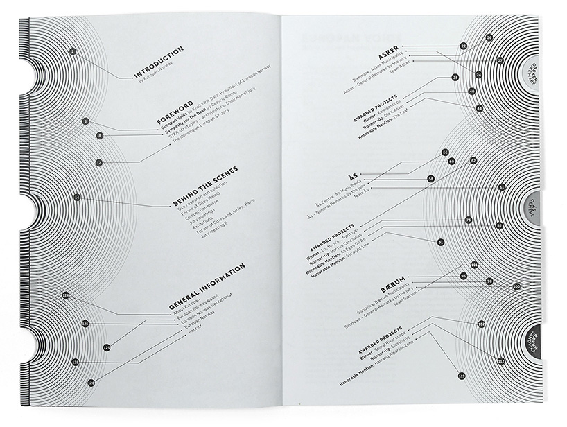
book of results of the architecture competition europan 12 in norway, themed adaptable city.
the book has index cuts which lead the viewer to the 3 chapters – the sites in the oslo region.
DB: which project have you enjoyed working on the most so far?
AS: to name a few; FUKT, a magazine for contemporary drawing that has as an ongoing series of typographic magazine covers and experimental magazine design, ‘the big draw berlin 2012’ and the alphabet ‘peak’ for notegraphy.com. I recently went to india to work on a publication for an art exhibition in delhi, which was a tremendous experience, I can’t complain. I usually enjoy almost all projects I am working on!
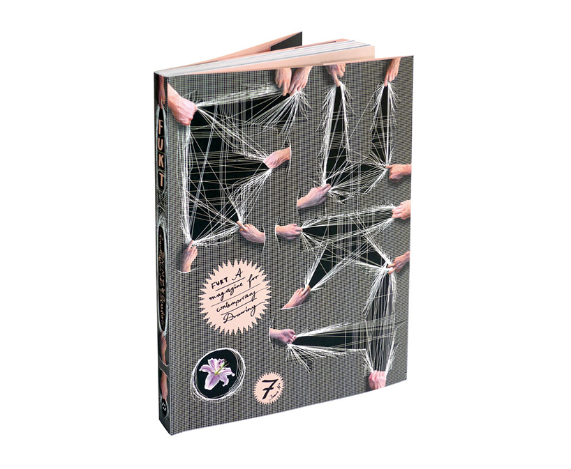
FUKT magazine #7, 2008
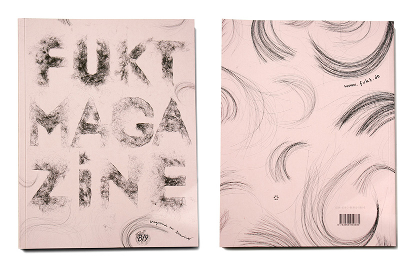
FUKT magaine #8/9, 2010
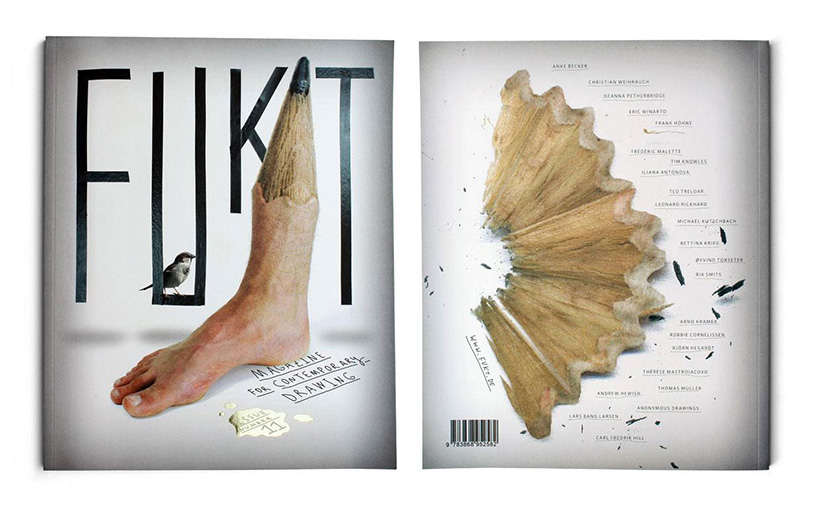
FUKT magazine #11, 2011
DB: what areas of your work are you hoping to explore in the near future?
AS: I might try out to work on a music video with a friend, which would be a completely new thing for me and therefore, hopefully, very exciting.
DB: what do you know now that you wish you knew when you left university?
AS: doing good design doesn’t exclude having fun.
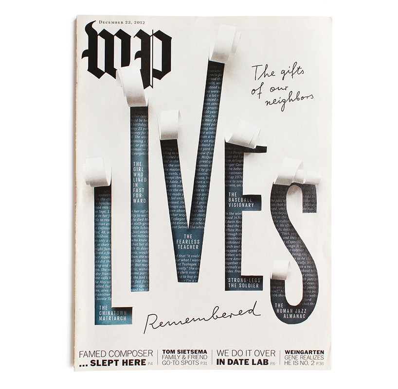
washington post magazine ‘WP’ cover illustration, 2012
the cover story was telling 6 touching life stories of people who passed away in 2012 in the washington area.
DB: do you draw often and do you think it’s important to be able to draw as a designer?
AS: I stopped drawing for the drawing’s sake at some point after finishing art school. I felt I didn’t get anywhere with it as a ‘stand alone’ practice. today I use it a lot for sketches of course, but thats just as a tool. I do think drawing is important for a designer in terms of visualizing your ideas, sometimes just to yourself, to see if an idea could work also outside of your own head. and it plays a lot of roles in design (since design can be so many things), in illustration or type design for instance. since drawing is the starting point for many designers to get into the profession its very connected to the process of designing. drawing is usually the first door that ‘imagination’ passes through on the way to design. but at the same time there are a lot of designers that do very well without even touching a pen or pencil. in the end everyone has to figure out their way of visualizing ideas and designing.
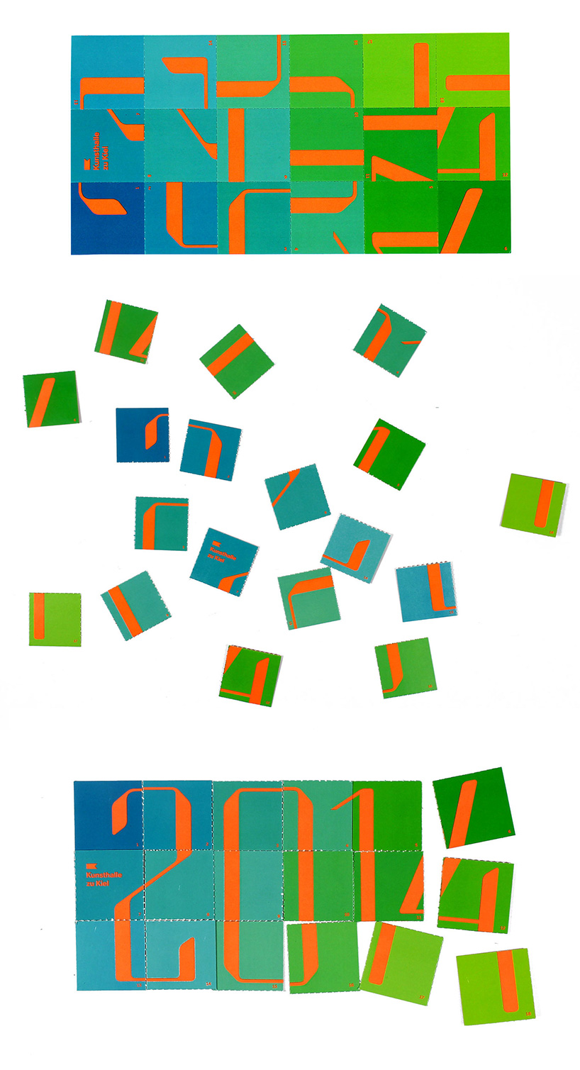
2014 promotional mailer, 2014
DB: what do you do to keep your ideas fresh?
AS: trying to avoid using the same concepts that have worked before. its always inviting to walk the smoother, already known path, but I try to resist, because I know I will get bored or get a bad feeling at the end of an easy way out.
DB: what compels you to design and what other compulsions do you have?
AS: there’s no compulsion – I enjoy it and earn money from it at the same time.
DB: do you have any superstitious beliefs?
AS: worrying expresses itself as a way of superstitious believing. if I worry enough, things will turn out fine in the end. which can be a very unhealthy way of looking at things. I tend to do that, but I’m trying hard to avoid doing it as much.
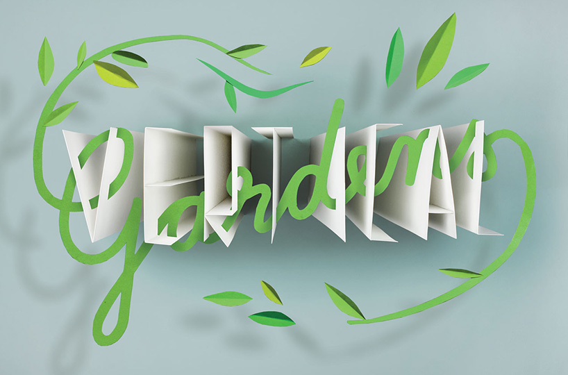
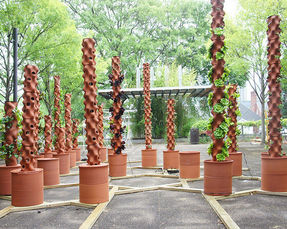
vertical gardens illustration for greensource magazine, 2013
DB: what’s the last thing that made you say ‘wow’ ?
AS: when I read about electronic devices that are able to destroy themselves by evaporating or some similar thing (researched/developed by darpa). but thats just fascination for the fact that science fiction as we know it is already here. I have no interest for what that technology will probably be used foor.
another time was the discovery of ‘hidden mothers‘, something I hadn’t noticed before. its’ literally hidden mothers in old photographs of small kids or babys, who are covered with a blanket and are holding their children, so that they sit still long enough for the exposure times that were necessary in the old times. the mothers were supposed to be ‘invisible’ but it really didn’t work out too well and some of these images are hilarious.
