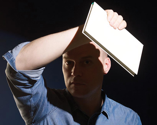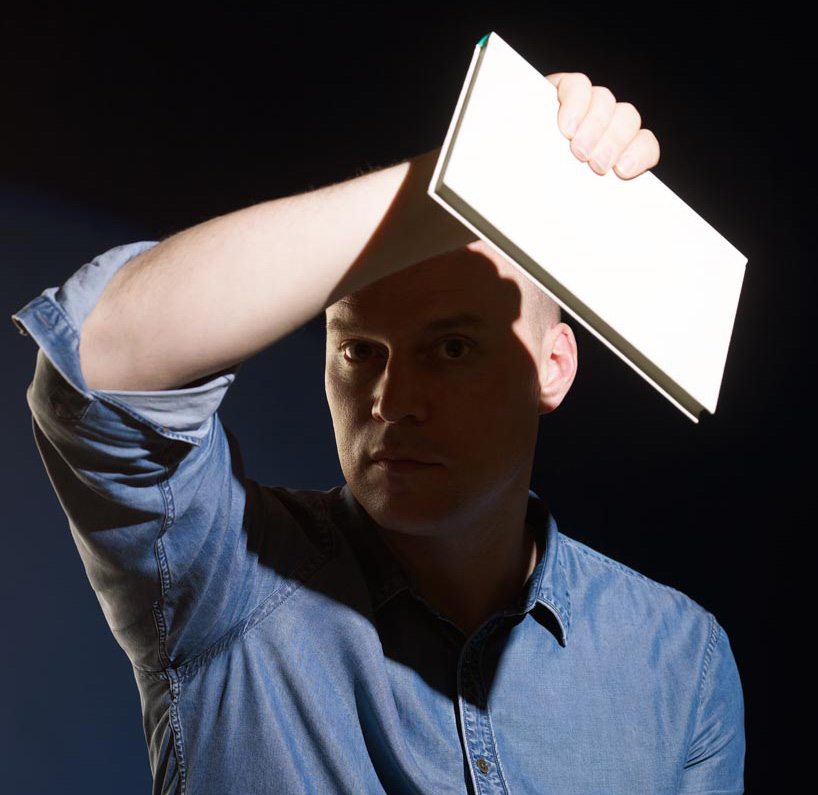
top image: john morgan photgraphed by blommers & schumm
john morgan‘s eponymous studio has made a name for itself designing books, identities and environmental graphics for cultural institutions, artists, and architects since it was formed in 2000.
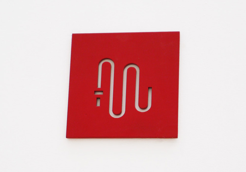
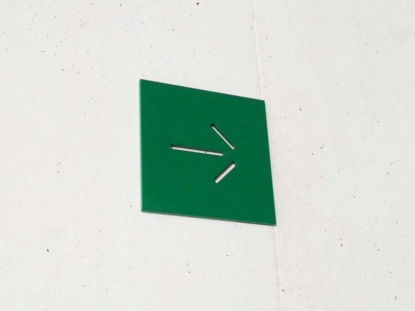
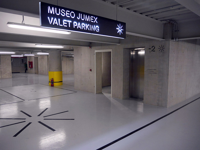
recent projects include the identity and signage for the jumex museum in mexico city, wayfinding for tate britain and the art direction of artreview magazine.
to coincide with the launch of the studio’s new website we spoke to john morgan about his work, influences and more.
DB: please could you tell us a little about your background?
JM: I studied typography & graphic communication at the university of reading, where I now occasionally teach. it was a very thorough four year course with a strong emphasis on theory and history combined with an a very engaged group of contemporaries and tutors. when I graduated in 1995 I was fortunate to go and work with derek birdsall at omnific, which in many ways was the ideal postgraduate course in how to live and work as a graphic designer. I then set up my own practice in 2000.
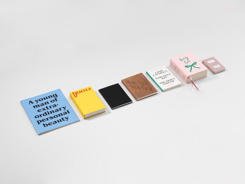
four corners familiars, 2007–ongoing
a series of books featuring artists’ responses to classic novels and short stories. they provide a fresh look at the tradition of the illustrated novel, with each artist choosing a text to be reprinted in full alongside their newly created work. each book is different in style and format, according to the needs of the artwork and the text. eight titles have now been completed, with more being prepared.

the picture of dorian grey by oscar wilde, 2007
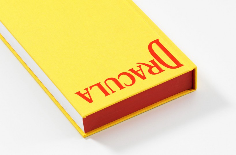
dracula by bram stoker, 2008
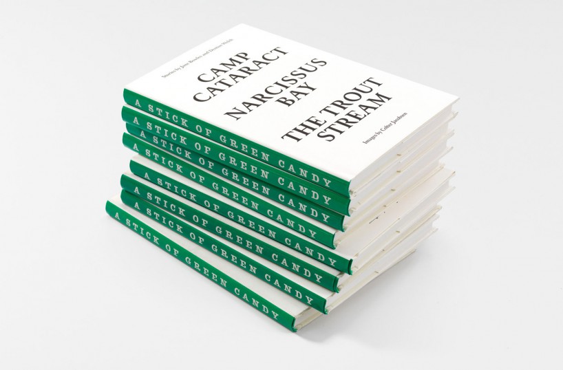
a stick of green candy – stories by jane bowles and denton welch, 2009
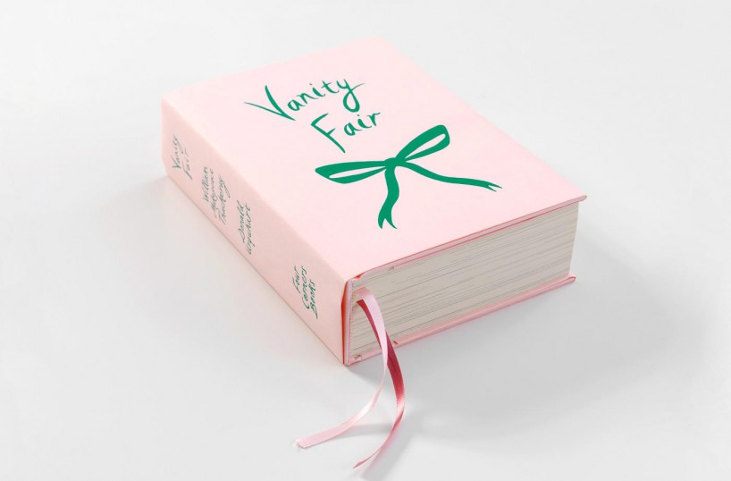
vanity fair by william makepeace thackeray, 2010
DB: how would you describe your style?
JM: I’d like to think there is no over-arching style, more an attitude and sensibility. an approach which is full of contradictions and compound sensibilities. I’m fond of JMW turner’s statement ‘atmosphere is my style’.
DB: what’s been the biggest singular influence on your work?
JM: the advantage of serious study of history and tradition, whether academically or just through concentrated ‘looking’ is that all previous work influences you and your work in turn influences all previous work.

AA files, 2008 – ongoing
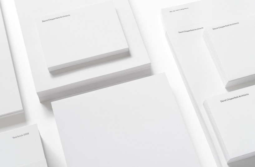
graphic identity for david chipperfield architects, 2008 – ongoing
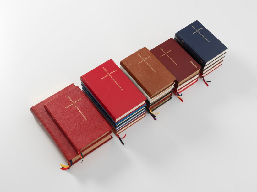
services and prayers for the church of england, 2000–2012
DB: what’s the thing you enjoy most about designing books?
JM: the form of the book has changed very little over time. it’s pleasing to work with a medium that has found it’s optimum form, where the development and interest switches from a desire for an innovative jump – a naive hope if you’re designing books – to a more enduring refinement and development of small gestures. in comparison to other areas of graphic design, the content of books is usually more meaningful and considered. to help shape a text by somebody with something to say, that readers might find helpful or enlightening and that deserves a shelf life is a gratifying and worthwhile social activity.
DB: which project has given you the most satisfaction so far?
JM: the four corners familiars series of books, an ongoing project featuring artists’ responses to classic novels and short stories. each book is different in style and format, according to the needs of the artwork and the text. of all my projects, the end result in this series is closest to that imagined ideal, enabled by the scale of the project, a trusting publisher and a positive collaboration with each artist. I have designed eight so far, and am currently working on the ninth – an edition of chaucer’s canterbury tales with spartacus chetwynd.
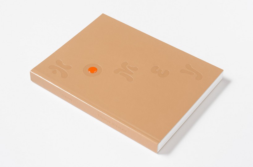
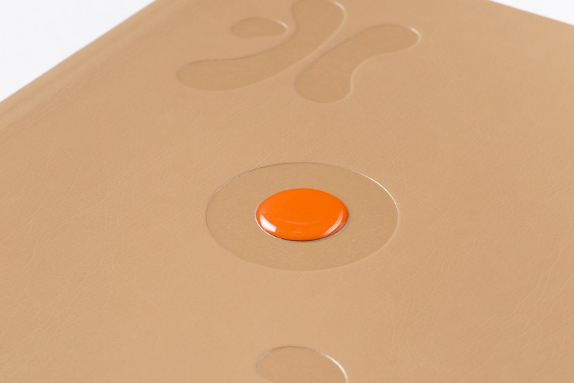
thomas grünfeld, homey, 2013
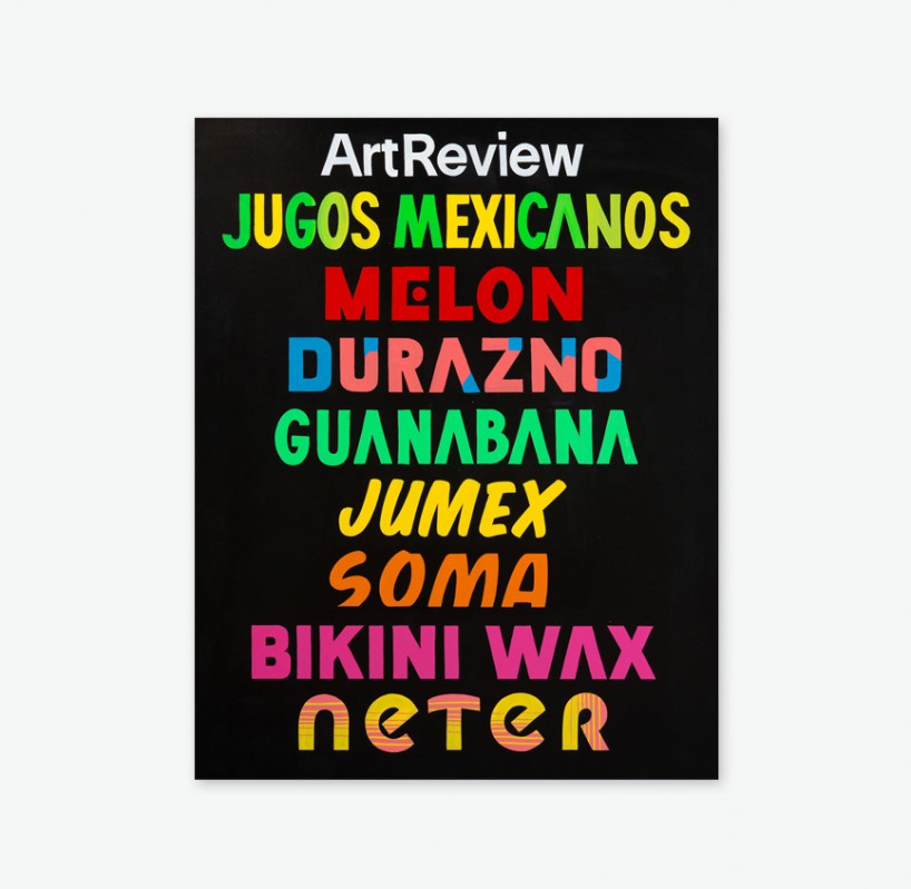
artreview magazine, january / february 2014
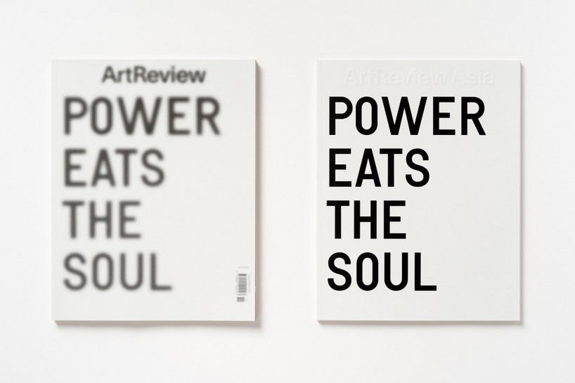
artreview and artreview asia, november / december 2013
DB: what areas of your work are you hoping to explore in the near future?
JM: we began art directing artreview magazine in september last year. I enjoy art direction and the speed of magazine production very much. there’s a certain pressure to designing a book, you mostly design for the long term and due to the number of invested parties the process is often long. magazine design is more fluid and relaxed as the design evolves over time, you can take more short term risks, make quick decisions and achieve a more immediate result. as I get more impatient this suits me. I particularly enjoy working with photographers, and look forward to exploring how far I can take these relationships in the new year.
DB: what do you know now that you wish you knew when you left university?
JM: the value of a network of peers, in university our nearest relatives were fine artists, we didn’t have an extended family of product designers, photographers or illustrators. working and growing with friends is much easier and more natural than employing collaborators.
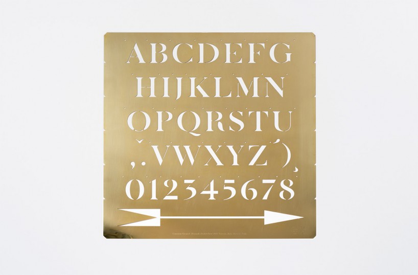
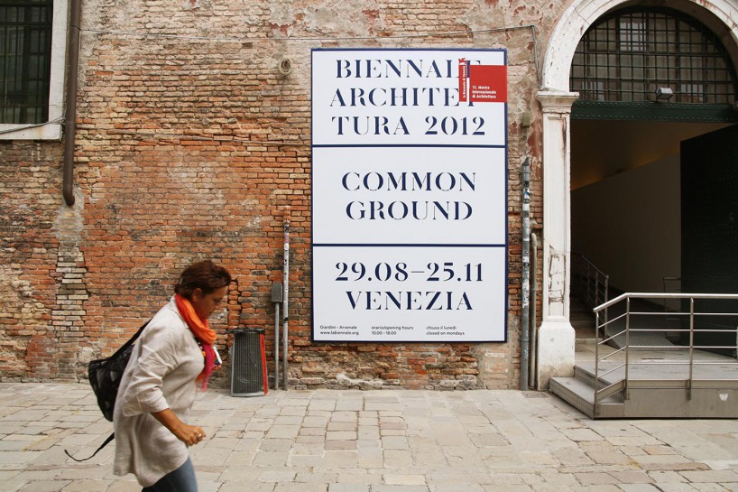
stencil alphabet designed as part of the identity for ‘common ground’, venice architecture biennale 2012
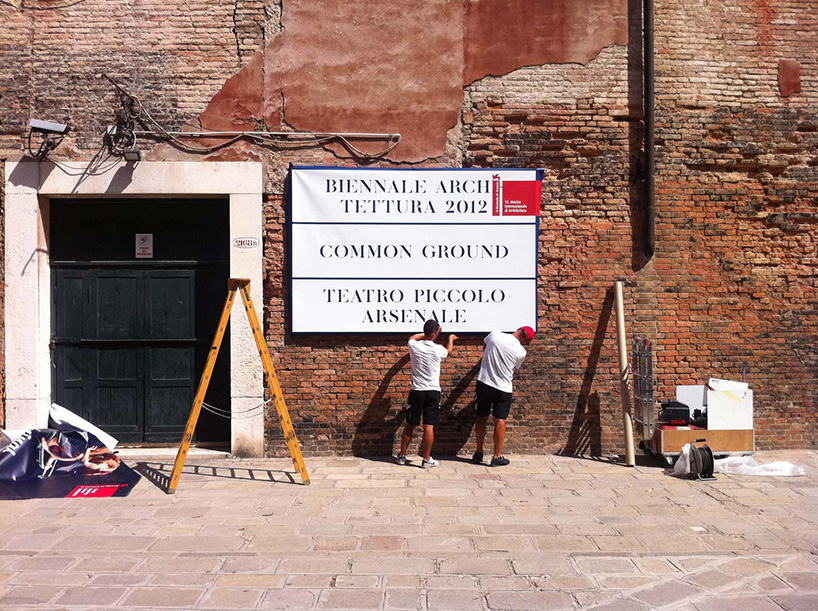
the identity references the the venetian stencil street signs or nizioletti
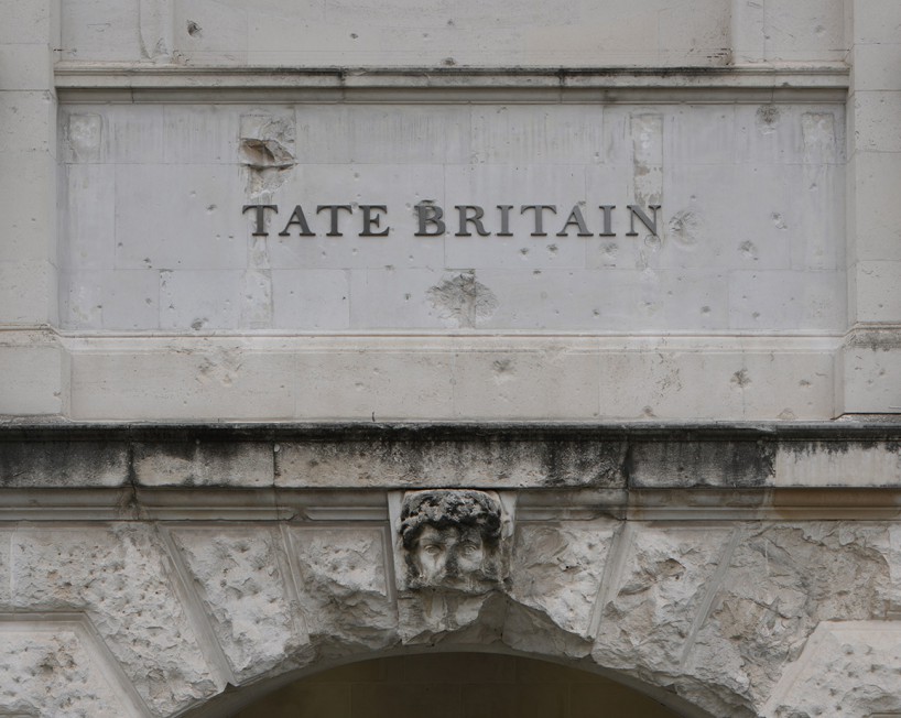
tate britain signage and wayfinding, 2013–ongoing
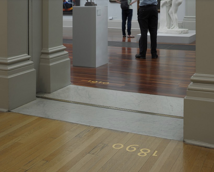
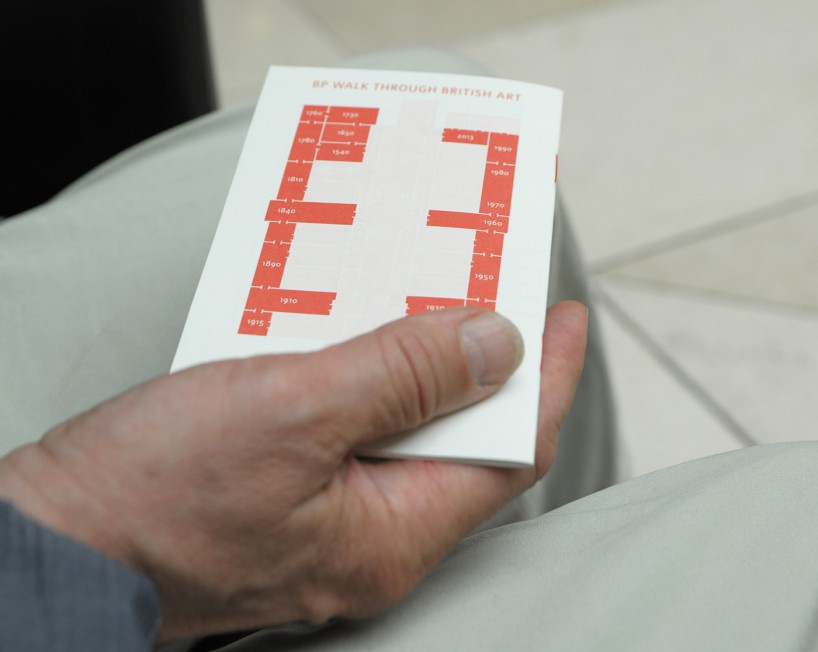
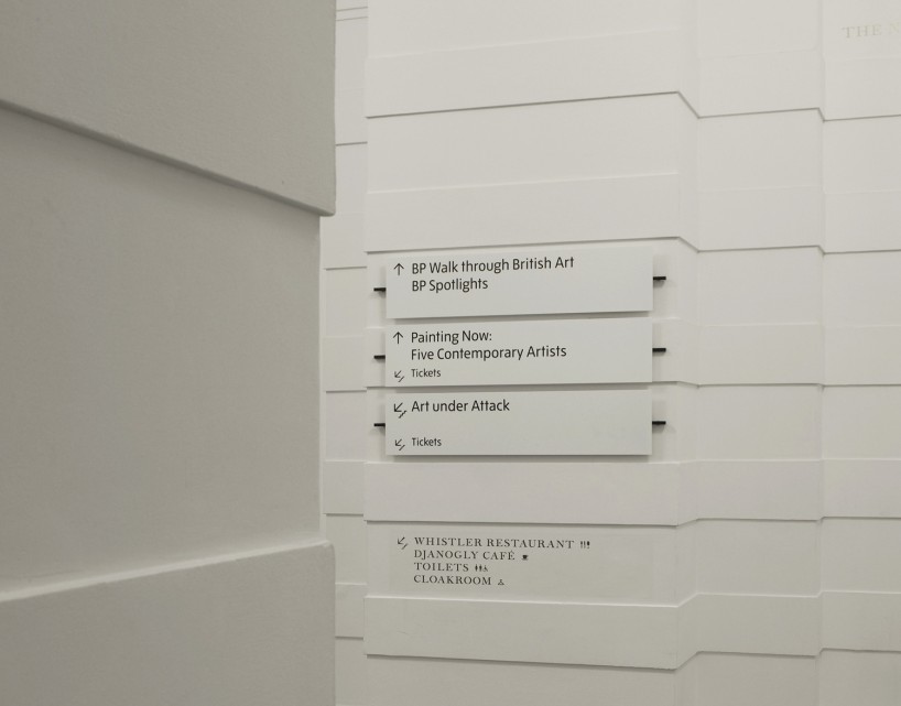
the system uses two typefaces: a new display typeface inspired by bowles – a ‘british vernacular’ letterform for a british building. this letterform is cast in brass for external signs and silkscreened directly onto the interior walls. where the ‘tate pro’ typeface is used, we commissioned an expert set of numerals – a better fit for the number-heavy data we were presenting. as part of a ‘total’ scheme for tate britain, we designed templates for new maps, menus, banners and posters.
DB: do you draw and do you think it’s important to be able to draw as a designer?
JM: I very rarely draw. however there’s no doubt I got into this line of work because I enjoyed drawing, was considered ‘good at art’ and was encouraged to pursue it. I’d suggest that empathy, and the ability to communicate and string a sentence together, are more critical and desirable (and rare) skills in a designer. but if you don’t have the sensibility that looking through drawing or painting teaches you, your work may lack something
DB: what do you do to keep your ideas fresh?
JM: work until the last possible moment, and on many projects at the same time. if you have the luxury of working on only one project, you can throttle the life out of it.
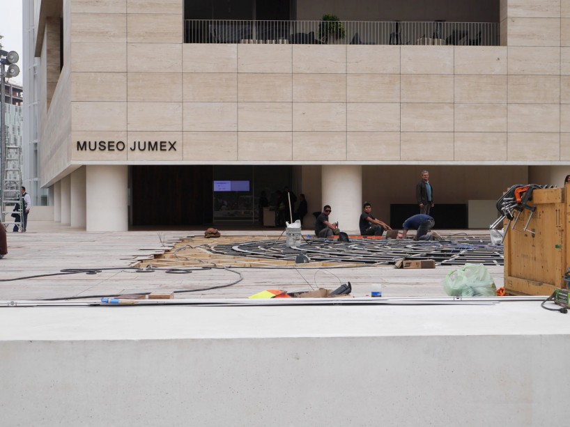
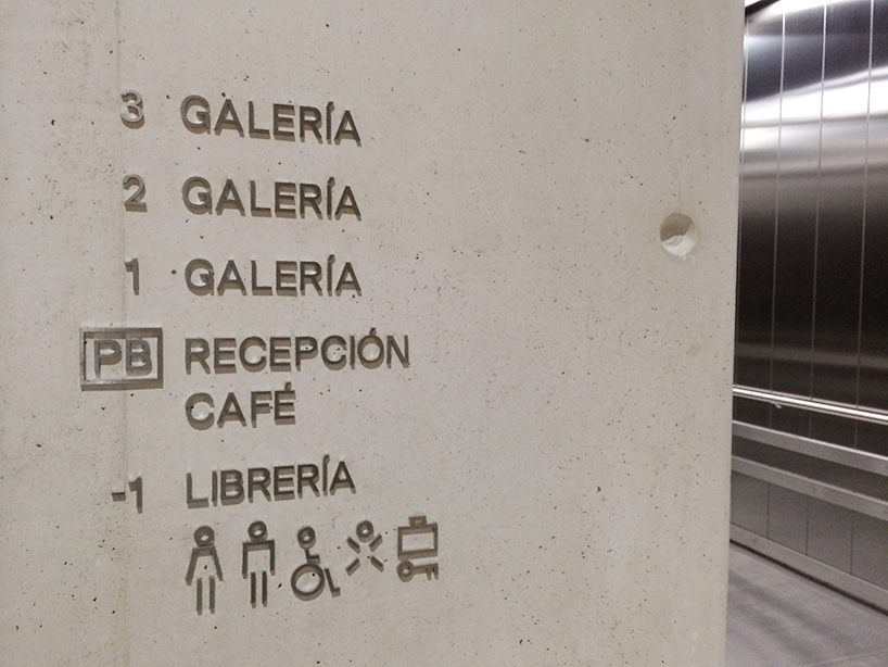
identity, wayfinding and signage for museo jumex, 2013-ongoing
see our feature on this building »
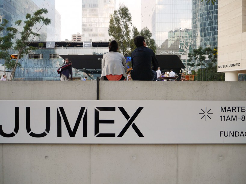
DB: what compels you to design and what other compulsions do you have?
JM: an unashamed compulsion for beauty in all things.
DB: do you have any superstitious beliefs?
JM: no. but I don’t think it’s generally a good idea to meet people in the morning, or on mondays.
DB: what’s the last thing that made you say ‘wow’ ?
JM: the most wonderful drawings and expressions by my three children rudy, francis & iris and the discovery of micheladas – clamato juice mixed with beer – while working in mexico city last year.
