KEEP UP WITH OUR DAILY AND WEEKLY NEWSLETTERS
happening this week! holcim, global leader in innovative and sustainable building solutions, enables greener cities, smarter infrastructure and improving living standards around the world.
PRODUCT LIBRARY
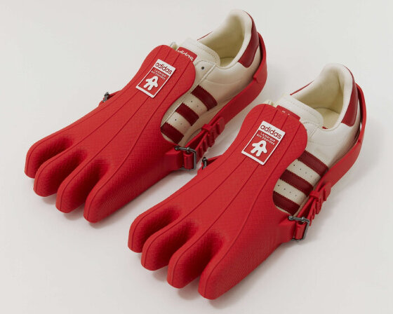
the removable four-toed ‘gloves’ of the superfinger superstar can also be used as bags or be attached to other shoes.
broken pieces of soft mirrors are pieced together using medical cotton gauze and 18-carat gold finishing, while the electric components installed allow them to move autonomously.
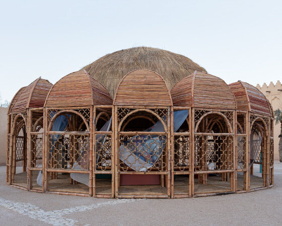
across twelve themed galleries, the first-of-its-kind show at qatar's national museum traces the evolution of pakistan's visual arts and architectural practices over the past eighty decades.
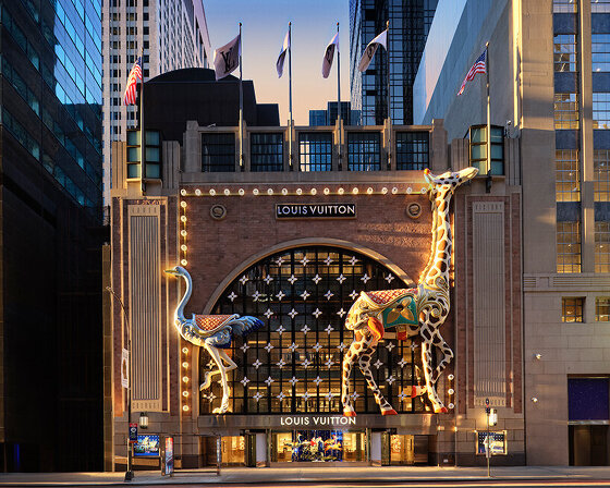
comprising a store, café, and chocolate shop, the 57th street location marks louis vuitton's largest space in the U.S.

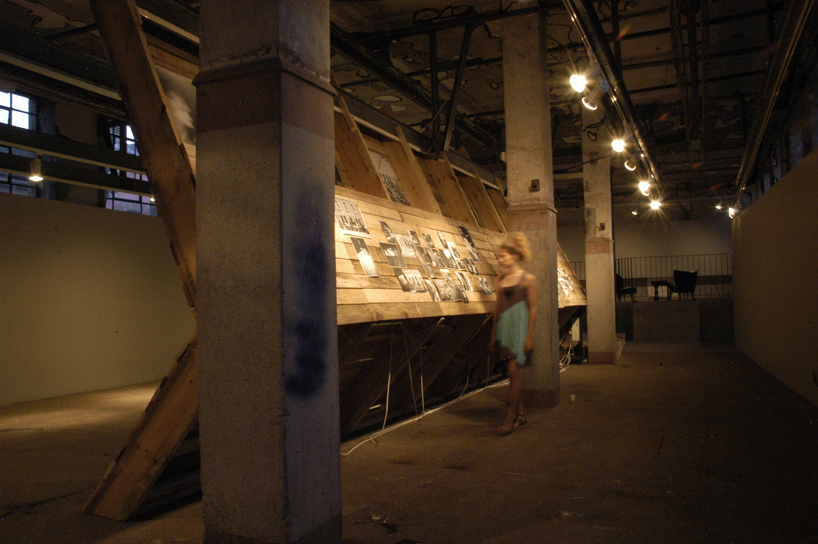
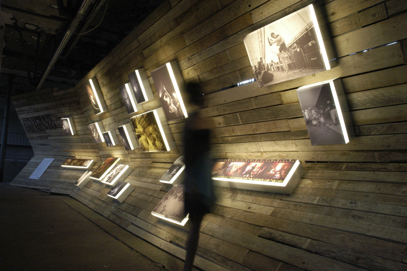
 a major ambition for the scenography was to make it totally accessible and experienceable for disabled people. the dimensioning of the structure had thus to answer strict structural as well as ergonomic demands
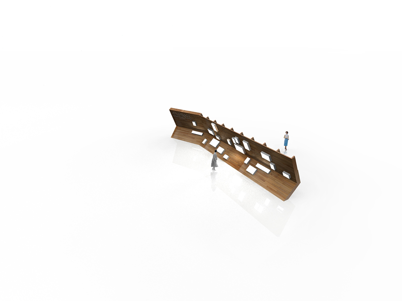
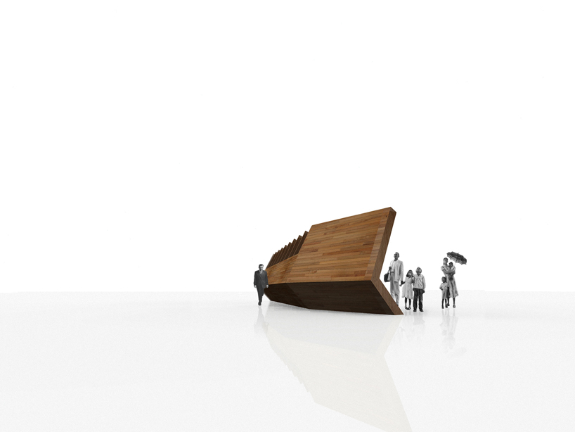
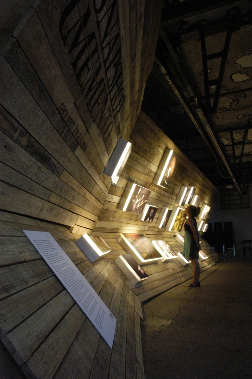 “intro” : entrance zone displaying title and descriptive abstract of the exhibition. the slightly angled shape of the entrance zone guides the visitors in the direction of the exhibition.
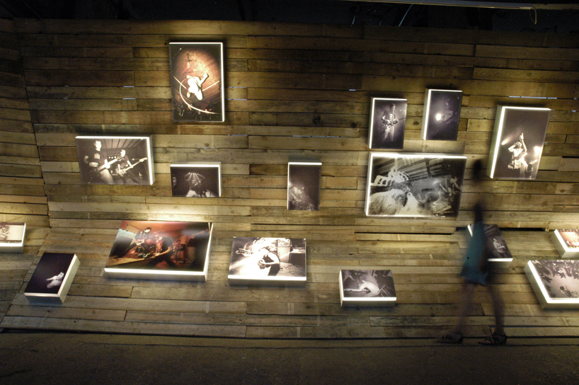 “on stage” : pictures taken during live performances. Each picture is mounted on an aluminum frame and backlit by neon lights. all gallery lights on this side are turned off.
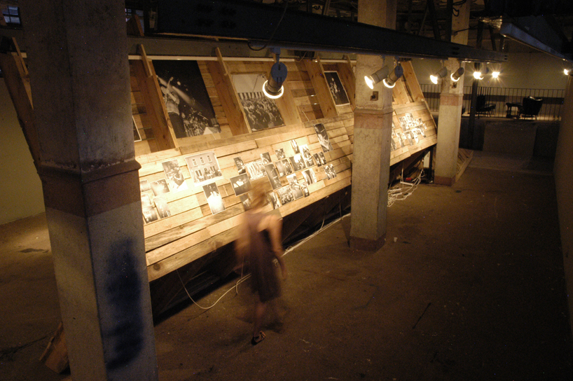 “backstage” : pictures taken during recording sessions, rehearsals, on tour etc. the small-sized images are printed by a xerox machine on heavy paper and lit by natural light and gallery spots.