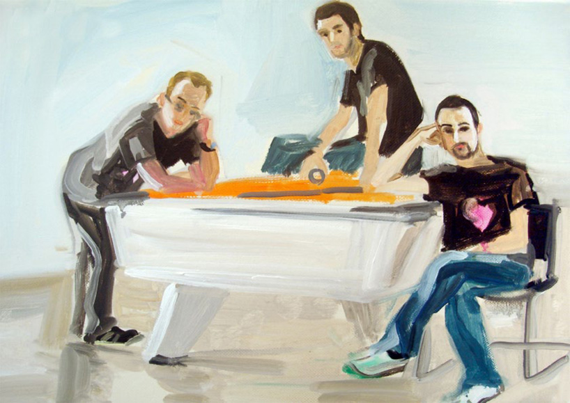
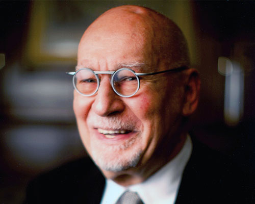
GBH interview – mark bonner (left), peter hale (middle), jason gregory (right), portrait by nelly dimitranova
we talk to GBH‘s founders about their branding studio’s approach and influences.
DB: please could you tell us briefly how you met and decided to form your studio?
GBH: the three of us, that’s jason gregory (the G), mark bonner (the B) and peter hale (the H) were on the graphic design course at the royal college of art. we struck up a close friendship and working partnership straight away with a shared sense of humour, an appreciation of the absurd, a playful and unexpected approach and a love of bold, beautiful imagery. so we just naturally fell into working with each other on projects at the RCA, a set up which was supported by margaret calvert, the then head of design at the RCA who to this day remains one of our design heroes. you could say that the first ‘GBH project’ evolved at the RCA when we spent the best part of a year working on a limited edition calendar. it was a great project, stuffed with detail and passion and got into the 1994 D&AD annual which for students was a pretty big deal. you could say it was our first taste of the chemistry we seem to have together – a strange mix of creativity, fun, fear, obsessiveness and an anything is possible attitude. from that point we collaborated frequently and at some point then began imagining how exciting running our own company could be.
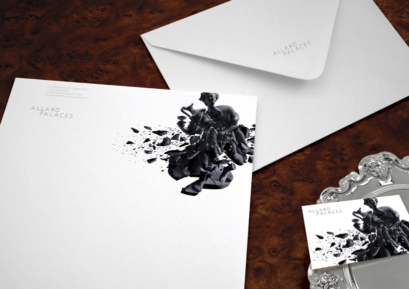
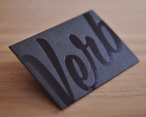
allard palaces branding stationery
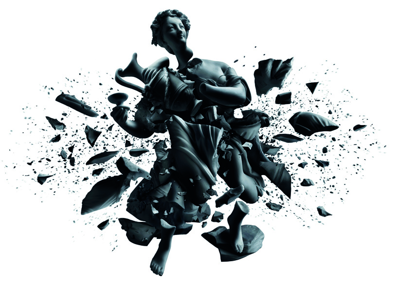
allard palaces branding
DB: how did you come to work on the type of projects that you do today?
GBH: we love what we do and always try to make the most of every project that we work on. this has lead to a great portfolio which in turn has attracted some great clients who are also good at what they do. we work with puma, eurostar, philippe starck, virgin, the list goes on. in our experience, great work always leads to other great opportunities and to be honest, that’s the way we’ve always done new business. fifteen years on, we’ve obviously become a lot more experienced as an agency, but that desire to surprise, delight, show off, to make the viewer smile and make stunning work is exactly the same as it was when we started out.
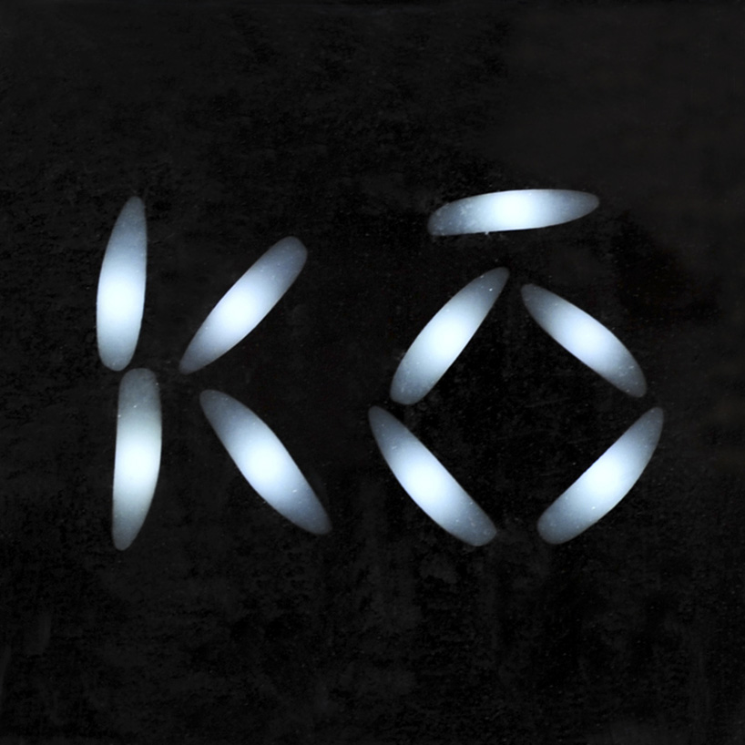
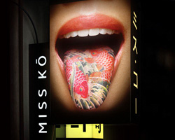
miss ko branding – logotype
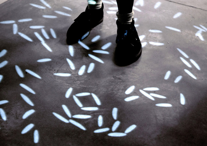
miss ko branding – lighting installation
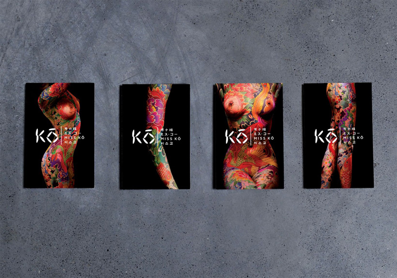
miss ko branding – menus – see more about this project in our article
DB: how do each of your personal approaches compare?
GBH: individually we have quite different approaches and interests but there is enough of an intersection to have a big shared vision and working together merges the best of each of us. it’s those differences and overlaps that makes GBH interesting to us. that and the fact that we don’t consider ourselves ‘experts in any particular area’ but prefer to be ‘expert’ at being on the outside looking in to a brand or a client’s business – it helps us retain an odd perspective and come up with unexpected ideas.
virgin galactic branding – logo
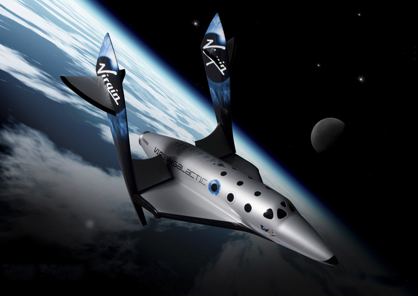
virgin galactic branding – livery

virgin galactic branding – livery
DB: how do you share the workload between studio members?
GBH: in as fair and democratic a way as possible! on the project side of things, GBH has twelve creatives, ranging from designers to creative directors and two project managers. we’ve always run the studio as a real meritocracy so whether you’re a recent graduate or have ten years experience, a creative or project manager, everyone has a voice and the opportunity to come up with something exciting.
in addition to being extremely talented, all the designers at GBH have a very broad range of abilities and as such we don’t have or want a ‘brand team’, ‘packaging team’ or ‘film team’. instead, we try and ensure that everyone has a mixed diet of enriching projects to work on so in terms of assigning jobs, when a new project comes along we look at who’s available and who is due a particular kind of project.
then we assemble a small team consisting of a creative director, senior designer and designer. obviously some projects are larger so require more people and some are smaller and as a designer you’ll often have two or three projects to juggle at the same time. and of course, one of the benefits of being the size we are is that we’re able to collaborate within the studio and we tend to exchange ideas across projects in the studio quite a bit.
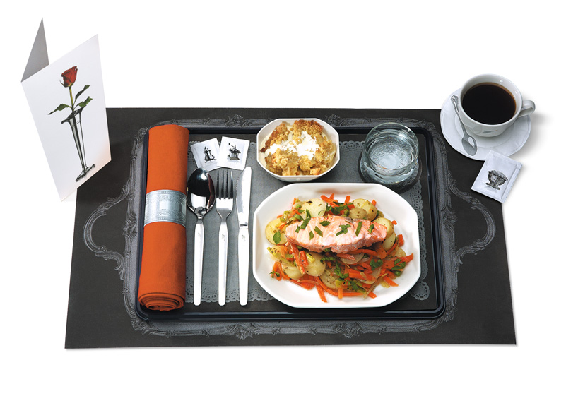
eurostar – meal menus and packaging
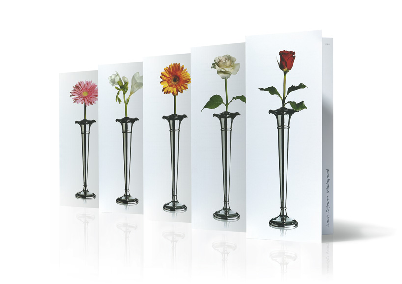
eurostar – menus
DB: what is the attraction of designing identities for GBH?
GBH: back in 1991 ‘identity’ basically a logo and whole lot of applications of that logo. but gradually, the importance of the logo has been giving way to the importance of the bigger brand language and all the touch points that help the audience experience the full personality and value of a brand. that’s what really appeals to us because we’ve always thought very big about what’s possible and approached branding in a lateral way. the diversity also lets us flex our creative muscle.
it’s the brand expression through applications today that make identities so interesting. for us it means we find ourselves designing public art and working with sculptors or with film makers making films or writing stories from a brand’s perspective or thinking about how a brand talks and engages with you online. identities really satisfy our desire to work across many disciplines, to break outside of the constrains of ‘graphics’. but without doubt there’s also the satisfaction that comes from knowing we are creating or shaping the fundamental look and feel of a brand which they’ll be recognised to the outside world by for ever more and which everything else they do will be informed by.
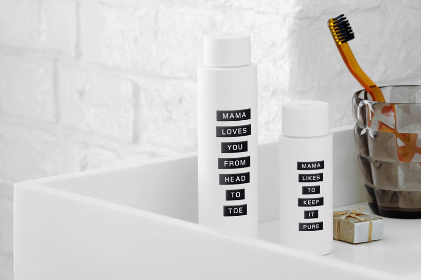
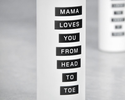
mama skin packaging for mama shelter hotels
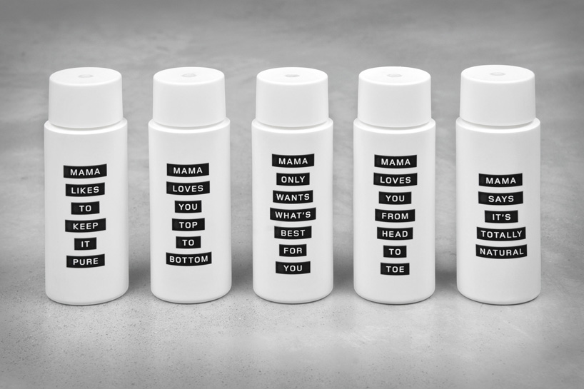
mama skin packaging for mama shelter hotels – see our article about this project
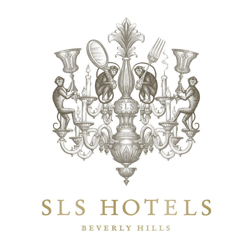
SLS hotels branding – logo
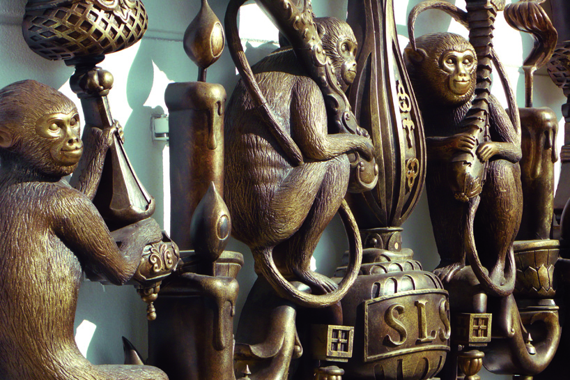
SLS hotels branding – signage
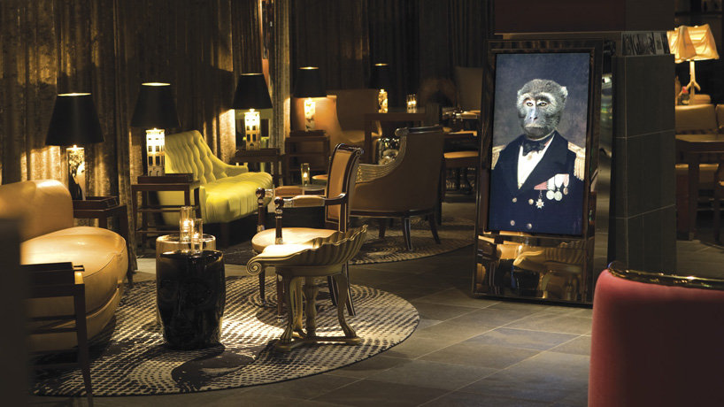
SLS hotels branding – interior
DB: given your experience, are you able to finalize an identity much quicker than you used to?
GBH: it certainly doesn’t get any quicker or easier to make brilliant work. in some respects it’s more difficult. we’ve never been the kind of people who make lives easy for ourselves! we don’t have a system or cookie cutter solution for identities. it actually feels like each time we do something, we’re raising the bar higher for the next project that comes along because you want to keep doing better work than you have done previously. that said, having more experience does mean that we don’t waste as much time exploring ideas that won’t work. we know very quickly what feels right or wrong for a brand and what’s worth exploring or not. there’s much less trial and error in that respect because we’re very focused on the brand and we know the kind of area we should be in.
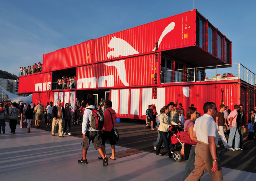
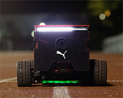
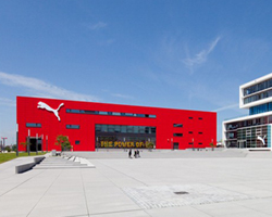
puma – container store
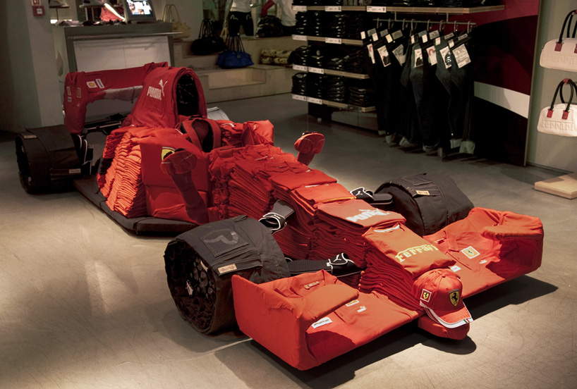
puma – in-store merchandise installation
DB: what mistakes or ‘traps’ should a young designer avoid when working on an identity system?
GBH: where do you start? you’re touching on practical issues but also issues about the importance of client relationships and having the confidence to stick your neck out. practically, for instance, it goes without saying that identities are endlessly broad in their applications so whatever you propose you need to make sure you won’t be caught out when somebody asks you how it’ll work as a 57 pixel smart phone icon! but answering that question in a slightly bigger context, the best work comes out of really understanding a brief which means understanding what your client needs. and that’s not necessarily what the client wants or has asked you to do either. we’ve learned to listen to clients and then read between the lines to work out either what they actually mean or what would actually be a better solution for them. we’d also say, to never try and second guess what a client would want or like. listen to your own voice, make the proposal that you feel is the smartest, most thrilling solution because if you’re not excited by it, your client won’t be either. then all you need is the confidence to present it and not take it badly if they look at you like you’re a loony!
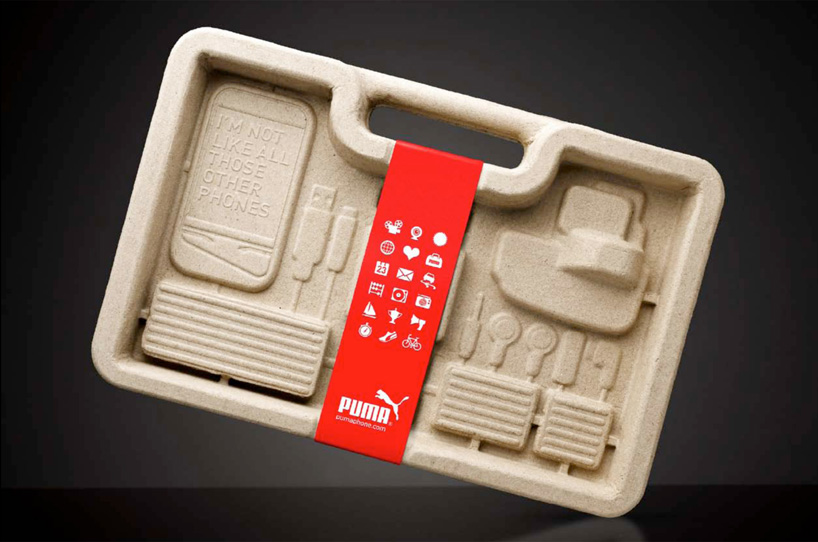
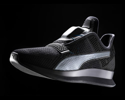
puma – mobile phone packaging
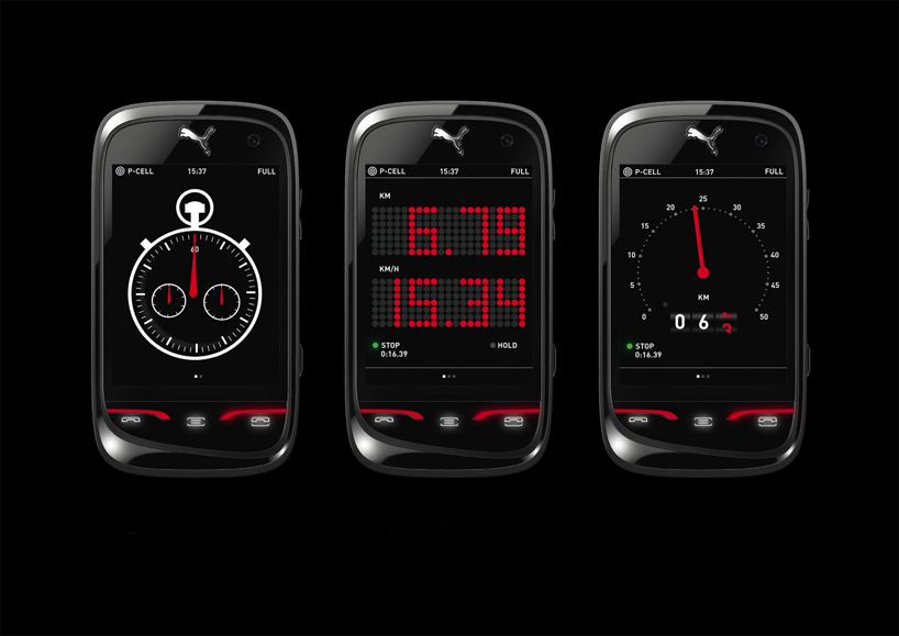
puma – mobile phone display
DB: what are your thoughts on specialisation vs generalisation?
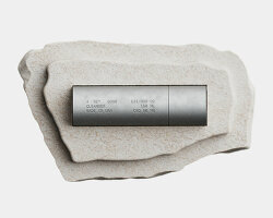
GBH: our work is very diverse but everything we do is united by one thread, and that thread is branding and brand expression. although we work across identity, print, digital, packaging, interiors, film, advertising, copywriting, sculpture, even product design, it all comes down to working with and understanding a brand and then helping that brand to talk about itself in the most engaging, creative and memorable way possible. so in that respect, we’re very specialised! but we enjoy working across different media, collaborating with specialists and finding unusual things to do that we’ve not done before – whether it’s a statue in sao paulo, making mannequins, branding a rocket or thinking about how a mobile phone talks to you. the nature of branding today is all about finding new and meaningful ways to engage an audience and we love that.
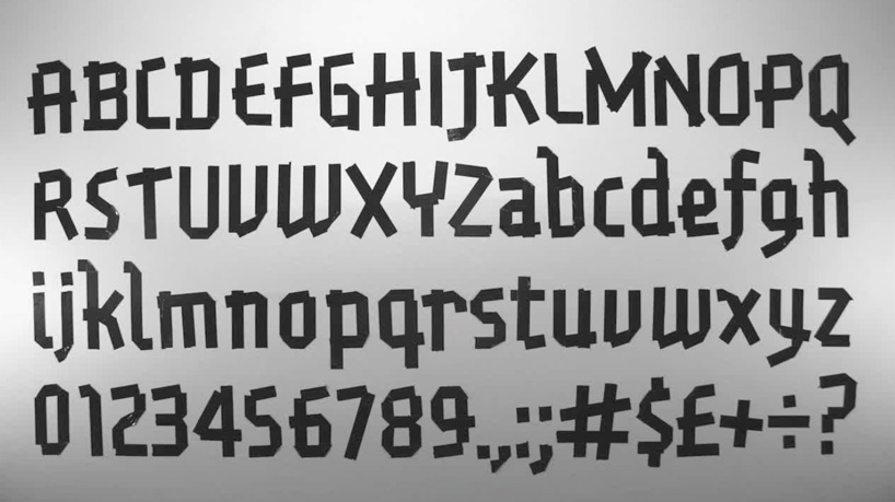
puma – gaffer font
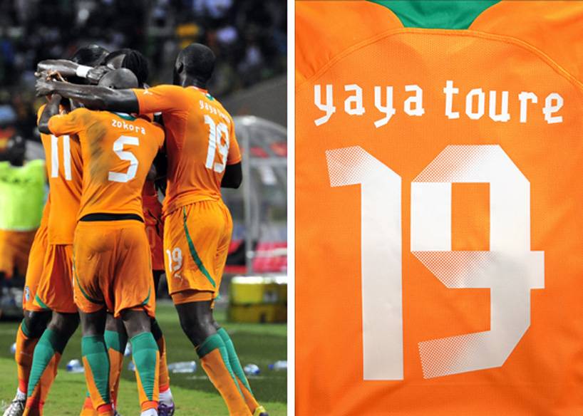
puma – gaffer font, see our article about this project
DB: do you think it’s important for a graphic designer to be able to draw?
GBH: many people could easily prove that it’s not essential in this day and age but… there’s an extra dimension to a graphic designer who can draw. we are a very pro-drawing agency and all of the creatives at GBH draw very well. being able to draw makes you more than a graphic designer. it lets you look at things in a different way, have a more lateral and free view of the world. a more artistic approach with wider references and helps draw influences from the broader art world not just the cosy little world of graphic design. it’s also a great way of stimulating your mind when trying to come up with ideas and it’s still the quickest and most direct way of communicating an idea to a colleague.
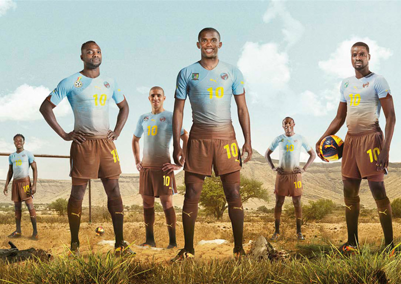
puma – african unity kit
DB: what do you think the most significant development in identity design has been in the last five years?
GBH: the rise of the app maybe? it’s all about how much standout you can create with the smallest amount of space!
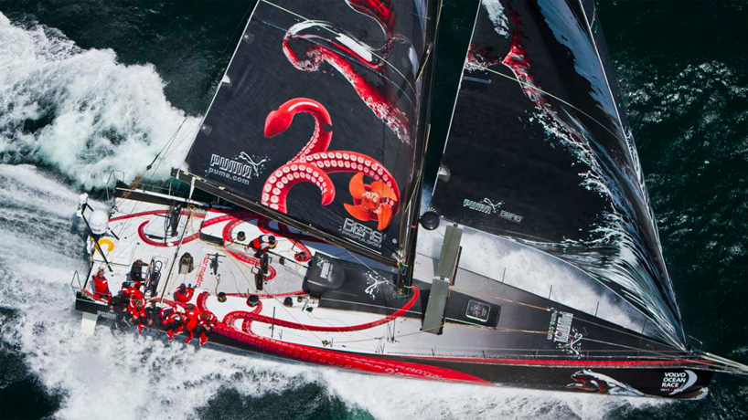
puma – mar mostro yacht branding – livery
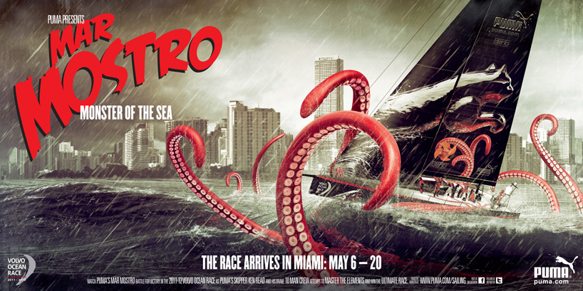
puma – mar mostro yacht branding – poster
DB: how do you think online design resources have influenced design being produced today?
GBH: it’s certainly a huge part of the daily design routine in our studio but whether it’s always good is difficult to say. on the one hand, the instant access we all have to design reference or to other projects is fantastic. sometimes you want to discuss the merits of an idea and you can illustrate a point quickly with something you’ve seen. it’s an amazing resource you just didn’t have fifteen years ago. you are also able to monitor what’s being produced and feel up to date with your industry much easier than before, which is also great and provides fodder for much debate in our studio.
on the other hand there’s a danger that there’s so much design spilling into your inbox everyday that it can lead to a very lazy approach to idea making. it’s not great to start a project by resorting straight to ffffound or the serif etc. to find inspiration for a project. you need to be strong willed enough to not do to that and to have your own view on how you want to use those kinds of resources. we believe that you also need the sense to see what you design as if through someone else’s eyes. we sometimes talk about seeing a problem through a child’s eyes. with this approach you can break free from the overload as the world looks totally new to you and there’s no preconceptions about what might be appropriate only an opinion on what would be exciting and interesting. if you approach a problem this way you might just have a shot at standing out from the inbox crowd.
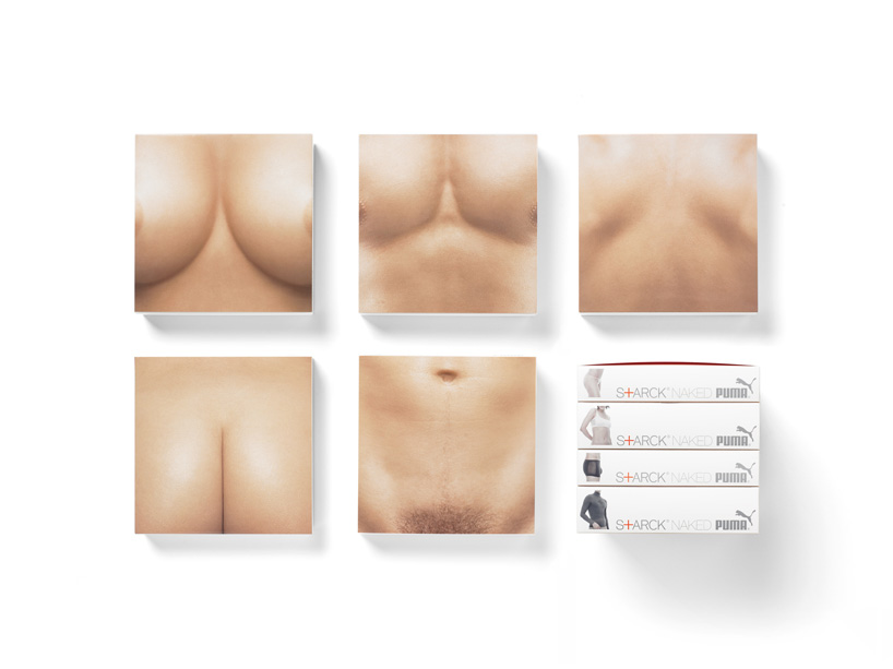
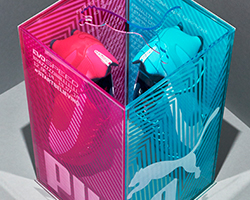
puma – starck naked packaging
DB: what is the best piece of advice you have ever been given?
GBH: not so much advice, but a few years ago we found ourselves in LA making a creative presentation to philippe starck and the owners of a large hotel chain. at the end of the presentation, starck stood up holding one of the concepts in his hand and announced to the crowd ‘this one is definitely the best. I love it because it wins the game by not playing the game’. a poetic and astute comment which has always stuck with us because it neatly sums up our approach. now often when we have an idea, we’ll ask ourselves if it wins the game by not playing the game.
