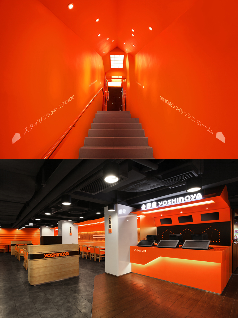
Yoshinoya by SAM SUM from china
designer's own words:
“Designers want customers to understand at the first glance, being simple and direct would make more sense.” Designers used “Home” as the core design element to build a “Chic Home”, to inject a sense of young, energy, and a warm image to a corporate brand with a long history. The idea of “Chic Home” does not only make the organization to flow with the trend and also to create the “Feel at Home” to the stores.
The shape of “House” created a marker that makes the customers easily associated with the new image “home”. We also found that the shape of “House” has a high malleability, it could be used reused, linking different areas and making the space more stereoscopic; can be appeared in more shop scenes of different sizes. Yellow pillar structure, geometric triangle patterns, giant Japanese chopsticks, Japanese wooden plate menus and Japanese roof tiles became the feature of traditional homes and a variety of combination of diverse elements, and the design of golden color geometric triangles on the wall creates a diversity of design styles, was inspired by Japanese origami which create experimental and playful design effects.
Designers also considered the linkage between traditional Japanese cultures and modern design, which supported the retention of traditional cultural elements, and also combined with modern elements, so the new generation of young people can recognize the traditional cultural elements. Designers create a new image with a new generation of Japanese-style fast-food culture, not only breakthrough the traditional image from the past, and also evoked the fast food industry by injecting the warm feeling of "Home".
Entrance staircase area & Cashier counter area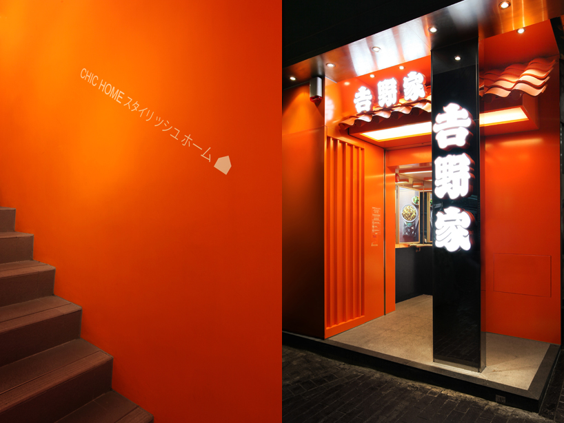
Entrance staircase area & facade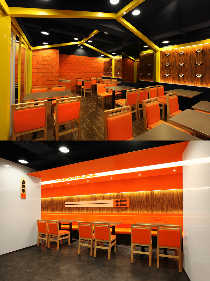
Seating area & giant Japanese chopsticks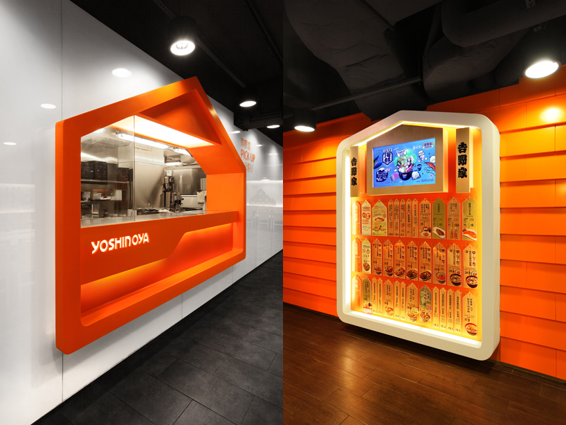
Food counter & Food menu area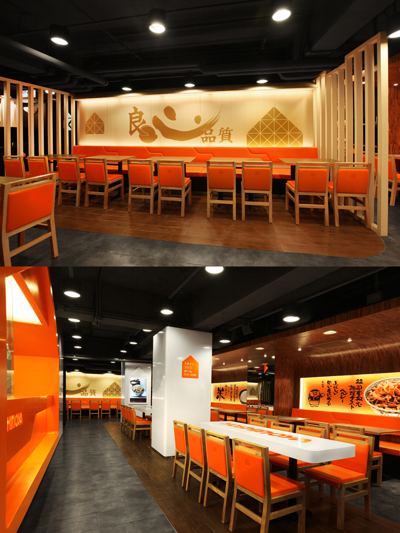
Feature Wall & Seating area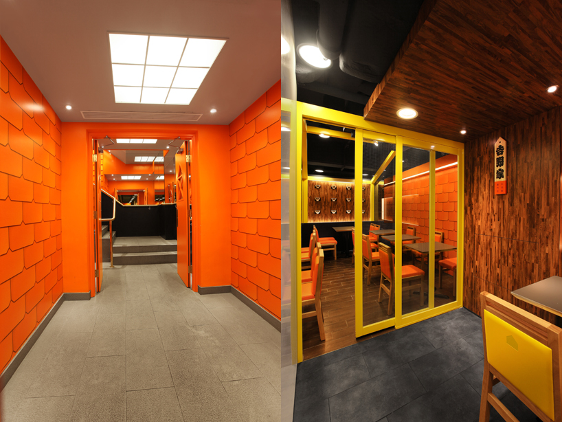
Roof tiles pattern & Japanese wooden plate