KEEP UP WITH OUR DAILY AND WEEKLY NEWSLETTERS
happening this week! holcim, global leader in innovative and sustainable building solutions, enables greener cities, smarter infrastructure and improving living standards around the world.
PRODUCT LIBRARY
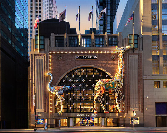
comprising a store, café, and chocolate shop, the 57th street location marks louis vuitton's largest space in the U.S.
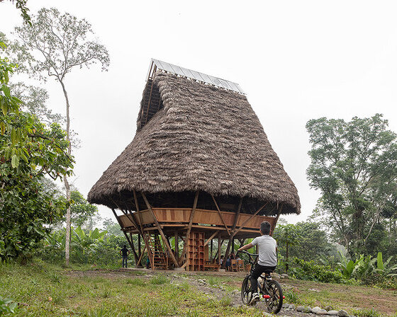
beneath a thatched roof and durable chonta wood, al borde’s 'yuyarina pacha library' brings a new community space to ecuador's amazon.
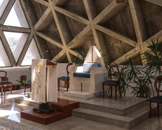
from temples to housing complexes, the photography series documents some of italy’s most remarkable and daring concrete modernist constructions.
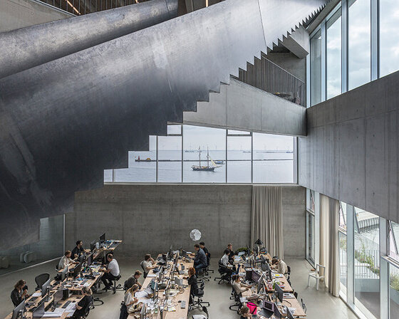
built with 'uni-green' concrete, BIG's headquarters rises seven stories over copenhagen and uses 60% renewable energy.
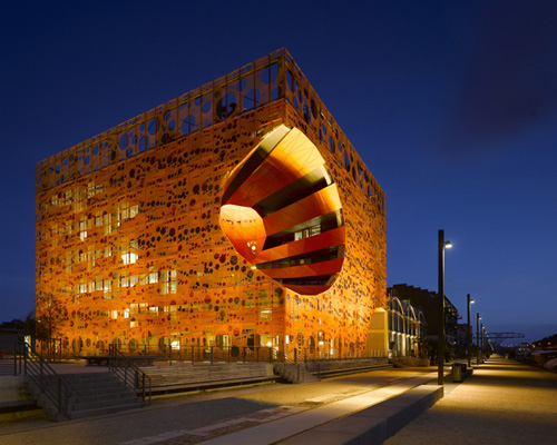
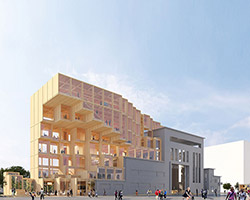
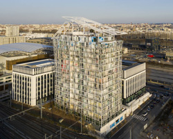
 elevation image courtesy RBC
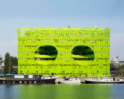
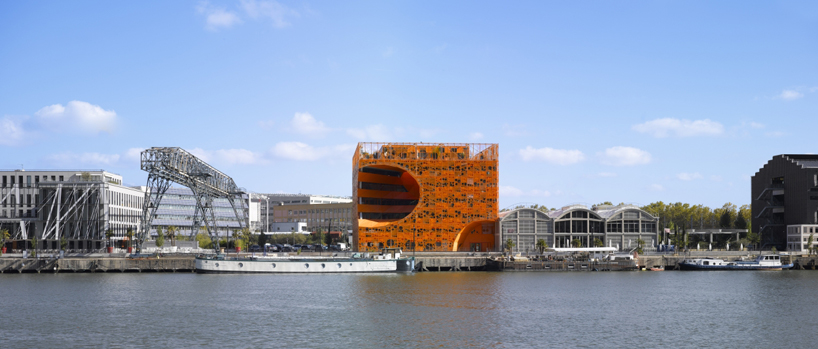 in context of the river and surrounding structures image ©
 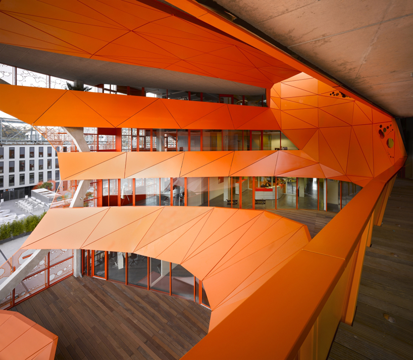 view of the void from an outdoor terrace space image ©
 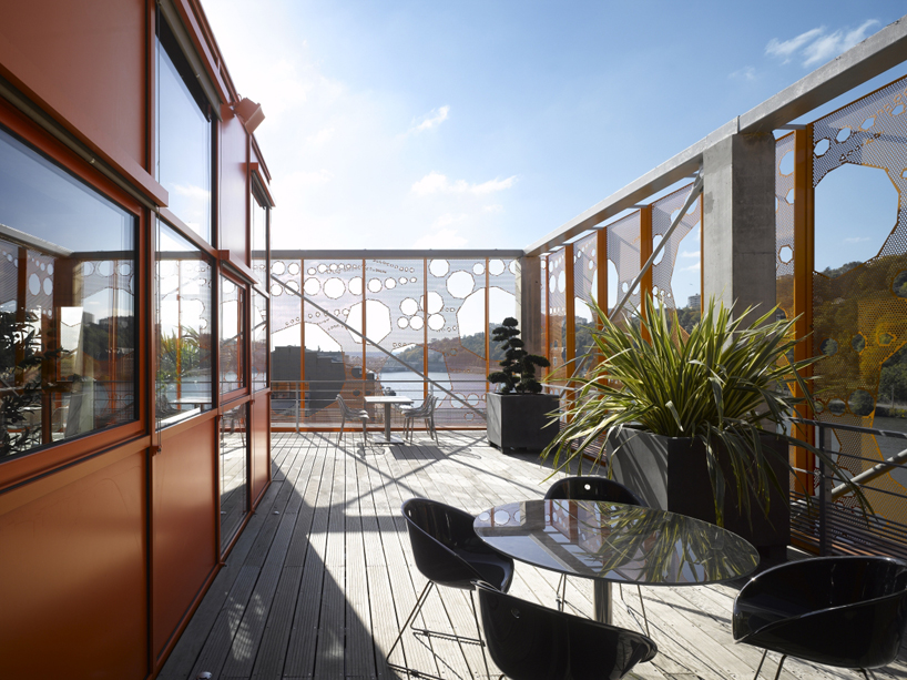 roof top terrace image ©
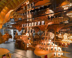
 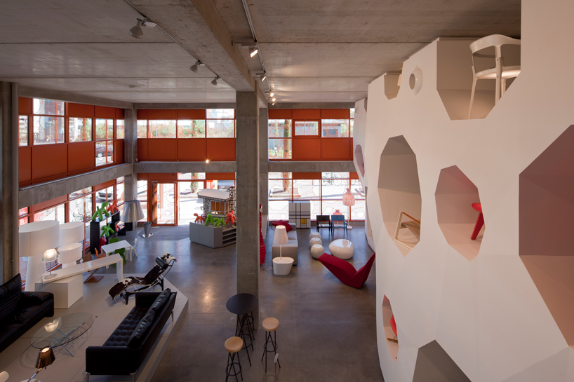 interior view of the design showroom image © nicolas borel
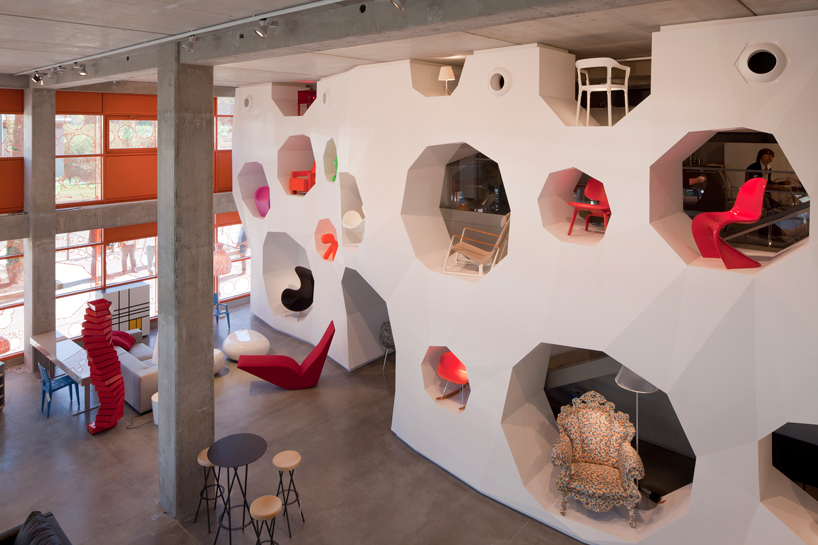 display wall image © nicolas borel
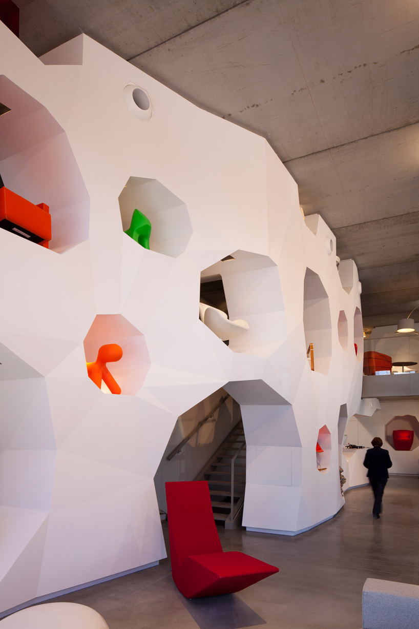 image © nicolas borel
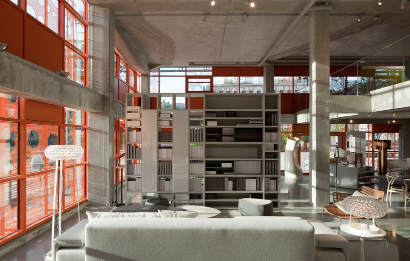 image courtesy RBC
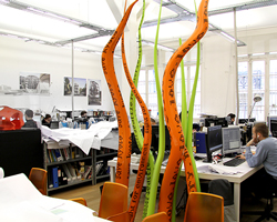
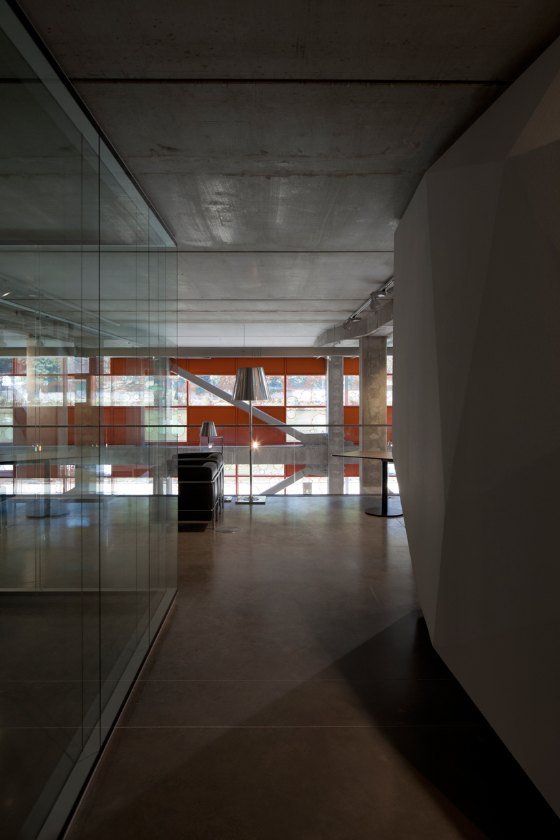 office floor image © nicolas borel
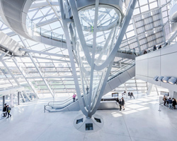
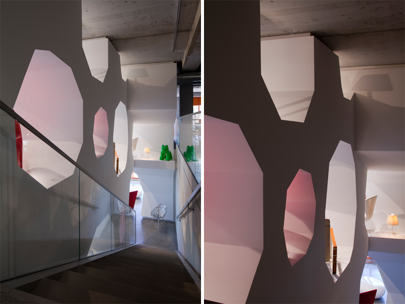 staircase images © nicolas borel
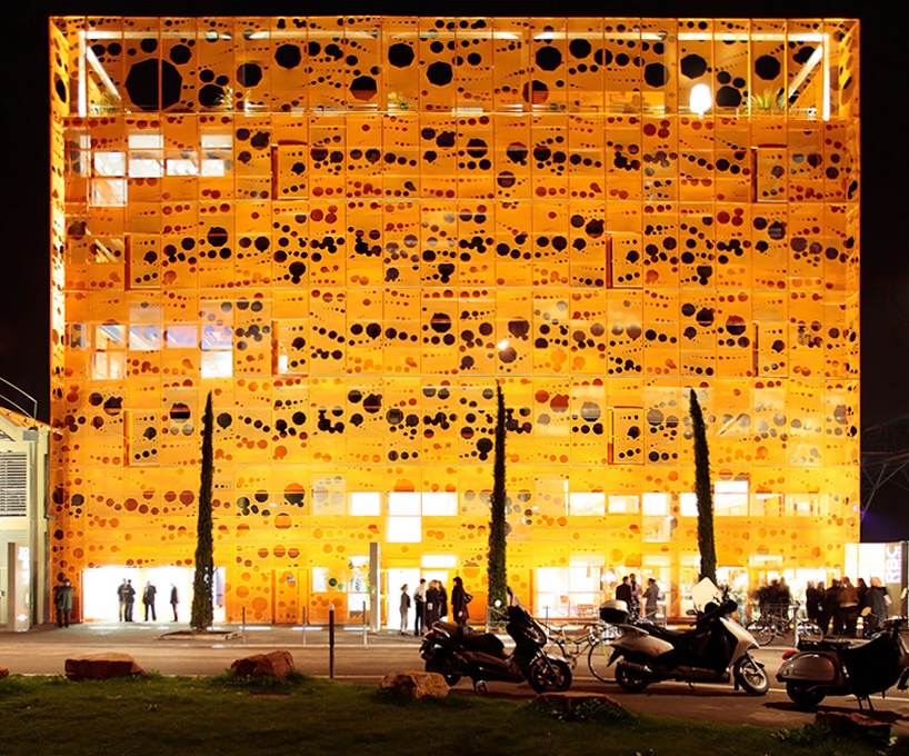
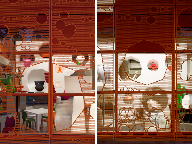 detail of light facade image © nicolas borel
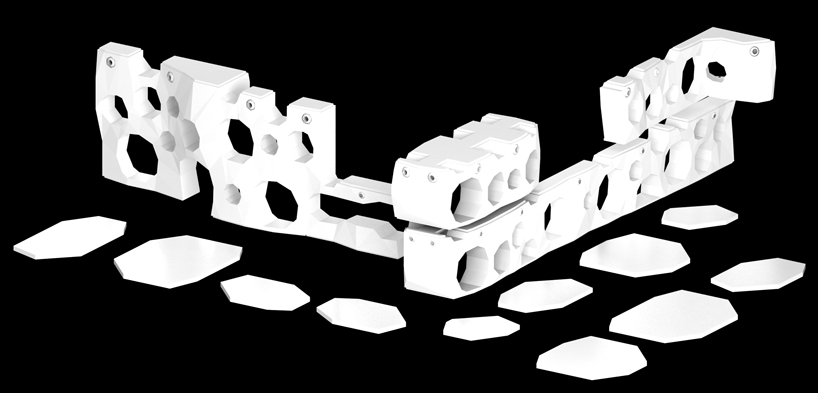 3D rendering of display wall units
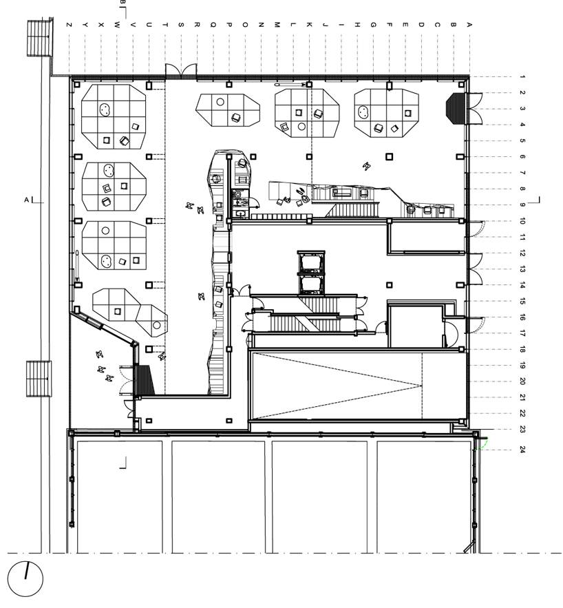 floor plan / level 0
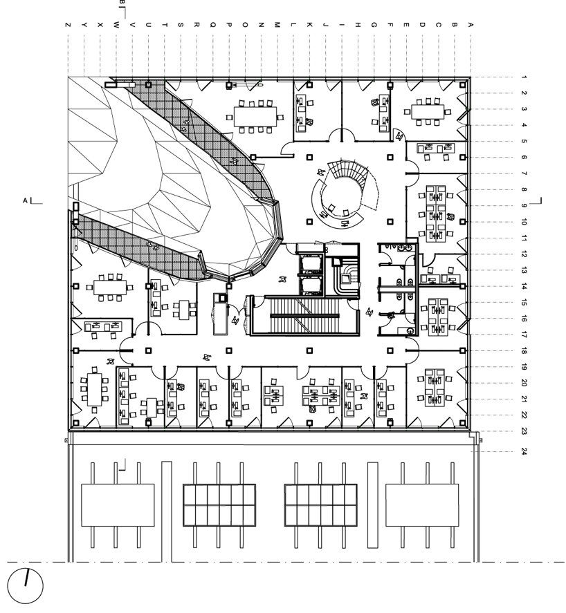 floor plan / level +4
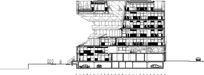 section

