inside space perspective’s capsule with dan window
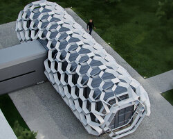
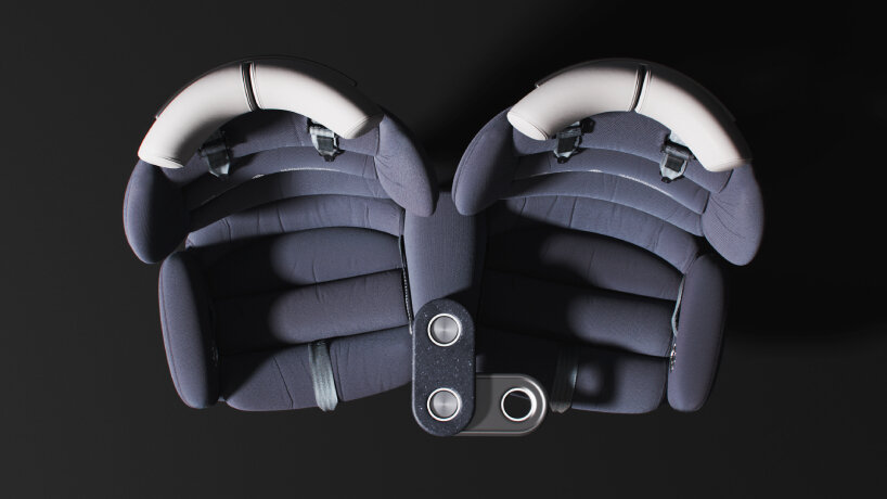
Space Perspective’s Head of Experience Design, Dan Window, speaks to designboom about the Neptune capsule’s interior design. The capsule’s aerial view looks like an hourglass: a crescent-shaped white pathway in the middle, while eight dark-blue plush seats facing the windows fill in the spaces on the side. Dan Window tells us in an interview that he and the design team tried out a different setup at the beginning.
Since the Neptune capsule has a round interior, they placed the spa bathroom at the center of the space and the eight seats surrounding it, all facing outward. It restricted the space. Passengers would walk around in circles, as if following a leaderless cult, and in a six-hour flight, it might make them feel like space traveling in a limbo, around an endless loop, with no way out of space. ‘By creating these two semi-circular arch lounges, it does two things: it pulls the people a little bit back from the windows, creating a lot of legroom in front of the seats so they can stretch their legs out and be relaxed, and it also allows the standing space at the windows for them to get up and stand around in this space,’ Dan Window shares with designboom.
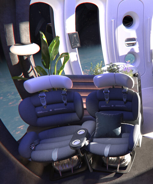
The split is made, giving birth to two lounges. On each side, four seats are facing the vertical, panoramic windows. These chairs are positioned to follow the curve of the floor, making two seats adjacent to each other. There’s a space between every two seats, allowing for a passageway, so the passengers can walk around the entire Space Perspective’s capsule, strolling around with ease, soaking up the views, enjoying the flight out to the earth with drinks in their hands.
images courtesy of Space Perspective
Excelsior is neptune’s test capsule
Space Perspective has already unveiled the interior of their Neptune space capsule through their test build, Excelsior. The design team says it can accommodate up to nine people, including the pilot, taking them all for commercial space travel beginning 2025. Dan Window paints the picture as to how the interior can fit all the passengers while giving them enough room to roam around, socialize, and stretch. As soon as they enter the door leading inside the cabin, they find a single seat for the pilot, who is walled in two aluminum cabinets, one beside them and the other adjacent to it.
These cabinets serve both as the division of the space and what Dan Window calls the ‘bar area.’ ‘This area down here is where drinks and food are prepared. You have windows around here, so you can walk through to the bar, stand at the bar, and have conversations with someone sitting in another seat,’ Dan Window explains to designboom. The setting creates a laidback and open space rather than a regimented, forced, and individualistic design where each passenger is facing their own window. Across the pilot’s seat, the finish line of the white curved pathway, the passengers find the spa bathroom, a room to relieve themselves when they’ve had enough drinks or just enjoy a brief respite within a luminous yellow nook.
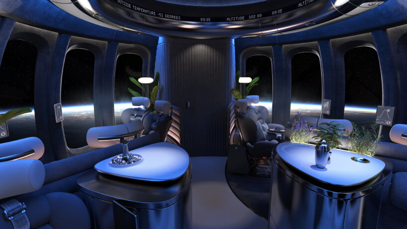
interior design of Space Perspective’s Neptune capsule
Mini biosphere design outside of earth
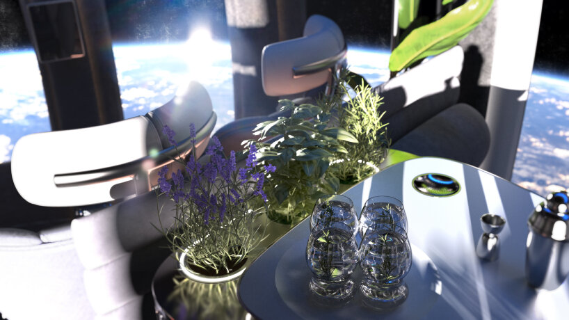
Around the quaint interior of the Neptune capsule, plants pop up, growing in pots or crawling around the walls with their tendrils and healthy stems. Dan Window says their presence is drawn from the experience of Space Perspective’s founders, Jane Poynter and Taber MacCallum. They were part of Biosphere 2, a research facility that encased eight participants in a glass structure to understand and study how human-made ecosystems could be replicated. ‘They had to grow all of their own crops, and create their own atmosphere and environment. That’s where the founders of Space Perspective met, and I guess that’s the start of their journey,’ Dan Window tells designboom.
The plants inside the Neptune space capsule nod to the grow-your-own-plants atmosphere that the founders lived in. In a way, Space Perspective may be bringing it back for space travel tourism, a mini biosphere that’s conducive for passengers, floating above until it exits out of Earth. Other objects inside the space capsule can induce a domestic feel to the travel, as if the passengers never left their lands in the first place. The familiar lounge, the plants, the drinks, the carpets, the textiles, the lighting design. There’s nothing harsh-looking, as Dan Window puts it; the interior is familiar and may be natural. It strips off any aseptic visuals that might propel passengers to think they’re astronauts rather than travelers.
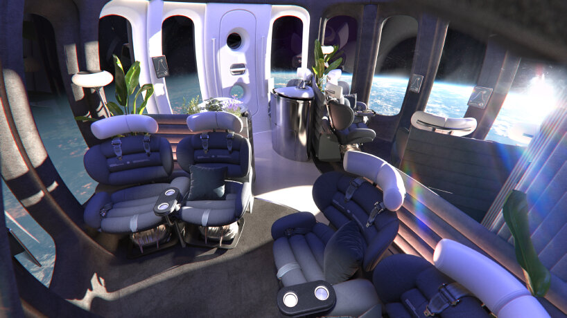
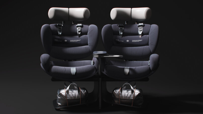
twinned seats facing the windows
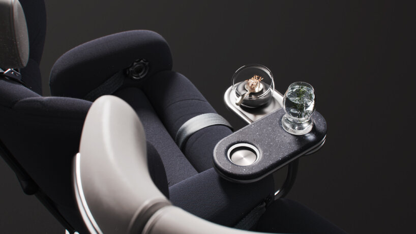
Dan Window brings us back to the chairs’ designs, segmented with long capsule-shaped cushioning. They’re twinned up as pairs to encourage the passengers to speak with the others, and adjoining them is an mini wooden table that can double as a desk. Below this tabletop surface, there are fold-out leaves that rotate out to dock a small dish that passengers can hold in their hand and place your glass nearby, extending the tabletop to accommodate more objects. ‘This concept goes against the typical idea of an airline flight with a big meal service, numerous containers, and complexity. We’re aiming for something very different and contemporary—exciting small bites of food served at regular intervals throughout the flight,’ Dan Window explains to designboom.
Dark palettes enshrine the colors of the space capsule’s lounges, contrasted by the light hue of the pathway between the entrance, the pilot’s seat and bar, and the toilet. In this part of Space Perspective’s Neptune, the lush carpet is luxurious and soft. Passengers can take off their shoes and just be in their socks, making them feel at home. Yet the choice to imbue these parts with dark palettes is because of the intensity of the lights coming from the windows. They’re strong, as Dan Window shares with designboom. By going for this dark-blue shade, they avoid lots of reflections and bright white surfaces that reflect back into the window. And by making the space lounges dark, muted, and tactile, they complement the glossier and textured entrance area and the rest of the space capsule.
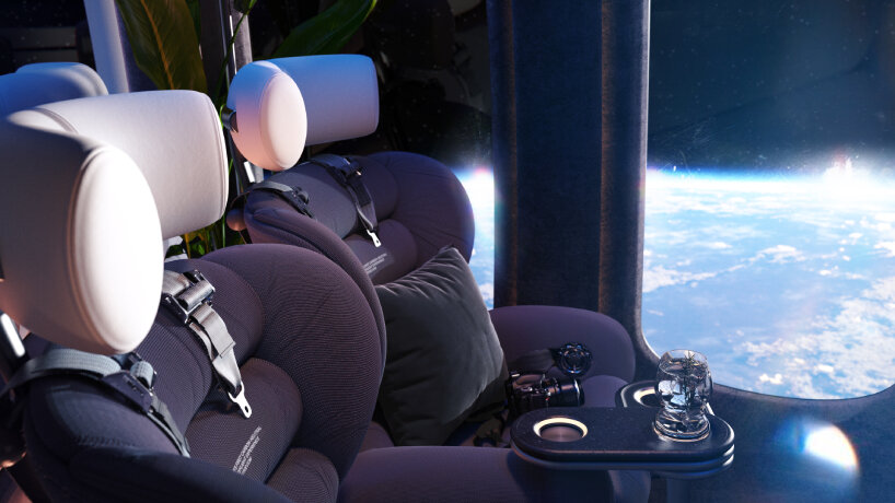
detailed view of the seats and the fold-out leaves
Parachute inside neptune capsule for emergencies?
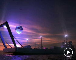
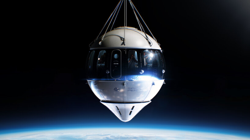
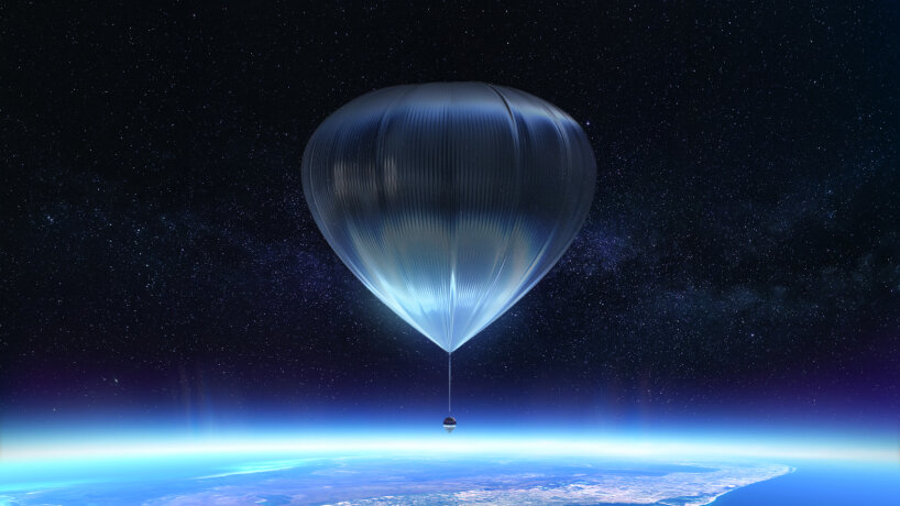
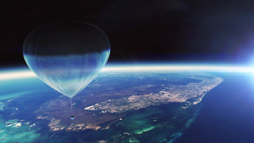
Underneath the seats, a silver glint can catch the passengers’ attention. At first, they seem to be parachutes for emergency landings, but the Head of Experience Design says it is for storage. The idea is for every passenger to have their own small, soft bag to stow their personal items up to a certain volume. It fits the shape of the chair, so bulky items are not cut out on board. A curious case for emergency designs comes through, and Dan Window shows designboom the exterior image with the space balloon anchoring the Space Perspective’s capsule.
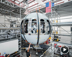
It is the capsule itself and its rigging that include parachutes as part of the system and a backup in case of failure. ‘Safety is our top priority, and every component of the project is designed with high safety standards in mind. The entire system is kept as simple as possible to reduce the risk of failure. The parachutes are integrated into the system, but it’s important to clarify that passengers do not wear them for jumping out. That’s not part of the experience,’ says the Head of Experience Design. Outside the Excelsior’s space capsule, the test build of the Neptune vessel, Dan Window points out that their color scheme is limited to chrome or white.
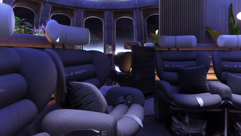
four seats per space lounge
It’s only these paints that can meet the temperature requirements of the space capsule, which can help reduce the solar energy, thus the heat coming into the Neptune vessel. The designer adds that ‘we have a chrome band through the center. The chrome band reflects whatever is outside. So, when it’s dark inside, it reflects dark, and when it’s bright with the doors open, it reflects light outside. Rendering the capsule in space has been challenging because the chrome band always looks dark against the blackness of space, even though it’s actually chrome. It’s always a challenge to capture.’
Developing the paint for the exterior of the Space Perspective capsule is only a challenge that the design team has to conquer. For Dan Window, they sang the victory chant once they got over the design for the splash cone, the triangular shape underneath the space capsule that helps with the landing once the passengers’ travel time is over. It has been developed to penetrate the water, slow down the descent of the capsule, and control its buoyancy as water vehicles zip through the sea to meet the passengers and take them back to the launching vessel waiting nearby.
‘It acts like a sea anchor to create stability in the water. We experimented with different lengths and shapes of the cone, as well as multiple spheres at the bottom of the capsule. We tried wild and wacky iterations to see what would work best. As aesthetic designers, we were relieved to settle on something simplistic, minimal, and geometric. Some of our initial designs looked crazy, but we weren’t sure what would meet the technical requirements. For us, as the exterior designers, minimizing the visual impact of the cone compared to everything else was the most challenging aspect,’ Dan Window opens up to designboom.
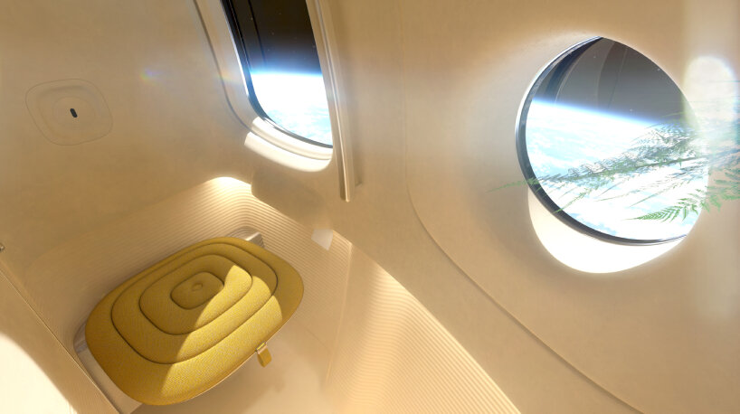
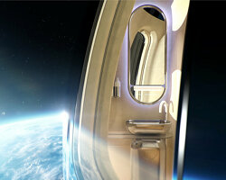
spa bathroom design inside Space Perspective’s Neptune capsule
Vertical windows for neptune capsule design
The Head of Experience Design turned to the vertical windows of the Space Perspective capsule. The landscape orientation is traded with pillars of consecutive glasses to avoid distorted or stereoscopic vision and align well with the Neptune capsule’s internal structure. Inside the vessel, there are ribs that align with the window frames. The design team had to calculate the ideal surface area for the windows, considering factors like solar radiation and energy intake, before they could determine the window’s height, width, and position.
The result can let standing passengers have a clear view outside without oversized windows, all the while offering them an uninterrupted view around the capsule. Soon enough, these transparent glasses win over Dan Window, one of his favorites in a series of design features of the Neptune capsule. ‘The windows themselves are very technical and highly engineered with special coatings and manufacturing techniques. It may not seem like a standout feature, but it’s actually the most important aspect of the entire design—it’s all about the experience,’ he explains to designboom.
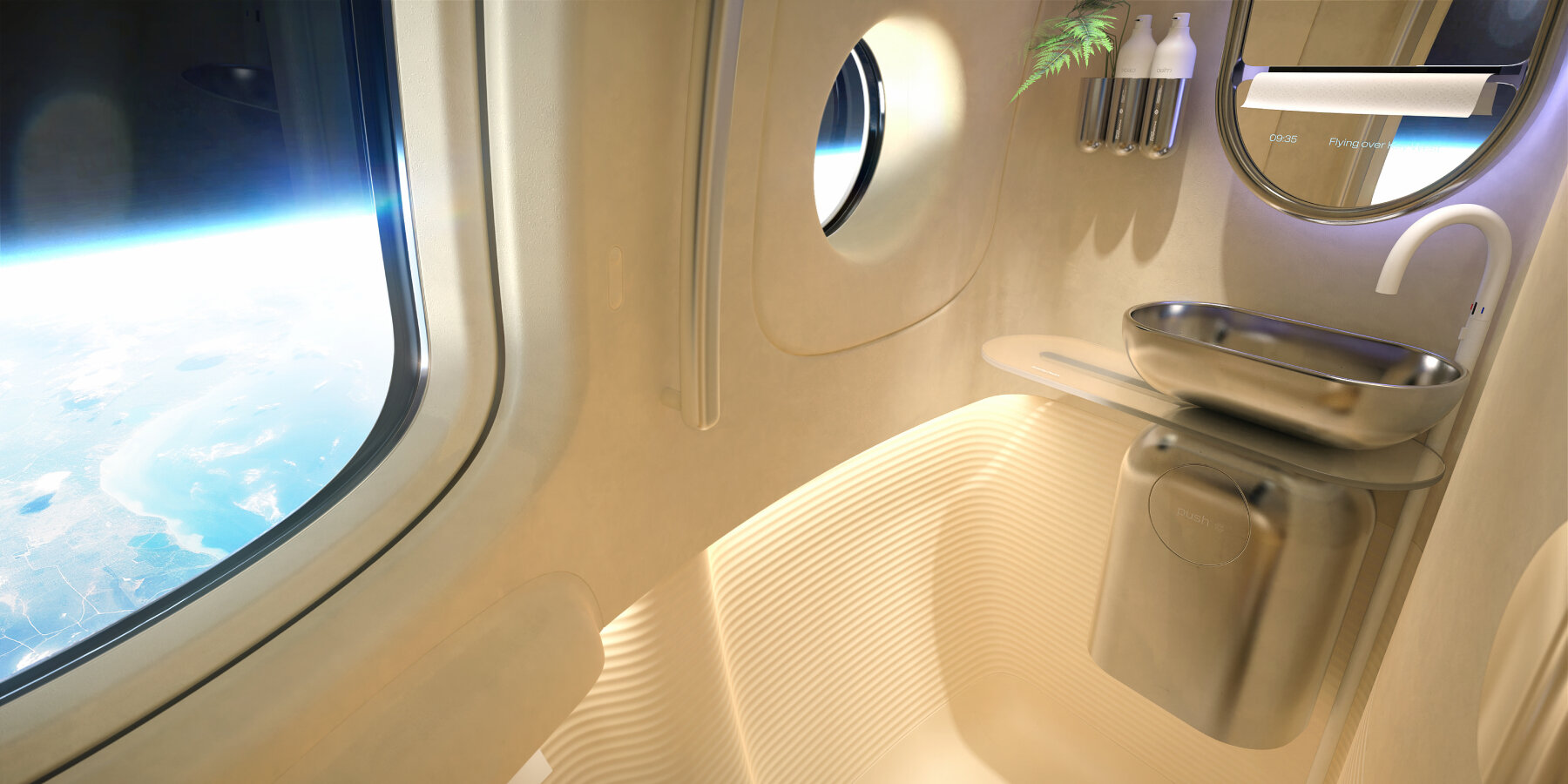
spa bathroom view
New form of tourism from Space perspective
Dan Window used to work in the transportation industry before transitioning to space travel design. He interned at Ford Design and joined PriestmanGoode where he spent 16 years of his career. In the process, he has designed high-end aircraft interiors, bullet trains for China, and exterior design systems like the Hyperloop and the new Tube for London. Today, he’s the Head of Experience Design for Space Perspective as well as its Neptune capsule. For him, it’s not a big change. It’s all about transport. It’s different from designing cars, with the capsule featuring a geometric spherical shape, but the fundamental principles in design remain the same.
‘Spacecraft design is highly technical and engineered, with a strong emphasis on meeting specific requirements. Unlike car design, which heavily focuses on exterior styling, our role is to ensure the capsule looks its best while meeting stringent engineering demands. For example, the capsule’s exterior must withstand extreme conditions like solar radiation, limiting our choice of materials and colors. This contrasts with car design, where options are more varied,’ the designer shares with designboom.
Looking forward, he admits that space travel design is a new system that’s now at the forefront of tourism. Democratizing and making it more accessible to the public are some of the goals Space Perspective is looking into, and Dan Window tells designboom that ‘when compared to the competition, it’s cheaper, so that can allow people to be introduced to space travel. We have 1,700 pre-sold tickets, which is obviously a huge number in terms of potential people going up into space, and I think overall it’s only going to become more accessible. In this capsule, people will be spending longer lengths in space compared to the journey.’
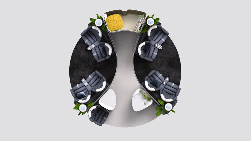
aerial view of Space Perspective’s Neptune capsule interior design
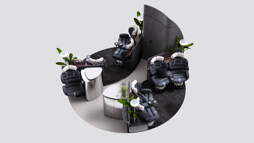
the plants nod to the biosphere research project in the 90s
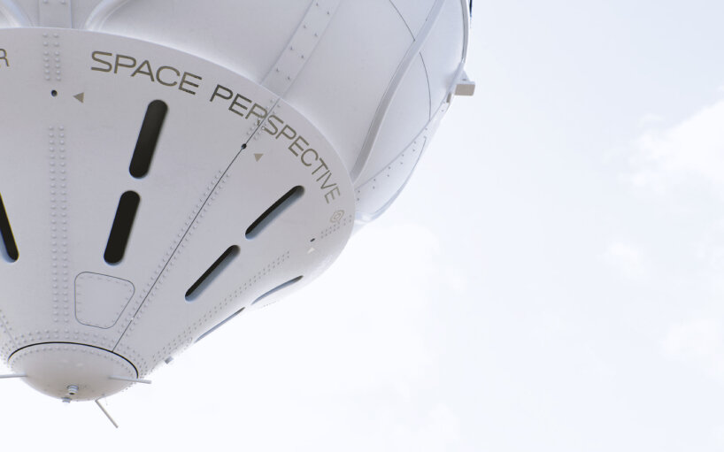
splash cone of the Neptune’s test capsule, Excelsior
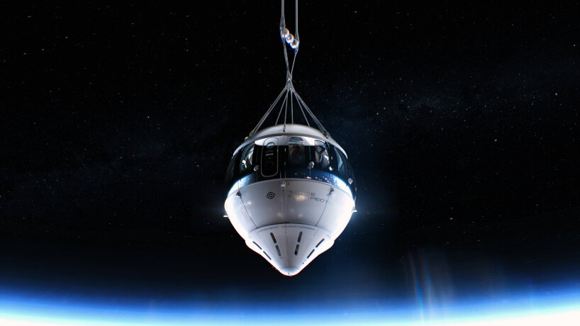
outside view of Space Perspective’s Neptune capsule design
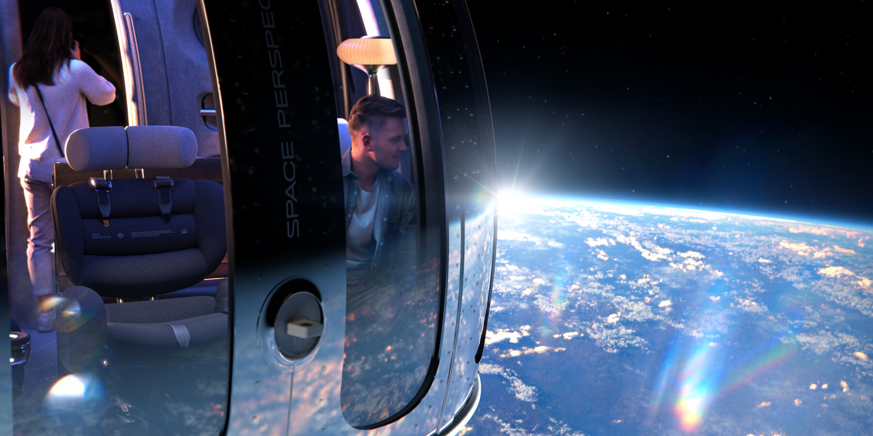
vertical windows for out-of-Earth views
project info:
name: Neptune / Excelsior capsule
company: Space Perspective
