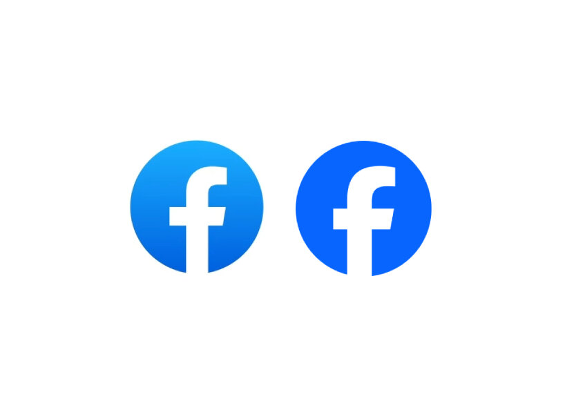
Facebook’s new and rebranded logo


In case you didn’t know, Facebook changed its logo. First, X and Android; now, Facebook. Rebranding logos is in fashion these days, and Facebook, under Meta, is not letting itself lag behind. The company has rebranded its logo as an attempt to, in their words, ‘create a distinctive, refreshed Facebook.’ Still using blue, the shade goes darker to make it more visually accessible in the app and to make the “f” stand out.


Facebook’s new logo still employs its custom typeface, Facebook Sans, to keep the design of the wordmark and logo consistent. It aims to create a consistent treatment and improve overall legibility across Facebook. Facebook says that these changes, while subtle, enable the company to continue its known identity all the while catering to the design needs of the present.


‘Our intention was to create a refreshed design of the Facebook logo that was bolder, electric, and everlasting. Each of the distinctive, new refinements drives greater harmony across the entire design as a key element of the app’s identity. We’ve done this by incorporating a more confident expression of Facebook’s core blue color that is built to be more visually accessible in our app and provides stronger contrast for the “f” to stand apart,’ says the design team at Facebook.

facebook new rebranded logo
images by Meta


Are there other updates, or just the logo’s color?


It is not only the saturated blue that Facebook adds to its rebranding and logo. The design team has also developed a new color palette. ‘We crafted a new set of hues, tones, and contrast ratios that felt unique to the Facebook brand and are optimized for accessibility,’ the design team says. While Facebook remains faithful to its blue foundation – unlike X’s shift from blue to void black – the design team expands its spectrum with a deep tonal range of secondary blues to create a stronger distinction for Facebook in marketing and when speaking to people in the app.


By growing the color palette, Facebook’s reactions are affected too. ‘We adjusted colors to meet color accessibility guidance so that our iconography is legible at any size, flexible enough for different needs, and easy for people to interact with,’ the design team adds. They even rebuilt the entire iconography system to scale the Reactions bar and icons. The initial release of design updates to the app includes Facebook’s new and redesigned logo and wordmark, as well as an updated color palette, reactions, typography, and iconography. Facebook says it will return with more updates to be rolled out in the future.

facebook new rebranded logo
old Facebook logo

facebook new rebranded logo
can you spot the difference?

facebook new rebranded logo
brief history of changes in Facebook’s logo over the years


project info:


name: Facebook’s rebranded and new logo

company: Meta

social media: Facebook