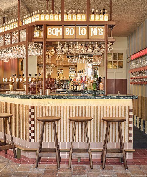
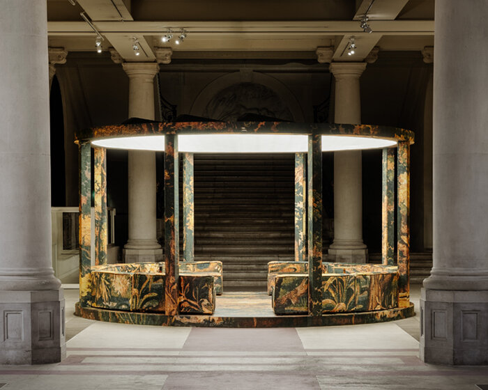
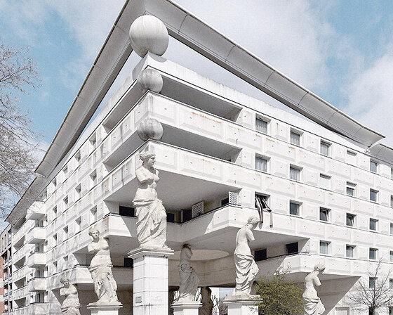
A DEEP DIVE INTO HOSPITALITY DESIGN WITH studio modijefsky
From Booking.com’s immersive City Campus interiors to buzzing bars, bistros, hotels, and spas, Studio Modijefsky’s pool of hospitality projects celebrates the art of creating memorable spaces seeped in color, textures, and tradition. The interior architecture and design practice was established in central Amsterdam by Esther Stam, who built a team of eleven women to kickstart her practice and bring delightful familiarity to social spaces. For each project, Stam relates the design to the context while experimenting with texture and materials, light and routing, height and depth, and sight and tactility — shaping interiors that exceed expectations. ‘Good spaces are great settings for new memories’, she tells designboom in a recent interview. Following that gentle take on hospitality interiors, the studio brought Gitane to life earlier this summer — a restaurant project dedicated to a celebrated young chef in Amsterdam.
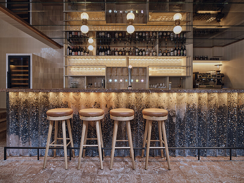
Gitane (2023), Amsterdam | all images © Maarten Willemstein
unveiliNG gitane in central amsterdam
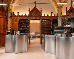
Designed for chef Angelo Kremmydas, whose meals ooze cross-cultural flavors served without pretension, Gitane by Studio Modijefsky (see more here) achieves an ambiance of casual elegance, engulfing visitors in warm wooden tones, intricate textures, and creative geometries. A ground floor, mezzanine, and bar make up the dining space, each catering to different moods and times of day. Together, they welcome a drinking and dining atmosphere where everyone, from food connoisseurs to residents, will feel at home.
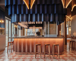
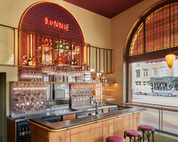
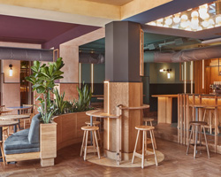
A wooden vestibule with colored glass nudges visitors into the ground floor, where a double-height restaurant space reveals a large, dark-orange neon ‘BAR’ sign atop the entrance. The room features a mix of classic and custom furniture and lighting, including vintage café chairs, tall lamps, arched windows, leather-finished barstools, and terrazzo-integrated benches. Two steps below, the bar area holds a zigzag-shaped terrazzo structure with pink accents recalling the exterior’s brick facade. Contrasting the bar is a marbled tiled floor and a dark brown aged mirror ceiling that reflects the lighting spheres and patterns of the sculptural bar beneath, capturing the play between robust, weathered materials, and the fresh tiles and terrazzo. The mezzanine, meanwhile, connects to the ground floor through a geometric rattan ceiling pattern and an original wooden staircase. Studio Modijefsky adorned this level with a railing of metallic brown vertical elements along the edge, large windows, a service area, tables, benches, and a banquette, all endowed with zigzagging details. Lastly, an outdoor terrace along the facade invites a gathering around custom wooden love seats under striped red and orange awnings.
This soothing design narrative ultimately reflects and emblematizes the practice’s mission to reinvent how people interact with an interior. Upon the release of Gitane, we spoke with Esther Stam who unpacked that mission to create memorable interiors — discussing her approach to hospitality design, material compositions, heritage and locality, and much more. Read on as we share the full interview.
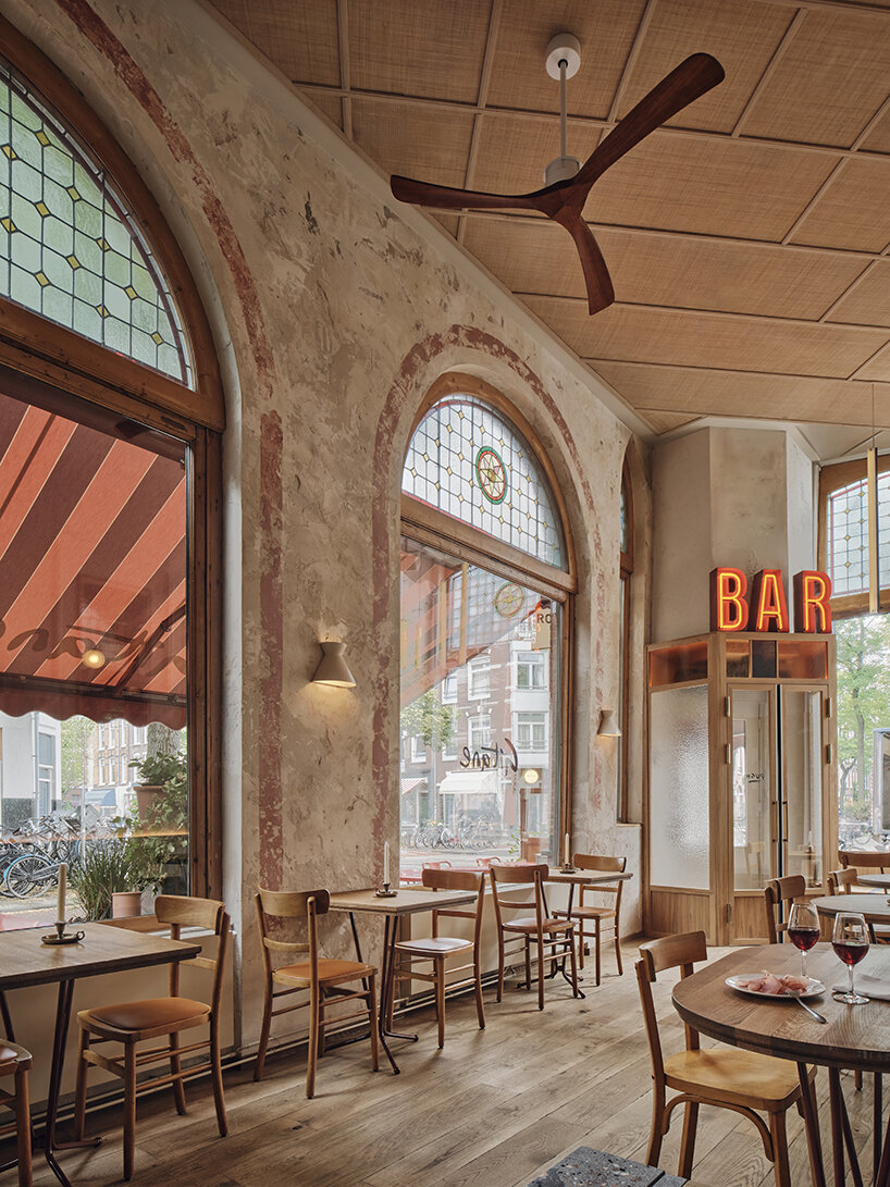
Gitane (2023), Amsterdam: a restaurant for Chef Angelo Kremmydas
interview: founder esther stam on her hospitality concepts
designboom (DB): When was Studio Modijefsky founded, and what projects did you first start working on?
Esther Stam (ES): Studio Modijefsky was founded in 2009 by me, Esther Stam. When I first started, I worked on many things — from train station tunnels to custom furniture pieces, from office spaces to festival stages. Some of my first hospitality projects were Visaandeschelde — a Fish restaurant in the south of Amsterdam, a collaboration with Studio Molen and Piet de Gruyter — and a local bar in Amsterdam West.
DB: How did you go into hospitality design? How has your style/approach in this sector evolved over the years?
ES: I was always fascinated by hospitality. It’s an environment that inspires me, feeds me, and where people go to enjoy life and celebrate, share stories, and create new ones. It’s spaces where you relax and enjoy a different scenery, experience new flavors and music, meet people, and have different interactions. Good spaces are great settings for new memories. Our approach hasn’t changed in essence. We look at concept, context, history, light, architectural surroundings, spatial features, food that will be served, drinks that will be poured, people that will visit, music that will be played, graphic identity, natural surroundings, and local traditions and materials… There is a big research leading to a strong and unique design language that is site-specific and tailor-made. We refine our research and ways to design. Our knowledge of materials is still growing, as well as our network of professionals, craftsmen, and people we collaborate with, making our designs even more distinctive and refined.
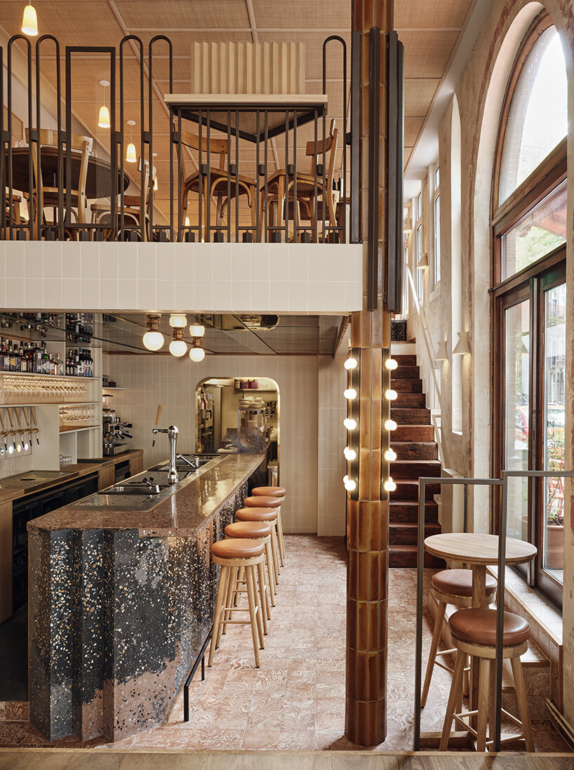
Gitane (2023), Amsterdam: creating casual elegance
DB: Digging deeper into your approach — each of your projects radiates with colors, layers, and textural richness. What emotional responses or impressions do you wish to convey through your compositions?
ES: We approach every project with an open mind and zero preconceptions. Yet time and time again, we are drawn towards the same things: authenticity, craftsmanship, patterns in nature, faded finishes, timeworn materials, daylight moving through a space, unique architectural features, local traditions — and lists. We love long lists. We’re not attracted to all these things because they’re visually appealing but because they spark an emotional response that a pristine finish can’t. A rumpled, distressed surface piques our curiosity and calls out to be touched. The shape of a table leg refers to a chapter of that building’s history. Lighting directs you subliminally to the part of the space you didn’t know you wanted to be.
We provoke these physical and emotional responses with stories rooted in a building’s location. The first step is to delve into a building’s origins, architecture, and former uses. These form the seeds of a concept, the start of a story. To bring these stories to life, we use six tools: materials, volumes, light, color, textures, and shapes. Each tool offers multiple design possibilities on its own, but it’s only when the tools are applied together that they realize their full potential. For example, how colors, shapes, and materials are seen, felt, and appreciated depends on the light and textures we add for tactility. The volume of a space, the size, and shape of the objects we fill it with instigate interactions and turn static interiors into exciting adventures. Combining our tools empowers us to translate the data behind our concept into something much more poetic: the next chapter in a location’s story.
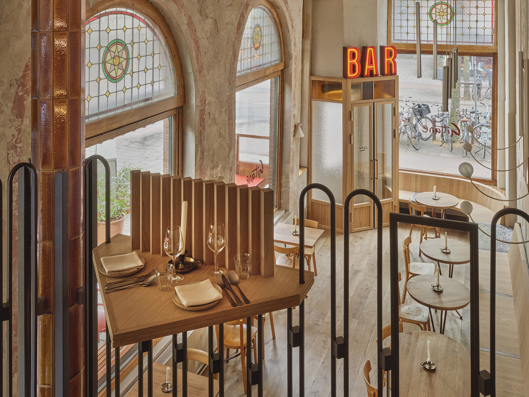
Gitane (2023), Amsterdam: view from the mezzanine
an intricate use of materials to convey hidden messages
DB: Wood, marble, and terrazzo are commonly found across your work; would you consider these your signature palette? What other materials do you enjoy working with or would like to experiment with further?
ES: Our studio is packed with material samples. Swatches, boxes full of tiles, and crates full of leather line the walls. There’s a whole shelf of natural stone samples while piles of fabrics and stones swamp our desks. These materials are placed on the wall, cut, stroked, and rigorously analyzed as we create and refine our concepts. How they are combined and contrasted will make a space feel soft or cold, impacting the atmosphere and visitor’s emotions. Unexpected, alluringly tactile materials will catch people off-guard and invite them to interact with a space: to look closer, touch, smell, and feel objects, from the food served to the seats they sit on.
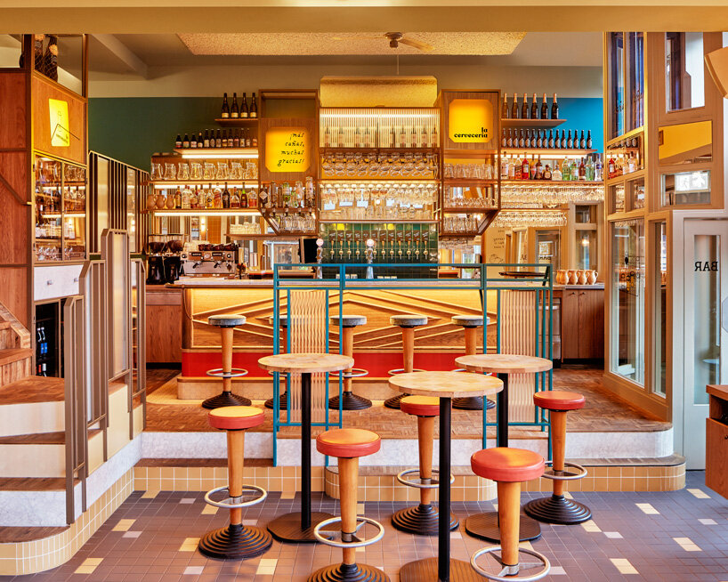
La Cervecería pincho & beer bar, Amsterdam (2019) | read more here
ES: There is an inherent contradiction in our use of materials. On the one hand, we have great respect and love for traditional materials like paint, cotton, wood, steel, and marble. We always search for local raw materials and finishes as they create an instant and durable connection between a space (or object) and its location, grounding our concepts in their local environment and history. To get the most out of these traditional materials, we collaborate with local craftsmen to spotlight neglected artisanal techniques and materials. On the other hand, our respect for local traditions and crafts doesn’t mean we’re afraid to mess with them. We’re keen to explore a material’s unexplored potential. We frequently reinvent and reinterpret finishes by treating them with extreme aggression, applying abrasive tools, or manipulating them.
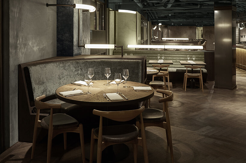
Restaurant Wyers & Miss Louisa (2017), Amsterdam
ES: We use materials in new ways and combinations: flip them round to display their reverse sides; coat and varnish them; place them in unusual, controversial places. But it’s not all tough love; we also brush materials softly and ease them through gentle treatments. Working closely with local manufacturers allows us to modify and customize the production process, altering the speed, temperature, or ingredients to generate unorthodox finishes and effects. Results that would normally be discarded by the industry are the ones that speak to us the most, as they expose the fragility and beauty of imperfection.
Once we have achieved our desired finish, it can be further altered by our contractors and fitters until we get the final outcome. Our materials help us create a hidden message, whether a reflection caught in a polished surface or barely visible writing on a wall. These transform a static space into an encounter, a treasure hunt, something tangible, memorable, and exciting. This is the power a material has on your spatial experience – like a wonderfully soft leather chair with a pine armrest that gives the chair a comfort and smell that forms an indelible memory of the space.
I would say I have a big love for natural materials. Also, natural materials were something else before they became a building material. And that something is also an inspiration. The coincidence that can be found in natural materials and the spontaneity is a quality that can’t be reproduced and something I love. It would be great to do projects with a more rural character, where we can work more with very local materials and crafts that dictate the material/color palette and push us to focus on getting all the potential out of a smaller range of materials, resulting in a distinguished interior that fits its contexts.
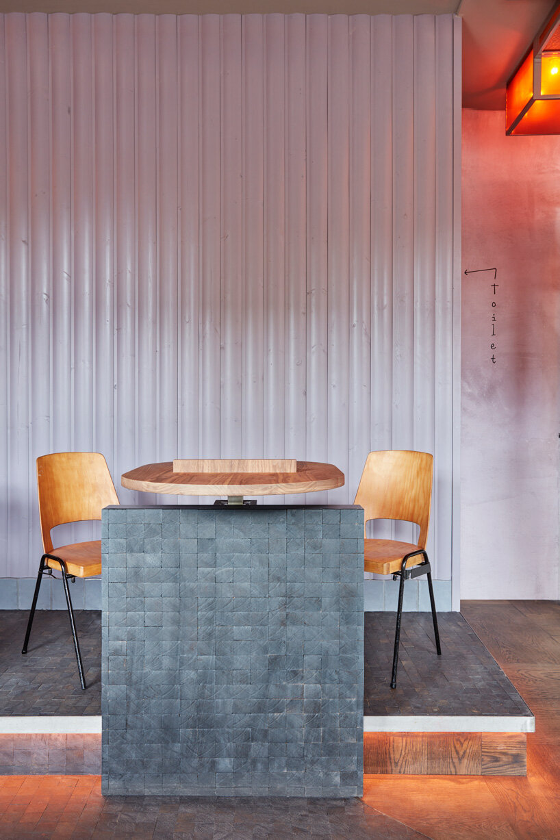
Ramona (2019), Amsterdam | read more here
how esther stam looks to context, heritage, and people
DB: The bar seems to play a crucial role in defining the character of your hospitality interiors. How do the rest of the spaces develop around it?
ES: Every Modijefsky project is unique thanks to a rigorous creative process rooted in each location. The site – not just the building but also the local environment – is carefully researched and analyzed to reveal and embellish the location’s story. An equal amount of attention is given to the brand or inhabitant of the new space in determining how their attributes, character, and heritage can be translated into a relevant, appealing spatial design and experience. The next step is to consider how the space could and should be used. Height, width, lines of sight, routing, light, and sight are explored and optimized in a spatial design in which everything is related to the location and the brand’s unique character. What we do is research all of these and see how we can mix these different data into a new formula. And use all the characteristics in a new way, creating a design language that can be translated into a spatial design.
To me, this is the magic and also the hardest part. But it generates something unique that fits because it is site -pecific. You never really know how you get there, and in the middle of the process, you sometimes get lost in the amount of collected facts, but at one point, it starts to crystallize, and the logic starts to appear. I believe that the bar is a spatial element that lends itself to celebrating the design language created for a specific venue. It’s also the moment when guests are welcomed; it should be inviting, tempting, advertising, and comfortable and seeking to guests without the barman needing to say a word.
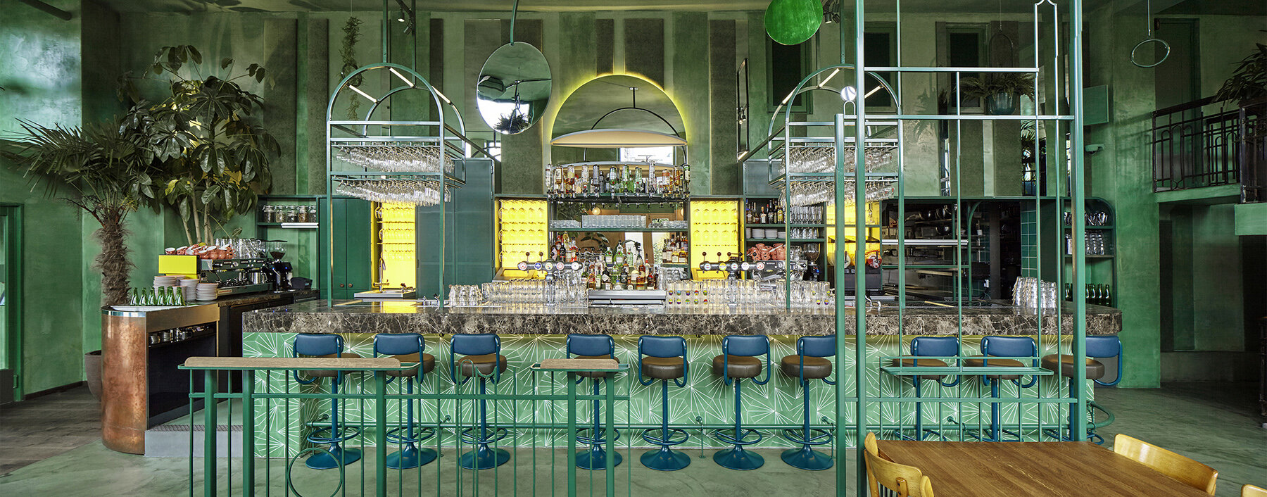
Bar Botanique Cafe Tropique (2016), Amsterdam
DB: Speaking of heritage and local context, how do you balance the familiarity of the past with a modern approach?
ES: This isn’t a story about how Studio Modijefsky started ten years ago and grew to be where it is today. In fact, it’s not really about the studio at all. It’s about people. We make space to create experiences, and that’s impossible without putting people at the heart of everything you do. Our story is about the people who come to us with an idea for a venue; the people they inherited the space from; the ones who built it and worked there to shape its history and character; the people in the neighborhood who tell us what everyone used to call the place, what a crazy owner used to get up to after closing time, and what kind of products used to be made there; the people who we work with to create handmade, custom-designed interiors; and last but certainly not least, the people who will come to the new space to make new connections and memories.
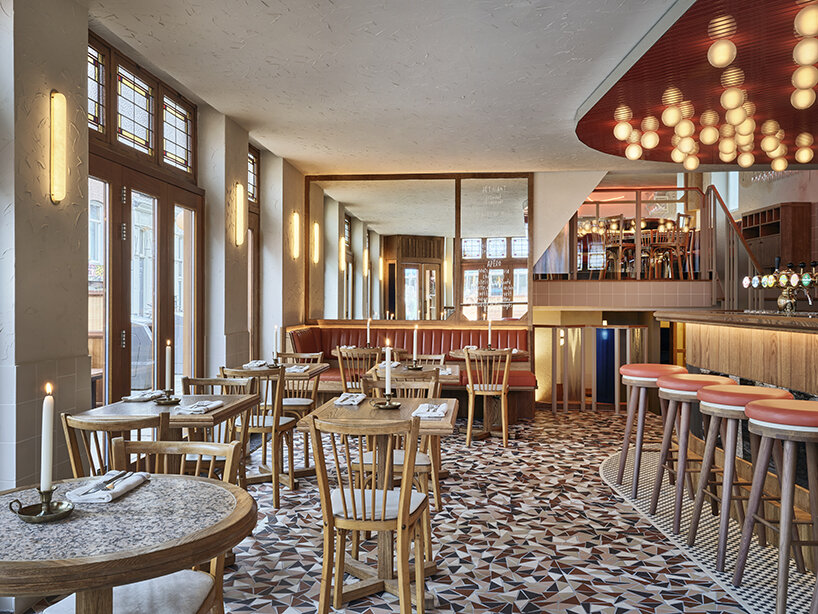
Café Manger Ami (2023), Amsterdam
ES: All these people contribute to the stories we create. All these stories culminate in one moment when a guest stands in front of a door for the first time. They might have booked a year in advance, or they might have taken a wrong turn. However they got there, they’re going to have expectations of what they’ll find inside. Our job is to ensure that everything, inside and outside, will work together to match, if not surpass, their expectations. It sounds like a big job, and it is. But thanks to all the people mentioned above, we can combine their stories into an experience that triggers visitors to explore, enjoy, play, touch, and simply be in that space.
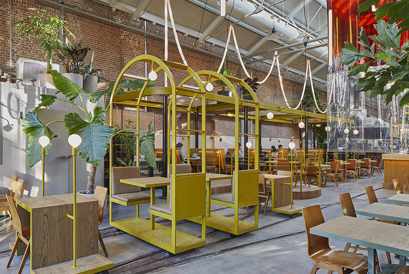
Kanarie Club (2016), Amsterdam | read more here
ES: Our story begins when someone comes to us with an idea. Together, we sit down to get to the bottom of what they want to achieve: the service they want to provide and for whom. In other words, what the space’s function is. Everything in the interior should contribute to enhancing it. If it’s a restaurant, it’s making sure each mouthful is sublime. If it’s a hotel, it’s keeping someone entertained for 24 hours in a place where going to bed is just as great as waking up.Once that function is clear, we can start exploring the dialogue between the space and what the people in it will experience. If it’s a store, how the products will be displayed to attract, intrigue, and provoke. If it’s a spa, how the routing will contribute to maximum relaxation. Everything that guests smell, see, touch, and hear (whether they’re aware of it on a conscious level or not) should contribute to the perfect functioning of that space and add a layer to its story. This is where our makers come in. Our relationship with the artists, craftsmen and trades who create one-off pieces for each location is also a dialogue.
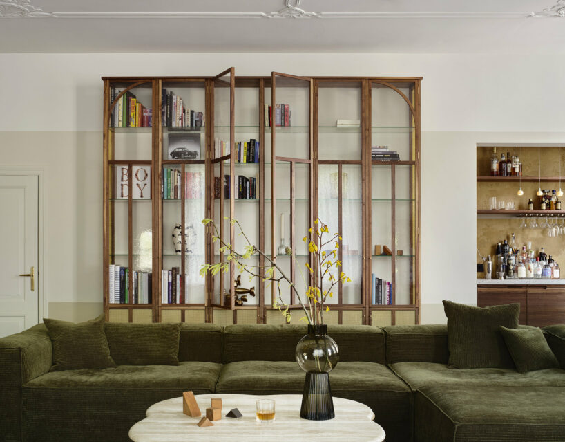
Home Dijkhuis (2021), Amsterdam
ES: Together, we search for new connections between the space, its context, and their craft. We don’t know half as much as them, but that’s not a bad thing. Fresh eyes open new perspectives, and our conversations can push us and them in new directions. We might not always agree, and plenty of people probably think we’re as demanding as we are charming, but combining our detailed concepts and their expertise always gets an idea to the next level. We’re inspired by what they do, and we want to pass on that energy and our enthusiasm for their skill. This leads us to the most important people here, the ones who star in the second part of this book: the visitors who will see, feel, and breathe the things we design.
Our story only goes so far. We set the stage, fill it with props, then exit. Whatever happens next is up to the people who come after us. We could never imagine that the staff at Bar Botanique would add their plants to the interior, making it even greener, or that the pool at Kanarie Club would be used for everything from workshops club nights to somewhere for kids to play while their parents have coffee. In Bar Basquiat, people add their own layers to our story with the posters and texts they put on the walls and mirrors. That’s exactly the way it should be. It’s their space. We just make it.
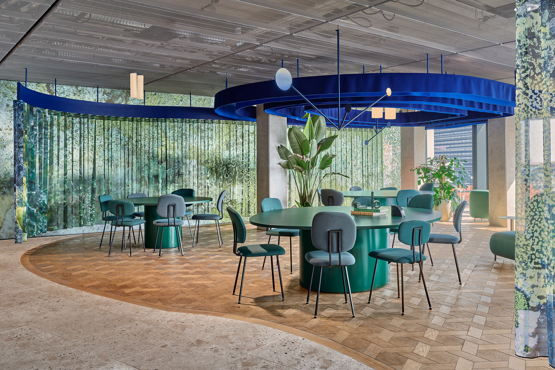
Booking.com City Campus Restaurant (2023), Amsterdam
DB: You recently took part in designing the interiors of the Booking.com City Campus in Amsterdam. What was that experience like?
ES: This was an inspirational experience for us. It was exciting to work closely with names we admire and see different approaches to designing while learning from each other. We approached this project differently. In our usual projects, we tend to follow a specific design path that we’ve honed over time. However, with this project, we had to pivot and approach it differently, mainly because we were part of a bigger design, even though we had our own island within it. We had to ensure that our work fit seamlessly into the greater design. The end result is something we’re very proud of. It’s also gratifying to see how all the designs work harmoniously together. This experience has been both professionally fulfilling and enriching, allowing us to expand our horizons and build strong connections with others in our field.
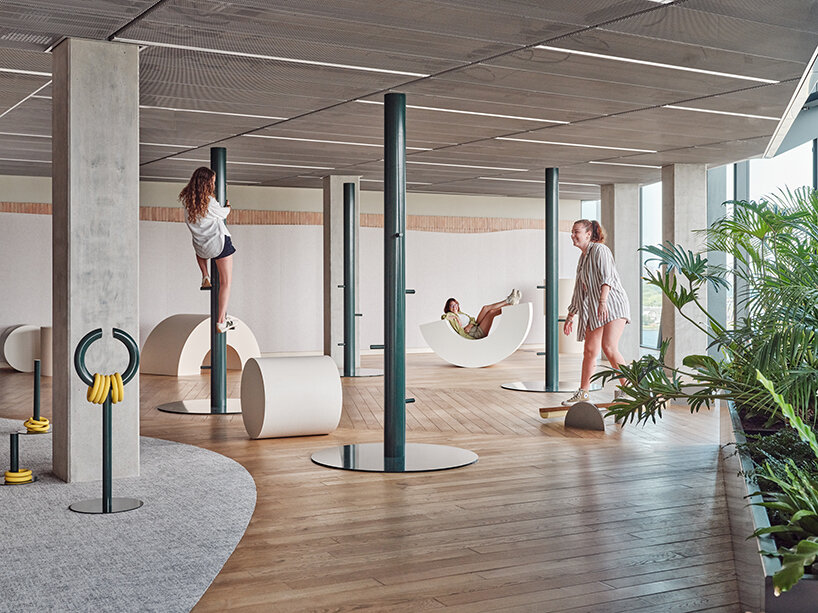
Booking.com City Campus Connector (2023), Amsterdam | read more here
DB: And what are some of your favorite projects so far? What did you enjoy most about them?
ES: I always love the latest project we work on, in this case Gitane, where we worked with a very talented chef and created a space that fits like a glove for him and his team. We worked extensively with terrazzo and pushed the boundaries by using this material’s full potential. We created seven unique ‘recipes’ for the terrazzo. Defining the color of the cement and the stones: type, color, size, and amount. We used a mix of terrazzo for each spatial element (bar/bench elements/service point), pouring them into the mold and then intuitively blending them into organic shapes.
I also loved Blauwe Theehuis because it was such a unique location- and the architecture was inspiring. With many Amsterdam inhabitants watching what we would make of it, this felt like quite a prestige project. The Roast Room, too, because it was a collaboration with Studio Molen, and we designed so many custom things, from tiles to lights, from the longest tables we ever drew to an entire meat vitrine.
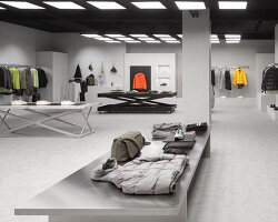
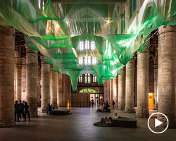
Designing the Wolford stores was also nice because it was so different and, again, going into detail regarding the products and display and making so many custom elements. But, for example, the chandelier and public spaces of Museum Arnhem in the beautiful monumental dome were also quite a dream. But now we are working on a cinema brasserie space in Dordrecht that will also be cool.
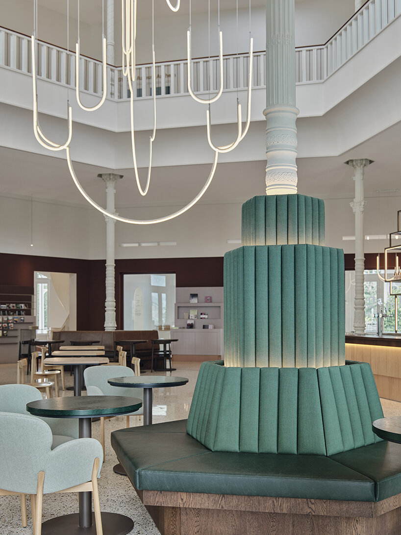
Museum Arnhem public spaces (2022), The Netherlands
DB: Is there a dream project or location that you wish to take on?
ES: Of course, lots! For starters, a boutique hotel in a beautiful setting, whether on a Greek island or between the olive trees in Portugal. A place where people are sleeping, eating, and spending all hours of the day, offering them different spaces, moods, ambiances, and possibilities. From a pool bed to a perfect hotel room, from a herb garden to a small cocktail bar. The secret treehouse somewhere on the estate and the library with a fireplace, offering the perfect backdrop for the ultimate hospitality experience and an unforgettable journey.
I’d also like to work on a wellness project somewhere in the middle of nature, with a jaw-dropping surrounding of lush tropical greens or a mountain breeze. Working with local materials and refined details, a place to soothe the mind and invite people to withdraw and land in the here and now. Next up is a very specific shop — for example, a perfume store or hat maker — a destination where people go for the experience as much as for great service and quality products, not loads of them, but a very strong and distinguished selection…A restaurant, cocktail bar, or anything in New York City..and so much more!
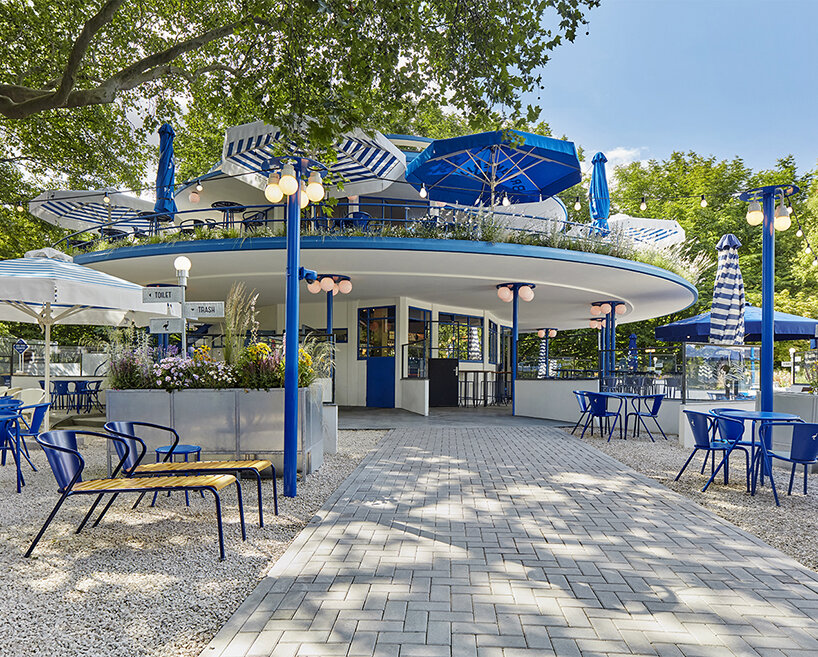
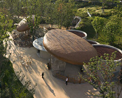
‘t Blauwe Theehuis (2019), Vondelpark, Amsterdam | read more here
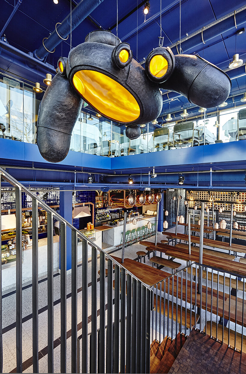
The Roast Room (2015), Amsterdam
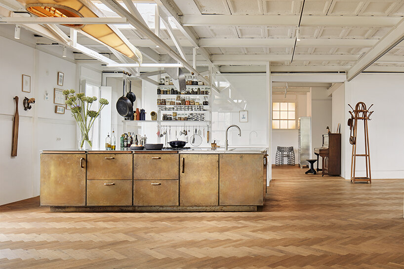
Home Ketelhuis (2020), Amsterdam
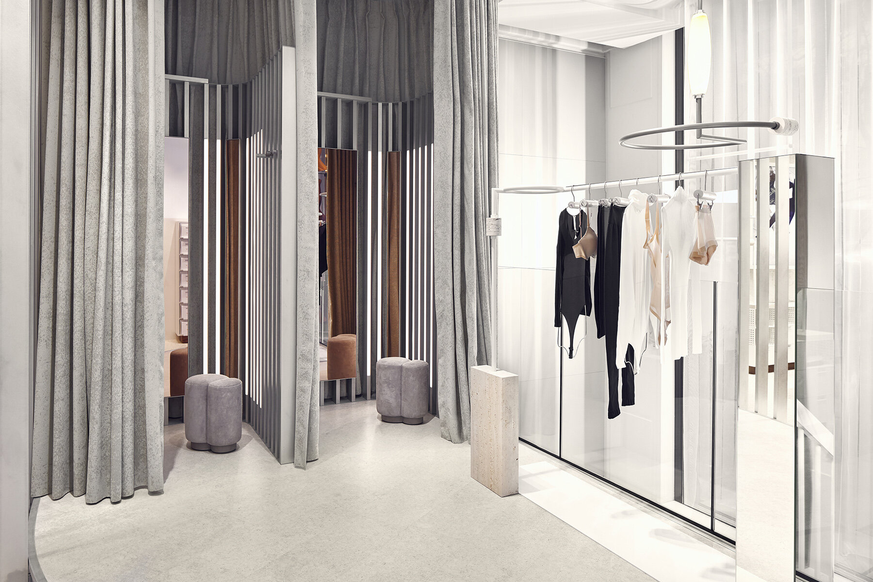
Wolford Amsterdam Flagship Store (2019), The Netherlands
project info:
interviewee: Esther Stam
practice: Studio Modijefsky | @studiomodijefsky
photographer: Maarten Willemstein | @maarten_willemstein
happening now! thomas haarmann expands the curatio space at maison&objet 2026, presenting a unique showcase of collectible design.
