‘LEAD’ type damaged with various tools left: lower case ‘t’ right: uppercase ‘t’
‘LEAD.’ designed by dutch graphic design studio autobahn is a font made of lead characters which have left their print on paper in the heat of battle. while not completely finished, these typefaces are pressed together under high pressure and maimed with various tools. conceptually, ‘LEAD’ examines whether images of lifeless objects, in this case lead printing type, generates the same intense emotions as images of wounded and fallen soldiers. the conscious decision to use red ink helps to support this conceptual exploration.
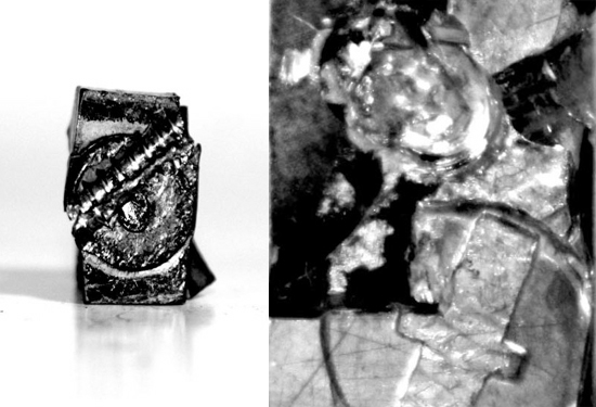 left: lowercase ‘o’ right: detail of lowercase ‘t’
‘LEAD’ is featured as part of grey tone publication which showcases the collective work of designers from ten other dutch cities. the theme for this edition is ‘MyCity’ and asks each participants to contribute their vision of their respective town, their scene or their own design sense. the release of the book will take place during graphic design festival breda, a bi-annual event on graphic design in the netherlands.
‘LEAD’ type
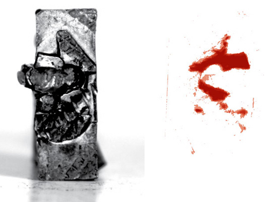 lowercase ‘t’ printed with red ink
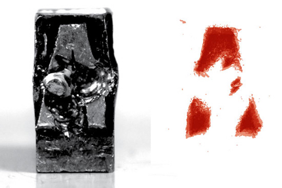 capital ‘a’ printed in red ink
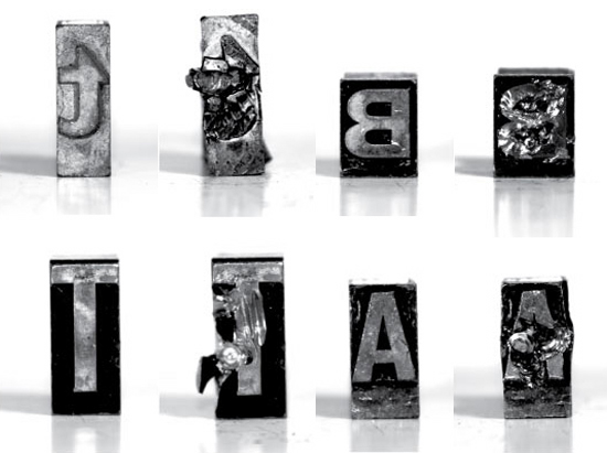 lead type
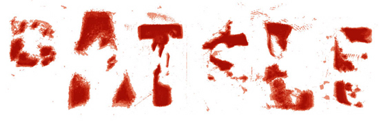 ‘battle’
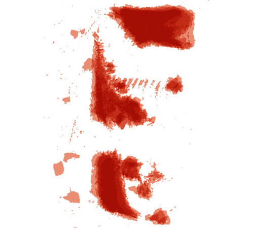 capital ‘e’ printed in red ink