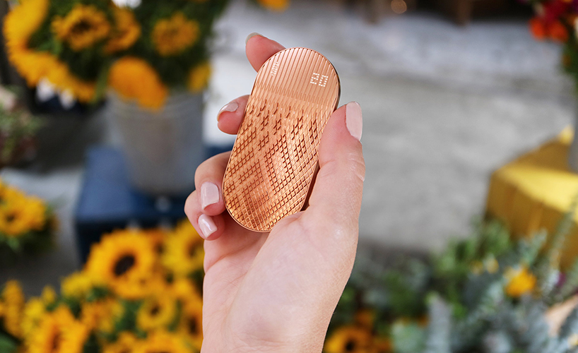
if you could really feel your digital money–in the same sense that you can hold a roll of bank notes–would you spend it more wisely? this is the question behind ‘scrip’, a digital money product concept from the studio behind fitbit, newdealdesign. as companies like apple make financial transactions virtually invisible, the san francisco-based design studio envisions a future where every purchase is a literally weighty decision in the palm of your hand. to bring this dream to reality, it’s built something sleek, sensible and a little science-fictional.

scrip digital money designboom


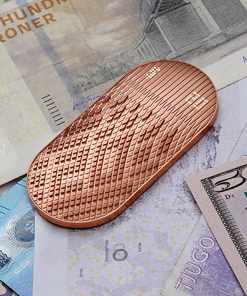
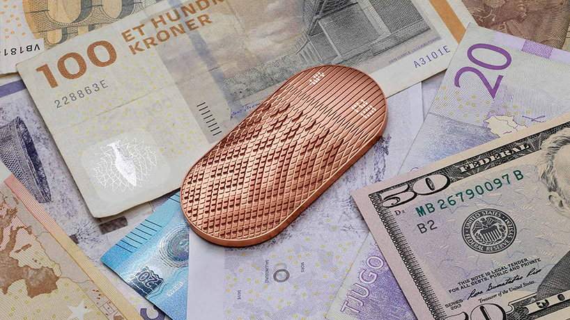
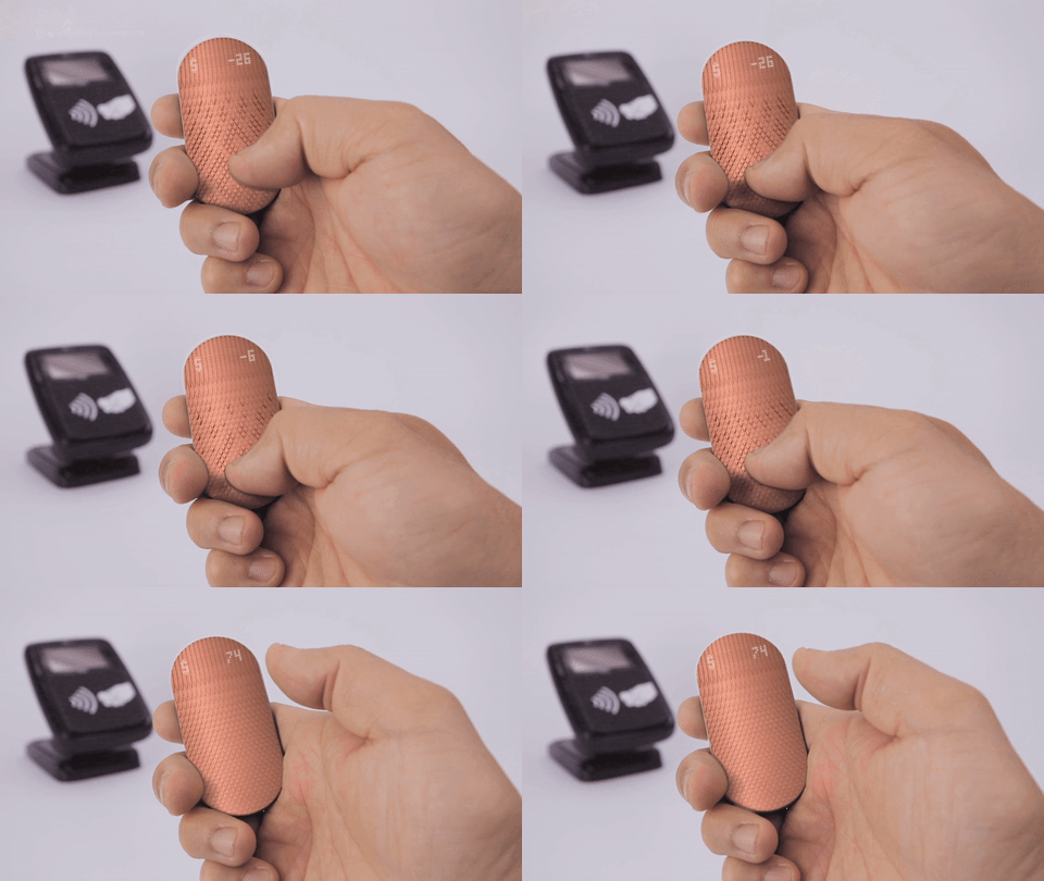
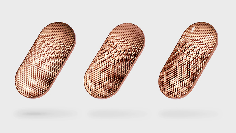
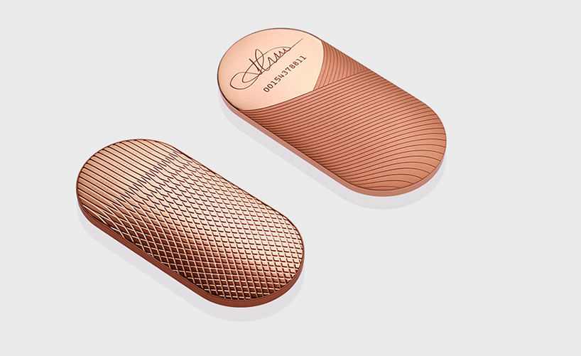
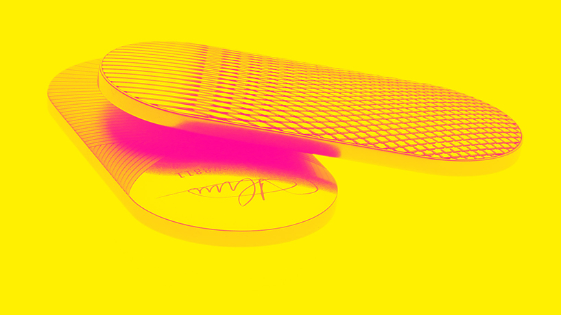
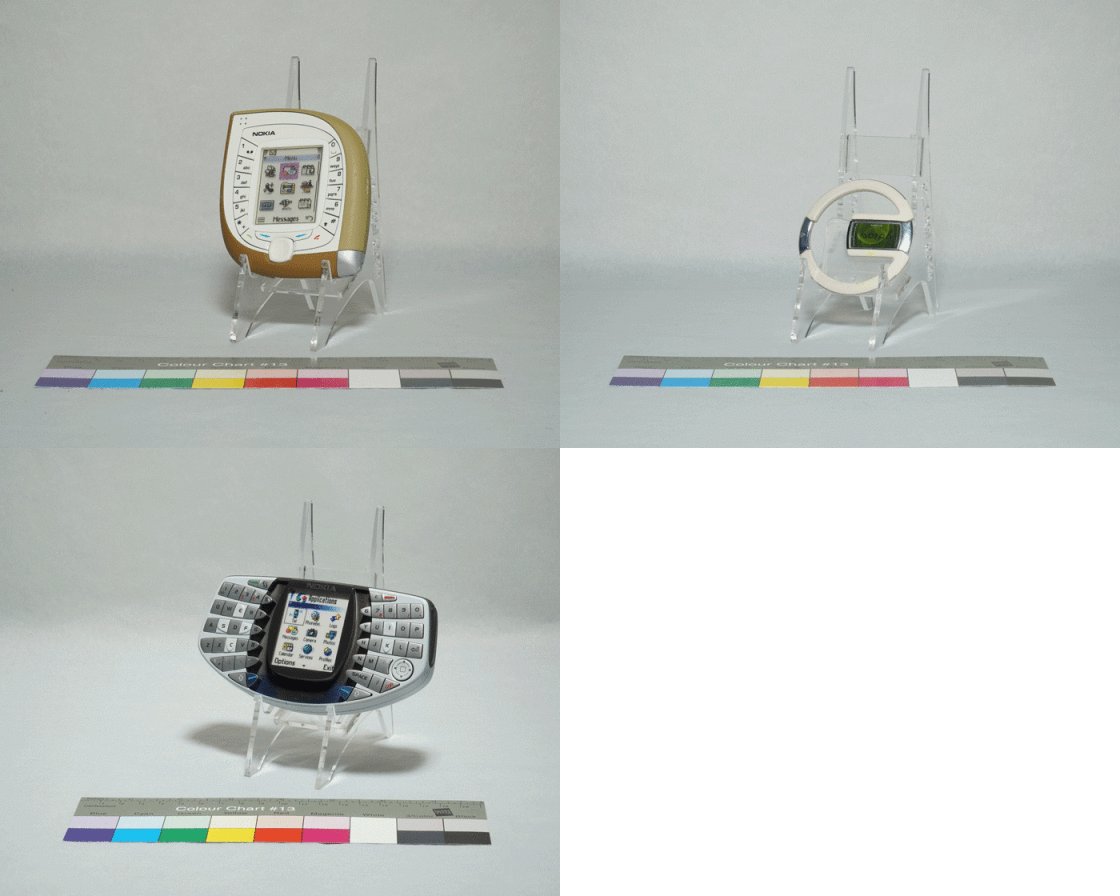
‘scrip’ is a copper capsule that’s smooth on the bottom and ridged on the top, with space for a tiny numerical screen at one end. in reality, it exists as a trio of solid, non-electronic iterations. but in newdealdesign’s prototype, the tiny bumps on top would act like a braille display, rising and receding to create numbers. in order to buy something, you’d point the device at an NFC payment terminal, swipe your thumb across its surface, and it would feel like peeling bills from that roll of cash. for a $16 charge (or one that rounds up to it), you’d swipe once across a ’10’; once across a ‘5’; and once across a ‘1’. this cost is then automatically deducted from an online wallet, while its remaining balance is viewable with a long press. friends can pass each other money by tapping ‘scrips’, and people can set the digital cash product to ‘lock up’ if it gets too far from their phone.

scrip digital money designboom


‘the main thing about user interface (design), primarily, is thinking about the efficiency of the action from a system perspective, not necessarily from a visceral emotional human perspective. it’s measured like, how fast can you do something?’ says company founder gadi amit, who has also worked on products such as the fitbit. even when designers do aim at triggering visceral emotions, they’re usually supposed to be positive ones. ‘scrip’, while it might be gorgeous, it also is designed to make you feel a little bad.

scrip digital money designboom  


perhaps the most convincing case for ‘scrip’, beyond the fact that it is so visually appealing, is that it could effectively teach children about budgeting. ‘I have a two-and-a-half year old kid, and I was thinking, in this age where i’m buying things with my watch now, he’s going to grow up with so little sense of why it’s okay to buy this $5 thing but not a $25 thing,’ comments jaeha yoo, director of experience design. ‘it’s the same tap.’ scrip could replace refillable debit cards that some parents have opted to buy, adding features like making users swipe more slowly, the more they spend.

scrip digital money designboom


above all, ‘scrip’ would be a money-saving tool that signals when you have money to burn. as a concept, it doesn’t have a price, but it’s clearly supposed to feel precious. rounding off transactions only makes sense if you aren’t carefully counting pennies in your bank account. ‘scrip’ would be a fantastic set piece in a star wars film, and the idea raises pertinent questions about the effects of tactile sensations; the psychology of user interfaces; and where exactly we situate the value of money.

scrip digital money designboom

scrip digital money designboom