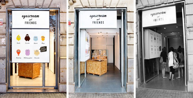
‘eyescream friends’ by marion + merche barcelona
using imported shaved ice-cream from taiwan, a creamery designed by barcelona-based architecture and graphic studio marion + merche solves the problem of unattractive amorphous masses of ice cream with lots of sauces and toppings falling off the sides. by creating a strategy to address the issue, a deconstruction of the desert results in ‘eyescream’ – a series of monster-like forms come to life with personality. as key creative twist, two sugar eyes are placed on the top of this ice cream mountain, making each character unique for each flavor. additionally, well-thought out packaging is presented with simple construction: a tray that fits the ice cream container and two containers for toppings (jam, chocolate sauce, caramel, etc.).
being confronted with the actual location, a self-serve formula is realized to best fit the product. low cost wooden boxes are constructed for service, concentrating all the consumer experience. a fragmented facade, is organized with a large sign with “legs” that have the ability to break down into a number of signs when open to the public.
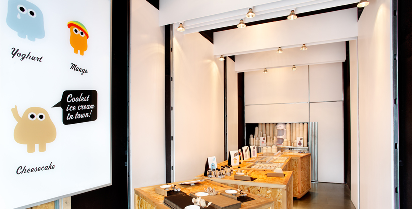 interior
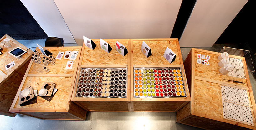 self service toppings counter
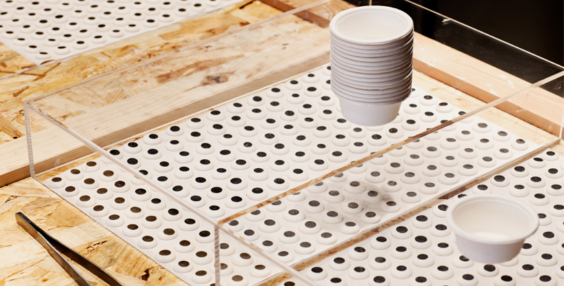 lots of eyes
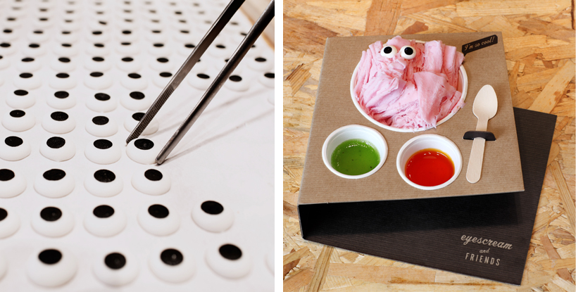 the eyes turn the ice cream into little monster
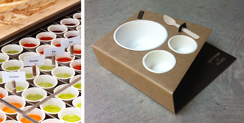 packaging
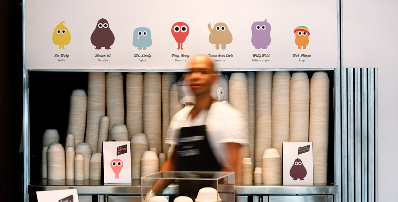 interior
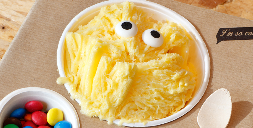 product design
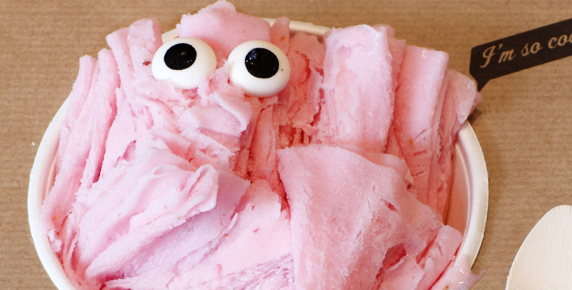
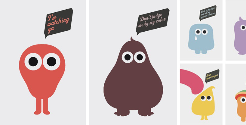 branding
designboom has received this project from our ‘DIY submissions‘ feature, where we welcome our readers to submit their own work for publication. see more project submissions from our readers here.
