logo moleskinerie «eselsohr» by mario zoller from switzerland
designer's own words:
this version of the moleskinerie logo has a very simple inspiration. a typical character of the moleskin sketch books are the round corner. so i created logo with a font with round corner, witch should represent the round corners of the pages. and with a little change at the letter m, i created graphic element, witch looks like a dog-ear of a book.
logo m positiv
 logo m negative
 logo moleskinerie positiv
 logo molekinerie negative
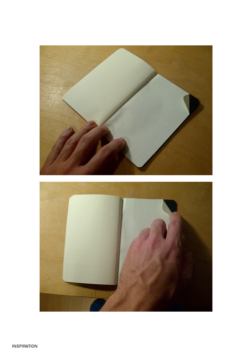 inspiration
shortlisted entries (2162)