top image: walkNYC pedestrian maps kiosk by the pentacitygroup
the new york city department of transportation (DOT) has introduced walkNYC, a new program of pedestrian maps designed by the pentacitygroup, a special consortium of designers that includes pentagram‘s new york office, wayfinding specialists cityID, industrial designers billings jackson design, engineers and urban planners RBA group, and cartographers and geographic information specialists t-kartor. the team worked closely with DOT and the city’s local Business Improvement Districts (BID) and other institutions and agencies to develop the program.
 the kiosks present two maps, one of local streets and the other of the area’s location in relation to a larger section of the city.
pentagram have been working on the project since the late summer of 2011 and were responsible for a unique system of icons for the maps, including the drawings of the landmark buildings. the graphics use a custom version of helvetica created by monotype for the program. helvetica was chosen to complement the iconic graphic language of the new york city subway system, originally developed by massimo vignelli and robert noorda at unimark. walkNYC’s customized version, helvetica DOT, makes all of the font’s square dots round, giving the program its own look.
‘we thought long and hard before we committed to using helvetica, and sampled a number of different typographic approaches first. but the helvetica approach was just so authoritative and so ‘new york looking’ (and it’s a swiss typeface, of course), that it was too hard for all of us to resist. having the pedestrian wayfinding, the new bikeshare program, and the subways all seem to work together reinforces the goals of the DOT and commissioner janette sadik-khan to create a system that acknowledges all the different ways we move around the city.’ – michael bierut
 user testing of a prototype.
 the maps are printed on clear vinyl, which is applied to the second surface of the glass.
 the maps use a ‘heads up’ orientation that corresponds to the direction the user is facing.
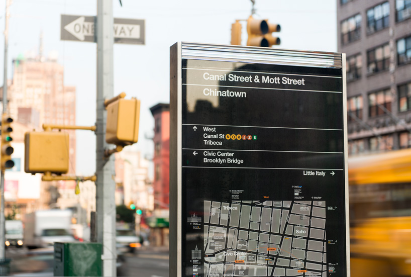
each side of the 8 ½ foot tall kiosks displays a large map of the streets within a 5-minute walking distance and another map showing the area in relation to a larger section of the city. the orientation of the walkNYC maps uses ‘heads-up mapping’ in which north, south, east or west is rotated to correspond with the direction the user is facing. if you’re facing south in manhattan, the top of the map is downtown, and the bottom is uptown; on the other side of the map, the information is reversed. the design was extensively tested with pedestrians, who found it easy to use; in the city, it is often hard to know which direction one is facing.

a range of kiosk and signage types have been designed for the various urban environments and locations around the city (at intersections, mid-block, in plazas, etc.) the maps are printed on clear vinyl, which is applied to the second surface of the glass. the vinyl is easily removed and the glass reused for any updates to the map.
‘the biggest lesson for me was how unique it is to do wayfinding in a major urban area like new york. wayfinding for an airport, as challenging as it can be, has fairly simple goals: get the departing passengers to their gates, and get the arriving passengers to baggage claim. the goal of an urban wayfinding program is no less than exposing everything the city has to offer to anyone, coming from any direction, going towards any destination. where do you put the signs? how much do you say? how do you say it? you have to anticipate the needs of millions of users, no two of which will have exactly the same frame of mind.’ – michael bierut
 a range of signage types has been developed for different urban environments.
 hierarchy of information on a sign.
 a customized version of helvetica was created for the program…
 which replaces the square dots of helvetica with round ones.
 placement of building labels.
 icons designed by pentagram for the program were drawn to match details in 18 pt. helvetica DOT.
 a selection of the new icons.
 illustrations of landmarks created for the maps.
 icons for the pepsi-cola sign, the chrysler building, manhattan bridge and the soldiers and sailors memorial arch.
 the landmarks are layered into other information on the map. subways are indicated by tabs that resemble station signs.
 ‘you’ icon that locates the user on the map.
 the color palette is inspired by the colors of the city.
 how information is arranged on the maps.
 some
some


 WalkNYC logo
 ‘you’ icon on the back of a t-shirt.
pentagram also designed the graphic identity for the program. the logo appears at the bottom of the new signs, and will eventually be used to endorse any maps that use graphic language of the program as ‘official’ city maps.
this past monday DOT commissioner janette sadik-khan unveiled the initiative’s first signs at a news conference in chinatown, where four maps were installed over the weekend. in addition to chinatown, the first phase of the program will be implemented this summer in midtown manhattan, prospect heights in brooklyn, and long island city in queens, with more to follow next year in other parts of the city. the maps are already installed on over 300 kiosks of the citibike bike-share program.
—project team
pentagrammichael bierut, partner-in-charge and designer; tracey cameron and hamish smyth, designers; jesse reed, icon designer; tamara mckenna, project manager.
cityIDmike rawlinson, harriet hand, david gilliam, sam coultrip, rachel abrams, matt jephcote, jason smith and jenny janssen.
t-kartordavid figueroa, charu kukreja, wendy bell, kathryn green, rich perkins, jeff vonderheide, hanna lindahl and thilda garö.
RBA groupjackson wandres, chris lucas, klaus weidemann and kevin ballantyne.billings jackson design: duncan jackson, eoin billings, paul leonard, aidan jamison, dale newton and simon kristak.