‘halftone satisfaction’ by sagmeister & walsh for the luxe project by moo
the luxe project initiative partners up leading creatives with moo – the award-winning online print business – giving them free reign to develop a limited edition collection of cards. each set is showcased for a month, with 100% of the proceeds made from their sales being donated to a charity of the designer’s choice.
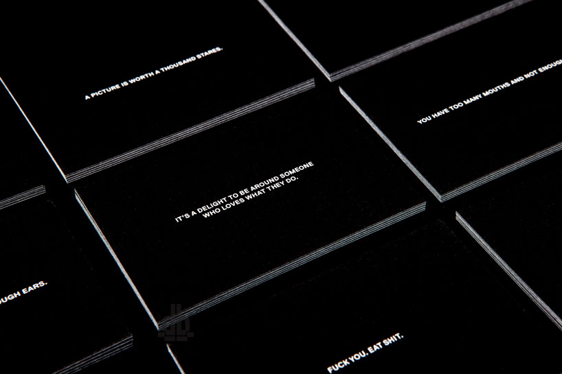
sagmeister & walsh‘s ‘halftone satisfaction’ is composed of seven business-sized cards, each printed with a message that is meant to elicit a particular reaction and stimulate dialog between the distributor and the receiver. the name of the series indirectly refers to both the short written note on their fronts, and more literally to the application of black dots to change the range of tone from solid white to solid black on their backs– white extends a more positive a statement: ‘it’s a delight to be around someone who loves what they do‘; and the more black, the darker the message: ‘you have too many mouths and not enough ears‘. the individual notes are meant to be handed out to anyone you may meet, whether or not they annoy you or bring you joy. ‘it’s a test of what kind of a person you are and what kind of people you meet… which cards would you give out and why?‘, says stefan sagmeister.
sagmesiter & walsh have chosen new york’s coalition for the homeless as their charity of choice, as sagmeister has been volunteering for the organization for more than 10 years. with his close association, and having first hand seen the benefit of its services on helping individuals in need, he knows that the coalitionwill put the money to good use.
 each of the seven cards in the limited edition series offers a message to its recipient…
 ‘it’s a delight to be around someone who loves what they do.’
 ‘your eyes are lovely.’
 ‘a picture is worth a thousand stares.’
 ‘you have too many mouths and not enough ears.’
 ‘you are a waste of time.’
 ‘rude!’
 ‘fuck you. eat shit.’
 each set of cards is packaged within a white box
 full range of ‘halftone satisfaction’
 more literally, the title of the set refers to the halftone graphic application on the backs of each card
 cards with lighter backs (white) share a brighter message, the progression of tone resulting in black offering a darker note
 detail of the black dot sizing

 halftone range on the backs of the cards