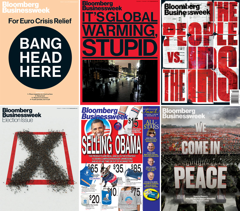
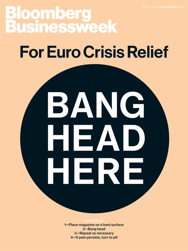
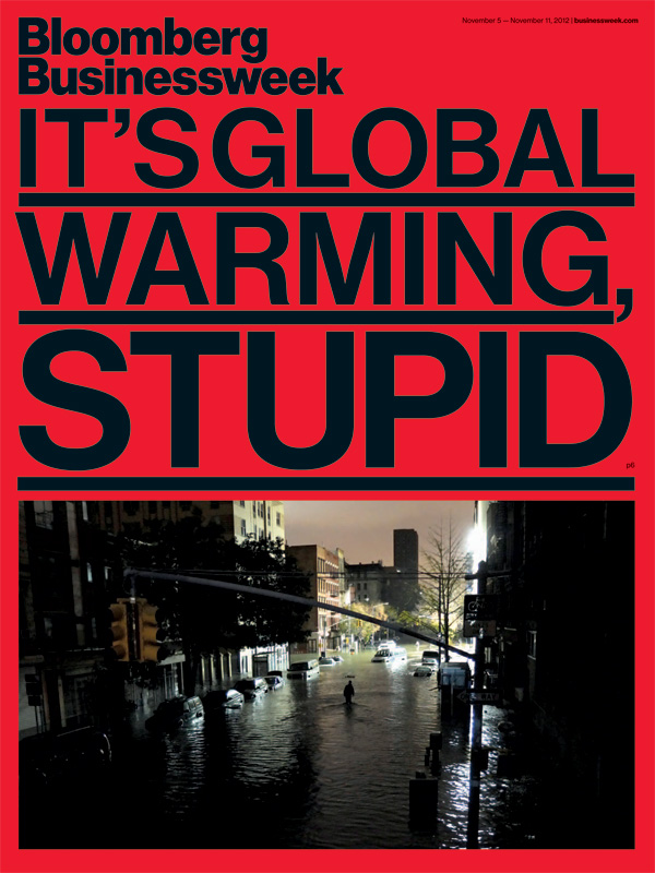
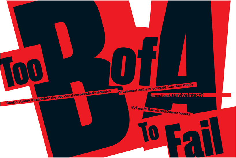
selection of bloomberg businessweek covers designed by turley and his team
richard turley (RT) tells designboom (DB) about his role as creative director for bloomberg businessweek its design, production and his thoughts on how digital and printed news publications compare.
DB: please could you tell us about your background?RT: I studied graphic art at liverpool art school, UK and then went on to work at the guardian. the guardian sponsored a competition to design a university magazine and I got work experience as part of the prize. after that they took me on full time and I worked in a few departments there, where I ended up assisting the creative director mark porter on special projects.
a few months after I started working with him we experimenting with different formats (the guardian was at that time printing a broadsheet paper). mark oversaw that process and we spent two years working on what would become the berliner redesign. after that launched I was made art director of the G2 section, which is a daily features magazine, printed half berliner size and folded into the daily paper. I did that for a couple of years before moving to new york to do businessweek.
DB: when you were hired as creative director for bloomberg businessweek what were the objectives you were given or set yourself to achieve?RT: to reinvent the magazine. there was a long brief given to me by the editor josh tyrangiel, the details of which escape me now, beyond overhauling it completely. I didn’t really give myself any objectives that I recall, to not fuck it up I suppose.
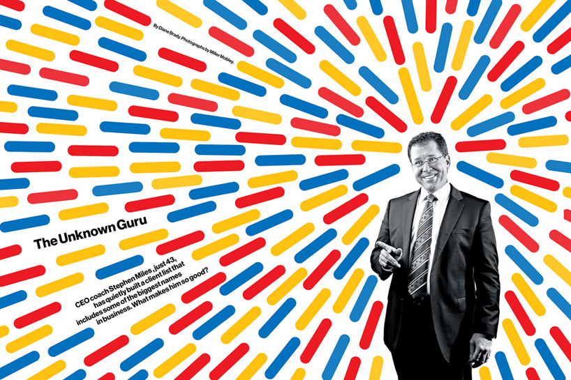
DB: what direction did your instincts tell you to go with regarding the new design and how close is the current format to what you initially had in mind?RT: I followed the brief given to me. what you see in the magazine now is fairly close in many ways to the initial proposal I made, which was done in a very short amount of time. I decided to use helvetica during my first phone call with bloomberg about the magazine. I knew christian schwartz had begun to redraw it – going back to max miedinger’s original drawings (he started that for an early version of the guardian redesign a few years earlier). I was bored with custom type at the time, and even thoughthis was a piece of custom type inasmuch as we commissioned it, I couldn’t be bothered to begin a quest for a sans serif typeface that looked ‘a bit like helvetica’. if there was any sense of risk with the design it was that helvetica is such an overused, tedious typeface and that to base a redesign around it, might be considered quite brave.
I was also aware that since I came from the guardian that I would be seen as trading off the heritage of my former employer and though I resisted that at the time and was annoyed if people wrote that, it was absolutely what I was doing. I was younger and inexperienced, really totally out of my depth but pretending everything was OK and bluffing that I knew what I was doing. I needed some familiarity to hold onto and what you see in the design of businessweek is what I learned under mark porter, broadly the same type rules we used at the guardian, same very strict modular grid based principles.
the irony with that is that that really isn’t the sort of designer I am, I think you can see that when you look at what the design has evolved into. I’m much less disciplined.
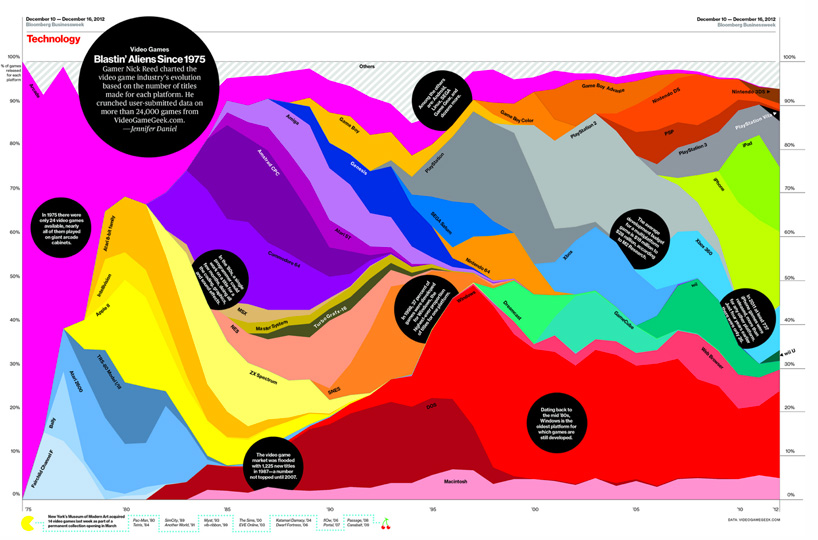
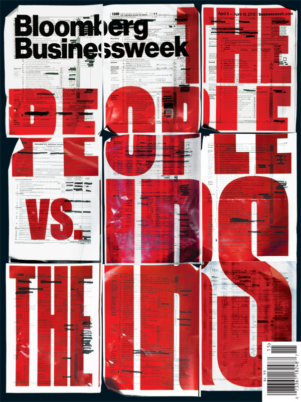
DB: can you describe the process of how each issue is designed and finalized for print?as you might expect it takes a week to do each issue, on thursdays we start with meetings about what’s in the magthen on friday there are more meetings and at the end of the day a first walkthrough to see initial designs and running orders etc. but really we don’t start doing the magazine properly till monday. monday is when the story order gets firmed up and doesn’t tend to change much after that. tuesday tends to be our busiest day, when we work late. the magazine has to be shipped by 7PM on wednesday so wednesday is more a finessing day.
the week can be easy or frenzied depending on a variety of factors, but I think generally we’re pretty organized. I have around 15 people in the art department encompassing design, graphics editors and picture editors. though there are those three distinct sections within the department, those distinctions are becoming more and more lose. I deliberately want people who are able to bridge the divide between sections. picture editors who can draw, that illustrate. designers who can do charts, who can illustrate, who can take pictures. chart designers who design pages,illustrate, take pictures and so on. we don’t have a picture editor who can design yet, but a couple have shown an interest and I’d love to see that happen.
I want as many voices in the magazine as possible. the design and type is quite formal and boring when you really look at it, helvetica and a lot of strict grids and order. so I want people to fuck that up and to impose their own identity on the pages. that’s what I think we have here, a lot of competing personalities which is something to be celebrated rather than bulldozed.
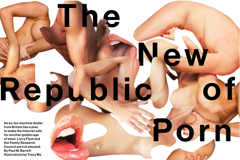
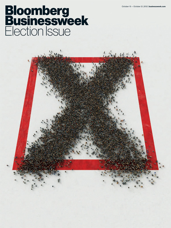
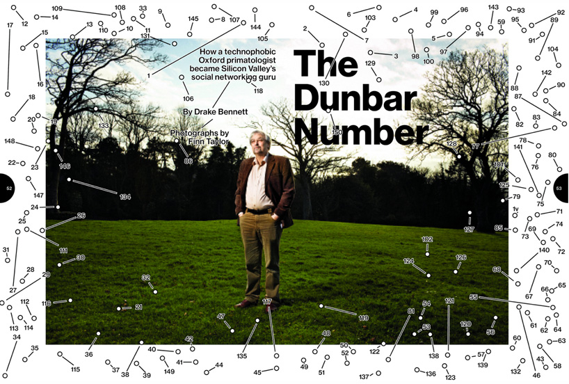
DB: which covers and articles have you enjoyed working on most?certainly the special issues of the magazine, when we clear out the normal running order and reinvent the magazine in some way or other. the three most successful examples of those would be the ‘2010 year in review issue’, ‘the 2011 steve jobs commemorative issue’ and most recently our ‘2012 election issue’.
I just love starting again, with a blank sheet of paper and building a magazine from scratch. taking a reader on a journey through an idea, working out the sequencing, ordering, how best we can visualize an idea whilst bending the conventions of magazines a little.
apart from it being refreshing to work like this, you also learn a lot about what the magazine can do, as a format – how people at the magazine work, and the possibilities that printing on paper still holds. I still believe wholeheartedly in paper and magazines. I always will.
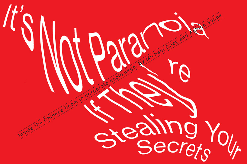
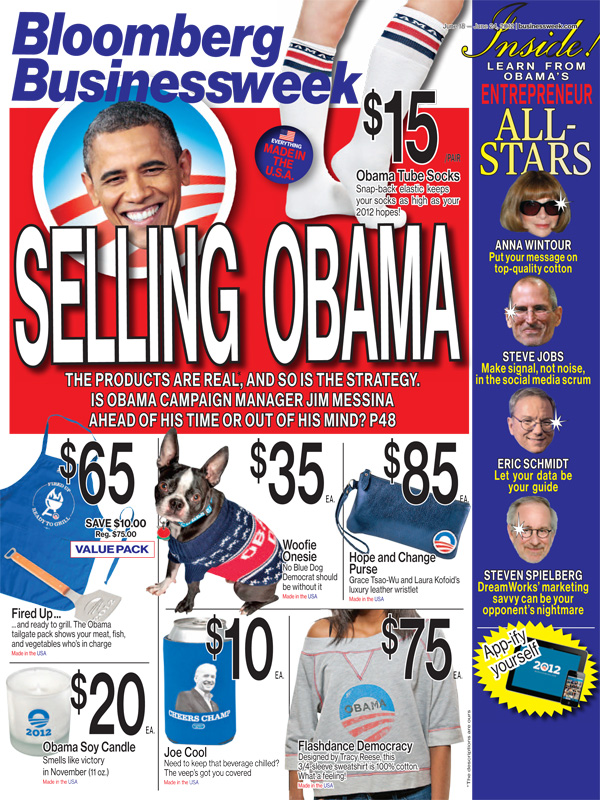
DB: how much do you think digital design influences the way people approach print or editorial design nowadays? especially in terms of content and how news is consumed in bite-size chunks rapidly online…RT: to be honest I don’t know. I think one of the things we did with the magazine is ignore the internet. don’t try and compete with it and second guess it. even with our own website – we deliberately decided to ignore the presence of businessweek.com in the magazine, so beyond a web address on the cover, you wont find cross-references for any website specific content in the magazine.
we want the magazine to be the whole experience and not allude to there being more exciting things elsewhere, it’s annoying to be told about content that doesn’t exist in the magazine thatyou’ve just paid $5 to read.
I don’t know whether magazines are now more design/image driven because of the internet, or because the software we use makes putting a magazine together much easier than it was, say 10 years ago, probably the latter actually.
I’m not sure you would pick up our magazine and think there aren’t that many words in. maybe the opposite actually, you’d have to conclude the longer story lengths must be our response to the shorter word lengths on websites… and maybe you’d be right. but we didn’t sit down and decide that. we tried to put together a magazine that we would want to read with word lengths we’d read regardlessof what’s popular on websites or apps.
we didn’t think too hard about it and we continue to not think too hard about it. we focus on telling stories, and explaining ideas, as opposed to trying to solve the problems of magazine publishing in 2013. there’s far too much of that. far too much crystal ball gazing. we need more people thinking about making great magazines and our industry will be just fine.
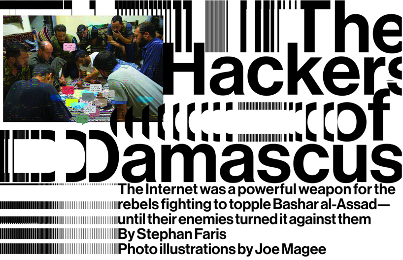
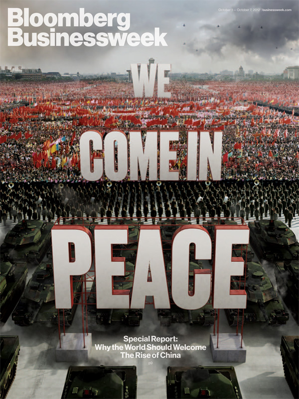
DB: what can we expect from bloomberg businessweek this coming year?RT: we’re going to have a little refresh but not so big that anyone will notice much. we want to put some new editorial in, think about the art/pictures a bit more. we have a few big issues in the planning stage which are exciting.
all I want to do is make things. magazines, covers, videos, interactive products… we just made a conference in san francisco and I’d like to do more of that, more events.my assistant tracy ma and I taught ourselves after effects recently, which opened up loads of possibilities for what we can do. I want our department to become a shop. that’s the aim.
I have so many talented people working here I want to exploit every opportunity with them. as a designer – as a person – all I want to do is create and explore and to share that experience with the people here, learn from them. explore with them. so as corny as it sounds… I just want to do more creating and exploring. for ever.
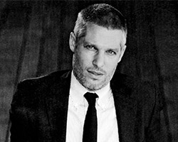
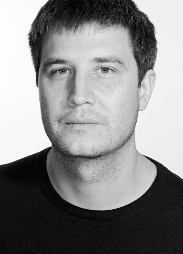 richard turley, creative director for bloomberg businessweek
