raisch studios creates unofficial tokyo 2020 logos with help from preschoolers
all images courtesy of raisch studios
michael raisch — lead designer at raisch studios — called upon an unlikely group to propose ideas for the redesign of the ‘tokyo 2020’ olympic games logo. armed with nothing but colored shapes and a slightly simplified design brief, his daughter’s preschool class was given free reign to create the ideal symbol. all logos were completed within the strict competition guidelines set by the international olympic committee but it should be noted that the project was developed for educational purposes only, with no intent to submit. raisch sees the results as a fresh perspective to olympic branding, and a clear indication of the significance of un-biased creativity and expression in logo design through crowdsourcing.
 listening to the brief
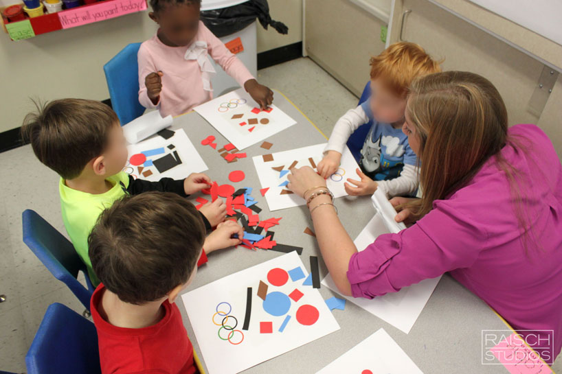 starting work
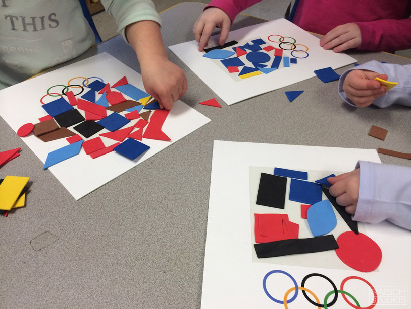 creating

original proposals for the ‘tokyo 2020’ games
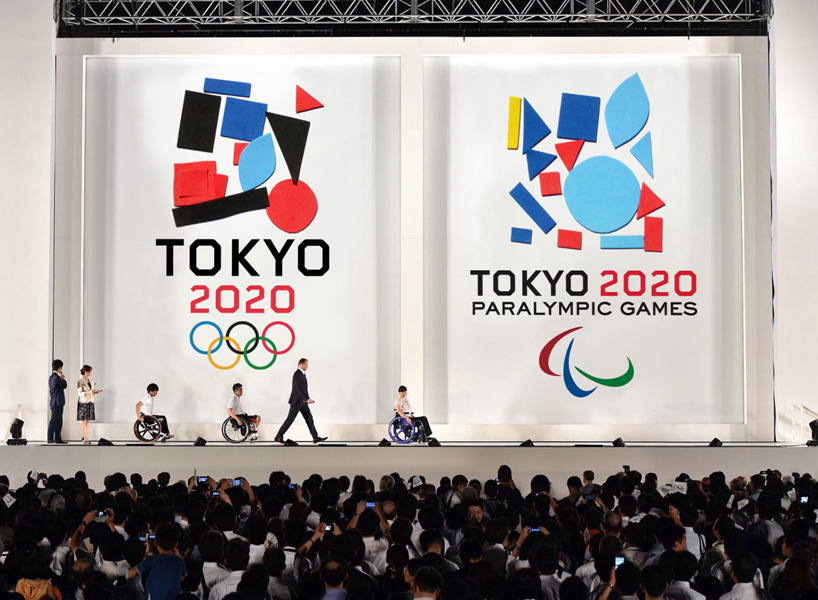
final ‘tokyo 2020’ logo design
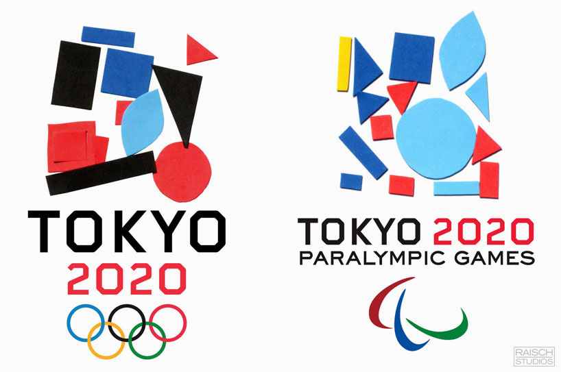
logos
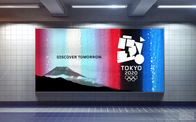
‘tokyo 2020’ promotional advertisement

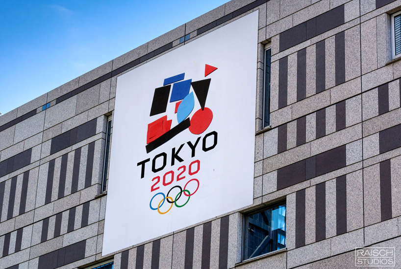
‘tokyo 2020’ signage
image by norman yusof
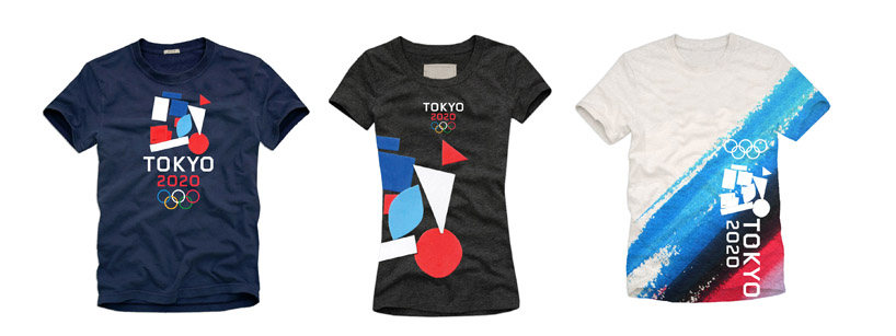
official T-shirts

airplane with ‘toyko 2020’ logo
image by gunnar kullenberg

detail
image by lorenzo giacobbo
designboom has received this project from our DIY submissions feature, where we welcome our readers to submit their own work for publication. see more project submissions from our readers here.
edited by: nick brink | designboom