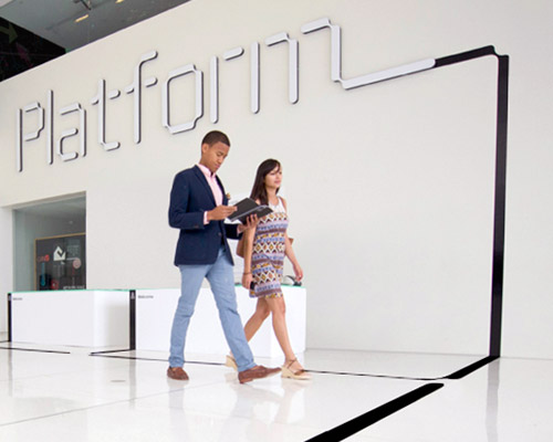
platform identity by pentagram – signage at the first platform summit held earlier this year
pentagram‘s eddie opara and his team recently designed the brand identity for the non-profit organization platform along with several digital and printed applications.
platform’s mission is to increase the interest and participation of underrepresented groups in the fields of technology and entrepreneurship, with a particular focus on african-americans, latinos and women. pentagram designed the identity and website for the organization, as well as the graphics for the first platform summit, recently held at the MiT media lab.

logotype
opara and his team worked closely on the project with platform founder and CEO hank williams, as well as with nicholas negroponte, the MiT media lab founder who serves on platform’s board of advisors.
‘as a first time event, for a new organization, our design had to reflect a level of gravitas and credibility that we had not yet earned. our website and event design elements delivered incredibly well on that goal. I think it’s fair to say the attendees at the summit were stunned by the look and feel of the event. part of that was the beauty of the MIT media lab. but the other part of that was the way the venue was transformed.’ – platform founder and CEO hank williams
the logo is set in the font threesix 11 (designed by muirmcneil), chosen for its futuristic, technological look. the wordmark has been extended with a distinctive line that can be customized for a series of transformations that reflect the dynamic nature of the organization.
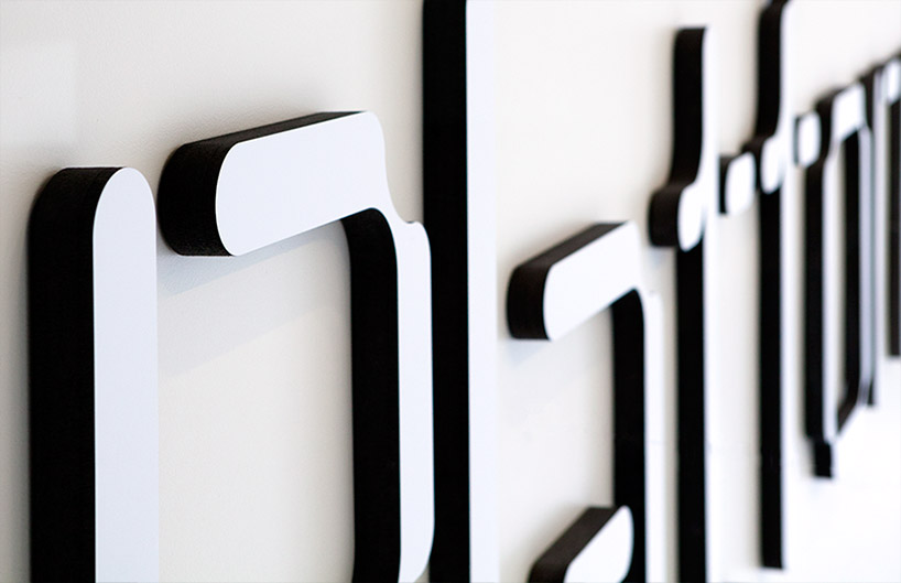
detail of the logo sign at the platform summit
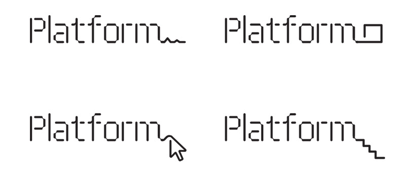
variations of the logo
the line can appear in an endless variety of forms and shapes: lengthening to convey the idea of connection or inclusion, or taking the shape of stairs, an arrow cursor, or the peaks and valleys of a chart. the line was animated for motion graphics projected before the summit presentations; in environmental graphics at the conference, the line extended from the logo to travel through the event space.
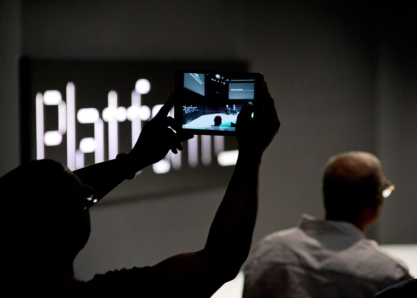
logo used at the platform summit
some of the icons created for the brand identity
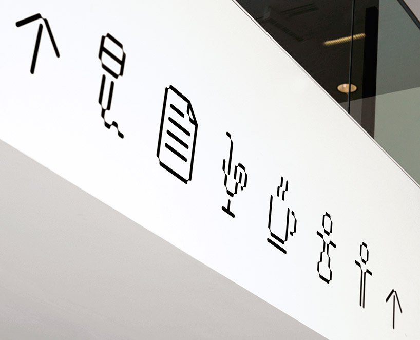
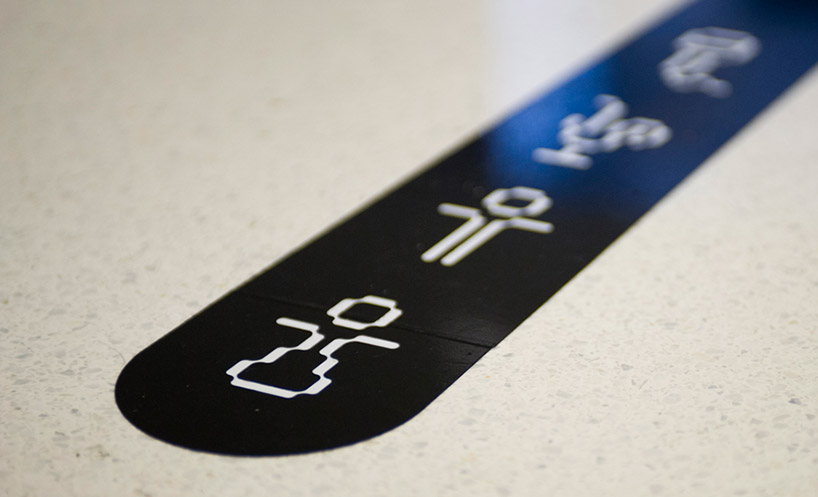
the designers used the structure of the threesix 11 font to develop a system of unique, playful icons for the summit collateral and environmental graphics. the icons appeared in patterns on the summit guide and in directional signage at the conference. each summit will have its own graphic look that is used in conjunction with the platform identity, and for the first conference, the materials were produced in a strong, simple black and white, with typography set in the font new rail.
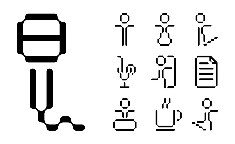

platform icons
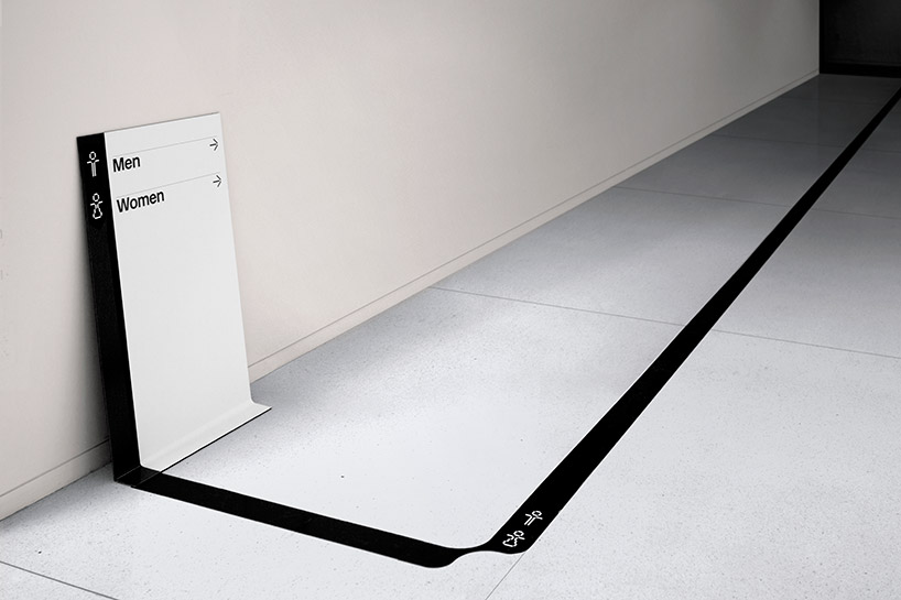
wayfinding signage at the platform summit
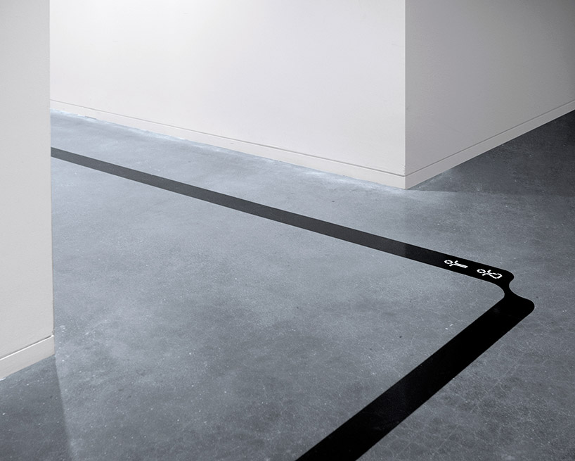
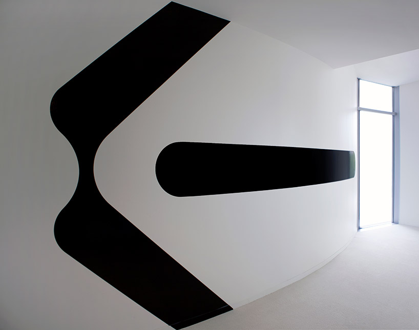
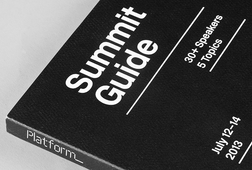
summit guide cover
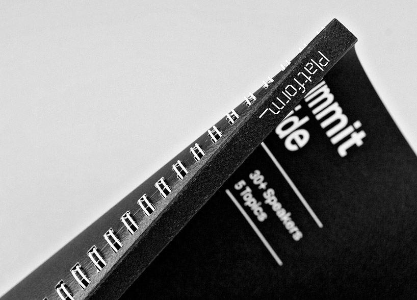
summit guide – spine
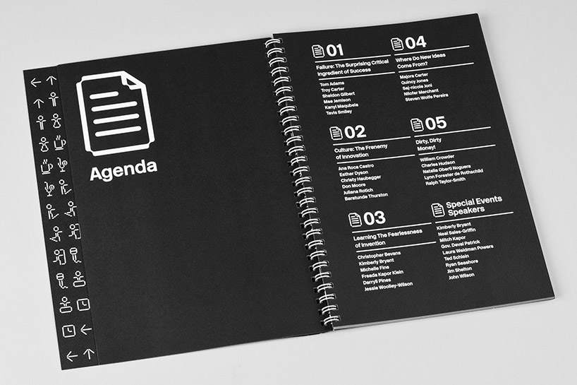
view of the platform summit guide
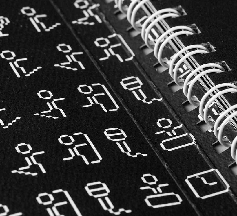
icons used on the inside cover of the summit guide
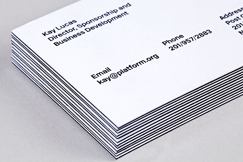
platform business cards
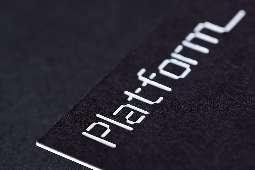
platform business cards

platform website
while the summit graphics are mostly designed in elemental black and white, the identity for platform as a whole incorporates bright colors to stand out. bold color is a basic element of the website, the chief ‘platform’ for the organization to share its ideas through videos of the summit talks. optimized for mobile use, the site design echoes the segmented forms of the logo in a modular format that places content in blocks. different categories of information appear in different colors, creating bright patterns. the site will eventually host a large library of conference videos, blog posts and other content, and the designers will also be working with platform to incorporate statistical info and data visualizations related to the topic of entrepreneurial diversity.
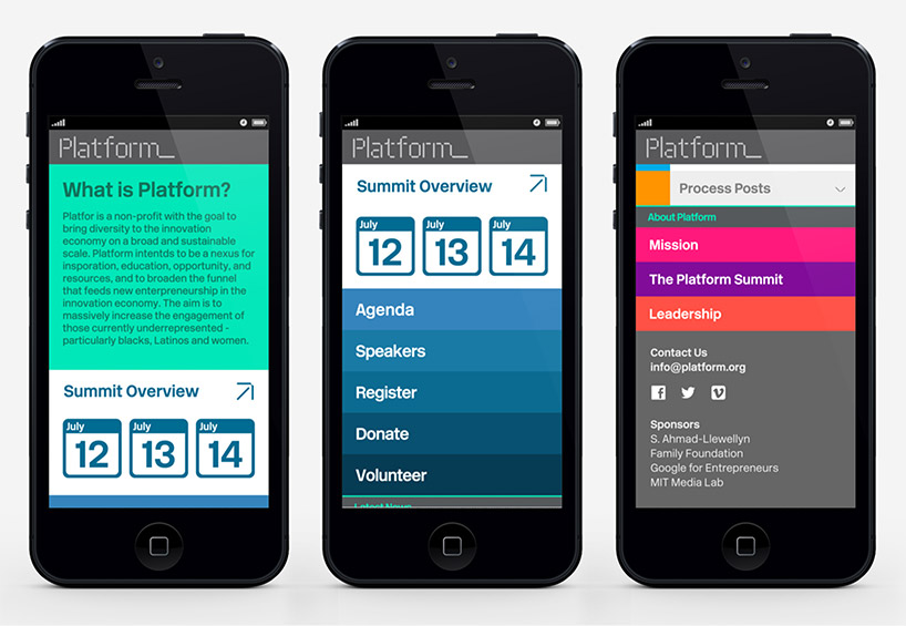
mobile version of the website
project team: eddie opara, partner-in-charge and designer; ken deegan, designer; pedro mendes, wayfinding design assistant; mark lindsay and chan young park, developers. stage design and construction by kadan productions. event photography by liz linder, ken deegan and pedro mendes.
