evelyn ter bekke and dirk behage
all images © atelier ter bekke & behage
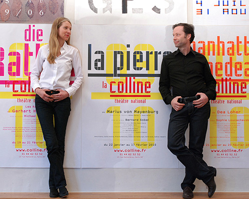
evelyn ter bekke and dirk behage are the founders of atelier ter bekke & behage, a graphic design studio based in paris that specializes in corporate identity and printed communications, largely for cultural organizations and individuals.
DB: how did you both meet and what made you decide to start a studio together?
TB&B: we met in paris in the mid-90’s, at a time when the arrival of computers in the workspace was starting to change the ways in which graphic designers worked. evelyn came to paris as a freelance designer after having worked in a rotterdam studio, whereas dirk was pierre bernard’s associate in the atelier de création graphique, a major parisian atelier. up until then, the size of the studio really mattered when taking on considerable design projects. computers completely changed the situation. little by little, key clients understood that it was indeed possible to work with smaller outfits, or even with individual designers. in fact, they preferred having this personal touch to dealing with big, impersonal design studios. these are the circumstances under which we met, both personally and professionally. we started small and made a conscious decision of keeping it that way – smaller means it’s easier to take risks when approaching a given project, and do things that you maybe wouldn’t do if you were responsible for a larger studio.
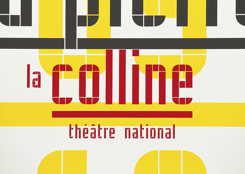
la colline – national theater, paris.
font design and logo.
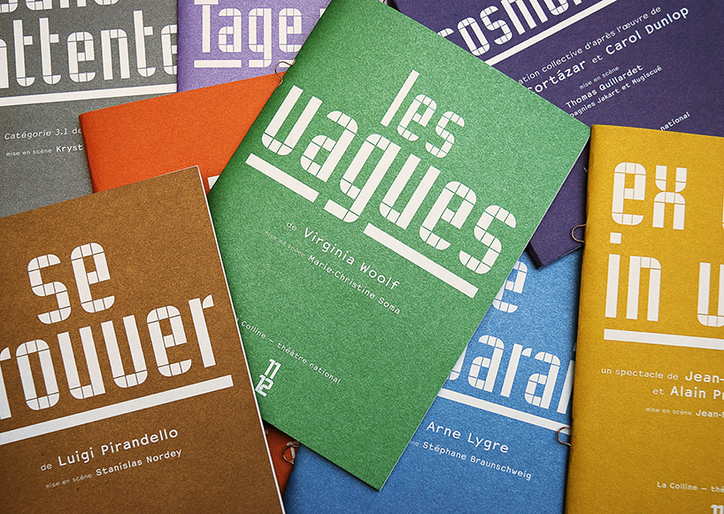
la colline – national theater, paris.
show programme leaflets.
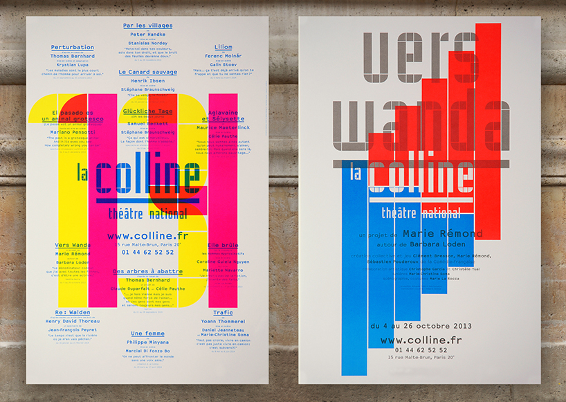
la colline – national theater, paris.
show posters for the 2013/2014 season.
DB: how do your skills complement or contrast with each other?
TB&B: we always present ourselves as a single entity. we’re different of course, but that is how we complement each other. we do, however, share the same vision, and often agree on how to tackle issues. when we don’t, it usually means the problem requires a particularly complex solution. we completely trust one another, which means we listen to, understand and complement one another. we’re efficient and really work hand in hand. with any given project, it’s just near impossible to tell who did what – and to be honest, we don’t really care about that anyway. what matters to us when working as a team is that everyone feels – and is – responsible for the end result. the team and its members have to accept that anyone who is part of the team can say: ‘this is my project’.
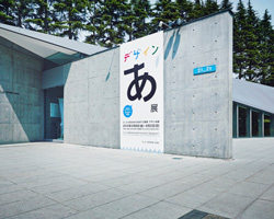
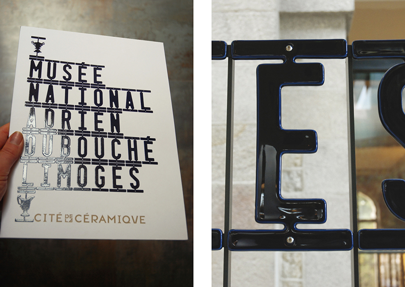 national porcelain museum adrien dubouché, limoges.
font design, signage and invitation announcing the opening of the museum.
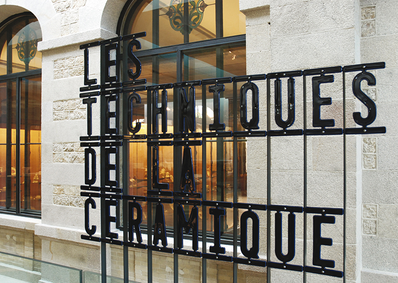
national porcelain museum adrien dubouché, limoges.
font design and signage.
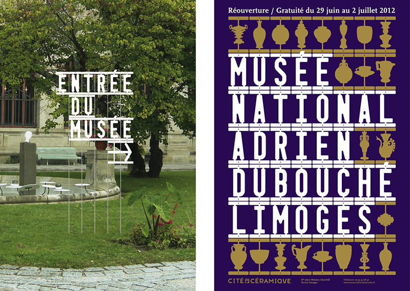
national porcelain museum adrien dubouché, limoges.
font design, signage and poster announcing the opening of the museum.
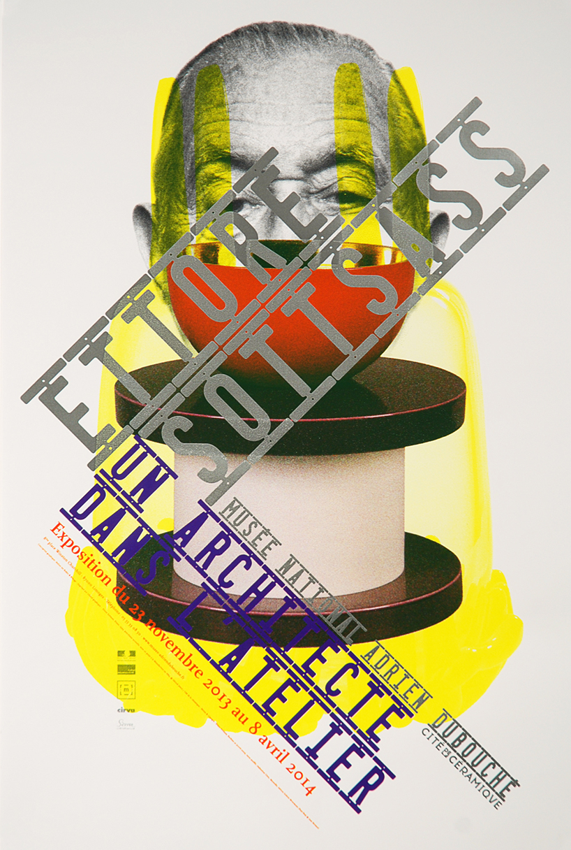
national porcelain museum adrien dubouché, limoges.
poster for the exhibition ‘ettore sottsass – an architect in the workshop’
DB: which project or period of your careers have you enjoyed the most thus far?
TB&B: from a professional point of view, the past five years have been fascinating, as we have (more or less) made a name for ourselves. of course, the projects we worked on before were just as powerful and visible, but we never aimed for too much of an obviously personal ‘graphic signature’. we always focused on content, on finding the right way of putting content across. this means our ‘graphic signature’ wasn’t always obvious or recognizable and the end results varied greatly. for the last twenty years, many graphic designers had a more plastic/formal approach, not so much a content-oriented one. we were different. this is probably what made us stand out and why we are now appreciated. what is nice is that the right customers (and subjects), who have similar views to ours, now know exactly where and how to find us…
DB: which medium or material do you like working with the most?
TB&B: the great thing about our job is that we get to be in touch with a broad range of people and topics. different topics allow you to discover different information, materials and media. the results of dealing with new topics and the research that follows can be surprising, you can really end up going much further than you originally planned. we work on quite a few complex projects (2D and 3D), for which all forms of communication are key. it is this variety we are drawn to. we don’t prefer one medium over another, although it is true that designing posters is probably most challenging.
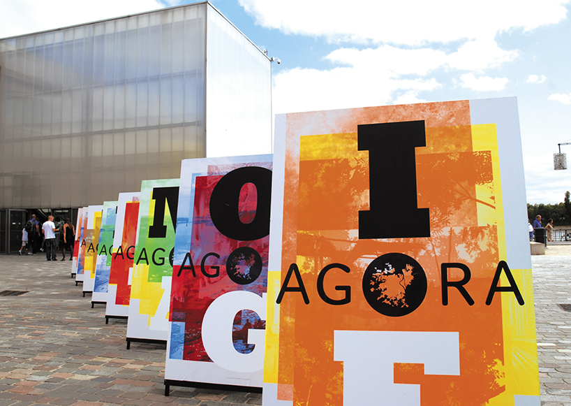
architecture & planning & design biennial ‘agora’, bordeaux – entrance of the biennial.
curator: marc barani, exhibition design: birgitte fryland, graphic design: atelier ter bekke & behage, videos: christian barani
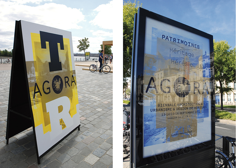
architecture & planning & design biennial ‘agora’, bordeaux posters
DB: do you prefer working with a specific brief from a client or having complete freedom?
TB&B: demanding total freedom is probably a mistake in our profession. it’s something we try to avoid – you end up moving to far away from the subject matter and place yourself, the designer, at centre stage. of course, the customer shouldn’t take over or think they are the subject either. just like you, the customer is someone who presents the subject matter to the audience. every problem has a solution; you just need to aim for an innovative solution rather than a destructive compromise. the brief has to be resistant to a certain type of radicalism if the end result is to achieve some degree of visibility. the customer in turn needs to trust you, not to use you to merely execute his or her ideas. he or she just has to take of leap of faith and be open to the adventure as well as the risks that any new project brings along.
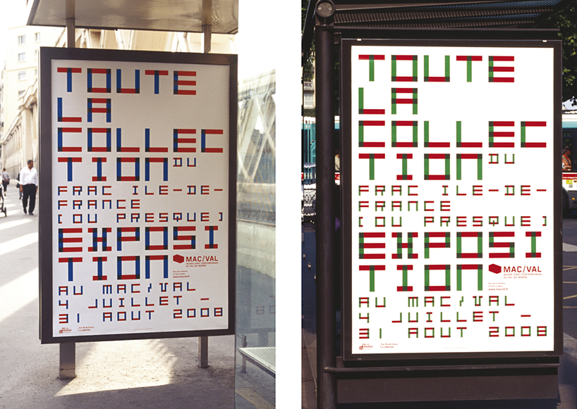
mac/val – val-de-marne contemporary art museum, france
poster in two different colour variations for the collective exhibition ‘all or most of the frac ile-de-france collection’.
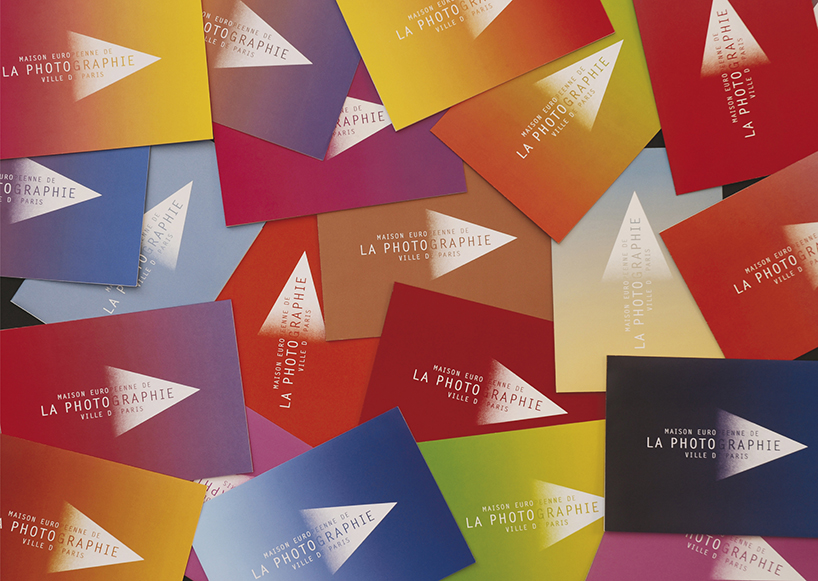
maison européenne de la photographie (MEP).
invitations to exhibitions and logo.
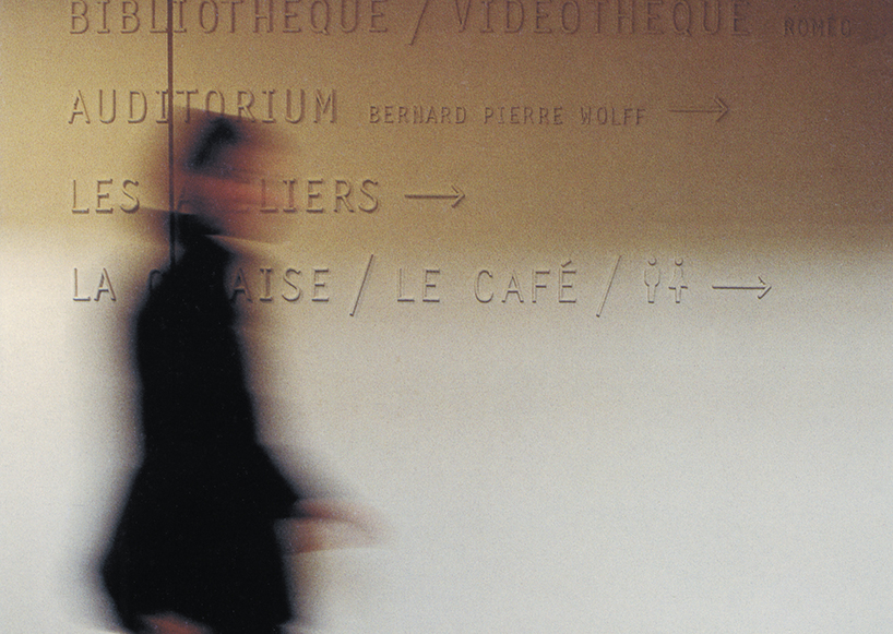
maison européenne de la photographie (MEP).
wayfinding signage.
DB: how do you see the future of the poster in a time where people increasingly get their news from the screen?
TB&B: we definitely believe the poster has a future. you have to differentiate between looking for information (online, in a library etc.) from unexpectedly being confronted with information. communicating with the public at large is different, and it can therefore not be done in the same way. the key aim of the poster is being noticed and giving visibility. the key objective of, say, a website, is to give clear and efficient information to the person who is looking for that information. posters are not just meant to inform people at a given moment in time, but are also a way of keeping information alive for longer. in theaters and museums, posters are a way of exhibiting a long term programming policy. we always try to make our customers aware of this, and we succeed more often than not. maybe that’s why we can keep on designing so many posters. when TV screens first made their appearance, everyone thought it signaled the end of the newspaper.
DB: what is the most important aspect of poster design for you?
TB&B: making something visible by giving information and creating a real contrast with the environment in which the poster will be put up. catching the eye to make sure the poster is seen, noticed, then read. a poster should not be designed for the sole purpose of having it displayed on white museum walls or winning a competition (even though that’s always an added bonus!). it’s important, although maybe not only for posters, to take into account the social context of the graphic object and the reason for its design. it is therefore important for posters to have actually been displayed on street walls, to really have played their informative role. if not, it’s not a poster; it’s nothing more than an image printed on a large sheet of paper.
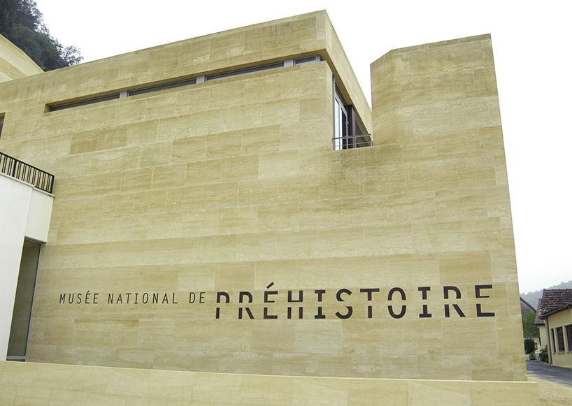
national museum of prehistory, dordogne.
logo at the entrance.
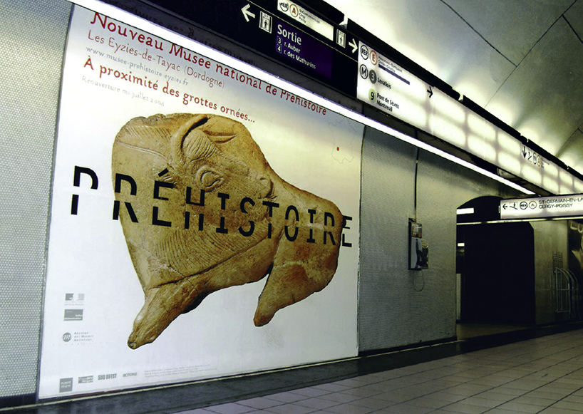
national museum of prehistory, dordogne.
poster announcing the opening of the museum.
DB: what do you do to keep your ideas fresh?
TB&B: we allow ourselves to be surprised and inspired by the diversity and variety of the subjects we have to work with. we make sure we keep having the guts to take risks, and that we really do keep taking them. sometimes you need to put yourself in just a little bit of danger to keep being challenged and keep things fresh. you have to be open to what happens around you, keep an eye on your surroundings and let coincidences happen.
DB: what do you know now that you wish you knew when you were 21?
TB&B: that you shouldn’t worry too much about tomorrow. hard work, motivation and enthusiasm solve most problems and lead to new, unexpected opportunities.
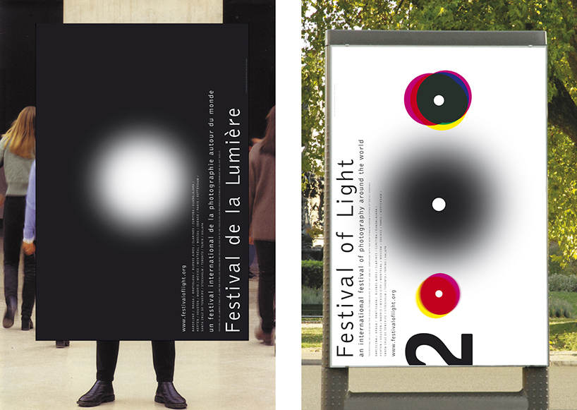
european month of photography.
two posters for the ‘festival de la lumière – festival of light’ in 2000.
DB: besides your work what are you both passionate about?
TB&B: several times a year, we go to the island of texel. it is the first of a group of five in the wadden sea. here we have our home, our boat, our friends. every day we take a walk for several hours. most of our major projects have found their solution during these strolls. at the beginning of the walk, in the dunes, we talk, we face the contradictions, the constraints, the obstacles, the impossibilities. then, when we walk in the fringe of the waves on the beach, calm settles in our exchanges and it is often at this point that our ideas begin to take shape. contemplating the horizon between the sky and the sea makes us imagine what is possible, dream up what we cannot yet see. this simplicity opens the door to the imagination. each topic that we work on, every problem we discuss is specific. and although the landscape is always the same, every walk is different and brings us unique solutions. we also both love oysters from brittany…
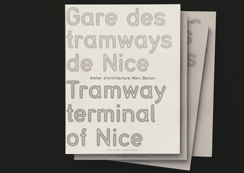
marc barani – architect.
book on the tram station in nice, book cover.
DB: do you have any superstitious beliefs or self imposed ‘rules’ that you live by?
TB&B: always try to find the right (and only) solution for a given topic and do not repeat yourself. we always keep working on a project until we’re both completely happy with it, even if time and money has run out. the end result is what stays, and is what will always remain visible. if the end result is good, it’s extremely rewarding. if not, it will always remain terribly frustrating. we’re not very superstitious… for years we had a black cat that was always crossing our path and for the past five years we’ve had a grey cat.
DB: what do you hope to do in 2014 that you have never done before?
TB&B: what we planned to do the year we first met: travel across south america! the icing on the cake, is that the AGI congress will be held in são paulo this year so there’s an extra reason to make it happen.
graphic studio interviews (193)
logo design (246)
posters (78)
PRODUCT LIBRARY
a diverse digital database that acts as a valuable guide in gaining insight and information about a product directly from the manufacturer, and serves as a rich reference point in developing a project or scheme.
