— the following is an example of a lesson from the upcoming self promotion course:
designing a logo
for those starting out the opportunity to meet potential clients in person can be quite scarce, so it’s quite likely that you’ll have to impress through how you present yourself in-print or online to begin with. for more established designers branding is a way of expanding your client base and communicating your work clearly to a wider audience. branding is a vast subject, so for this lesson we have decided to focus on one of its favorite elements – the logo.
creating a logo is a long and laborious task mostly carried out by specialist consultancies or a company’s in-house design team, each with their pros and cons. designing a logo for yourself is often considerably more difficult than designing one for others, for the simple reason that you are too-familiar with what you do and thus overlook key aspects that need explaining to others. on the contrary a consultancy may miss out on what you think is important and highlight what you see as irrelevant.
so what makes a good logo? logos are symbols used to provide an ‘identity’ for a brand, company, service or product. a good logo is unique, and not easily confused with others. it can be used in many different contexts while retaining its integrity.
the rise of the logo the prominence of the logo dates back to the industrial revolution of the 19th century. the purpose of branding items was so that people could identify products to their manufacturer, as many competitors would have similar products available in the same parts of the world.
logo design today in many cases, especially for global companies logo development can be a huge project that can sometimes take years and lots of money. on the contrary, some brands will expect a logo that is designed in a short period. logos thrashed out in a day or two tend to have flaws that aren’t noticed at first but become apparent after a little while. part of the design process of a logo is spending time analysing the ‘final’ versions and seeing how they look in their intended environments.
how logos work ‘a logo doesn’t sell, it identifies… a logo derives its meaning from the quality of the thing it symbolizes, not the other way around. a logo is less important than the product it signifies; what it means is more important than what it looks like.’ paul rand
if business practice, company message, customer service, products etc. are the basis for a brand’s personality then a logo is the face which we recognize that personality by. we can all quickly recall the faces of the most important and influential people in our lives and logos work in the same way. the ones that we remember are those, which belong to companies that have the most impact on us, that we see most often and that attract our attention.
familiarity & exposure while some logos aren’t necessarily the best examples of design but we remember them because we see them all the time. most likely they are the face of a very powerful entity that most of the world is familiar with. exposure creates the connection in this case. it’s the story of something becoming iconic because of what it represents rather than because of how it looks.
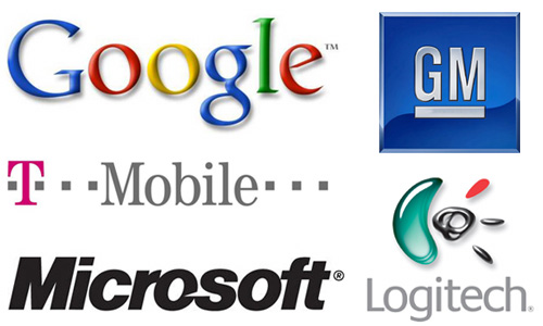 clockwise: general motors by general motors, logitech by logitech, microsoft by scott baker, T-mobile by T-mobile, google by ruth kedar, these logos are certainly among the most well known in the world – but yet none of them are considered the greatest or worst pieces of graphic design but we are all familiar with them because they represent global brands companies that advertise heavily or that are connected with our everyday activities.
attractiveness on the contrary some brands we remember because of the way they look without knowing very much about them. just like seeing a person we’re attracted to and know nothing about – they intrigue us and thus we become interested in finding out more. as a designer you should aim to try and create this feeling with your work.
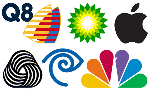 easy on the eye: clockwise: BP by wolff ollins, apple computers by regis mckenna, NBC by chermayeff and geismar, timewarner by chermayeff and geismar, woolmark logo by franco grignani, Q8 oil by wolff ollins. these logos are well known, some more than others – but as well as being highly exposed like the first bunch they also boast a strong aesthetic appeal – that can trigger interest in the brand this is the main reason why a well designed logo is so desired.
originality sometimes we can remember a logo, beautiful or ugly, because it’s simply different to most other’s we’ve seen. in terms of a logo this might be something with an unusual form or a playfulness.
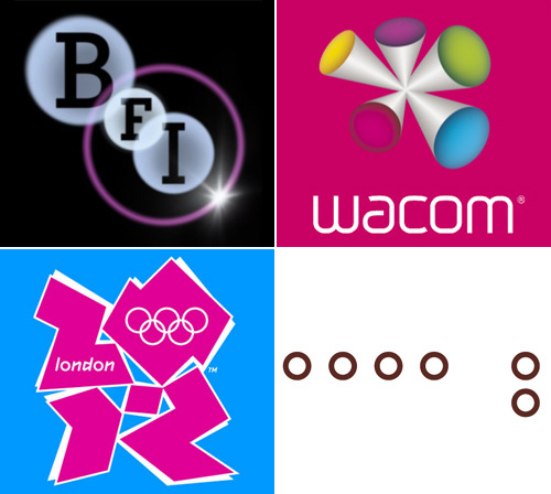 clockwise: wacom by wolff ollins, roppongi hills by jonathan barnbrook, london 2012 olympics by wolff ollins, british film institute by johnson banks. – these examples show some logos that are quite original in their appearance, some of which are not universally liked. they can however be considered successful in some capacity as they have all proven to increase awareness of the brands that they represent.
please note these are very loose categorizations. the characteristics of each can easily merge into another.
logo design tips… there are hundreds of tips for logo design some good, some dated and some useless. here we offer you ingredients for your own ‘recipe’ rather than rules to follow.
clarity ‘your logo must be unique, memorable … and simple.’ – paul rand decide on what you want to say with your logo as it will become the shorthand for the company its reputation, service, products etc. the best logos say something at first glance and yet suggest something more.
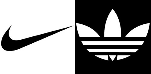 form: nike logo by carolyn davidson and adidas trefoil logo by adi dassle both logos compete in the same arena but have distinctly different forms.
content logos don’t have to be literal. it can help to include something direct about what the brand does but you don’t always have to. many of the best logos symbolize the essence of the brand, its values and attitude not the services or products they sell. the logo or brand name might have absolutely nothing to do with what the brand does – therefore your design might be related to the name.
form and flexibility any logo should be recognizable – by that we mean even if the form is somewhat abstract it should at least be identifiable as being company X’s logo. get rid of everything that is not absolutely necessary, any swirls or filters that only add noise to the design.
many times details will be lost at small sizes so don’t over-complicate matters for the sake of it. consider what various shapes and styles allude to in a wider sense.
take notice of the forms used in logos that attract your attention and apply these characteristics to your designs.
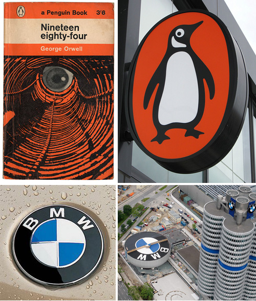 scale: penguin books and BMW’s logos show how a simple logo can be used at any size.
bear in mind how the logo will be applied. a good logo for a website, one that fits its layout etc may fail to have any impact when used for print or vice versa. the best logos can be used anywhere at any size.
to make sure your form can achieve this draw it in black and white first – this will ensure it works in one color. then test your early digital drawings at various sizes, for example 30cm and 8mm. the wider the logo the harder it will be to reduce without rotating.
make sure that the logo can be used on a wide range of medias, it should be suitable for screen, print and 3D. think about the colors you use and the level of detail you employ. also consider if it can be animated easily.
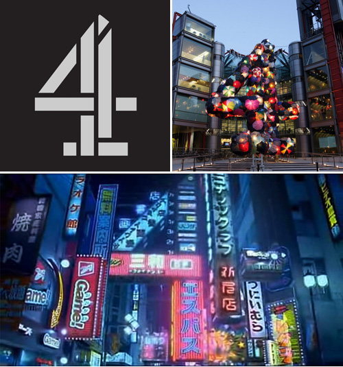 flexible: britain’s channel four logo has is often sighted as a good piee if design because of its flexibility – read the history of this logo.
color and consistency he logo should look good in black and white and should be able to be modified so that it can be placed on different colored backgrounds. you might have to place your logo inside a frame or slightly alter it when it sits besides other logos or graphic elements – so plan for these situations. by creating a logo that takes advantage of a limited palette you can easily expand the brand by using these colors in other communications.
branding guidelines should be drawn up if your logo and color scheme are to work efficiently, especially if there will be a number of designers using the logo. the logo should be used consistently within the visual identity scheme of the brand.
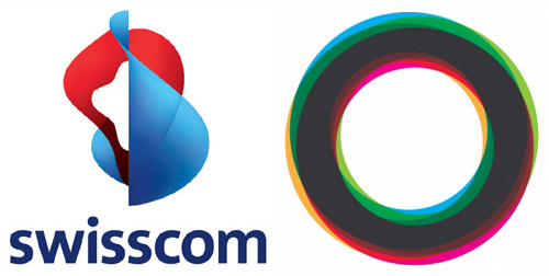
(left) swisscom by moving brands, and (right) ministry of education, youth and sports brandenburg by martin jordan. are two designs that rely on color to be fully recognized.
make it different avoid commonly used objects – particularly those used in famous logos. once you have sketched out some ideas research if it’s been done before. this doesn’t mean discard every idea you have simply because something similar exists. for example if you want to use an airplane, you’ll come across many logos that use an airplane but that doesn’t mean there’s no room for innovation. look at how the others are drawn, how can you make yours different? is the context the same – i.e. the same kind of company or is it completely unrelated. use your discretion to decide how original your design is.
metaphor many companies use metaphors to communicate their corporate aims and beliefs. these can come by way of abstract shapes that simply ‘look nice’ or more literal representations – usually objects which have a significance to the message that is being said. often because of the abstract nature of these type of logos they are memorable. in some cases though companies go a little too far and simply have logos that people don’t understand.
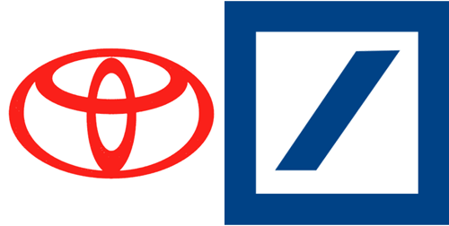
metaphor: here’s the official description of the logo, which toyota created for itself in 1996: ‘three ovals: the two perpendicular center ovals represent a relationship of mutual trust between the customer and toyota. these ovals combine to symbolize the letter T for toyota. the space in the background implies a global expansion of toyota’s technology and unlimited potential for the future’. also shown is the deutsche bank logo designed by anton stankowsk, which represents ‘constant growth in a protected environment’.
cryptic / hidden elements artists have long been hiding images, words and letterforms within a their art, which only become apparent on a second look or even lengthy study. designers continued this theme with logos that ask something more of their audience than just a quick glance. these hidden elements are often created using negative space or can only be seen when the logo is viewed at a distance. the popularity of these logos lies in the bond that they forge with the viewer. once they have spotted the hidden element they remember it – it’s as though they feel they have discovered something which others have not . as with metaphoric logos getting the balance right is everything – if it’s too difficult nobody will figure it out.
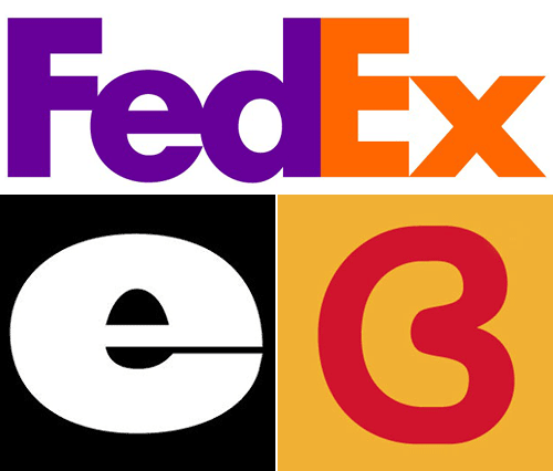
negative space: fedex by landor – spot the hiddedn arrow! culture bus by pentagram – a C & B are formed in one outline. egg + spoon by thoughtful – negative space of the company’s first initial provides the perfect image.
letterforms probably the most popular ‘trick’ in the book is to create letterforms graphically from objects or vice versa which relate to what a company or brand does. for example the B in butterfly could be made from the shape of a butterfly’s wing or the ‘O’ in globe is a globe… you might also see words forged from the negative space of other words or numbers used to replace letters of a similar shape.
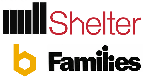
playing with letter forms – clockwise: shelter by johnson banks – the pitched ‘h’ references the nature of the homeless charity. families by herb lubalin uses tells us exactly who the publication was aimed at. beehouse by chermayeff and geismar references honeycomb structure. the mill by north design, spells out the company name and looks like an iconic factory.
logotypes logotypes are often used to abbreviate complicated names.commonly these are mergers between companies that need to highlighted to their previous audience. or to shift the emphasis from a gloomy past or unfashionable aspect onto the new green pastures of the future: kentucky friend chicken = KFC.
the shape of a typeface is important to a logotype: lowercase letters are more round uppercase more square or rectangular. choose tyepfaces that sit well with a logo and communicate the character of a brand.
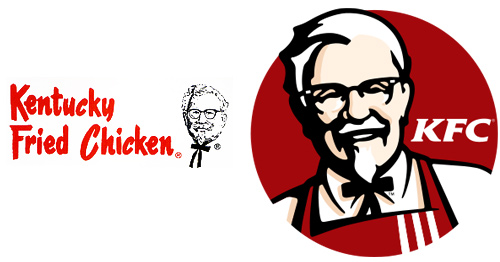
kentucky fried chicken was repackaged as KFC to sound healthier and also become more memorable. the first logo was designed by esigned by lippincott & margulies, who also had the idea to abbreviate the name. the second logo shown is the most recent by tesseruses the KFC letters and gave the colonel an apron. more
stylistic approach / execution of an idea trends change yet your company values should remain. thus if you have a logo that says ‘now’ soon it will represent ‘then’. avoid trends.
logos usually are simple vectors – because this way they be scaled easier than photographic, or highly illustrative solutions. that said – because of the rise in screen applications and software advances – logos are becoming more complicated than they used to be. design a simple logo that can be elaborated if need be.
to render a logo as best a possible you need to learn how to use the relevant software. most logos are created using adobe illustrator or similar vector program. additional effects may then be added using other software such as after-effects, photoshop etc. some might even be rendered using 3D drawing programs.
avoid effects: gradients, drop shadows, filters etc. some may be relevant but nine times out of ten they just worsen a logo.
the style of forms used to create a logo dictate how an audience interpret the brand’s market position, heritage, and much more. for example a gothic typeface evokes the sense of religion, history etc. while helvetica suggests modernism – the same can be said of the line styles used to draw graphic elements. round, three-dimensional with subtle colors could be seen as new while angular flat and brash colors might be seen as old and dated. again. consider these points if longevity is requirement of your design. (not all logos have to ‘be timeless!)
the stylistic language a logo is rendered in is something that is often tweaked and updated by brands as part of maintaining a connection with their target audience and you’ll notice subtle changes in form and styles are often applied to well-known logos without completely re-designing them.
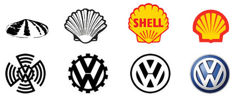
note how the image of each brand changes in style over time but maintains the same core elements – this is a practice often used to keep a brand looking fresh and up to date, which allows them to win new customers while making sure those already familiar with the brand stay faithful and aware of it’s presence.
designing your own logo this break down of logo design should help you to craft your own mark and refine your visual communication.
decide on what you want to say it’s important that you have a clear idea of what it is you want to say with your logo as it will become the shorthand for you and your work. identify what you do, who your audience is, what you are telling them and why. a good idea is to discuss this with others – those who know what you do and those who don’t, that way you will be able to get a clear understanding of what your logo should reflect.
rough sketches there is an unwritten rule that says a successful logo can be drawn by anyone on the back of an envelope in seconds. well, with the wealth of motion based mediums in today’s world that’s not necessarily the case, but its a good place to start. to begin with stay simple and try to put down as many ideas as you can.
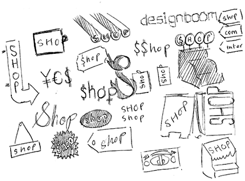
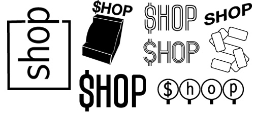
as you’ll see from the first image – these drawings aren’t intended to win any prizes! but they’ll help you see immediately if something has potential.
refine your selection next you’ll want to refine your ideas and depending on what works best for you – that will mean neater drawings or quick trials using your computer. as you can see in picture two a number of ideas are ‘tested’ crudely using existing typefaces and imagery to see how they might work. already at this stage particular designs will emerge as ‘favorites’.
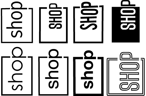
we decided that we liked the idea of using a letter ‘P’ as a shopping bag handle for our shop logo so we tried out a few different typefaces.
experimentation with forms by now you’ll be able to start playing around with letter-forms and styles and you might wish to start considering whether your design will be photographic, hand-drawn, vector graphic etc. it’s worth identifying what works and what doesn’t in terms of your aesthetic requirements.
take the ‘shop’ logo with a rounded ‘P’ – alone it looks quite alright but when juxtaposed beside the previous designboom logo it didn’t sit very well.
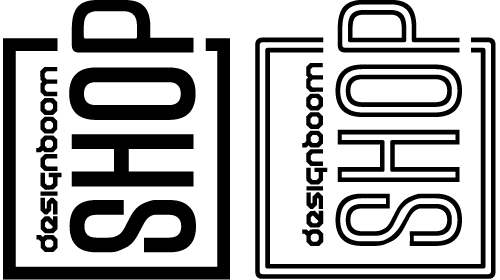
immediately we knew that the form of the shopping bag would have to become more angular.
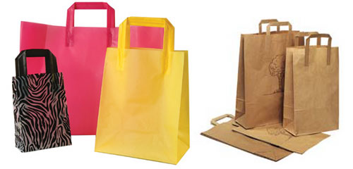
the classic folded handle of a paper shopping bag the ‘designboom feel’ and so we decided to explore this route.
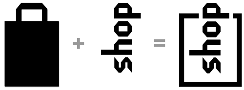
tweaking logos that use type may seem easier to create than those which use pictorial elements but it’s not always so. you’ll often find that a typeface has been used by someone else and so it might make your logo appear similar to an existing one. a way to avoid this is by ‘tweaking’ a typeface so that the letters become slightly different or sit beside one another more harmoniously. tweaking methods include:altering the letter widths and heights, skewing, warping, removal or adding of serifs, and numerous others.
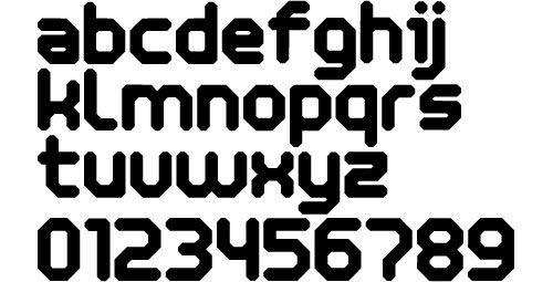
initially we thought to use the typeface used in the designboom logo ‘humanoid’, which only uses capital letters. the problem was that some of the letters are barely legible. so we decided to create a new typeface influenced by ‘hamanoid‘ by dustbust fonts, ‘neu alphabet‘ and ‘vormgevers‘ by wim crowel. the new typeface uses 45º degree angles like the humanoid typeface but is comprised entirely of lower case letter forms – which are more legible. next we went about creating the shopping bag using the new typeface…
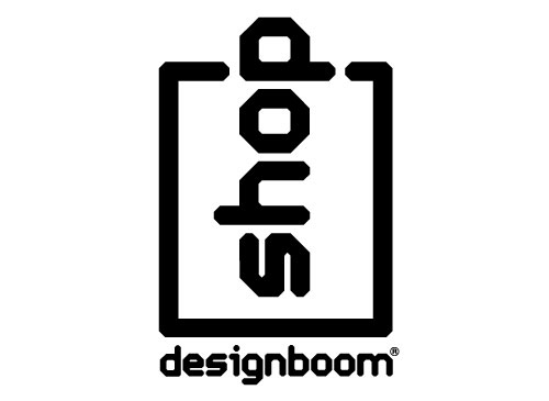
finalizing with your logo’s form refined you can begin to play with color swatches and sizing. most logo’s come with guidelines on how they must be used -but seen as this is your own, you get to make the rules. common advice states to avoid over-usage, bastardization, specific sizing and colors but it’s entirely up to you.
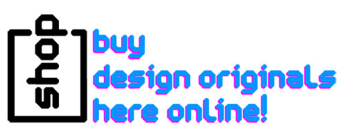
we choose to use the shop logo alone on our site as the designboom logo is clear to be seen on every page. the designboom shop pages compliment the black logo with bright blue and pink text.
exercise 1 please post some of your favourite logos in the discussion area and explain: – why you like them – what impression of the brand they give you
exercise 2 considering the points mentioned in this lesson you might like to start designing your own logo and post it in the discussion-area / blog. the designboom team and your fellow participants will then give you feedback on your design.
—

« BACK TO THE DESIGN-AEROBICS HOMEPAGE
happening this week! holcim, global leader in innovative and sustainable building solutions, enables greener cities, smarter infrastructure and improving living standards around the world.
PRODUCT LIBRARY
a diverse digital database that acts as a valuable guide in gaining insight and information about a product directly from the manufacturer, and serves as a rich reference point in developing a project or scheme.


