deborah sussman interview
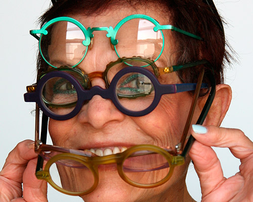
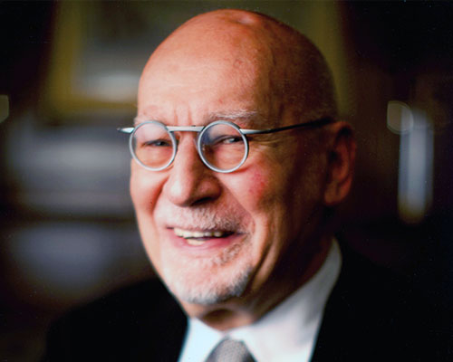
designboom talked to graphic designer deborah sussman ahead of her solo exhibition at the woodbury university’s WUHO gallery in los angeles.
recognized as a pioneer of environmental graphic design for creating arresting visual imagery and designing its highly imaginative applications for architectural and public spaces. deborah’s passion for the marriage of graphics and the built environment began during her time at the eames office and has since led to collaborations with planners, architects and clients.
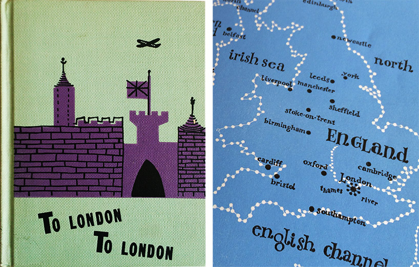
book cover & illustrations for ‘to london, to london’ comfort beckley-card designed by sussman prior to joining the eames office in 1950.
DB: please could you tell us about your background and how you became interested in design?
DS: I grew up in brooklyn where my parents exposed us to the arts from a young age: we had dance lessons, piano lessons, french lessons, trips to museums, performances and galleries. after high school I went to study painting and acting at bard college in new york, which was a very radical school at that time. in those days I thought I’d become an actress or an artist but then I heard about a school in chicago, the institute of design, ran by lászló moholy-nagy and I really wanted to go there and see what it was all about. I got transferred to chicago and design completely took over my life from then on.
one of my teachers in chicago was konrad wachsmann, who was friendly with charles and ray eames. in my first year there the eames came to give a talk at our school and also afterwards asked konrad to recommend them a student who could work with them for the summer, as a graphic designer. he suggested it should be me.
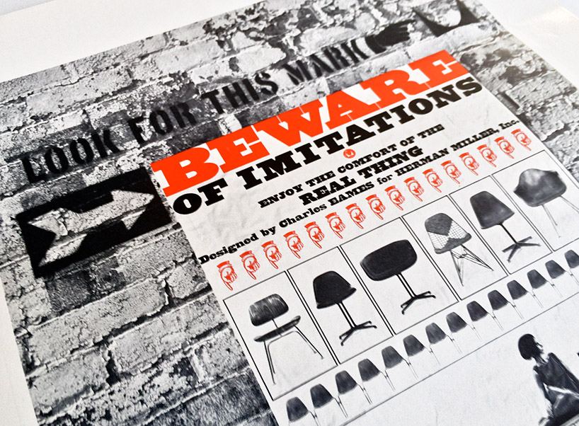
detail of an ad designed for herman miller while at the the eames office
DB: how was it to work at the eames office?
DS: I was extremely happy. as a young designer in my early twenties there was nobody I would rather have worked for. it was a dream job. originally I was only supposed to work there that one summer and then go back to finish my studies in chicago. at the end of the summer I approached charles to say goodbye and he said ‘goodbye? why? where are you going?‘ I told him ‘I need to go back to school and finish my degree‘ he simply replied ‘I don’t have a degree. why do you need one? ray and I are going to europe for a few months, why don’t you stay in our house until we come back?‘. I didn’t need any more persuading than that!
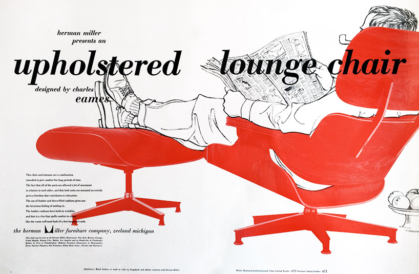
ad designed for herman miller while at the the eames office, illustration by deborah sussman
DB: what did you work on while you were there?
DS: a bit of everything; photography, graphic design, illustration, ads for herman miller, sets for films. many, many different things. after working there for three years I applied for a fulbright scholarship to study at the hochschule für gestaltang in ulm, germany and a year later I got it. so I was there for four years in my first stint.
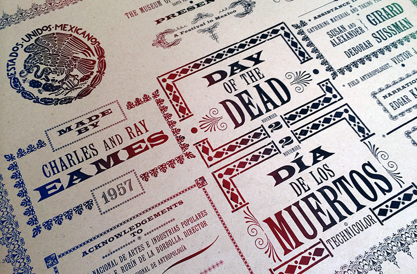
detail of the credits card used at the start of the film ‘día de los muertos’ made by the eames, designed while at the eames office
DB: have the eames been the biggest influence on your work?
DS: ray and charles along with alexander girard who worked with us were great mentors to me. another experience from those days that really shaped me a lot was my first trip to mexico. I went there in the early 1950s to take photos as part of the research for ‘the day of the dead’ film and was really taken-back by the place, the people, the culture. the vibrancy of color that I discovered there has always stayed with me, the bright yellow and magenta icing on the sugar skulls and sweet breads – amazing! it was the first time I had been to another country and I absolutely loved it. that really whetted my appetite to travel more and before I knew it I was off to germany.
‘día de los muertos’ by charles and ray eames (assisted by deborah sussman), 1957
DB: how did your time in europe influence you?
DS: I have to be honest when I arrived to the hochschule für gestaltang I was quite shocked. I found it very rigid and hadn’t realized how much freedom I had previously. now, everything was conformist; one language, one color, one typeface. it wasn’t really the right fit for me but I learned some valuable technical skills.
I decided in my free time I’d explore as much of europe as I could. over three years I made my way through germany, italy, france, spain, north africa an other places – photographing everything! I ended up with thousands of pictures that I still have. after my scholarship ended I worked in paris for some months, but began to feel it was time to go back to the USA. I freelanced in new york for about a year before joining up with ray and charles again.
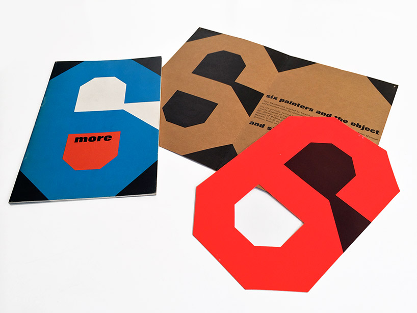
catalogue of an exhibition of LA pop art that accompanied the guggenheim’s traveling exhibition six painters and the object when it came to LACMA, 1963
DB: what eventually made you want to start your own company?
DS: in my second stint at eames I worked on mathematica, then I went to india to work on the exhibition ‘nehru: the man and his india’ and then ended up back in california. at that time people started asking me to work on things for them and I was using my desk at the eames office after-hours to get these side projects done. as the side projects became bigger and more frequent I became uncomfortable working on them at their office, I didn’t want to disrespect them in any way so decided I’d go it alone. frank gehry offered me a space at his office and I started working from there. I worked with him on some projects and also with other architects, advertising agencies, shops and slowly ended up needing my own space. over the years the office has grown and switched locations several times and in the middle of it all I met my husband, paul prejza and we work together with our team on an interesting blend of civic, cultural and commercial projects.
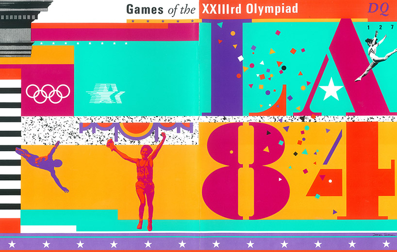
sussman/prejza designed the identity for the 1984 olympic games held in los angeles.
shown here is the cover of design quarterly published by the walker arts center, DQ 127
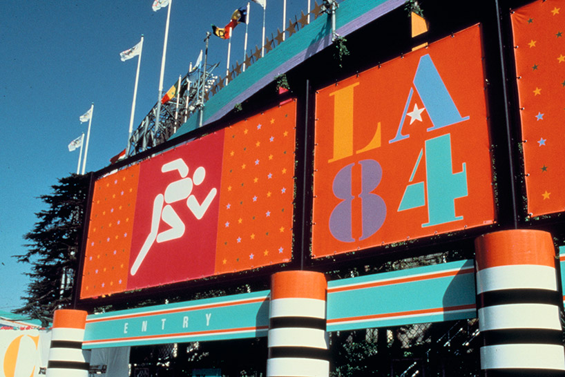
environmental graphics for the 1984 olympics – (pictograms by keith bright)
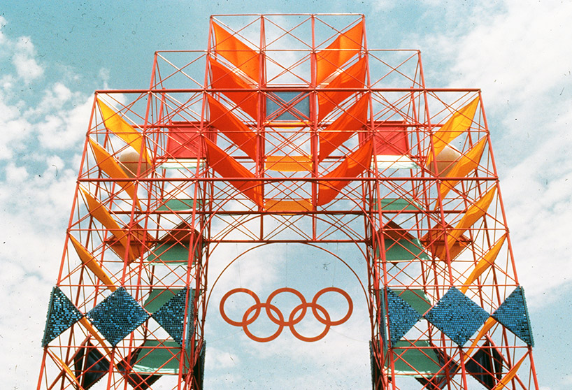
environmental graphics for the 1984 olympics in collaboration with the jerde partnership, inc.
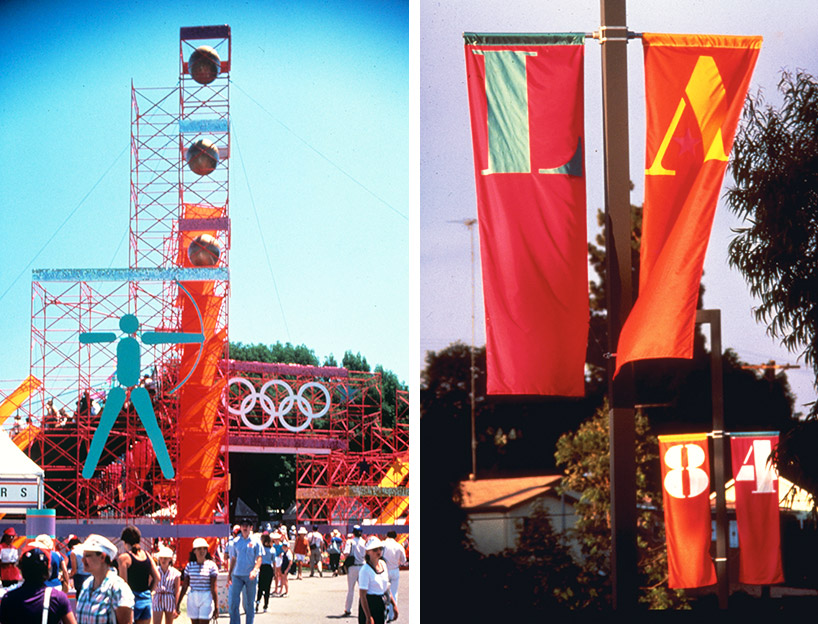
environmental graphics for the 1984 olympics
left: entrance to archery
right: street banners
DB: how would you describe your style to someone who hasn’t seen your work before?
DS: exuberant and bold.
DB: what traps should a young designer avoid when working on an environmental design project?
DS: one of the most common traps is not understanding scale. you need to test your design with physical scale-models and if possible at full scale. that’s a very important exercise, you can’t always understand scale on on a computer screen.
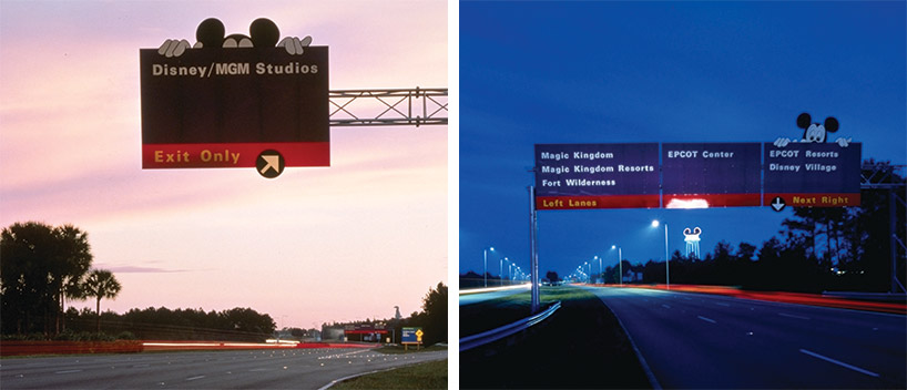
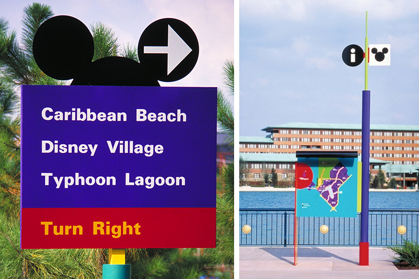
wayfinding signage for walt disney world and euro disney by sussman/prejza
DB: what are your thoughts on specialization vs generalization?
DS: I’m most certainly a generalist. I enjoy all the different arts too much to only do one thing all of the time.
DB: what are you passionate about apart from design?
DS: poetry. I would have said photography some years back but now it’s definitely poetry. I write free verse poetry, often about the way I see things and for the last few years myself and juan felipe herrera (poet laureate of california) have been writing poems back and forth to one another, that’s something I have a lot of fun with.

palms casino resort identity – art direction by deborah sussman, graphics by hillary jaye of sussman/prejza
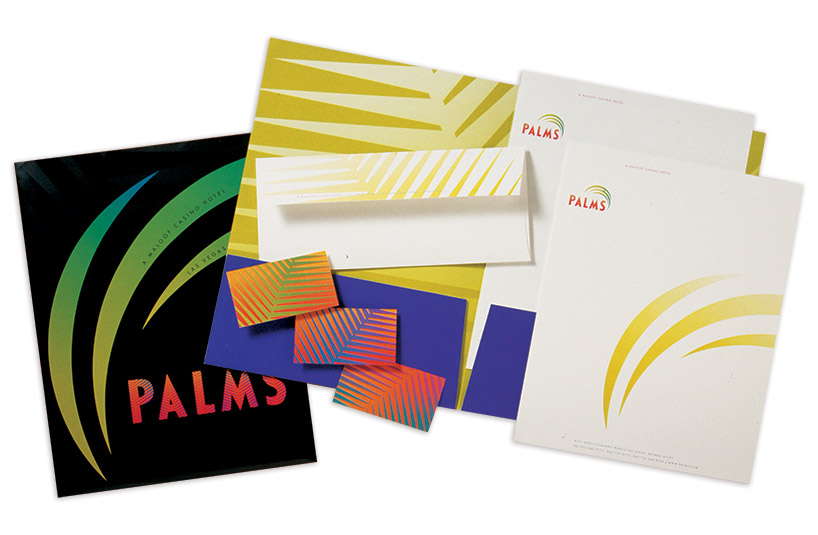
palms casino resort stationery
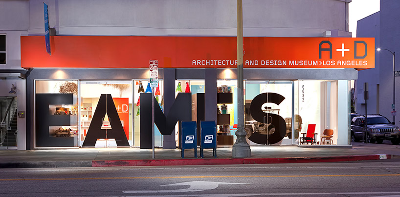
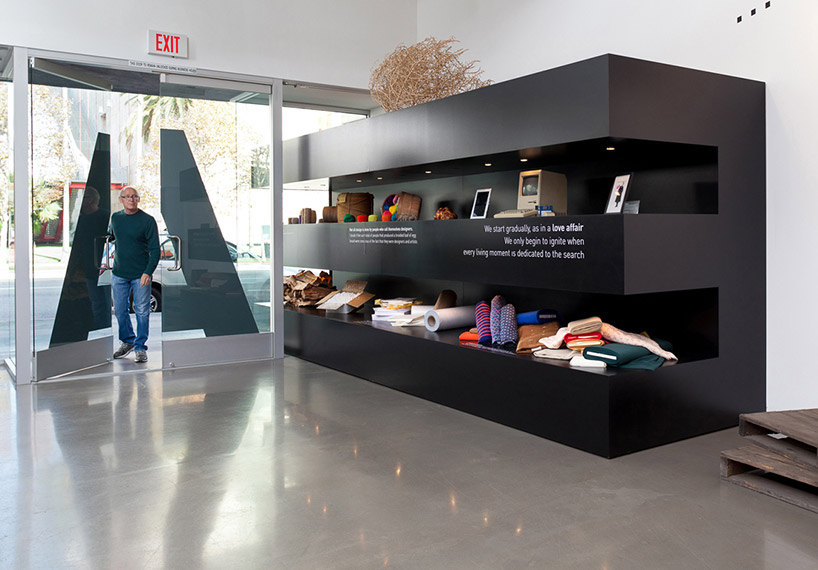
eames words: pacific standard time exhibition design by deborah sussman, andrew byron, todd erlandson and lara hoad
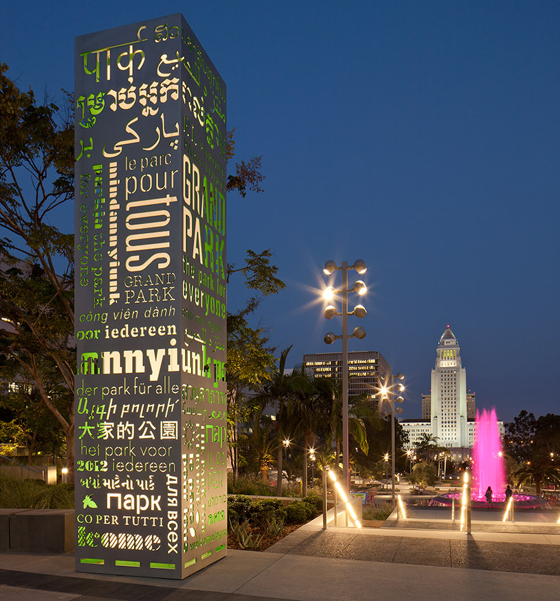
grand park LA, signage and wayfinding by deborah sussman, hsien-hsien tsai and miles mazzie at sussman/prejza
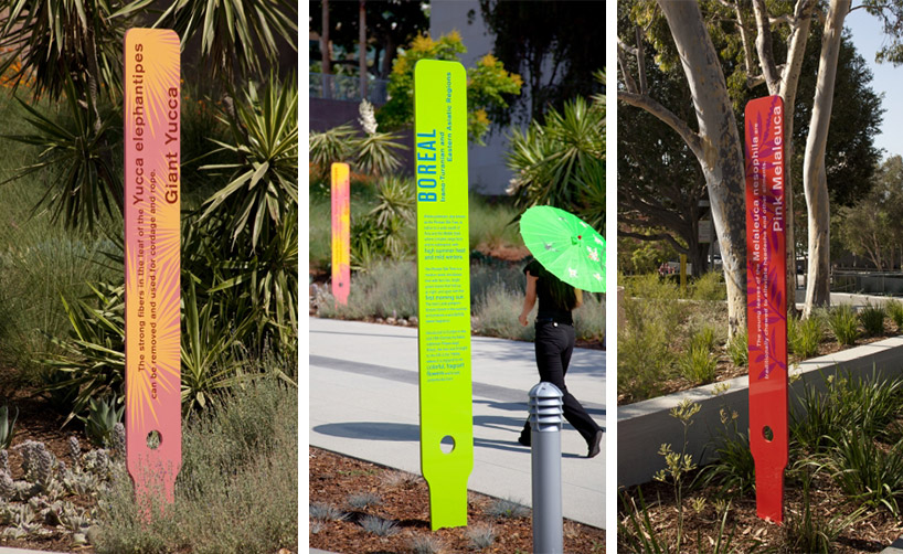
grand park LA, signage and wayfinding

MOAD (Museum of the African Diaspora) identity by deborah sussman, holly hampton, and miles mazzie at sussman/prejza
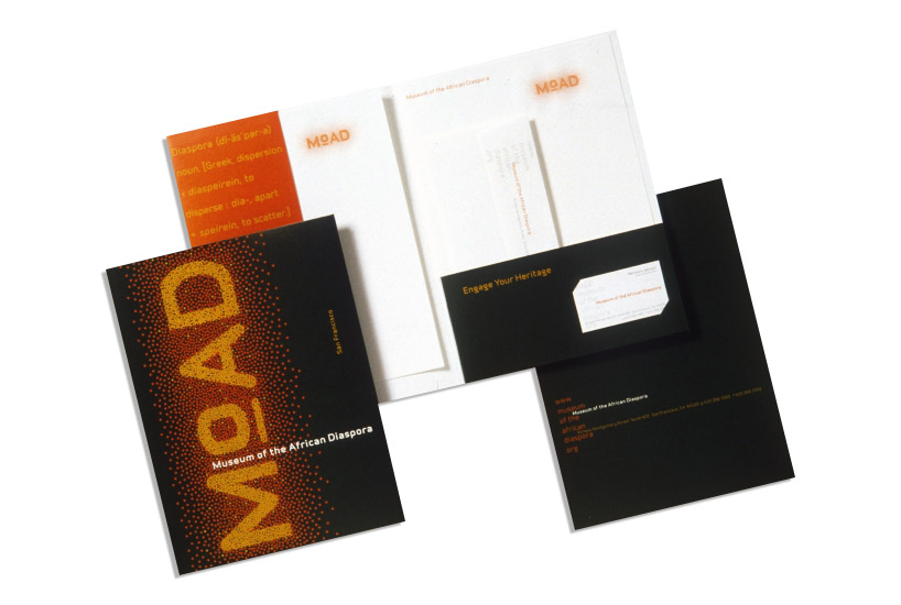
MOAD stationery
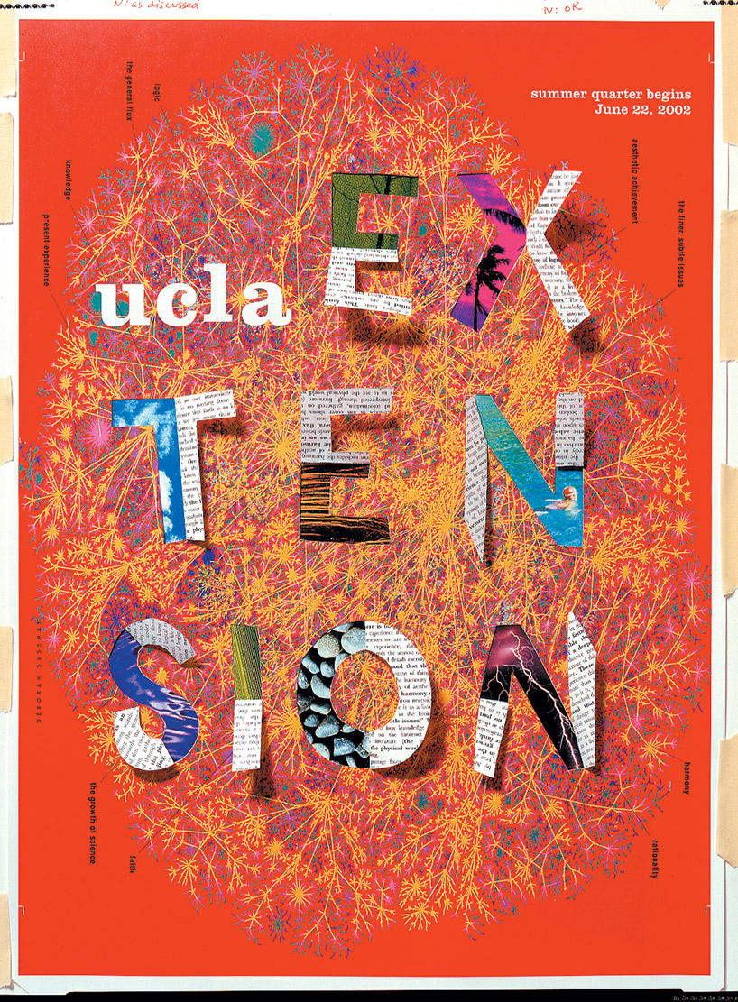
poster for UCLA by sussman/prejza
DB: do you have any superstitious beliefs?
DS: I do and it’s a bit silly but I’ll tell you! I think that whatever you do on new year’s day, you will do for the rest of the year… so it’s nice to drink plenty of champagne.
DB: what’s the best piece of advice you have ever been given?
DS: a couple of pieces of advice that I often remember are:
‘stick to the concept’ – charles eames
‘the best thing we can do for our clients is not obey them, but inspire them’ – alexander girard
DB: what’s the worst piece of advice you have ever been given?
several people have told me over the years ‘just give them what they want‘ with regards to clients, and I just can’t bring myself to do it. I have to inspire them and that can sometimes be a very dangerous attitude to have because you can loose yourself a lot of money!
—
deborah sussman loves LA – opens tomorrow!
at the woodbury university’s WUHO gallery, LA
december 12, 2013 – january 19, 2014
opening hours and further information
