KEEP UP WITH OUR DAILY AND WEEKLY NEWSLETTERS
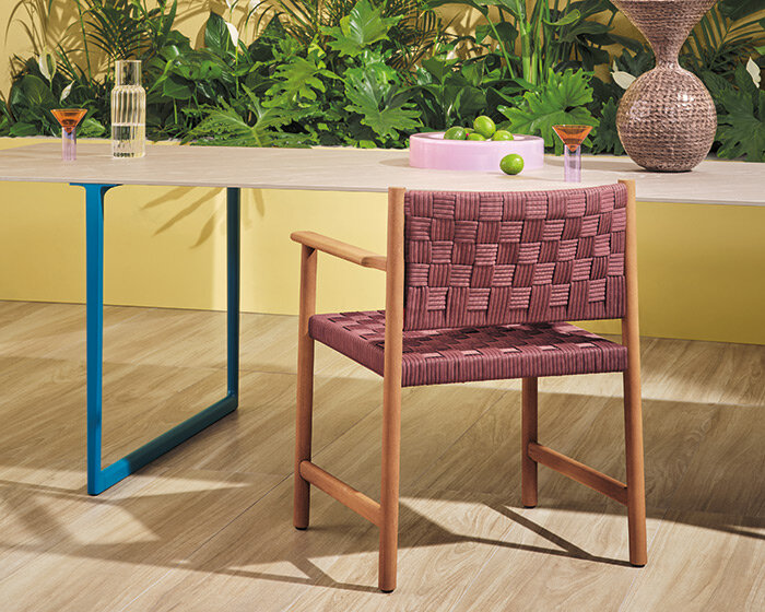
happening now! in an exclusive interview with designbooom, CMP design studio reveals the backstory of woven chair griante — a collection that celebrates twenty years of Pedrali’s establishment of its wooden division.
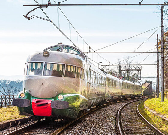
uncover the colorful legacy of italy's iconic train, designed by gio ponti and giulio minoletti in the '50s.
connections: +110
unveiled as well at the italian pavilion in expo 2025 osaka, the design uses fuel coming from cooking oils and animal fats.
connections: +190
discover our guide to milan design week 2025, the week in the calendar where the design world converges on the italian city.
connections: 69
'there is no real, defined space, there’s just the reflection’ – designboom speaks with Hermès artistic directors charlotte macaux perelman and alexis fabry.
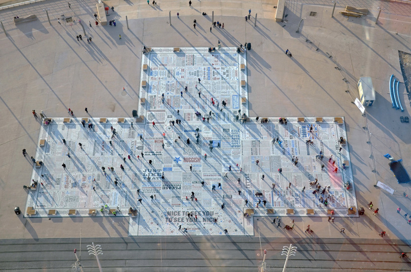 comedy carpet (in collaboration with
 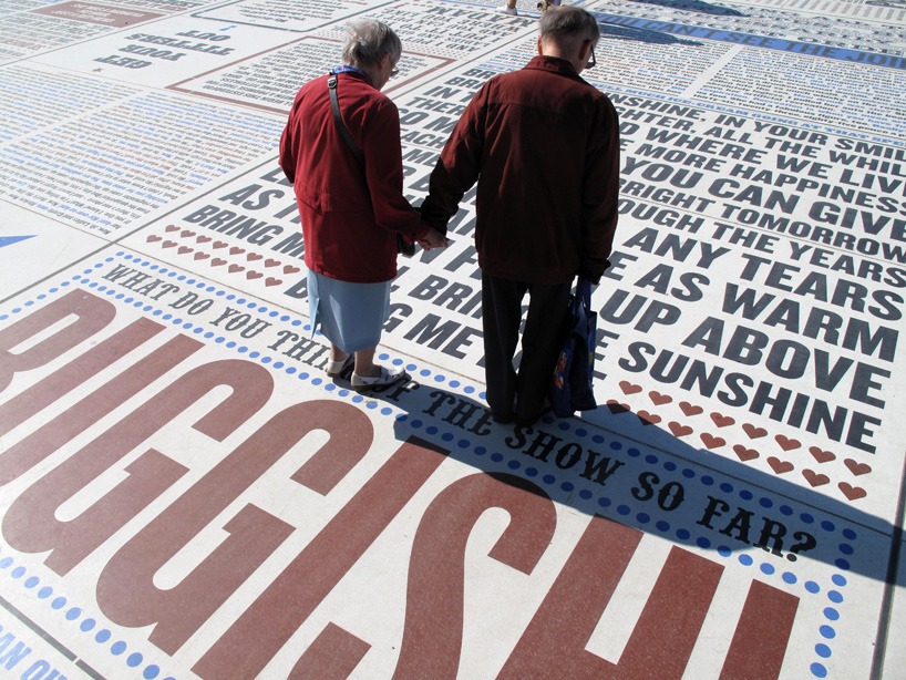 comedy carpet (in collaboration gordon young)
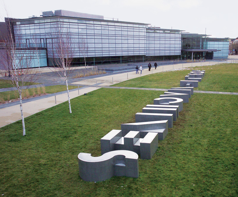 letter shaped sculptures created for the national waterfront museum in swansea (in collaboration with gordon young)
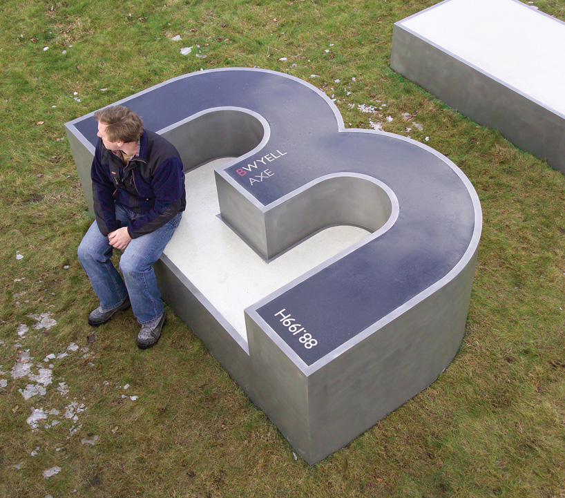 letter shaped sculptures created for the national waterfront museum in swansea (in collaboration with gordon young)
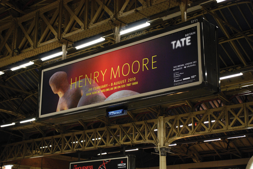 billboard poster for tate britain
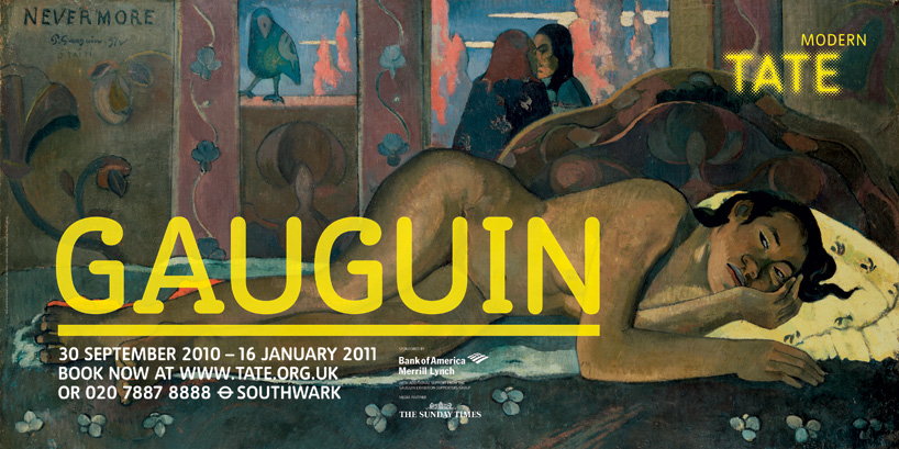 exhibition poster for tate modern
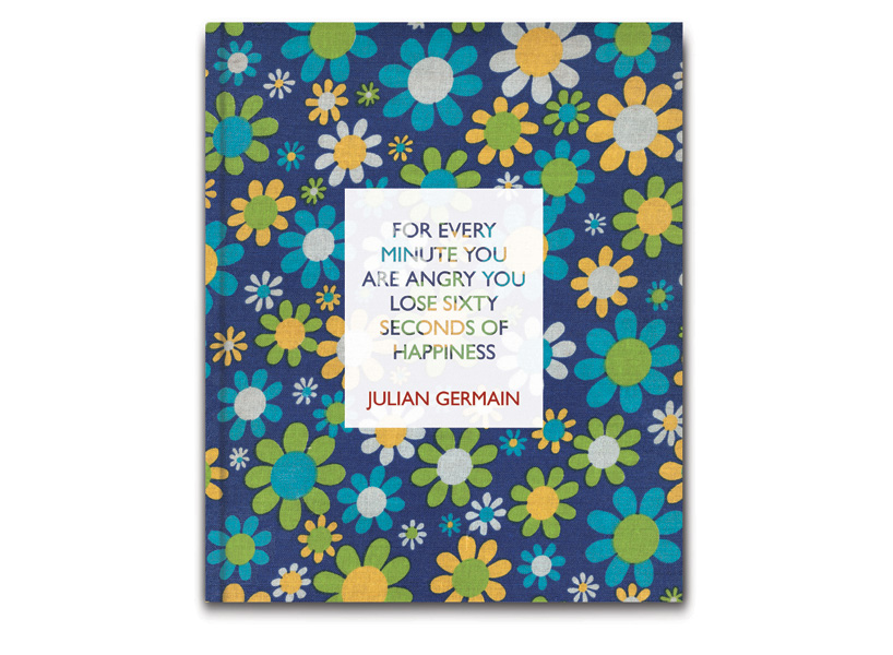 book cover for photographer juilan germain
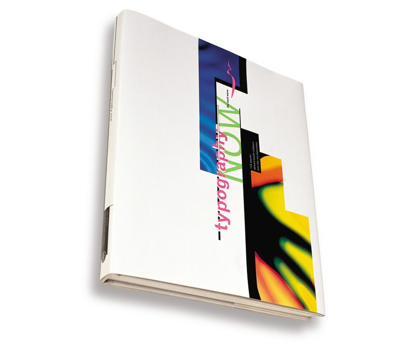 typography now book cover
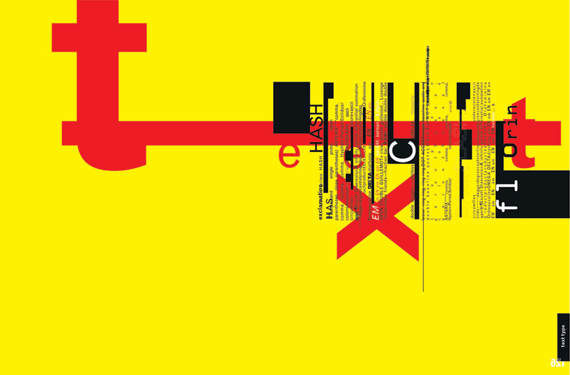 spread from typography now
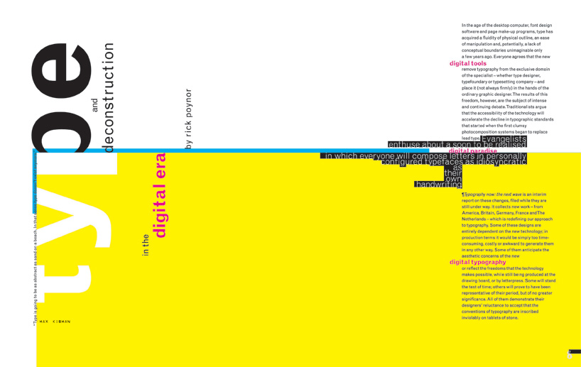 spread from typography now
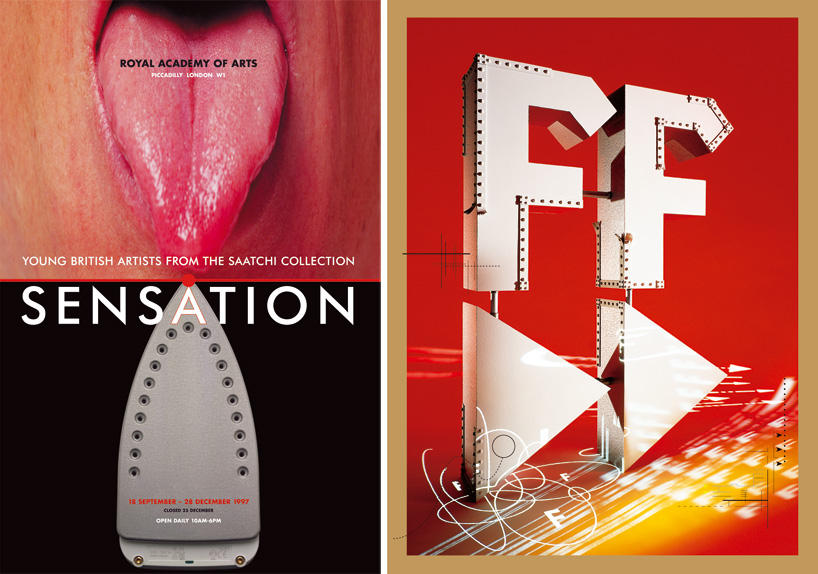 left: sensation exhibition posterright: smirnoff advertisement
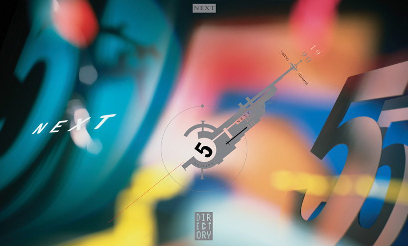 next directory (clothes catalog) cover
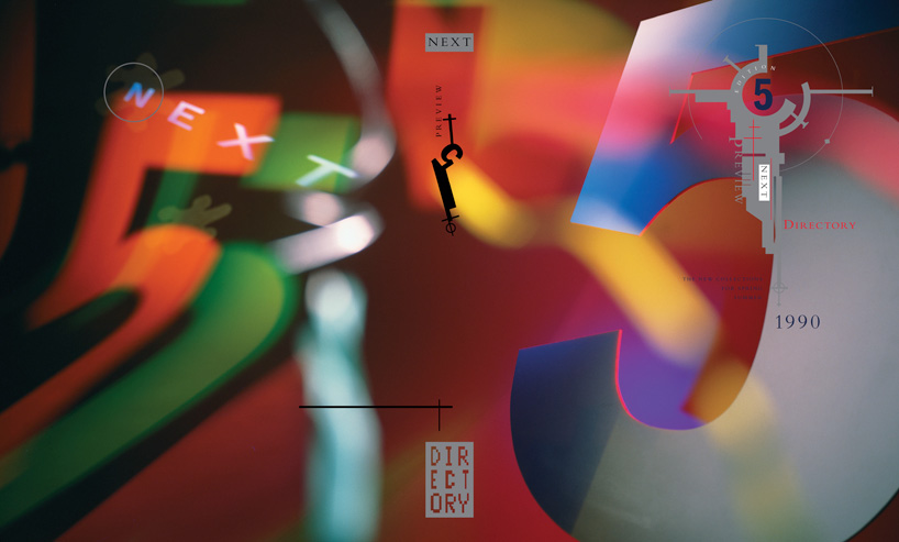 next directory (clothes catalog) cover
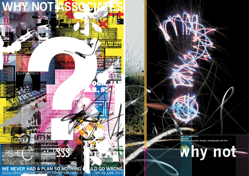 left: poster for WNA exhibition at ginza graphic galleryright: book cover for WNA monograph published by booth clibborn
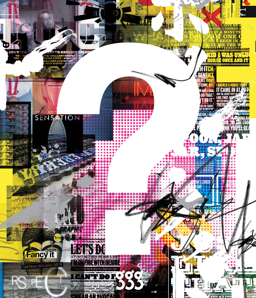
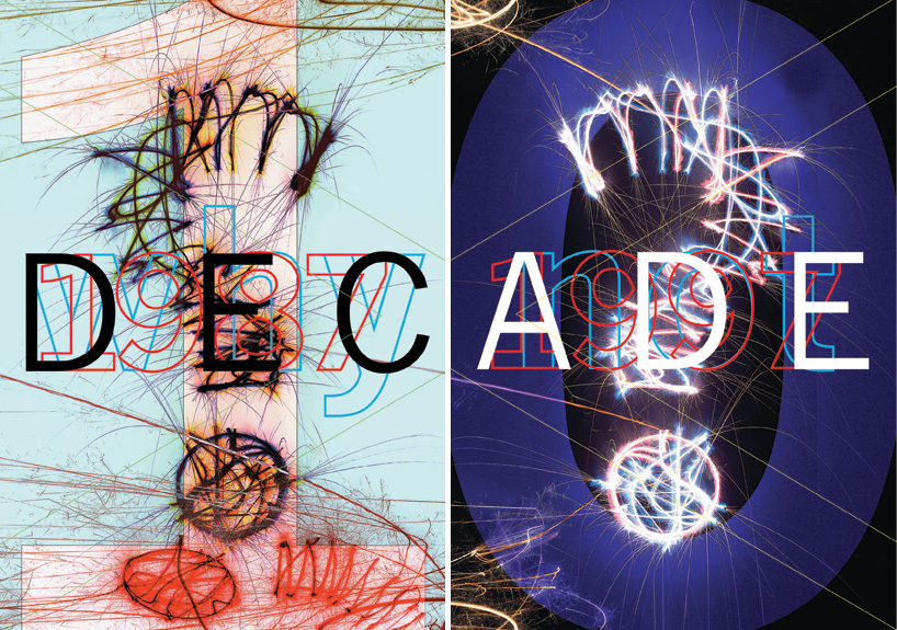 right: WNA decade poster ‘1’right: WNA decade poster ‘0’
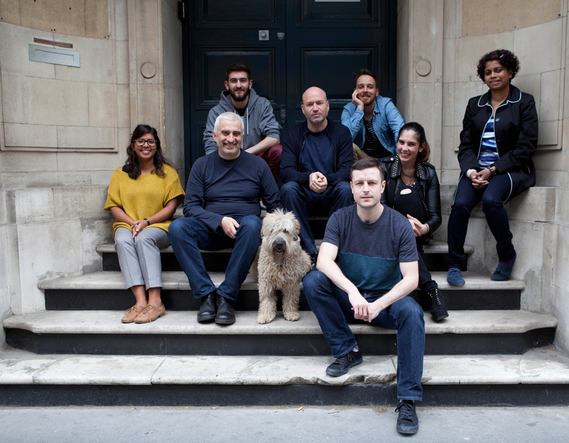 why not associates team portraittop row (left to right) : joseph lion, andy altmann, gustavo fernandes (blue shirt) middle row: shaheena poloo (yellow top), david ellis, martha the dog, marianna la fuente, janet moses (black coat) bottom row: clayton welham