silhouette by martin broen from italy
designer's own words:
Silhouette:
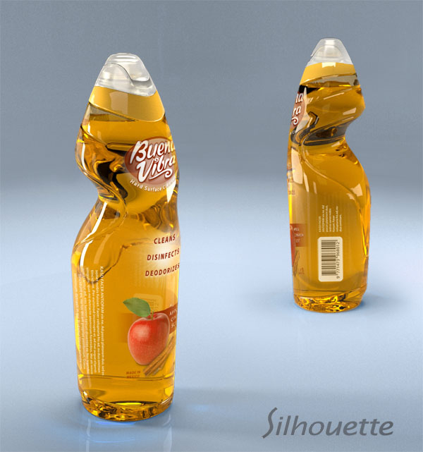
This concept is born on the intent to create an innovative packaging that offers an ideal gripping geometry, a distinctive shape and strong presence at the shop.
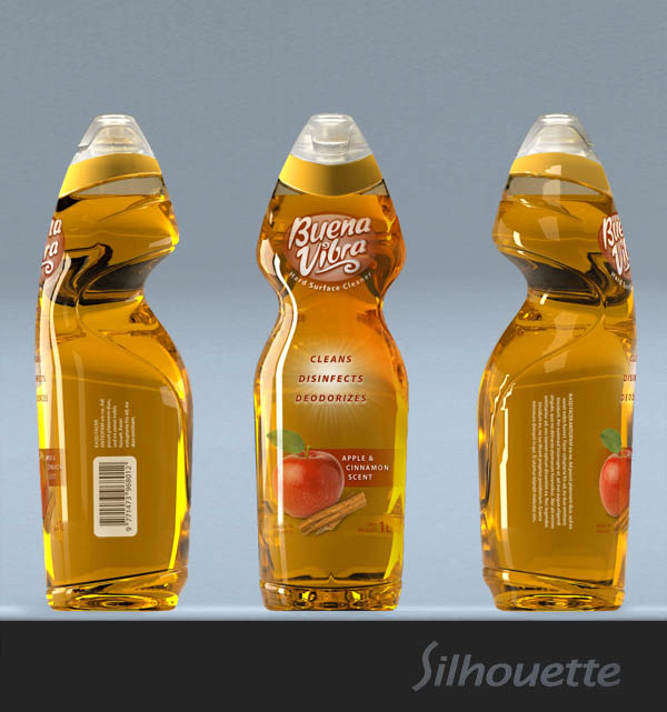
The novel aesthetic generates a distinctive front and back of the product to satisfy the different aspects of the shop and use experiences.
The front facade offers two distinctive areas for labeling positioning (single curvature surfaces), the upper one reserved for immediate brand recognition and the lower one to place the supplementary and legal information.
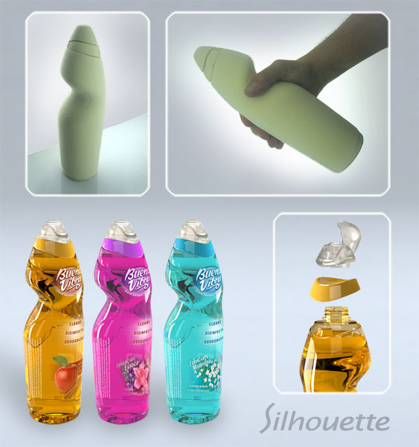
The back part is dedicated to maximize the handling comfort by offering a central reduced gripping area, located at a height that allows outstanding handling at different inner liquid volumes. Also the grip area is studied to be used at an angle that helps the pouring action, providing besides the grip an spherical lower surface that fits on the palm of the hand and an upper surface that helps loading the weight on the hand reducing the grabbing force needed.
The bottle is done in PET to allow a shiny finish that helps communicate the cleaning power of the product helped by reflections of the light on the sensual curves of the translucent body and emphasized by the translucent labels.
The PP flip-top cap is snapped into position trapping an extra collar that adds a distinctive color detail for each product fragrance.
Silhouette rendering
 Silhouette Views / graphics
 Silhouette model and colors