toyo ito designs interior for kinnasand flagship store in milan
all images © patricia parinejad courtesy kinnasand


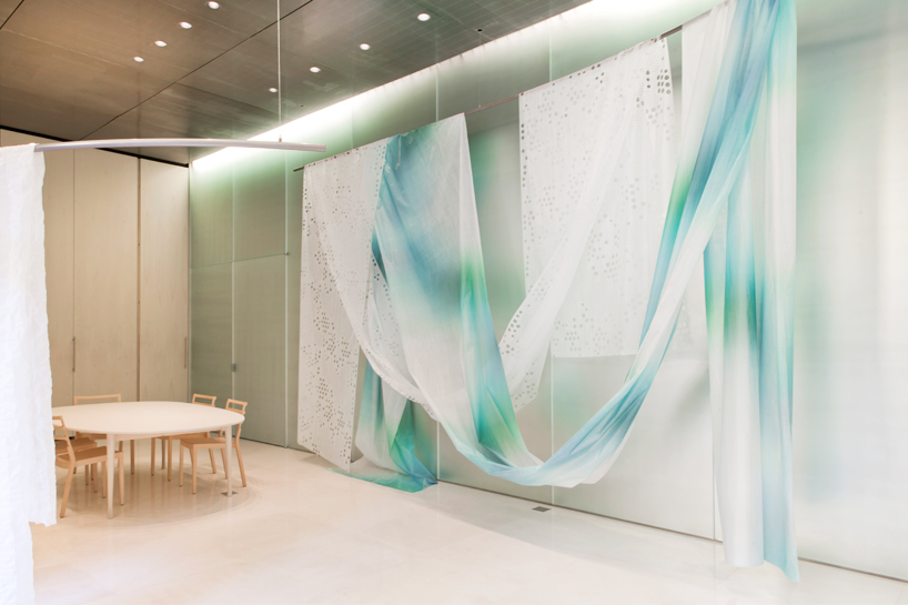
during milan design week 2014, designboom had the chance to interview japanese architect toyo ito, where he spoke on the design of the first kinnasand flagship store in milan, for the innovative curtain textile and carpet producer. situated inside a light-flooded courtyard in the milanese city center, the space showcases colorful textiles in captivating fashion. ‘as you can see, the textiles that are here are actually splendid; they are very delicate, and you can see that their coloring is really attractive and appealing,’ ito tells designboom. ‘so, when I decided to approach the architecture for this very place, I decided that I needed something that would not overwhelm the quality and the beauty of all these fabrics.’

toyo ito designs interior for kinnasand flagship store in milan


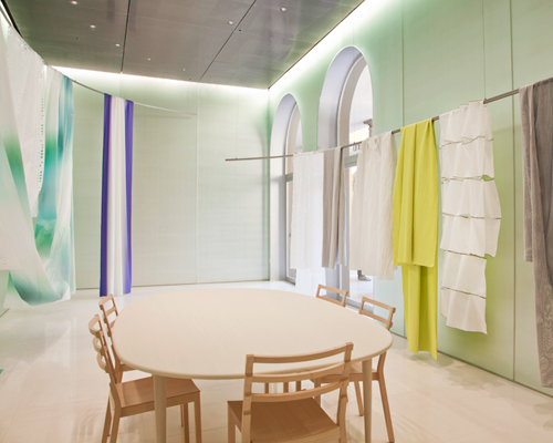
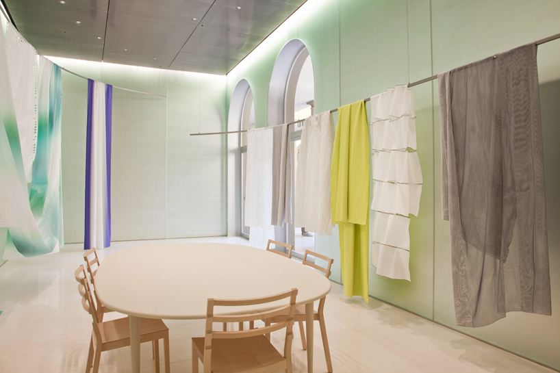
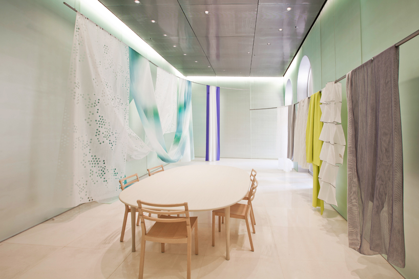
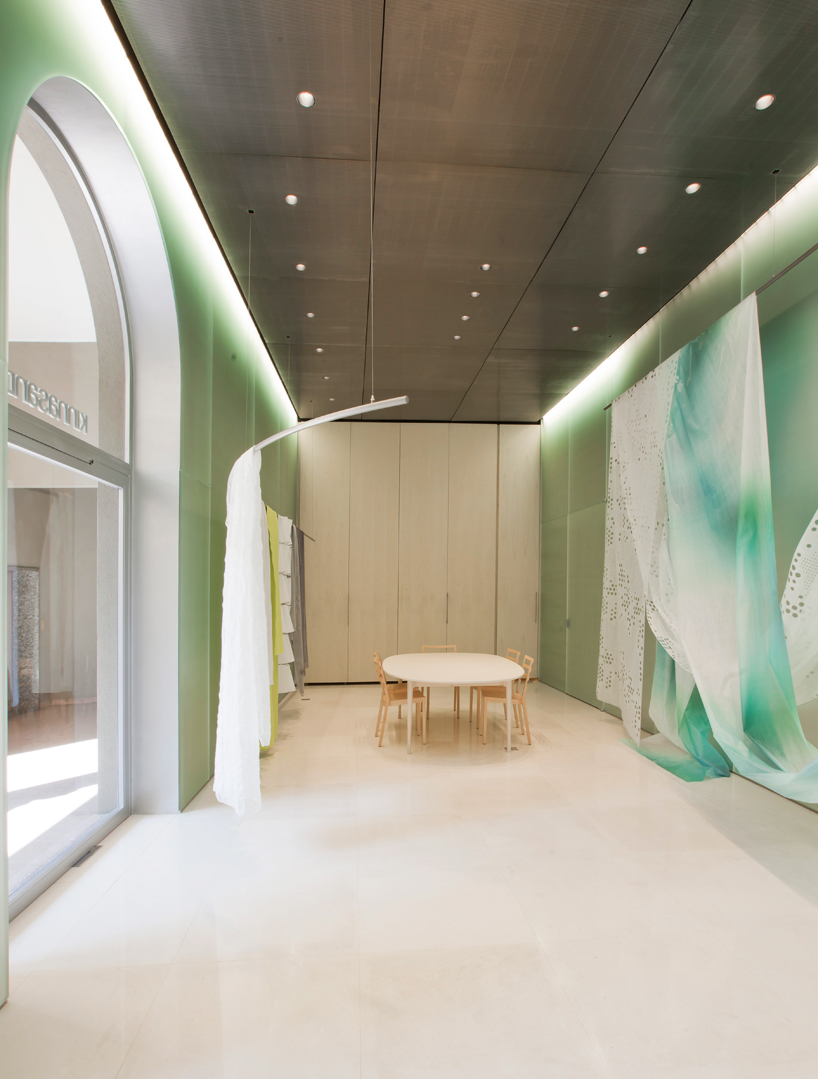
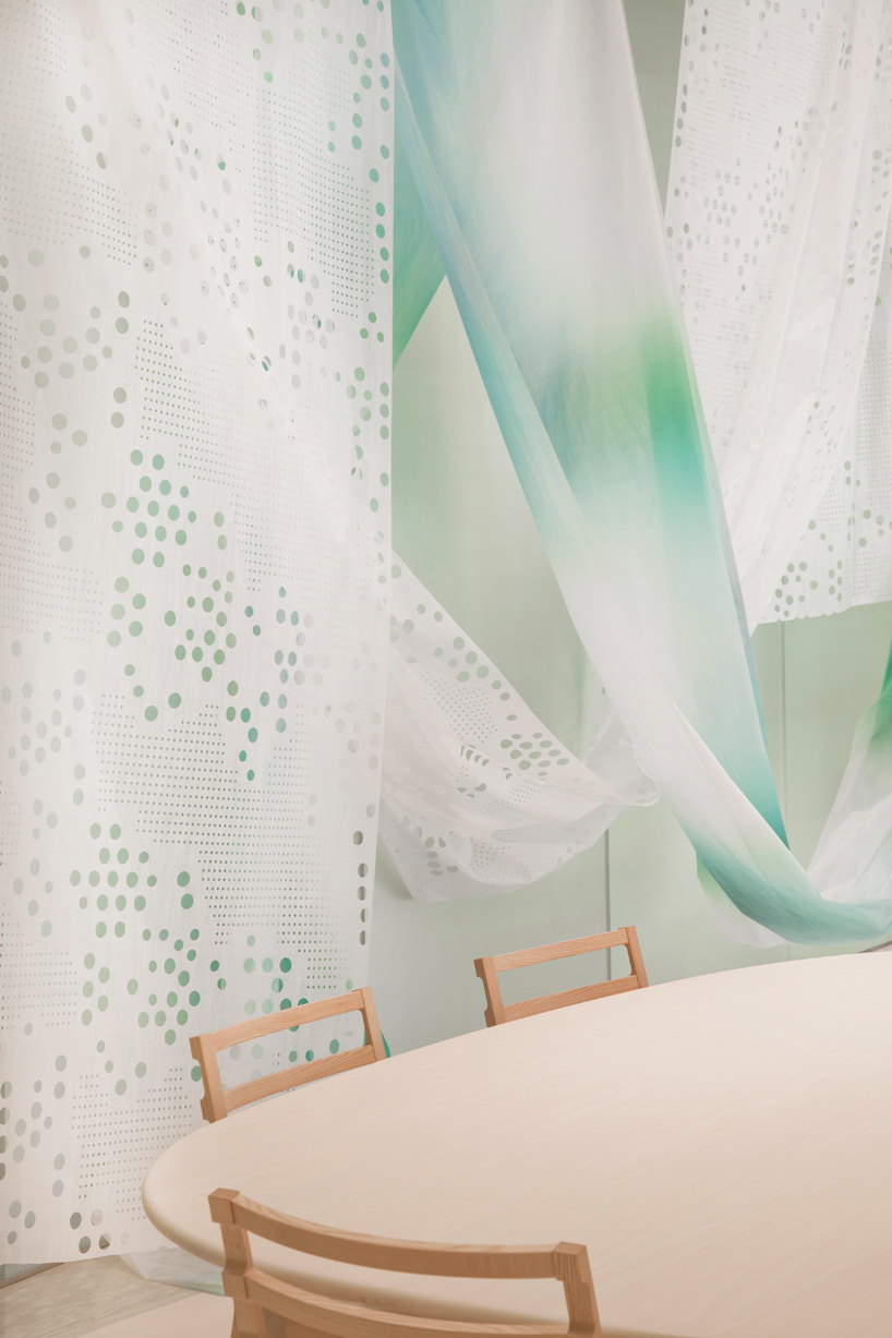
the showroom features walls made of frosted mirror glass, a ceiling made from electro-polished stainless steel panels and a floor made of polished white limestone. LED lights, which can be used to shape different moods, illuminate the walls. two rails, on opposite sides of the space, which curve around the showroom, are used to display the textiles.


‘you can see that we have two layers of lighting. the first on is the light directed toward the wall, and that’s an in-direct light. the second one is the light going toward the textiles, and that’s a direct light coming from the spotlights on the ceiling. there’s a third layer, more hidden, as it comes from the floor. it’s the natural light that is reflecting on the floor and going towards the fabrics as well. I wanted to emphasize more the natural light, the ecological light rather than artificial light for this installation.’

toyo ito designs interior for kinnasand flagship store in milan


the furniture, which sits in the centre of the showroom, comprises light chairs from italian furniture company DePadova and a table and closets especially designed by toyo ito made from white dyed beechwood – a material that complements the light, contemporary mood of the space and references kinnasand’s nordic roots.


‘I wanted a form that would be relaxing for the people inside the space,’ adds ito. ‘the reason we chose wood is the warmth that comes from it. as for the walls, some are operable doors. I wanted to create both wall and door to integrate the space with the surface of the wall, simultaneously creating a door that would open and swing back to integrate with the whole environment.’

toyo ito designs interior for kinnasand flagship store in milan


below you can read a transcription from designboom’s interview with toyo ito:


designboom (DB) : can you talk about the installation for kinnasand?


toyo ito (TI) : as you can see, the textiles that are here are actually splendid; they are very delicate, and you can see that their coloring is really attractive and appealing. so, when I decided to approach the architecture for this very place, I decided that I needed something that would not overwhelm the quality and the beauty of all these fabrics


DB: what was the inspiration for the project?


TI: in italy you have a very beautiful natural light and I thought that that was an important inspiration for the project, together, with the textiles that you can see here because I wanted to have them growing out of this space. so, in order to integrate these elements, I decided to use marble for the floor. behind me you can see this frosted mirrored glass. it was used to give this space a much softer look. and so, as much as possible, I tried to create a space that will be not realistic, an irrealistic environment.


DB: what kind of experience were you aiming for the user to have when designing the space?


TI: when you walk down the streets of milan you can see the many furniture  and textile shops. there really are many, many, many stores. you can say that the city is packed with stores and shops. I think that after a while of walking down these streets you get exhausted. what I wanted to create here was an oasis because this is a very nice place – a place where you don’t need to pay too much attention to your everyday life. you can get a moment to relax from your everyday life. this is a very quiet, tranquil space. this is exactly what I wanted to create.

toyo ito designs interior for kinnasand flagship store in milan


DB: being an architect, how do you find it to design an interior space?


TI: I don’t think it’s a very different job – architecture and interior design. of course we have to say that when it comes to architecture, you have to take into consideration many more elements like the external aspect and the environment and the problems that come from the structure itself, where none of this is necessary when doing interior design. this time I really had a chance to share my way of thinking with the client that had the same idea. therefore, it was both fun and relaxing for me to do this job.


DB: can you speak about the relationship between the furniture and the space and why you chose the pieces?


TI: having a big table inside the space was one of the requests of the client. when the moment came to decide the right shape and size, I wanted a form that would be relaxing for the people inside the space. if we had something with a hard edge, this wouldn’t be possible. this is why we chose this shape. the reason we chose wood is the warmth that comes from it. as for the walls, some are operable doors. I wanted to create both wall and door to integrate the space with the surface of the wall, simultaneously creating a door that would open and swing back to integrate with the whole environment.


DB: the mood of the light constantly changes  – what was the original idea behind it?


TI: you can see that we have two layers of lighting. the first on is the light directed toward the wall, and that’s an in-direct light. the second one is the light going toward the textiles, and that’s a direct light coming from the spotlights on the ceiling. there’s a third layer, more hidden, as it comes from the floor. it’s the natural light that is reflecting on the floor and going towards the fabrics as well. I wanted to emphasize more the natural light, the ecological light rather than artificial light for this installation.

toyo ito designs interior for kinnasand flagship store in milan


DB: how was the collaboration with kinnasand?


TI: it was a great collaboration because from the very moment that I was commissioned by them for this interior design job, I was given just a few basic directions, and then I was given as much freedom as I wanted to design this space. also, their aesthetics toward the space and textile were similar to my idea of space for this place. so, we didn’t have any controversies about any possible issue, which gave me the possibility to have a very pleasant work experience.


DB: what were some of the difficulties you encountered during production and execution of the installation?


TI: this time, it was not creating a completely new architecture. it was the renovation of an old building. when we first opened the ceiling we found some pipes, so we had some small technical problems. the other problem was the fight against time because we needed to do the opening for milan design week. apart from that it was quite smooth.


video © designboom