interview with liz diller of DS+R
photo © abelardo morell
diller scofidio + renfro has developed a body of work centered on activating spatial and experiential potentials of building, cities, and environments. the studio blends architecture, the visual arts, and the performing arts, while their projects noticeably look to new forms of technology for novel modes of engaging users. while the office has a long history of envisioned and realized work, their pace has accelerated into a period of intense production. following the exceptional response generated by the highline since its opening, the practice has moved into construction for projects such as the broad museum in los angeles, columbia university medical center in new york, and the museum of sound and image in rio de janeiro, while many others are in motion for the future.
designboom recently attended a presentation delivered by founder and principal liz diller in milan, and has since then sought out insights from her on the office’s current work as well as its foundational aims. read on to hear what she has to say.
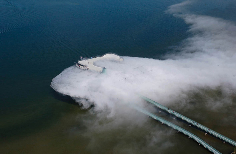
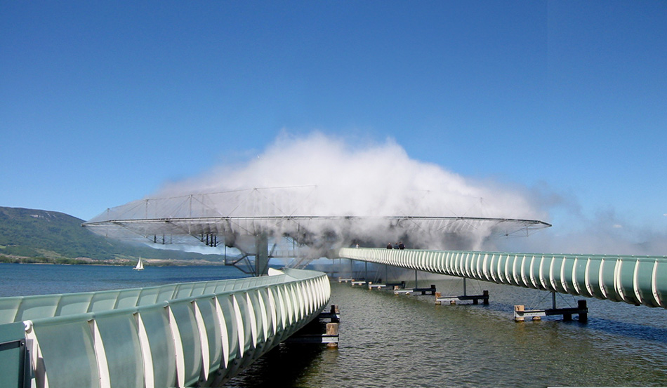
the ‘blur building’, realized for the 2002 swiss expo, existed as a fog mass created by sprayed mist
photo © beat widmer
designboom: how did the studio, between you and ricardo, begin? what were your core intentions and fascinations?
liz diller: even though I graduated from cooper union with a degree in architecture, I didn’t intend to be an architect. at that time, there were very few architectural commissions because of the recession. we didn’t want to turn to paper architecture like many of our peers. we were anxious to apply our research, to disrupt, and find new problems working within space.
our early work was ephemeral. there were many guerrilla installations on stolen or borrowed sites. we didn’t have clients or funding, so we were in credit card art debt for many years but slowly began getting recognition.
we acted as independents, looking at ourselves neither as architects nor artists. we didn’t care what discipline we belonged to and we didn’t have a specific trajectory in mind. we had no desire to establish an architectural practice or a client base. whether it was physical materials, video, performance or print, each project had a specific logic and appropriate medium. it was all about finding the right medium to challenge inherited conventions.
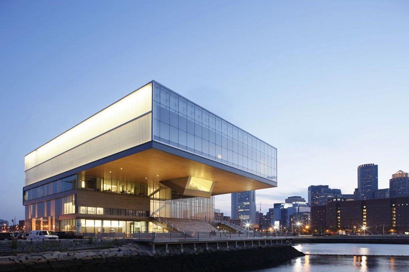
the ‘institute of contemporary art’, completed in 2006, is located along boston’s harbor front
photo © iwan baan
DB: how have those values changed over the years?
LD: I don’t think it’s a matter of values changing. as we grew and evolved, we realized that architecture was something we wanted to pursue. this transition into architecture was never at the cost of our other work. the early years gave me an opportunity to take a critical stand and challenge what architecture is and how it can interact with other cultural disciplines. I couldn’t have started by building buildings right away.
so, I think an identifiable change is not in our values but in the medium and the scale of our work. we’ve continued to explore the same research trajectories: smart and dumb technology, mediated versus authentic experiences, the culture of vision and visuality. the difference now is that the work is often on a larger scale. the performance, exhibitions, installations and public art is still being pursued. the difference now is that we are able to pursue projects at different scales, different degrees of permanence and complexity.
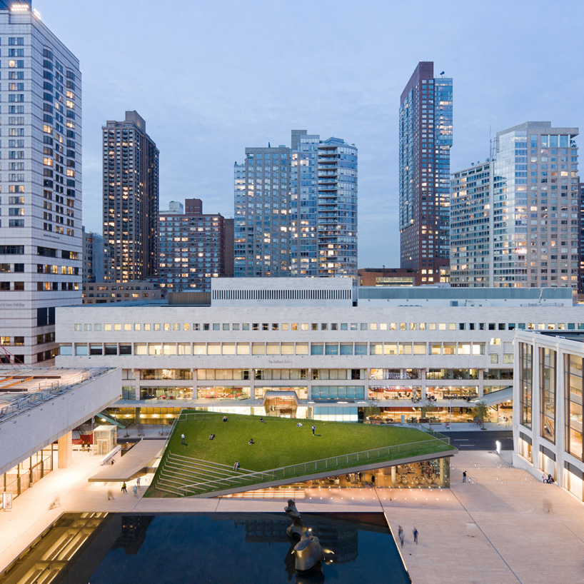
the ‘hypar pavilion’ elevates a grassy public landscape above a restaurant at lincoln center in new york
photo © iwan baan
see designboom’s feature on the ‘hypar pavilion’ here
DB: in what ways does your studio’s interdisciplinary nature strengthen its ability to shape or frame experiences?
LD: well, I think almost everything is ‘interdisciplinary,’ even architecture. in our work, we’re always trying to merge multiple disciplines and we’re always thinking critically about finding the right tools and processes.
for example, when we were working on the installation para-site for the MoMA in 1989, we had to think through the lens of an architect in the museum, working within durrell stone, philip johnson and cesar pelli space. our thinking had to transcend hanging drawings on the wall. even though we were working in multimedia, the installation was developed and kind of framed through an architectural lens as well.
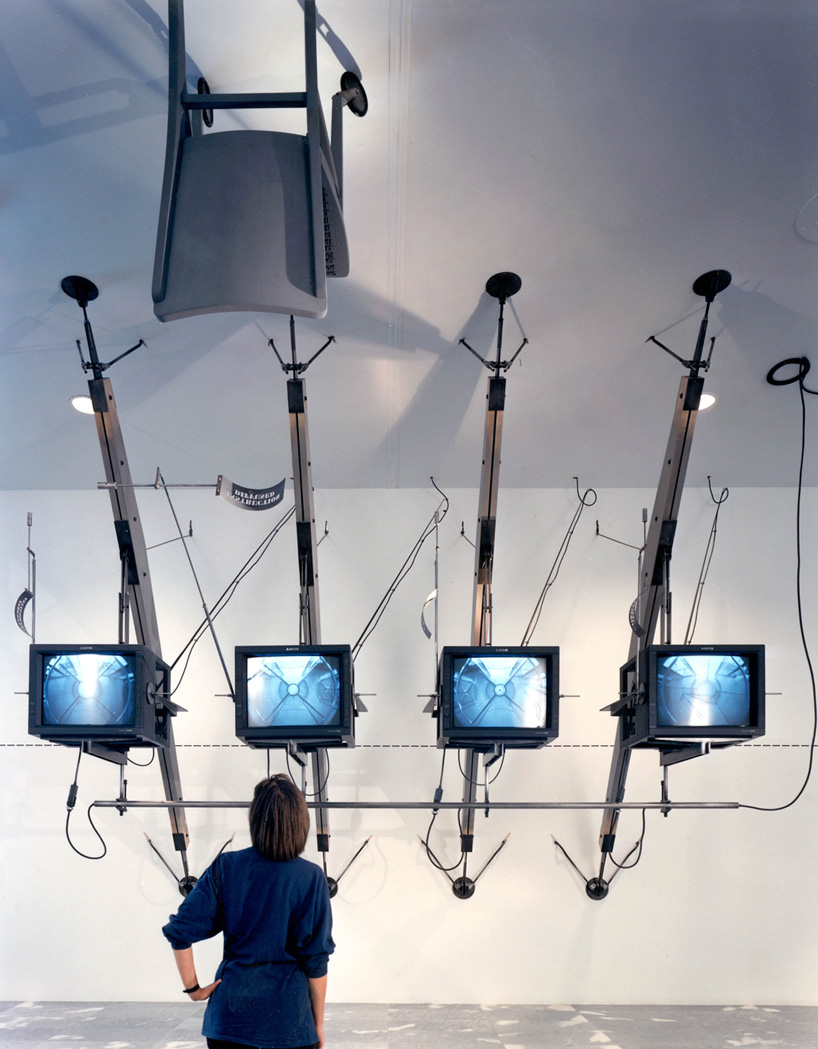
the 1989 installation ‘para-site’ at MoMA offers live-stream views of remote sites in the museum
photo courtesy of DS+R
DB: could you describe by example how your projects seek to break down institutional barriers, and offer an open relationship to the public?
LD: it’s always challenging to transition between a city’s public space and the private space of a building. we’re always looking to break down institutional walls, to dissolve the ‘high culture-low culture condition.’
when designing museums, we believe that the architect and the museum share the same responsibility: to educate and engage the public. guided by this belief, we aimed to integrate the ICA with its civic surroundings. we extended material of boston’s harborwalk’s into the building; it folds up to become a public amphitheater, and continues inside as the flooring and ceiling of the semi-public theater.
similarly, the redesign for lincoln center was rooted in bringing lincoln center’s cultural production into the public space while inviting the city into what was once introverted spaces. we wanted the public and private space to mingle. the aim was to connect lincoln center with its neighborhood, giving it a more noticeable presence on the street.
for alice tully hall, we reacted to how cut off the original design was from the city. so, we encased it in glass and put its interior on display. using newly created glass along the street and on broadway, the design invites pedestrians into the lobby’s public seating and cafes. we placed an information grandstand outside which displays news on video monitors about lincoln center events and provides a space for pedestrians to observe private functions on the second floor.
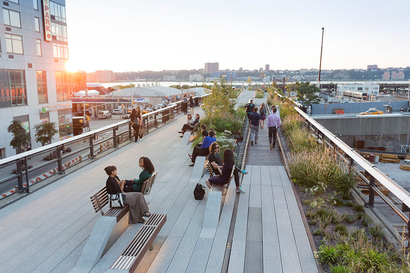
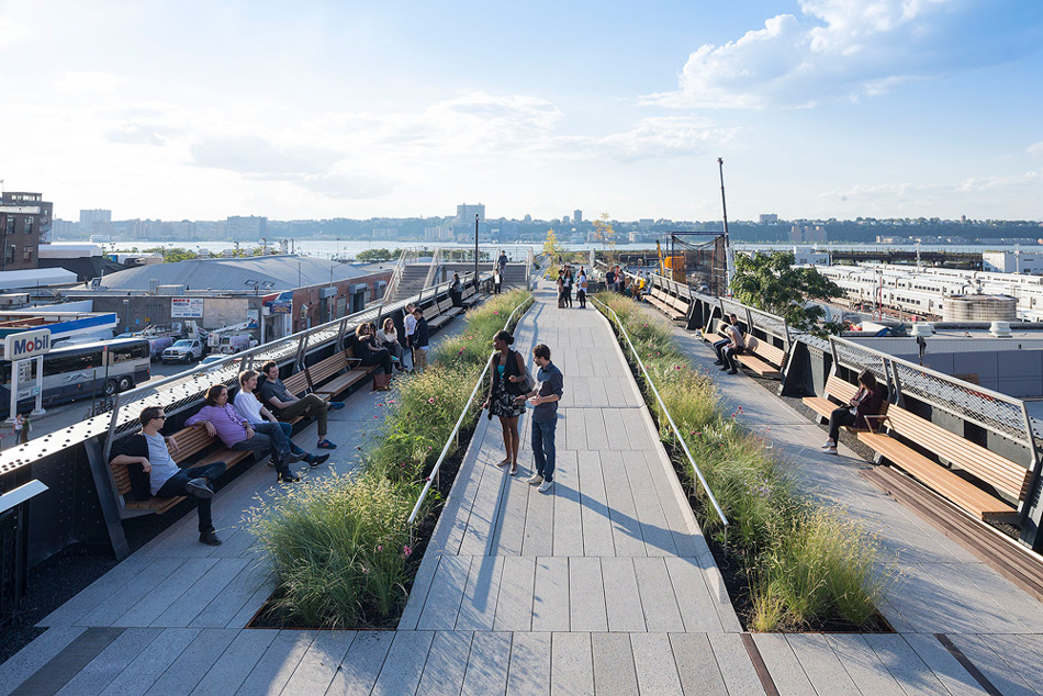
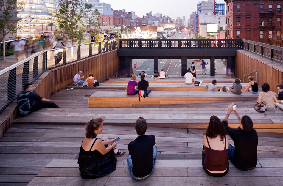
the third and final section of the highline opened for public access in autumn 2014
photo © iwan baan
DB: the highline has very apparently experienced a lot of success, and produced a lot of discussion not only among the discipline, but also buzz among the general public. how do you and your office feel about the various aspects of the ‘highline effect’, in regards to its overall popularity, presence in pop culture, proposals for variations in other cities, etc.?
LD: I feel good, but I also feel a sense of ambivalence. we were able to transform something that was going to be torn down into something so many people appreciate. and, yes, it has had a catalytic effect on mobilizing other governments to invest in similar urban regeneration projects. there have been many other proposals for variations and I think what’s exciting and has caught people’s imagination is the idea of reinventing or repurposing existing infrastructure.
yes, critics are pointing out its popularity now, but really there is nothing that can be done. if it’s popular, so be it. if anything, its popularity is a testament to it reaching such a wide audience.
DB: you mentioned in your lecture at MiARCH in milan that the highline has the potential to become a victim of its own success. in what ways can the beloved post-industrial urban element go bad?
LD: it’s not about the post-industrial urban element going ‘bad.’ what is happening is kind of paradoxical. there’s an urban growth that’s happening with more new buildings, higher rents, etc. and, I am unsettled about the threat or potential of monoculturalism in this area.
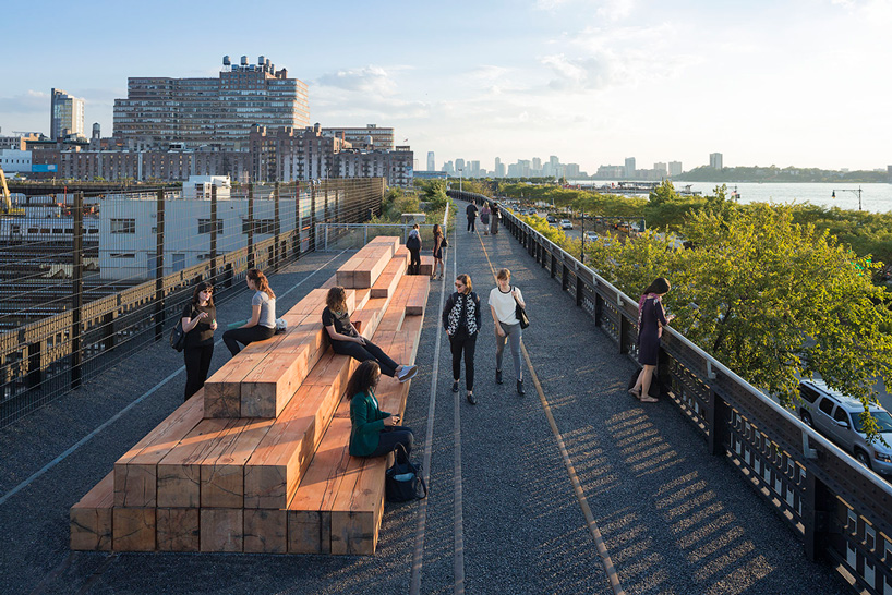
photo © iwan baan
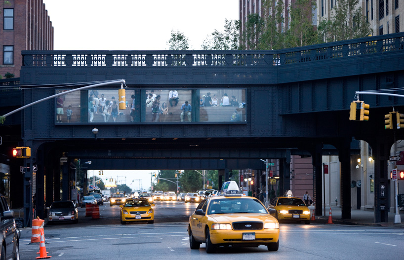
a view is framed toward traffic passing by below
photo © iwan baan
for more images, see here for designboom’s article from when the highline’s second section opened
DB: DS+R has a long track record with cultural institution projects. as the most recent investigations in this area, in what ways will the cultureSHED project be unlike any other cultural institution?
LD: cultureSHED is about positing how art will be looked at in the future. the design creates a sort of open infrastructure to support whatever the future art world will throw at it. in many ways, this project relates to the question about forming an open relationship or dialogue with the public. it’s a start up initiative looking to make a public forum for the creative industry.
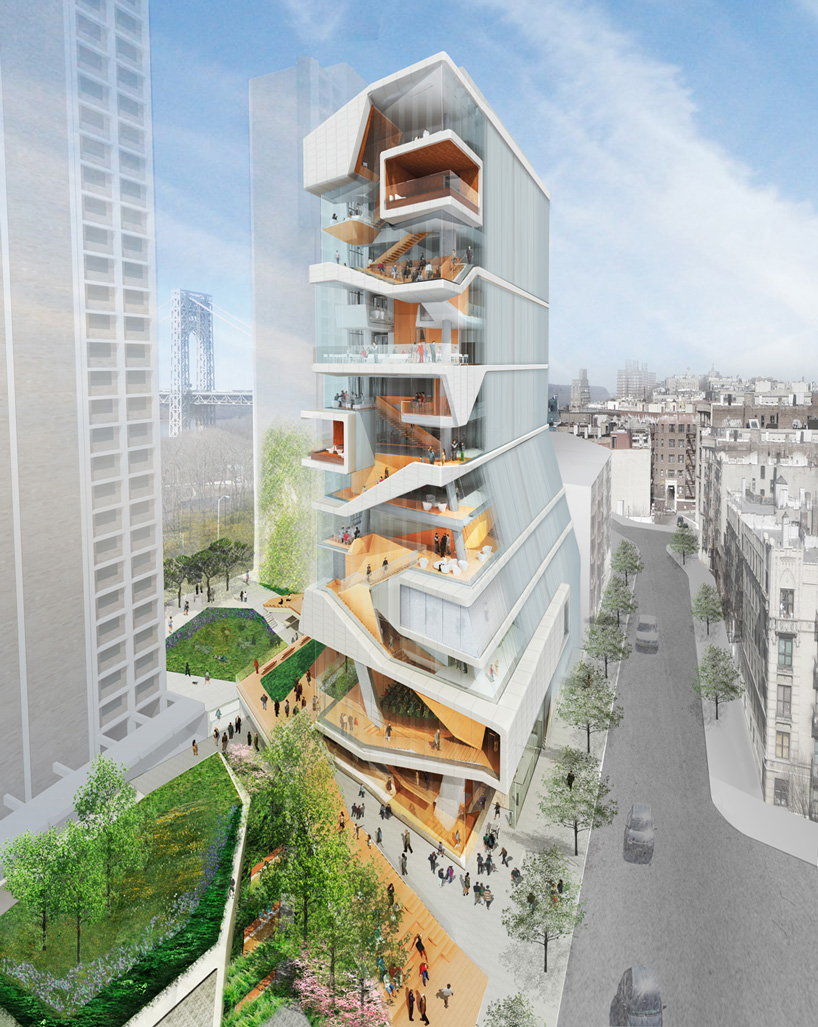
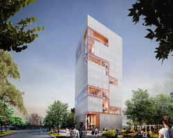
the columbia university medical and graduate education building is expected to open in 2016
image courtesy of DS+R
see designboom’s coverage of the topped out concrete structure here
DB: in regards to moscow’s ‘zaryadye park’, how has responding to the social and political conditions of russia been different than those of the US?
LD: we did have initial reservations about zaryadyde park, which sits right in front of the kremlin and red square in moscow. I think it’s important to recognize that there’s a fine line between celebrating the history of this site and celebrating authority.
we responded to this complexity by designing the park as pathless, allowing the public to wander freely – a stark contrast to the political and social history of the red square. in addition to the natural muscovite landscape, we incorporated historical site elements whenever given the chance. the scheme utilizes the foundation of the unfinished stalin tower and the demolished hotel rossiya as well as a number of unearthed archeological sites.
see designboom’s article on the design for zaryadye park here.
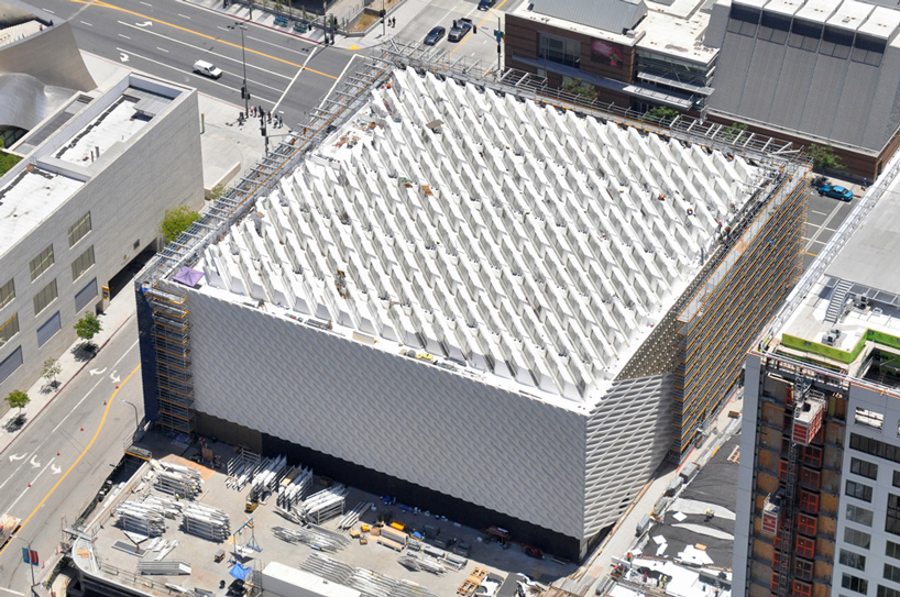
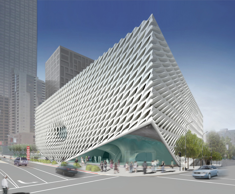
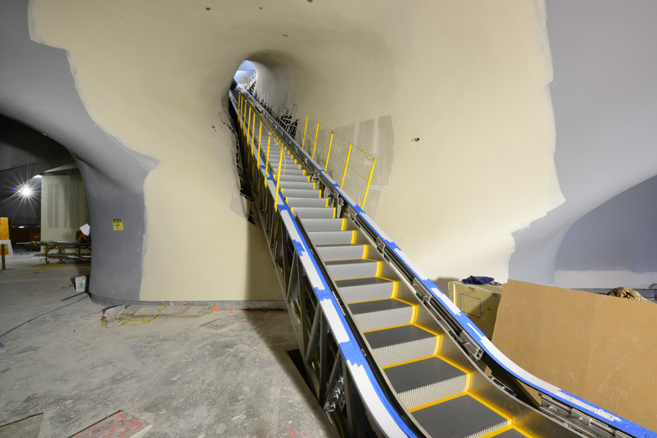
construction on the ‘broad’ is nearing completion in downtown los angeles
photo by matt construction
see designboom’s initial article of the museum’s design here
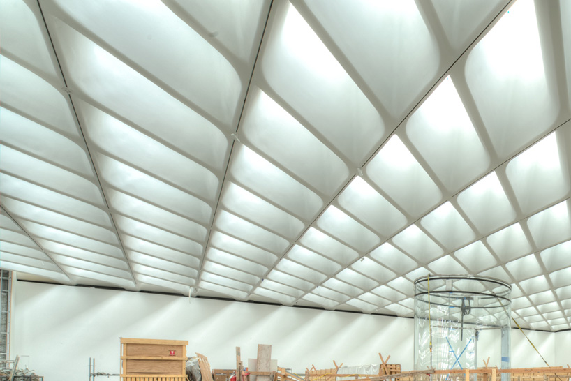
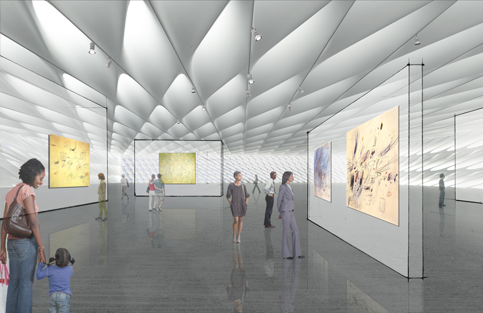
an image of the upper level gallery as of summer 2014
photo by nathaniel riley
DB: personally, what are you currently fascinated by outside of the profession, and how does it influence your work?
LD: since college, I’ve always been fascinated by film and took courses at cooper union before moving into architecture. I think it’s an interesting time to think about new ways of story-telling on new audiences.
DB: what advice would give to students and young designers?
LD: well, to me education is about pushing people to analyze, to examine, and to break the rules. I think the most important thing I can teach my students or young people in the field is to continue investigating. architecture is always evolving, it isn’t canonical.
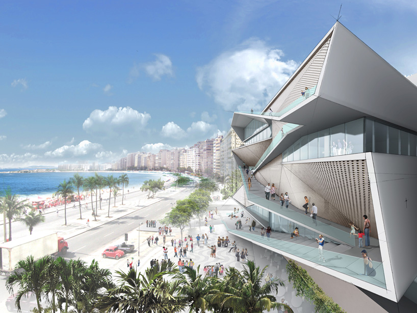
the ‘museum of sound and image’ in rio de janeiro is currently under construction
image courtesy of DS+R
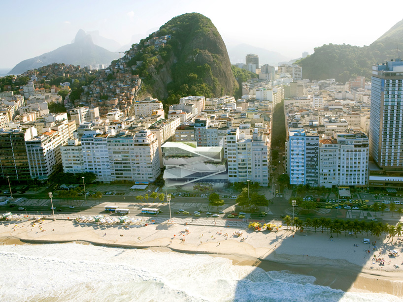
the building’s thickened façade serves as a continuation of the public promenade along copacabana beach
image courtesy of DS+R
