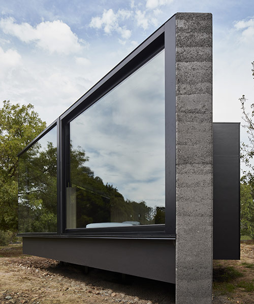
titled ‘a pavilion between trees’, the addition to an existing home was designed by australian practice branch studio architects for a client with a need for a new master en-suite. the home, a 90’s built design executed by the clients themselves, exemplifies a markedly different architectural style that was not pursued with the new addition. instead, the site and its many spaced out trees served as a starting point to create a semi-detached building that interacts with its environment, not only sparing any existing tree but allowing each one to become a point of interest and serve a function with the suite.
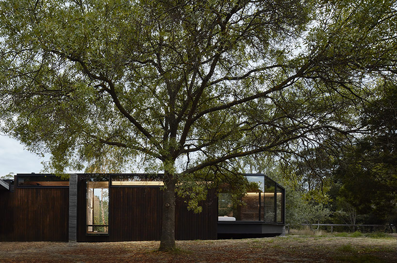
the structure was designed to preserve existing trees
image © peter clarke (also first image)
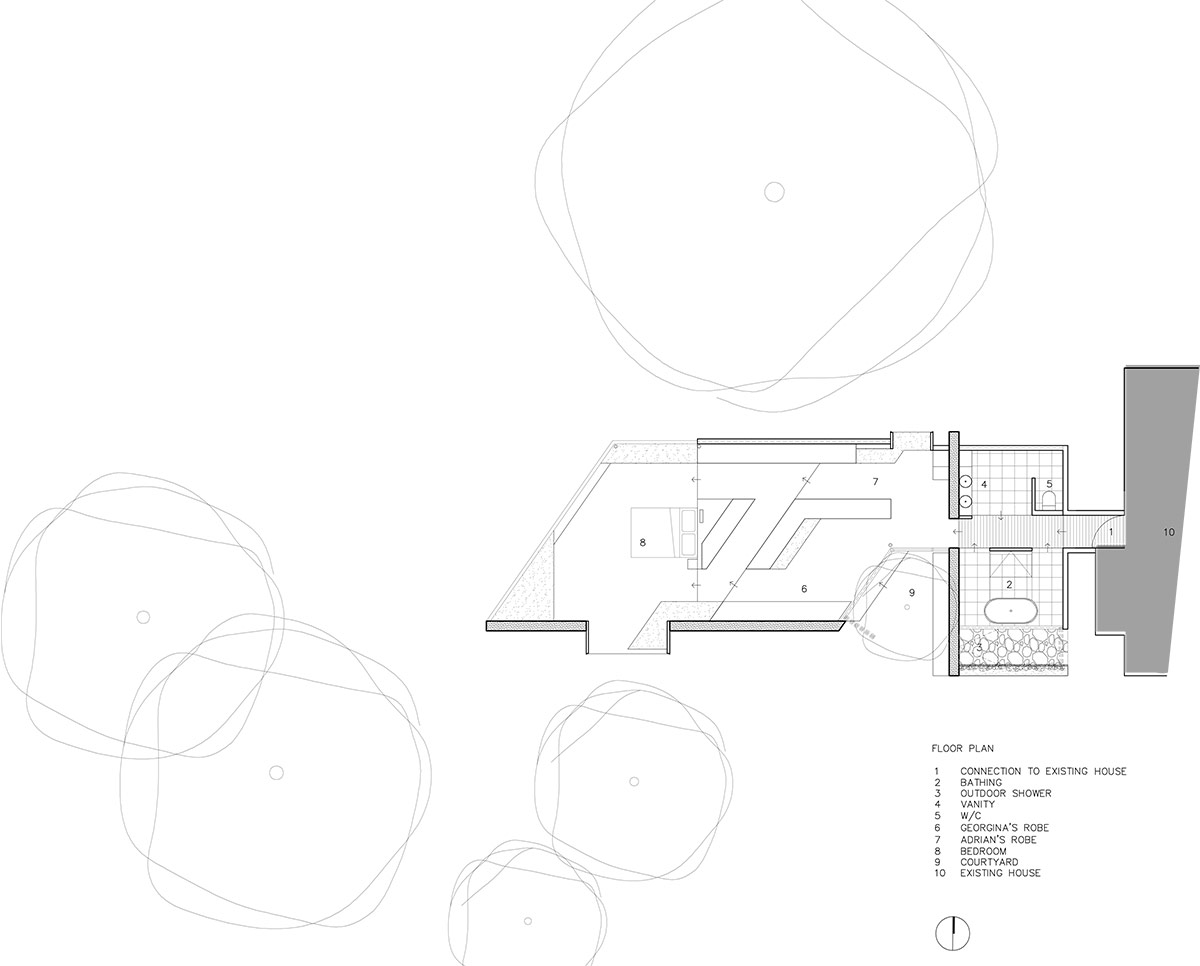
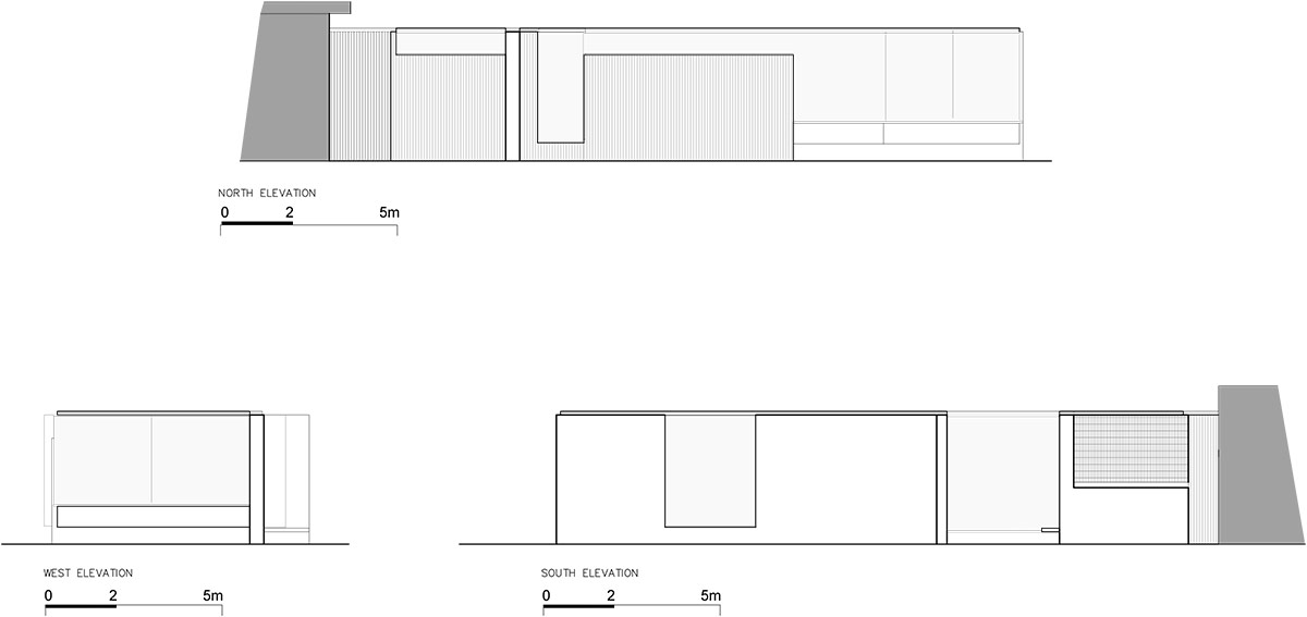
the parallelogram-shaped structure is organized intro three distinct zones which together serve as a sequence of experiences designed to mark the end or beginning of each day. a singular hallway leads from the door separating the addition from the existing home and into the three new programmatic elements that branch studio architects designed for the clients, raising only by the use of platforms intrinsic to the function of each zone. along the lowest floor, level with the existing home, the hallway bisects the master bathroom, with the indoor/outdoor shower and tub on one side and the vanities and water closet on the other. full height glass walls and external courtyard connect the bathing area to the outdoor gardens using a steel mesh to provide the necessary privacy.
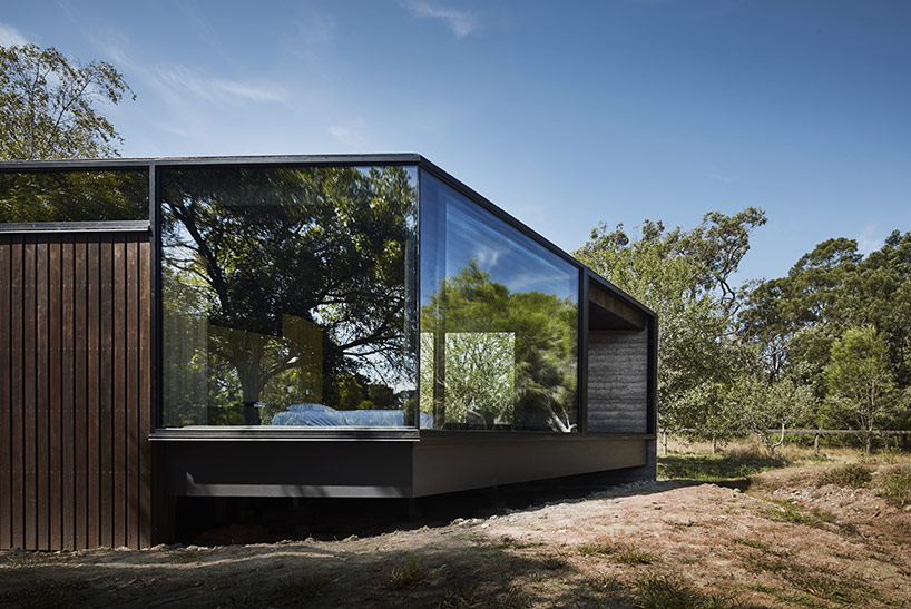
image © peter clarke
the next level is again divided into two sections providing his and hers closet areas. the woman’s closet to the south features a glass wall that opens to an open courtyard around one of the existing trees, an example of the structure built around the vegetation. a bench transitions into a side board and once again into a dresser at the perfect angle to force the occupant to view the exterior. just to the north, the man’s wardrobe exhibits a slightly different feel, with only a smaller clerestory that directs views to the tree canopies beyond- canopies which also naturally filter light to the interior. a protruding window provides for a seating area elevated over the landscape.
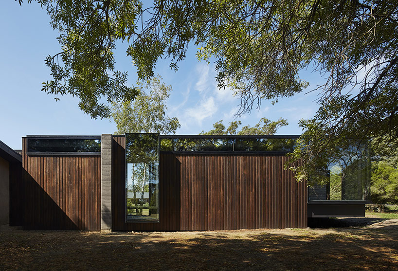
the timber clad building is designed to age along with the site
image © peter clarke
at the end of the procession, the split closets convene into the bedroom elevated at the highest point over the surrounding gardens. full-height glass walls wrapping around two thirds of the room provide constant external views. indirect lighting is used to help control the mood of the space, as natural lighting can achieve during the day, the architects wanted to continue a lighting scheme that would suggest an ambiance rather than simply provide light. as the first and last room that the owners will experience on ta daily basis, the room was designed with the waking and sleeping experience in mind.
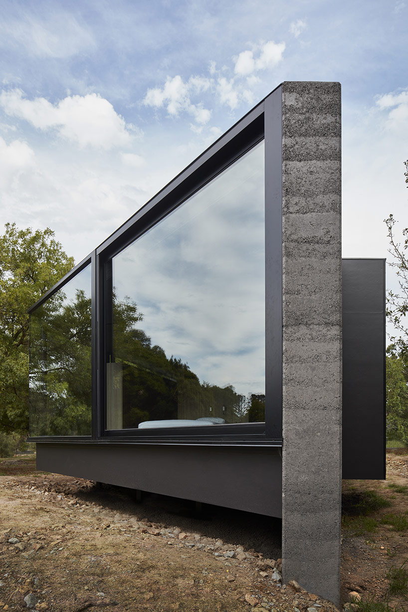
concrete, steel, and glas make up the external materials
image © peter clarke
the materials were likewise chosen to match the natural characteristics of the site, raw and exposed in nature, designed to exude comfort and tranquility. on the exterior, charcoal rammed earth, glass and steel will reflect its surroundings and age beautifully along with them. internally, the same palette with the addition of stained plywood soffits and timber fixtures provides an element of warmth. connection details and joinery help define otherwise raw material as particularly eloquent, with each edge carefully crafted and designed.
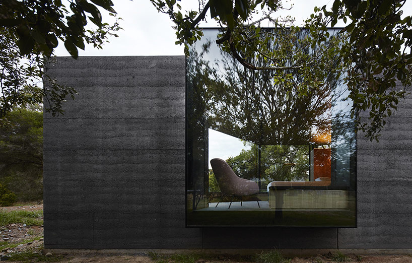
image © peter clarke
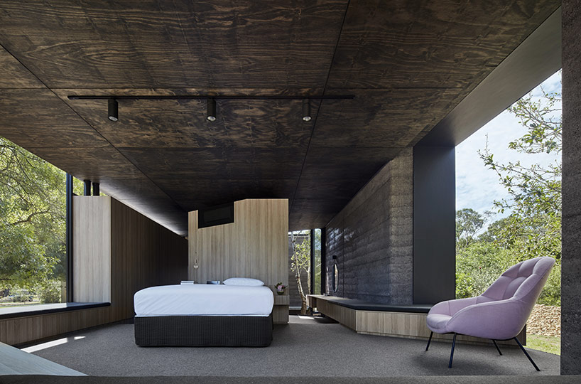
the bedroom is the highest point of the addition
image © peter clarke
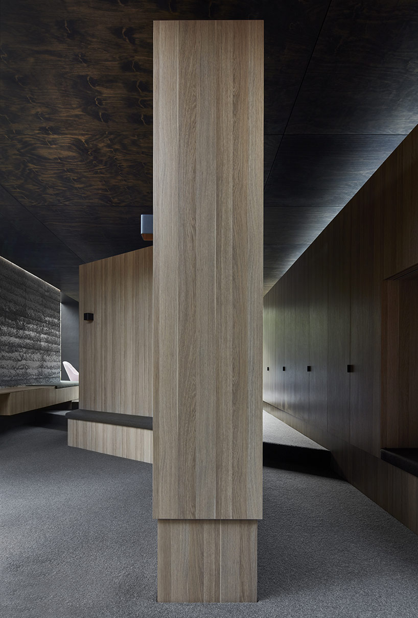
image © peter clarke
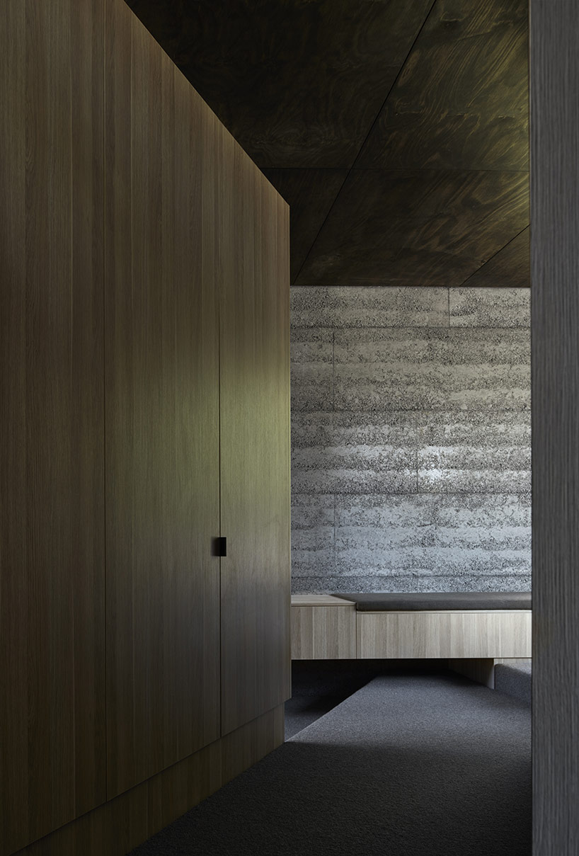
image © peter clarke
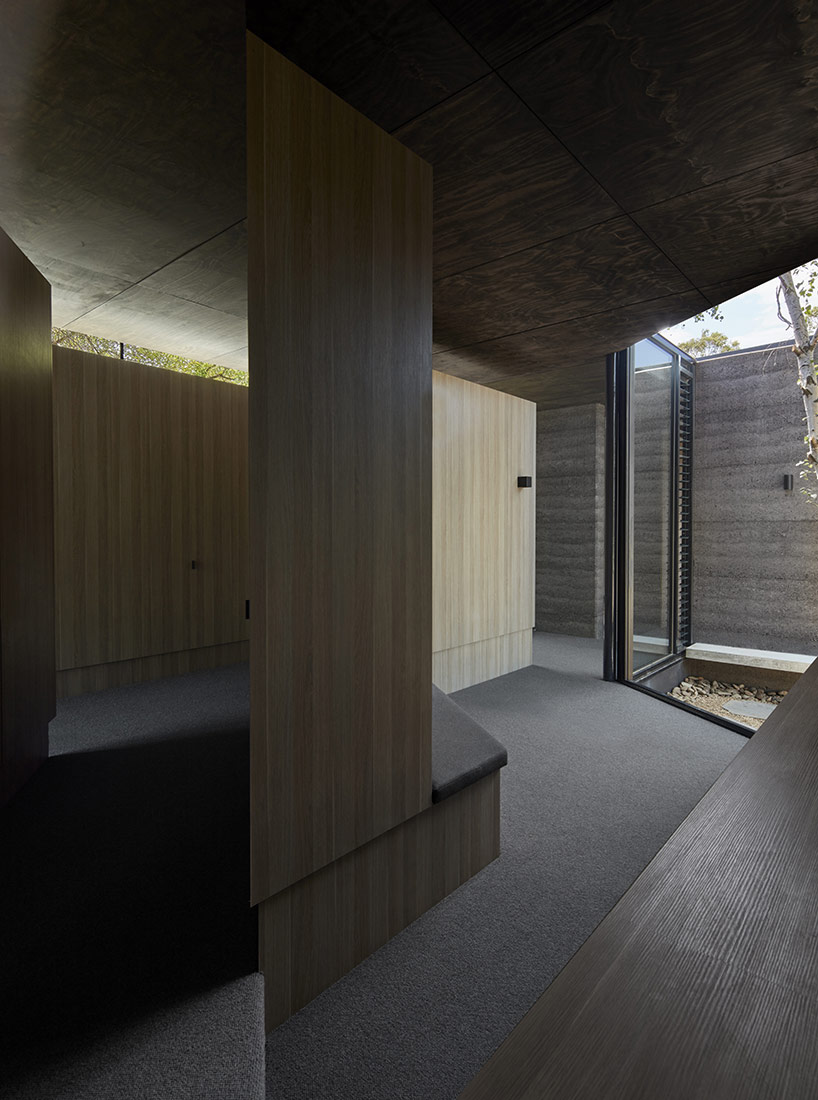
the two changing areas converge onto the highest platform containing the bedroom
image © peter clarke
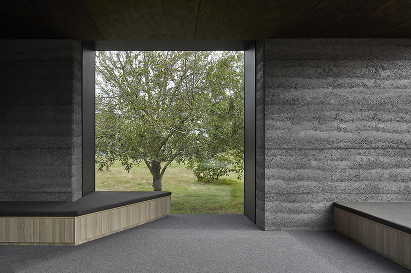
image © peter clarke
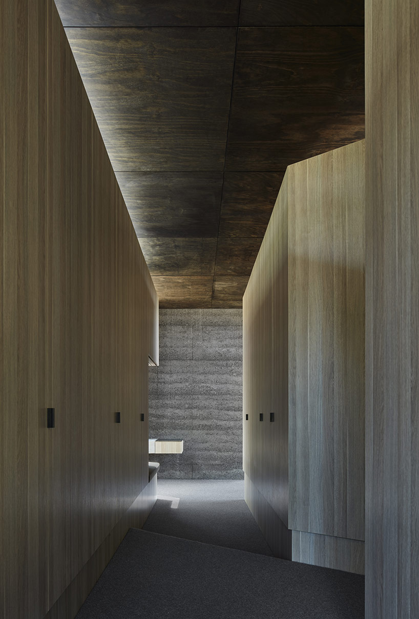
image © peter clarke
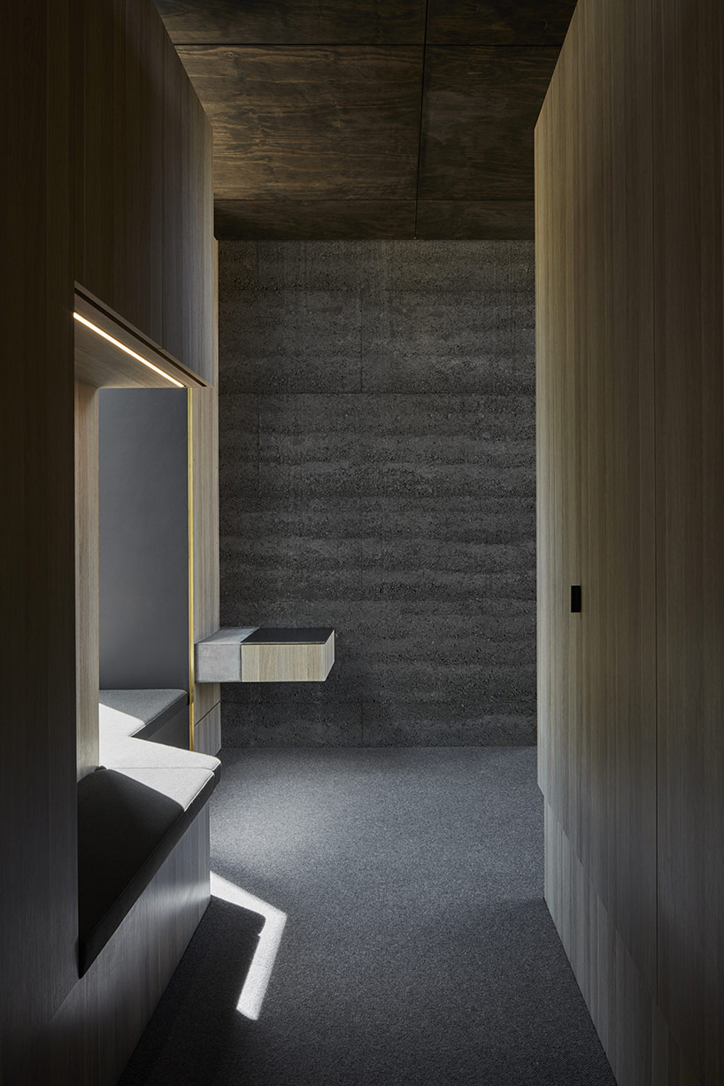
the man’s changing area contains a protruding window looking over the garden
image © peter clarke
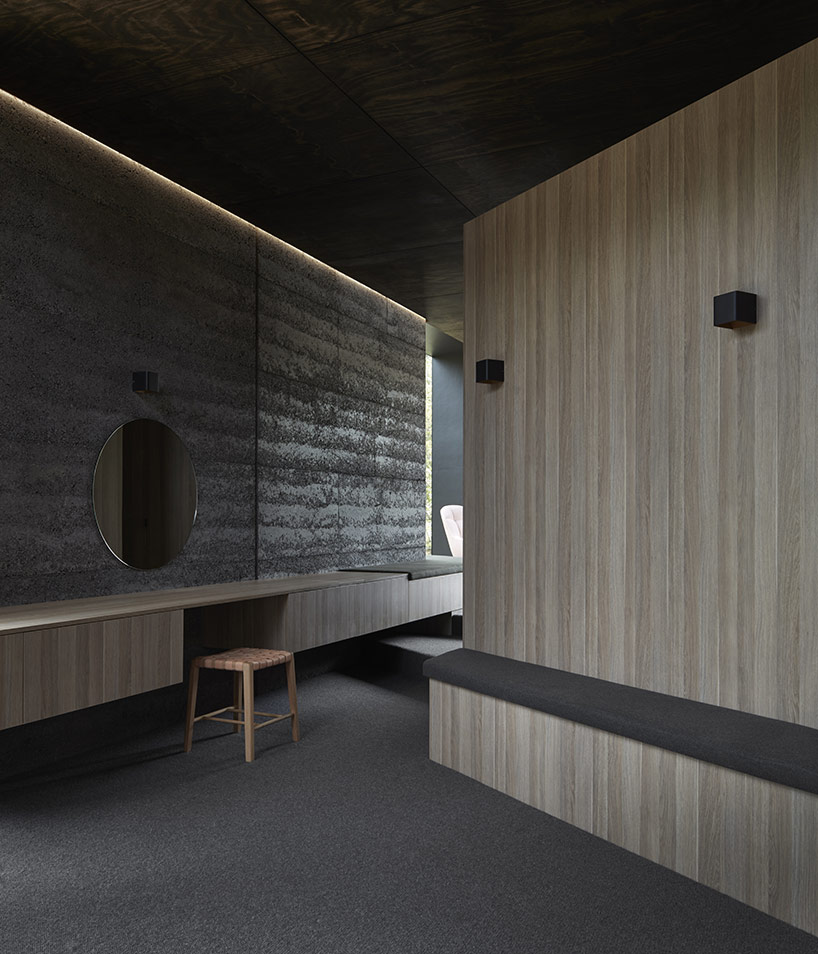
image © peter clarke
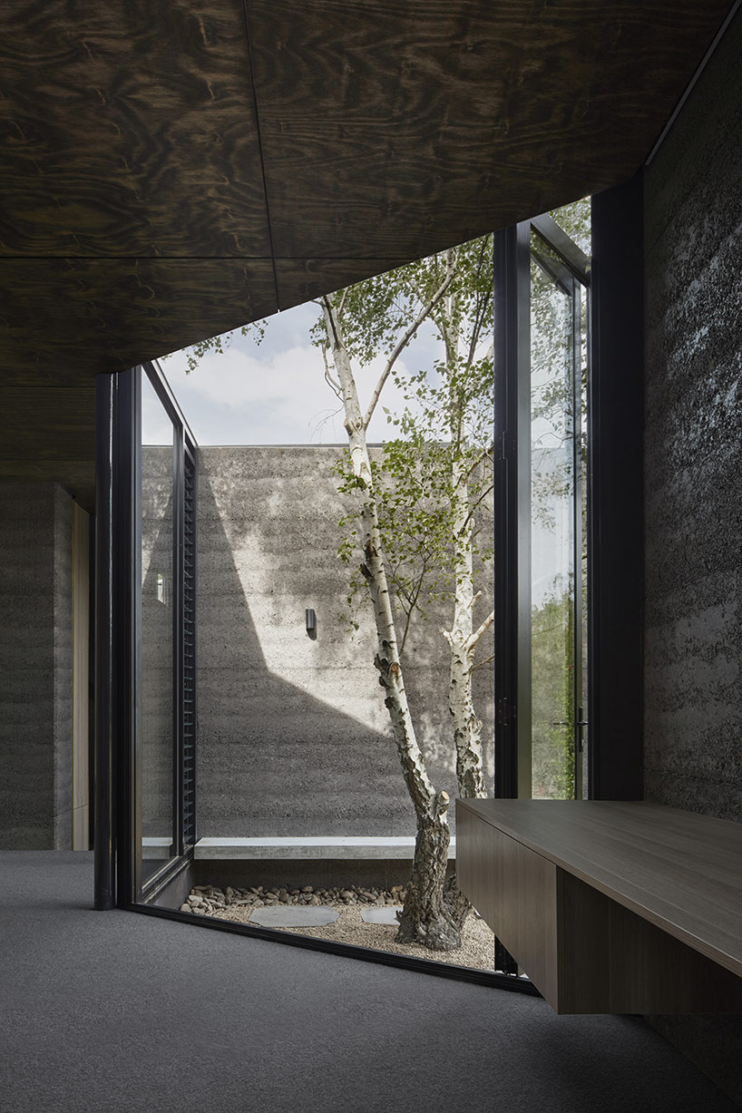
view from the woman’s closet area
image © peter clarke
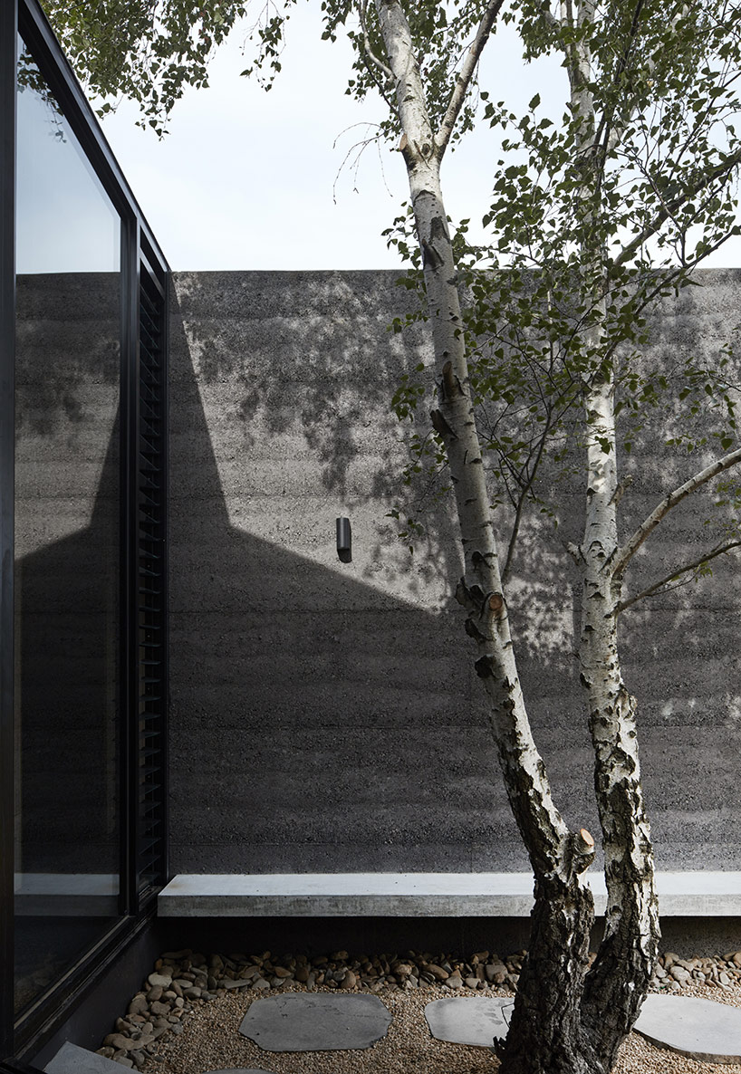
the courtyard on the south side of the addition is built around an existing tree
image © peter clarke
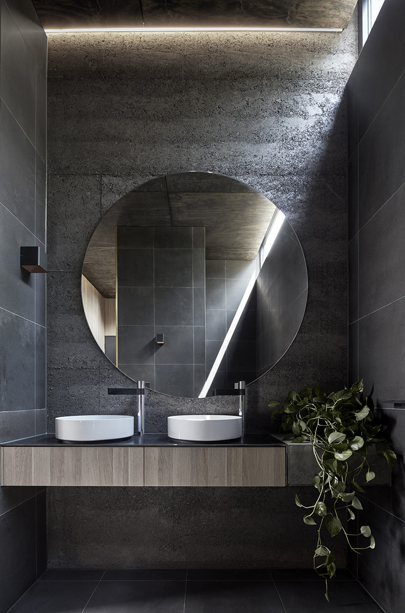
clerestory lighting provides indirect lighting throughout the extension
image © peter clarke
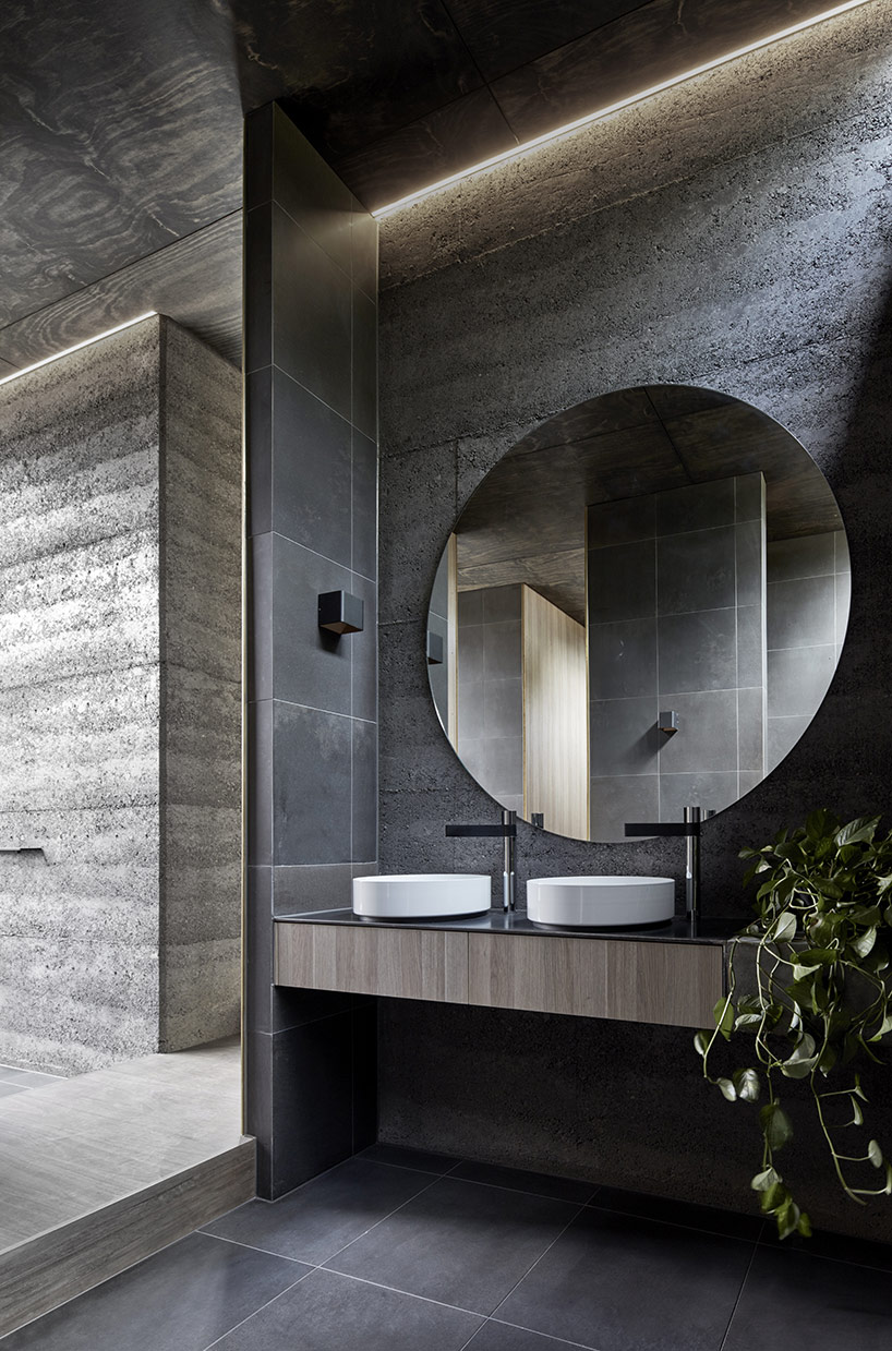
image © peter clarke
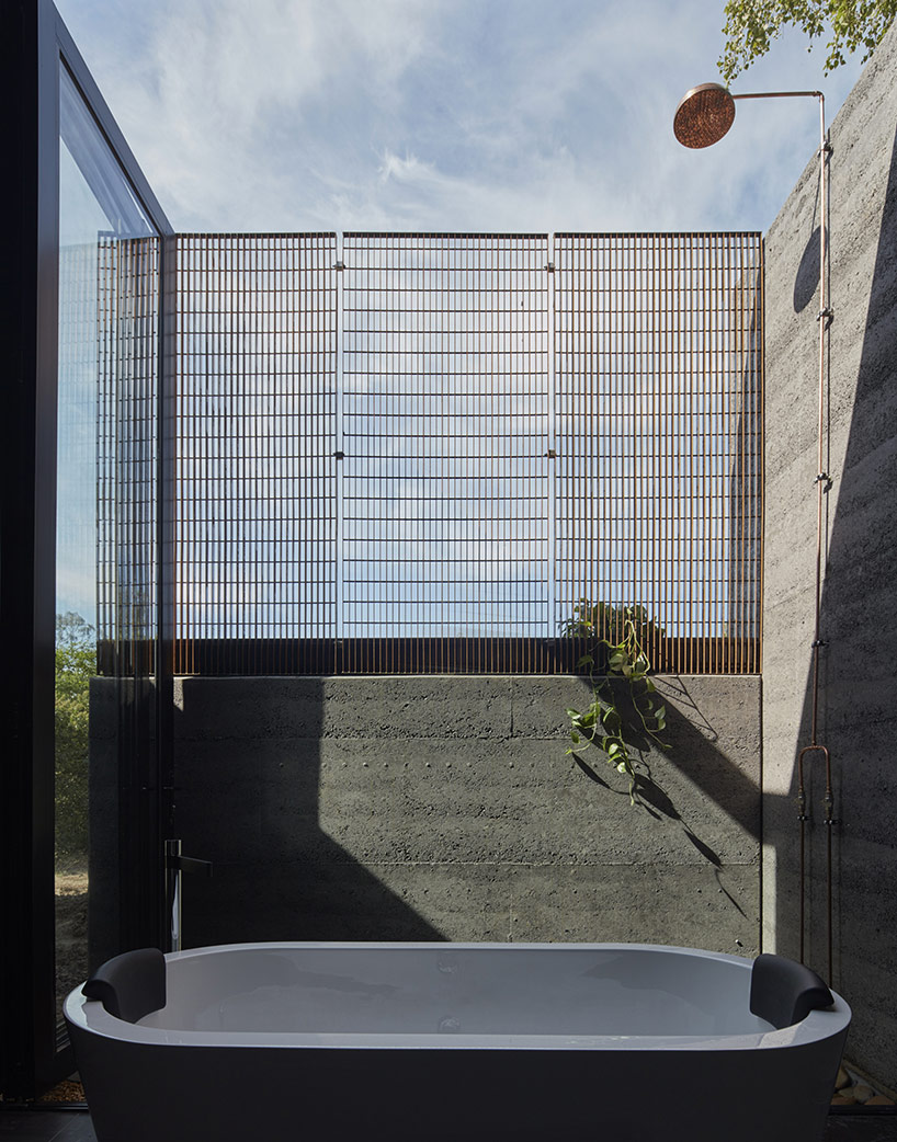
image © peter clarke
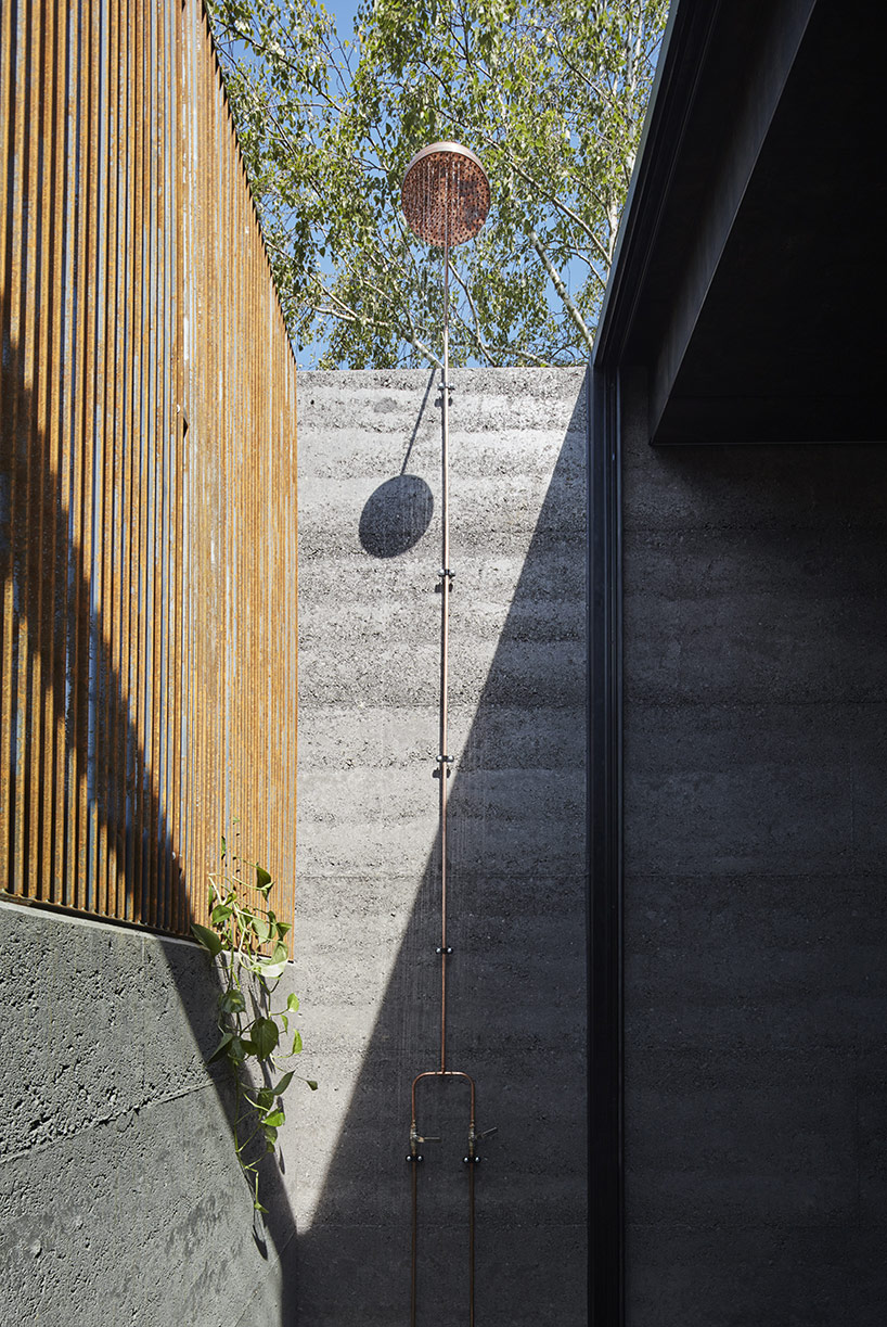
raw materials come together neatly to make a clean and natural design
image © peter clarke
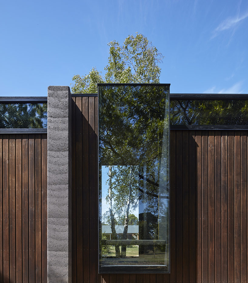
protruding windows serve as seating areas immersed in nature
image © peter clarke

project info:
architect: branch studio architects
project team: nicholas russo, simon dinh, rowena henry
builder: martin builders
structural engineer: wsp consulting engineers
photography: peter clarke
project size: 85m2
Save
Save
Save
Save
Save
Save
Save
Save
Save
