the whitney downtown museum – re-imagined by axis mundi
new york architects axis mundi have re-imagined the whitney downtown museum with
a self-initiated proposal that is provocative, and as bold in spirit as the original breuer
building on madison avenue.
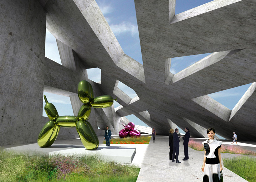
with an intense sculptural presence, the axis mundi design represents an historical extension
of the whitney’s commitment to innovative architecture, much as its polygonal windows and raw
surfaces pay homage to the original breuer fenestration and its formal brutalism.
the site is located at the beginning of the high line, at the intersection of washington and gansevoort streets.
axis mundi sought to ground the newbuilding in a web of ‘historical axes’ which form and organize
the program. the plan is based on a series of sight lines extending to 10th avenue, the empire state
building, the whitney on madison, and thelocation of the original whitney on west 10th street.
a desire for column-free galleries led the architects to create a perimeter superstructure to contain
the staircases, escalators, elevators, and mechanical rooms. this structural lattice allows the galleries
to float freely, suspended like bridges, unimpeded by a typical grid structure. the lattice allows light
to flood the building in unexpected and dramatic ways, heightening the visitor’s perception of
the artwork and the city.
maintaining vitality at street level and reducing the distance between the street and the art itself was
an important consideration for the designers at axis mundi. instead of designing a large vacant lobby,
an informal intermingling of public and private space occurs on the street level plinth, creating a complex
folding of the urban fabric. the plinth is populated by large-scale sculptures, an outdoor cafe bridge,
an info kiosk, and a performance area. a continuous path, weaving in and out of the lattice structure,
leads the visitor from the entrance ramp at the corner of washington and gansevoort up to the panoramic
viewing deck, overlooking the hudson river and the high line.
john beckmann, principal of axis mundi stated ‘we imagine the contemporary museum to be
a dynamic environment – a space that is less a container and more of a conduit.’

the whitney downtown museum – re-imagined

view from gansevoort street

plaza

gallery

roof terrace

site lines

exploded axonometric diagram

axonometric section

floor plan

floor plan

floor plan

site plan
project info:
height: varies from 75 ft to 175 ft
floors: 6 above (2 below)
building footprint: 39,000 square feet
usable square footage: 195,000 square feet
design credits:
design team: john beckmann, andy vann, denise pereira and marielle vargas
renderings: viviane liao and andy vann
illustrations + diagrams: denise pereira and andy vann


